How time flies. It’s been another week, which means another look back over the past seven days at all the things that have happened in the world of logo design. Here’s a round up of the things we thought were worth sharing:
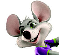 Let’s start off this week with a little news from the world of pizza. While it’s not exactly a new logo, Chuck E. Cheese’s unveiled an updated mascot. This version is less 80s cartoon and more 21st century computer animation. In fact, the new mascot would be right at home in a Pixar flick. Given that the pizza chain’s logo features the mascot, look for an updated logo to make its appearance on store locations soon. Click the link to see a slide show featuring several past C.E.C. logos. For those in middle age, it’s a walk down memory lane.
Just in time for the Olympics, here’s another set of logos spoofing the terrible design of the 2012 London Olympic Games.
 Regular readers will recognize that we end each week’s round up of logo design news with a look at the latest Google logo doodles. This week, Google introduced a new site and logo for its developer community. The new logo uses the familiar primary colors that Google’s logo are famous for. It also plays off the familiar (to coders) open and close tags used in several programming languages.
Would you pay $10,000 for a logo? St. Albans City is about to. Here’s a reminder that you can save a lot of money with our online logo creation tool.
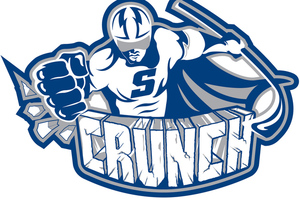 In sports logo news, the Syracuse Crunch unveiled a new logo and major league affiliation. That guy in the middle is called the Crunchman. Click the link to see several of the team’s former logos. And from hockey we go to Cricket where Australia’s Western Warriors unveiled a new logo this week. We suppose that cricket teams need logo to give the fans something to look at so they won’t be bored to death during the games which can last five days.
We often profile new logos for sports teams, leagues, and tournaments (see above). But what about a logo for people who don’t like sports? Genius.
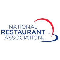 The National Restaurant Association (the other NRA) introduced its new logo this past week as well. The new look incorporates the organization’s history bringing in elements from logos of the past. But we’re not familiar with those old logos (and we would bet neither is anyone other than the board of the NRA) so we didn’t notice that. According to the announcement, the new logo represent pizzas, burritos, a pancake, or a plate. Again we don’t see it.
Nothing says condom-awareness like a new logo. Unless it’s two condom awareness logos. Both Ottawa and Los Angeles announced new logos for their awareness programs.
 myYearbook merged with QuePasa and changed its name to MeetMe. And of course that requires a new logo. Catherine Cook tells the story of the rebrand to TechCrunch in this article. Interesting. But not something I’d be excited to try, given the risks.
The Baltimore Ravens are facing another lawsuit related to their old logo. It seems they just can’t stop using the logo, even though they don’t own it. Lame.
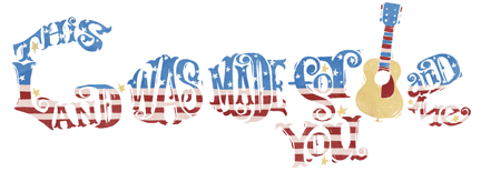 And this week’s Google logo designs included new logos for Independence Days in Algeria, Venezuela, and the United States of America. We like the somewhat hidden song lyrics in the design of the USA logo. As well as a logo for Canada Day.
Did we miss anything? Let us know in the comments.


