It seems to be a rare thing these days to find a company that sticks with its logo for more than a few years. And for organizations like sports teams, which are constantly trying to stay fresh and relevant to their fans, we’ll see new logos every two or three years.
So, if everyone else is doing it, you should design a new logo too, right?
Easy answer: Maybe.
The Pitfalls of Redesigning Your Logo
Your logo is the single visual identifier most associated with your product or service. When you’ve branded your company well, it is the first thing customers see or visualize when they think about what you offer them. Which makes it a very valuable asset.
Change the asset too much, or needlessly, and you can destroy some or even all of that value.
But, you say, Google does it every week. Sometimes several times a week.
True, but Google has several advantages that you probably don’t have. Most importantly, each new logo (Google calls them Doodles) appears in the same place as the original logo does, at the top of the page at Google.com. There are no other visuals on the page to compete with the design. No chance that you’ll find a competitor’s logo there. You’re at their home page, so the logo there must belong to Google, even if it is somewhat different.
Also, importantly, Google tends to keep as many letters and colors in place, as the design changes. You can generally make out the company’s name and the familiar colors in each logo.
![]() Lastly, each of Google’s doodles celebrate an event that is recognizable to the person who is viewing the logo. Whether it is the World Cup (for which we’ve seen about 50 new Google logos over the past few weeks), or the 144th birthday of Marie Curie (which Google featured three years ago), customers have grown accustomed to seeing unique designs based on historical events on the site.
Lastly, each of Google’s doodles celebrate an event that is recognizable to the person who is viewing the logo. Whether it is the World Cup (for which we’ve seen about 50 new Google logos over the past few weeks), or the 144th birthday of Marie Curie (which Google featured three years ago), customers have grown accustomed to seeing unique designs based on historical events on the site.
Before you try something similar, think through whether you have a similar set of advantages that help you succeed with a new logo each week.
Okay, so Google is definitely an outlier, with several advantages. But other companies update their logos every few years. Are you like them? Should you design a new logo once or twice a decade?
Famous Companies Who Successfully Rebranded
When people talk about updating their logo design, they often talk about the evolution of Apple’s logo, which goes something like this:
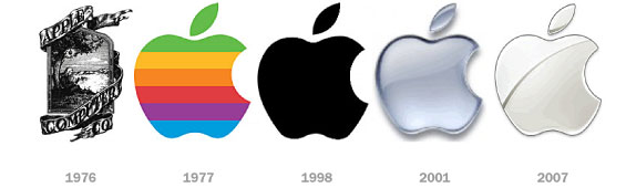
Apple is another wildly successful company that has updated their main logo about once every five to ten years (and it is doing it more often lately). The company’s first update was dramatic—changing a mark that is hard to read or print (Newton sitting under the Apple tree) to a colorful icon with a bite out of it. The new design is significantly easier to print or engrave on computers and iPods. But changes after that were small tweaks to color and depth, made to keep the brand relevant. Changes that most potential customers (rather than engaged fans of the brand) wouldn’t notice.
If your logo is difficult to read or the concept is a little nebulous (like Apple’s original design), then it is probably time to consider a new design that better represents your product or service.
On the other hand, some logo updates don’t do anything to enhance the brand. There’s not really a reason to make the change except that someone (usually the CEO or company owner) is tired of the design and wants to see something different.
That’s what we saw with the recent update to the Yahoo! logo. And the Gap logo.
![]()
Take a look at the Yahoo! logos above (the new one is on top, the old is on the bottom).
The new logo removed most of the “fun” feeling from the design by evening out the type (all but the first and last letters). And it uses a weird bevel on the typeface. We don’t think it’s an improvement, but even if you do, how is this different enough to justify the change? What value is added? What does it say about the new Yahoo! that the old logo didn’t?
Two years ago, when the Gap tried to update their logo, it was much the same. A change for change sake with no real value added to the products or the overall brand.
If this is the kind of change you are considering for your logo design, forget about it and spend your time on something that will deliver real value to your customers.
Let’s take a look at one last example: Shell Oil.
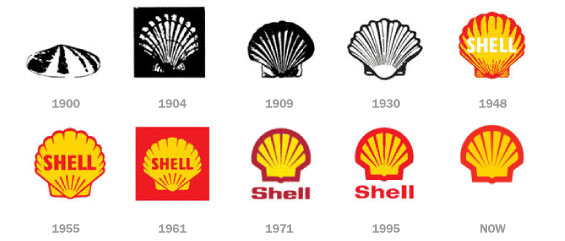
Shell’s logo has been updated roughly every 10-20 years. Each time the change has been small but sufficient to keep the design relevant for the time. Each tweak, especially after the 1930’s simplifies the design and makes it stronger, but still preserves the essential look and feel of the brand.
These are the kinds of tweaks to a logo that really make sense. If your logo needs to be updated to keep it relevant, to simplify the design, or to make it visual stronger, then it may be time to update your logo design.