We see a logo as a simple visual sign that stands in for something much bigger: your entire brand.
It’s the tiny mark that shows up on your website, your business card, your packaging, your socials, and tells people at a glance who you are and what you stand for. If you’re in the hunt for creating a new brand logo or looking to upgrade an existing one, you’re in the right place.
Here’s our guide covering what a logo is, what it means, how it works, and how to create one that actually helps your business expand!
- Why Logos Matter?
- Why Logos Create Impact?
- Types of Logos: 7 Main Categories
- Design Principles That Make a Good Logo
- What Are Vector Logos?
- Technical Specifications to Consider in Logos
- Logo Design Process & Best Practices
Why Logos Matter?
We define a logo as a visual symbol that combines typography, shapes, images, and color to identify a brand, product, service, or organization. Logos can feature abstract or figurative designs, and these visual elements, such as symbols, shapes, colors, and even the company name, help create a strong visual representation of the brand.
It’s the signature of your business, the quick, visual shortcut that helps people recognize you instantly. At its core, a logo’s main job is not to explain everything about your business; it’s to help people pick you out quickly and remember you later by making your brand instantly recognizable.
Over time, as people keep seeing your logo in different places, they start to connect it with certain experiences, feelings, and promises, like trust, quality, fun, or innovation.
A Brief History of Logos
Logos have been around in one form or another for centuries.
Early versions appeared as coats of arms, stamps, and merchant marks that helped identify who made a product or owned a property. As commerce and mass production grew, companies started using logos consistently on packaging, signage, and advertising so people could spot their products in crowded markets.
In the 20th century, especially with the rise of global brands, logo design shifted toward simpler, more modern marks that could work in newspapers, on billboards, and eventually on screens. A great example is the Coca-Cola logo, which has maintained its impact as a wordmark through different shapes and eras, using a distinctive font and consistent color scheme to achieve global recognition.
Today, logos must perform across websites, apps, social media, and physical products, which is why clean, flexible graphic designs are more important than ever.
Logo vs. Symbol vs. Mark
People often use “logo,” “symbol,” and “mark” interchangeably, but there are subtle differences:
- Logo: Any visual identifier for a brand, including words, initials, and symbols.
- Symbol/mark: Also known as a graphic mark, this is a purely graphic element, like an icon or shape, that serves as a visual identifier for a brand. It can be used with or without text.
- Wordmark/logotype: A logo made entirely of stylized text (the brand name).
In practical terms, “logo” is the umbrella term. Whether you’re using a wordmark, a pictorial mark, or a combination of both, you’re still talking about your logo.
Logo’s Main Purposes
A logo serves several functions for a brand, with its primary role being identification rather than storytelling. A good logo:
- Helps people recognize your brand quickly.
- Serves as a tool for public identification, making your business easily distinguishable to the public.
- Differentiates you from competitors.
- Acts as a visual anchor for your entire brand identity.
The meaning and emotion behind a logo come more from repeated real-world experiences, great service, quality products, and positive customer interactions than from the design alone. The logo becomes the symbol for all of that.
Why Logos Create Impact?
A logo might look small, but it sits at the center of your brand identity.
A logo is a vital element of a brand’s identity, encapsulating your company’s values, mission, and personality. It’s the most visible, most repeated piece of your branding, which makes it incredibly powerful when done right.
Brand Identity Foundation
Your logo is often the first visual piece you create when you develop a new brand. From that one mark, you usually build:
- A color palette.
- Typography choices.
- Graphic styles, icons, and photography direction.
All of these are design elements influenced by your initial logo design, helping to reflect your brand’s identity and align with your industry and audience. Because of this, a logo doesn’t just represent your brand; it shapes how everything else looks and feels. If your logo feels modern and minimal, the rest of your branding usually follows.
Psychological Impact on Consumers
Logos tap into basic psychology. People are wired to remember images faster than blocks of text, and simple shapes and colors can trigger emotional reactions almost instantly.
- Colors can suggest energy, calm, luxury, trust, or fun, and different colors can evoke specific emotions in consumers, influencing how they perceive your brand.
- Shapes and type styles can feel friendly, serious, playful, or high-end.
- Repetition builds familiarity, and familiarity builds trust.
Over time, consumers don’t just “see” your logo; they feel something when they see it. That emotional response is where logo meaning becomes real.
Business Value & ROI
A strong logo can support your bottom line in very practical ways:
- It helps you look professional and credible, especially to new customers who have never heard of you.
- It differentiates you from competitors, which matters in crowded markets.
- It supports brand recognition, which lowers marketing friction over time. People are more likely to click, open, or buy when they recognize you.
A memorable logo also creates lasting impressions in customers’ minds, embedding your brand in their subconscious and strengthening brand recall.
While you can’t always attach a neat dollar value to a logo alone, brands with consistent, recognizable visual identities tend to build trust and loyalty in a more natural way.
Recognition & Memorability
Memorability is often what separates forgettable logos from iconic ones.
Recognition is about whether people can pick your logo out when they see it again. Memorability is whether they can recall it later without seeing it.
Good logos support both of these principles by being:
- Simple enough to recognize at a glance.
- Easily recognizable, so viewers can instantly identify your brand.
- Distinct enough not to blend in.
- Repeated enough across your channels to stick.
Types of Logos: 7 Main Categories
We group logos into seven common types. Understanding these helps you choose the best format for your brand. Let’s look into each of these types:
Wordmark & Logotype Logos
A wordmark is a logo composed solely of your brand’s name, styled with distinct typography. Think of clean, custom lettering, spacing, and subtle tweaks that make the name itself recognizable.
Wordmarks are a great fit if:
- Your brand name is short to medium in length.
- You want to emphasize your name and make it easy to read.
- You’re starting out and want to build name recognition quickly.
Lettermark & Monogram Logos
Lettermarks use the company’s initials in a stylized format instead of its full name, arranged into a compact mark. They’re especially helpful for brands with long or complex names that are hard to fit in small spaces.
Lettermarks work well when:
- Your full name is lengthy or hard to pronounce.
- Your initials naturally form a strong, memorable shape.
- You plan to use your logo at small sizes frequently, like on app icons or avatars.
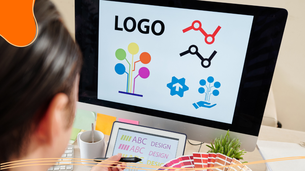
Pictorial Mark Logos
A pictorial mark is an icon or graphic symbol that clearly resembles something recognizable; an object, animal, or shape tied to the brand. Pictorial marks are a type of figurative design, using illustrative elements to visually communicate brand identity.
These marks can:
- Create strong visual associations with your brand’s personality.
- Work well for brands that want a global appeal without relying heavily on language.
- Transition to standalone use over time once recognition is strong.
Abstract Logo Marks
Abstract marks are geometric or non-literal symbols that don’t depict a specific object but still carry meaning through shape, color, and style.
They are useful when:
- You want a unique, ownable shape not tied to a literal object.
- Your brand operates in multiple categories or geographies.
- You want flexibility to interpret the symbol in different ways over time.
Combination Mark Logos
A combination mark pairs text (a wordmark or lettermark) with a pictorial or abstract symbol, and often integrates text directly within the graphic element. The text and icon can be used together or separately in different contexts.
This format is extremely popular because:
- You get the best of both worlds: clear name recognition plus a visual symbol.
- It’s flexible for different placements and sizes.
- You can gradually lean more on the symbol as recognition grows.
Emblem Logos
Emblem logos place text inside a shape or badge, think seals, shields, crests, or circles. They often feel traditional, official, or heritage-driven. Because emblems can get detailed quickly, it’s important to design them carefully so they still work at small sizes.
Emblems are a good fit for:
- Schools, government bodies, and institutions.
- Brands that want a classic, established feel.
- Situations where a badge-like shape will be used on uniforms, packaging, or signage.
Mascot Logos
Mascot logos use a character, human, animal, or fictional figure to represent the brand. The mascot may stand alone or appear alongside text. They can be incredibly engaging, but they must be simplified enough to reproduce clearly across all sizes and formats.
Mascots help when:
- You want a friendly, approachable, or family-focused vibe.
- You plan to use storytelling or content featuring a recurring character.
- You need a logo that connects well with kids or community audiences.
Design Principles That Make a Good Logo
Not every logo is a good logo. A successful logo is also an effective logo that follows a set of timeless design principles.
Simplicity
Simplicity is the most important rule. A simple logo is easier to recognize, faster to process, and more flexible across different uses. Such logos are often memorable and impactful because their unique elements make them stand out in digital and social media environments.
Simplicity doesn’t mean boring; it means stripping away anything unnecessary, so only the important shapes, letters, and colors remain. This also makes your logo easier to reproduce on everything from a favicon to a billboard.
Memorability
Memorable logos usually combine simplicity with a unique twist, an unexpected detail, clever shape, or distinct type treatment that sticks in the mind. For example, the Nike Swoosh is a memorable logo because of its simple yet distinctive design.
To improve memorability:
- Avoid generic icons and default fonts.
- Use one strong idea instead of multiple competing ideas.
- Test whether people can roughly sketch your logo from memory after seeing it once.
Versatility & Scalability
A good logo works:
- In color and in black-and-white, making sense for applications where color printing isn’t possible or when a clean, classic look is needed.
- At tiny sizes (social icons, app icons) and huge sizes (banners, signage).
- On print, screens, embroidery, and more.
This is why designers recommend starting in black-and-white, designing in vector format, and testing the logo at various sizes before finalizing it. If it falls apart when small, it needs refining.
Relevance to The Brand
A logo should feel appropriate for the audience and industry, even if it’s not literal. It’s important to make sure your logo is relevant to your target group, so the visual identity matches their preferences, values, and needs.
- A financial firm’s logo might lean clean, strong, and restrained.
- A kids’ brand may lean colorful and playful.
- A luxury brand might use refined typography and plenty of space.
Timelessness
Logo trends come and go, but your logo should be built to last. Timeless logos avoid overly trendy effects, complicated gradients, and gimmicks that will look dated in a few years.
Instead, focus on solid fundamentals:
- Clear shapes.
- Well-chosen typography.
- A color palette that reflects your brand consistently.
Distinction From Competitors
A logo must help you stand out in your competitive landscape. If your logo looks like everyone else’s, customers may confuse you with other brands or struggle to distinguish your design from other logos in your industry.
Before finalizing your logo:
- Review competitor logos and note common shapes, colors, and styles.
- Avoid copying industry clichés.
- Look for a visual angle that’s clearly and confidently your own.

What Are Vector Logos?
If you’ve ever heard a designer insist on “vector files,” there’s a good reason.
What Is a Vector Logo?
A vector logo is created using mathematical paths instead of pixels, so it can scale up or down to any size without losing clarity or becoming blurry.
Rather than storing information for each pixel, vector files store equations and instructions for drawing shapes and lines. That’s why they’re the standard for professional logo design.
Scalability Benefits
Vector logos:
- Stay crisp on high-resolution screens and large prints.
- Can be resized to any dimension without redrawing.
- Are easy to adjust, recolor, and adapt for different formats.
This scalability makes vectors ideal for everything from social media icons to building signage.
Common Vector File Formats
You’ll often see these logo file types:
- SVG: Great for web and digital use because it’s lightweight and scalable in browsers.
- AI: Adobe Illustrator’s native file format, commonly used by designers.
- EPS: A widely compatible vector format that many design and print programs can open.
For everyday use, you might export from these vector files into PNG or JPG to place on your website or documents.
Raster vs. Vector Comparison
Raster images (like JPG, PNG, GIF) are made of pixels, so they have a fixed resolution. When you enlarge them beyond that resolution, they become blurry or pixelated.
Vectors, on the other hand:
- Can be infinitely scaled.
- Are better for logos, icons, and illustrations that require clean edges.
- Offer greater flexibility when preparing files for different platforms.
A complete logo package should include both: vector files for master artwork and raster exports for immediate use.
Technical Specifications to Consider in Logos
When managing your logo files, keep an eye on:
- Color modes: Use RGB for digital and CMYK or Pantone for print to keep colors consistent.
- Clear space: Define minimum space around your logo so other elements don’t crowd it.
- Minimum size: Set a smallest recommended size to keep legibility, especially for wordmarks and emblems.
Logo Elements & Components
Every logo is made from a small set of building blocks: color, typography, shapes, and composition.
Color Psychology & Selection
Color does more than decorate; it shapes how people feel about your brand at a glance.
Common associations (which can vary by culture) include:
- Blues and greens: Trust, stability, growth.
- Reds and oranges: Energy, passion, urgency.
- Neutrals (black, gray, white): Sophistication, simplicity, balance.
Choose a primary color or two that align with your brand personality, then define secondary and accent colors to use in broader branding. Limit your logo’s color count for flexibility and clarity.
Typography & Font Choices
Typography is especially important for wordmarks and lettermarks, but it matters in all logos that include text. Choosing the right font style is highly important for logo design, as it reflects your brand personality, boosts recognition, and helps maintain consistency across all branding elements.
Consider:
- Font category: Serif (traditional, trustworthy), sans-serif (modern, clean), script (personal, expressive), or display (unique, bold).
- Legibility: Your brand name must be readable at small sizes.
- Customization: Tweaks to spacing, letter shapes, or unique details can turn a standard font into a distinctive logo.
Imagery & Iconography
If your logo includes a symbol, keep it simple and meaningful.
Good icon choices:
- Suggest your industry, values, or personality without being overly literal.
- Work in solid shapes (or minimal line work) that scale well.
- Are easy to recognize even when used alone as a favicon or profile picture.
Composition & Layout
Composition is how all elements, text, symbols, and shapes fit together. The goal is balance, hierarchy, and clarity.
Relevant considerations:
- Balance: Symmetrical or intentional asymmetrical balance helps the logo feel stable and pleasing.
- Alignment: Elements should line up cleanly for a professional look.
- Variations: Create horizontal, vertical, and icon-only versions to cover different use cases.
Logo Usage & Applications
A great logo isn’t just designed; it’s used consistently so people can recognize it everywhere they encounter your brand, whether it represents your products or services.
Website & Digital Applications
For digital use, you’ll need appropriately sized files with transparent backgrounds (often PNG or SVG), plus guidance on how the logo should appear on light versus dark backgrounds.
Online, your logo shows up:
- In your website header and footer.
- As a favicon in browser tabs.
- Inside emails and newsletters.
Print & Marketing Materials
In print, your logo appears on:
- Business cards, letterheads, and envelopes.
- Brochures, flyers, and posters.
- Trade show materials, signage, and packaging inserts.
For these uses, vector files, CMYK color values, and possibly Pantone references help printers reproduce your logo accurately and consistently.
Printed materials with your logo can also act as free advertising for your brand, promoting recognition and attracting attention without extra cost.
Social Media Optimization
On social platforms, your logo must work in small, square, or circular spaces.
Best practices:
- Use a simplified or icon-only version for profile images.
- Maintain consistent placement and size in cover graphics.
- Stick to the same logo variation across platforms to reinforce recognition.
Product Packaging & Merchandise
On physical products, your logo can appear on:
- Labels, boxes, and bags.
- Apparel, T-shirts, hats, and accessories.
- Promotional items like mugs, pens, or stickers.
Logo vs. Brand Identity
It’s easy to confuse “logo” with “brand,” but they’re not the same thing. A company’s logo is a visual element that conveys brand identity, builds recognition, and fosters trust with your audience.
- A logo is a visual mark.
- Branding is the full experience of your company, voice, values, visuals, customer service, messaging, and reputation.
Within a larger brand strategy, your logo:
- Acts as a visual trigger for all the thoughts and feelings people have about your brand.
- Provides a consistent anchor across marketing channels and campaigns.
- Helps unify different touchpoints, website, ads, and packaging under one recognizable mark.
Visual Identity Systems
A visual identity system expands on your own logo, which is the centerpiece of your brand’s visual identity. Creating your own logo is imperative for establishing brand recognition and differentiation. The system also defines:
- Color palettes.
- Typography hierarchy.
- Photography and illustration style.
- Layout patterns and graphic devices.
Together, these guidelines ensure everything your audience sees looks and feels like it comes from the same brand. The logo is the centerpiece, but the system brings it to life.
Logo Design Process & Best Practices
For a small business, knowing the logo design process is especially helpful; it can boost brand recognition, build customer loyalty, and shape how your company is perceived.
Research & Strategy Phase
Before sketching anything, clarify:
- Who your target audience is.
- What your brand stands for (values, personality, positioning).
- Which competitors your audience might compare you to.
Collect examples of logos you like (and dislike), especially in your industry, and note why. This strategic groundwork ensures the logo is not just attractive but appropriate.
Design Principles Application
Once the strategy is clear, the design phase focuses on:
- Exploring multiple directions (wordmarks, combination marks, symbols).
- Applying principles like simplicity, relevance, and versatility.
- Refining typography, color choices, and shapes.
Testing & Refinement
Before finalizing, test your logo:
- At different sizes and on different backgrounds.
- In both color and monochrome.
- With your target audience or internal team to get honest feedback.
You may go through several rounds of refinement to improve legibility, balance, or uniqueness. Small tweaks can make a big difference.
Implementation Guidelines
Once chosen, your logo should be documented with clear usage rules:
- Do’s and don’ts (e.g., no stretching, recoloring, or adding shadows).
- Minimum sizes and required clear space.
- Approved color variations (full color, one color, reversed).
These guidelines help keep your logo consistent, especially when multiple people or partners create marketing materials.
Conclusion
A logo may be a small piece of your business, but it carries a lot of weight. It’s the visual shortcut that helps people notice you, remember you, and eventually trust you. Done well, your logo becomes the front door to your brand, showing up consistently on every touchpoint and tying your entire identity together.
Understanding what a logo is, what makes a good one, and how it fits into the bigger picture of brand identity helps you make smarter choices, whether you’re designing one yourself or collaborating with a professional. With clear strategy, solid design principles, and the right formats, your logo can serve your brand for years and grow right alongside your business.
Ready to create your perfect logo? Start now with LogoMaker and start creating a lasting impression wherever you go!
FREQUENTLY ASKED QUESTIONS
What is a logo?
A logo is a visual symbol, often combining text, shapes, and color, used to identify and represent a brand, product, or organization across different platforms and materials, and to promote public identification by making the brand easily recognizable among the public.
What makes a good logo?
A good logo is simple, memorable, versatile, relevant to its audience, timeless in style, and clearly distinct from competitors in the same space. It should also reflect the brand’s personality through its design elements, helping to communicate the brand’s character and vibe.
What is a vector logo?
A vector logo is created with mathematical paths rather than pixels, allowing it to be scaled to any size without losing sharpness or becoming blurry, which makes it ideal for both print and digital use.
What file formats should I ask for when I get a logo?
You should request vector files like SVG, AI, or EPS, plus raster exports like PNG and JPG for everyday use on websites and documents.
Do I need more than one version of my logo?
Yes, it’s smart to have variations, such as full logo, icon-only, horizontal, and stacked versions, and color and monochrome options, to cover different spaces and backgrounds.
How important is color in a logo?
Color is extremely important, since it influences emotional reactions and brand perception, but a strong logo should still work in one color or black-and-white.
Can I design a logo myself?
You can absolutely design a logo yourself using online tools such as LogoMaker, especially if you’re a small business or working on early-stage projects.
How often should I update or redesign my logo?
Many brands refresh their logo every several years to stay current, but major redesigns should be rare and only done when your brand strategy or audience has changed significantly.
Is a logo the same as a brand?
No, a logo is one part of your brand. Your brand also includes your messaging, tone of voice, customer experience, values, and all the impressions people form about your business.