If you’ve spent some time in the design industry, you’re well aware that flat design is incredibly popular at the moment. Featured on everything from websites to letterheads, it’s sweeping the globe.
Some design newbies may be unaware of what it is, how it looks, and how it could benefit the overall look of design work. To clear this up, we’re going to spend some time explaining what flat design is, how many have used it, and how it could work in a logo design project.
What is flat design?
![]() Flat design is a specific style and concept that renders everything in a two-dimensional way, making a design look as though it were flat. The removal of this three-dimensional realism is flat design at its core.
Flat design is a specific style and concept that renders everything in a two-dimensional way, making a design look as though it were flat. The removal of this three-dimensional realism is flat design at its core.
Textures, gradients, bevels, shadows, and all other embellishments are removed from the design creation process. Many are drawn to this style because of the simplicity and minimalism in the overall look.
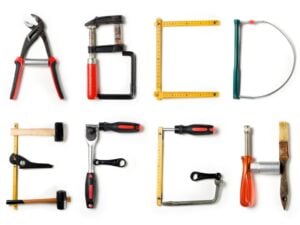
To make up for the lack of embellishments, flat designs use characteristics such as wording, simple shapes, bold typography, and bright colors to make designs look extra appealing. When designing a logo, consider using these attributes:
- Colors: Although there are no particular rules in the flat design color scheme, this style uses more colors than typical palettes, and the hues are generally more vibrant. Flat UI Colors offers some great examples.
- Typography: The typography used in flat design is direct and simple. Many people utilize sans serif typefaces and tend to limit the typefaces they use down to two on a single project.
- Shapes: The shapes used in flat design tend to be geometric and clean, meaning the most common shapes used in this style are circles and rectangles. Some use shapes with round edges, but they tend to be less common than shapes with squared-off edges.
- Text: With the nature of flat design being clean and simple, many tend to keep their language simple. Flat designs look better when text is kept to a minimum.
Logos and websites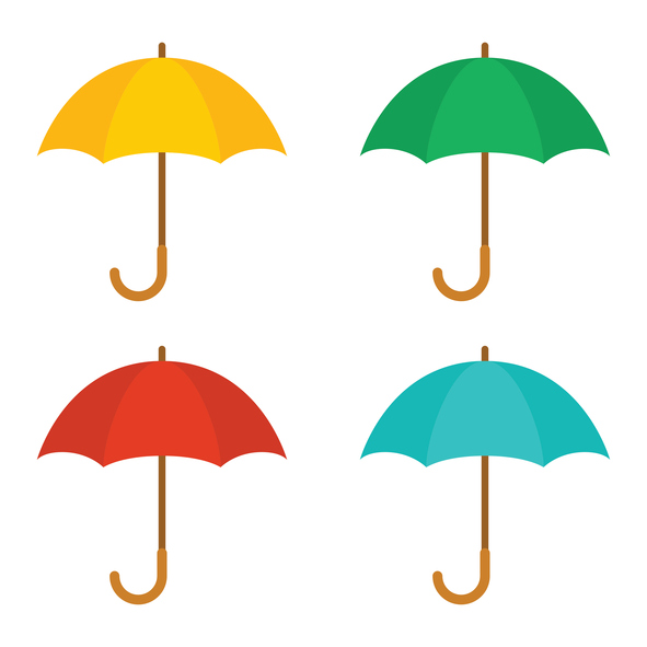
If you decide to create a flat logo design, you should use this same feature in your overall website theme. From the user interface to buttons, you should remain consistent to truly pull off this style.
It’s worth mentioning that many mobile applications use flat design for their overall theme. Built for smaller screens, this mobile app style keeps your site looking great (even if the call-to-action options are limited).
The flat design theme is beginning to evolve as new sites push traditional boundaries. The style that is developing looks like an “almost flat design” in which the design elements use a minimal amount of effects. This helps make the site incredibly user-friendly.
A new favorite style
Flat design tends to stir up plenty of conversation because it’s both user-friendly and easy on the eyes. Because of this, the flat designs that look the best are the ones used for simple sites without many pages or lots of content.
When it comes to developing a fun logo, consider using flat design. Its clean, modern feel looks great and will remain stylish for years to come. If this type of “look and feel” fits your brand, you may have found a new favorite.