Making your mark in any creative field is a challenge when you’re surrounded by gifted minds with original ideas. Low startup costs and few barriers to entry have made photography an exceptionally competitive career. The Bureau of Labor Statistics expects employment for freelance photographers to grow 12 percent between 2016 and 2026. Grabbing attention in this crowded arena will be tough, unless you have an exciting visual story to tell.
Visuals are your greatest tool to stand out as a pro photographer. A striking body of creative work offers instant proof of your talent and credibility. At the same time, expect clients to hold your visual presentation to high standards because of your artistic skills.
To make the right impression, start by creating an attractive logo to showcase in marketing materials. And no, simply sticking your name over a camera icon won’t cut it. A photography logo may be your smallest asset, but it gets more exposure than anything else in your portfolio. Keep these tips in mind to develop a distinctive photography logo design that captures your brand personality.
How to design a photography logo
1. Match Your Logo Style to Your Business Identity
Offer clients a glimpse of your approach to photography. Picking the right logo style from a myriad of options is one of the first challenges you’ll face. You can quickly narrow your design parameters by choosing a style that fits your business identity. Use the following factors as a starting point.

- What are your most prominent brand characteristics?
- What are your photography specializations?
- What customer segments do you serve?
A great logo can instantly communicate important details about your business. If you serve niche clientele, such as pets or wedding parties, it makes sense to tailor your logo to your audience. People who see your business card will know right away that you can provide what they need.
Writing down your brand characteristics should also help you decide the tone of your design.
Do you want your logo to be fun? Tongue-in-cheek? Ornate? Modern? Conservative? An ornate line-drawing logo could work well for someone who specializes in vintage portraits. A hand-drawn script could beautifully embody the work of a wedding photographer.
2. Use Your Business Name for Photography Logo Ideas
Getting customers to remember your business name is the whole point of making a logo. Look for ways to translate your business name into relevant images that boost brand recognition.
In freelance photography, it’s common to use a personal name to represent your company. But if you happen to have a unique business name, it will be even easier to be inventive with your logo.
The owners of From the Hip Photo Studio in Denver chose a name to describe their fun, candid method of shooting photos.
The company’s two-toned logo includes the image of a leaping dog, tying in with website branding that emphasizes adventure and spontaneity. What images immediately come to mind when you think about your business name?
3. Pick Typography That Complements Your Brand
Just like a logomark, any typography you incorporate has to fit the tone of your brand. Focus on the qualities you want to convey, and look for typefaces that capture the same spirit.
If you’re aiming for a fun or contemporary brand, sleek and simple sans serif typefaces are usually the way to go. On the other hand, serifs often work perfectly for brands rooted in tradition, heritage, and family values.
Sometimes, you might end up using a combination of multiple fonts if you have a long business name. However, try to limit yourself to two fonts at most.
Too many competing typefaces can clutter your design and make it come across as an amateur. You should also avoid highly decorative typefaces whenever possible.
If you aren’t working with an expert logo designer, it will be harder to maintain clarity when you use ornate typefaces on a variety of media.
4. Showcase Your Hand-Drawn Signature
It’s a safe bet that none of your competitors will ever create a hand-drawn signature in exactly the same style as yours. Handwriting has unique nuances that can set your wordmark apart from similar designs.
Experiment with writing your business name by hand. Try organizing your sketches on a sheet of lined paper.
You can make small tweaks to individual letters in each iteration to keep track of the changes. That way you can compare small differences and combine the best features in your final design.
View professionally drawn logos for guidance as you develop a one-of-a-kind look. One of the great things about hand-drawn signatures is versatility.
They can be graceful flowing scripts or a more casual penmanship style.
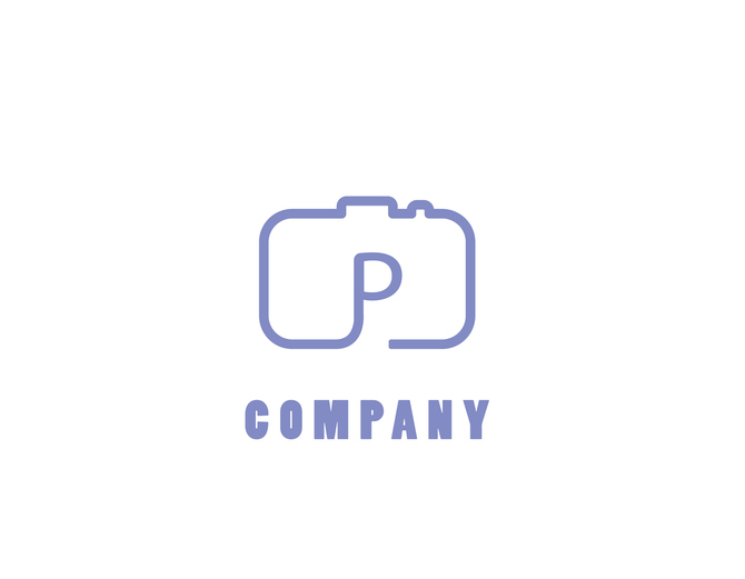
5. Play Around With Common Shapes
The minimalist trend is well-suited to DIY logo design. You can use incredibly simple shapes in clever ways to come up with an eye-catching design.
Basic shapes provide a clean, clutter-free framework to build upon while leaving room for ingenuity. Let’s use a camera-based logomark as an example.
While it isn’t a bad thing to include a camera in your design, it’s harder to be unique when your idea is right on the nose. One way to remedy this problem is to use familiar shapes and imagery in places where they’re unexpected.
A camera is mainly made up of rectangles and circles. Look for advantageous places to include these shapes in your design, such as:
- The forms of letters in your business name
- Negative space inside letters and around words
- As a focal point of abstract monogram logos
No matter what symbols you choose to include, be clever about placement. You can slap a symbol next to a basic wordmark, but the overall design will be more memorable if these elements interact in some way.
6. Aim to Tell a Story 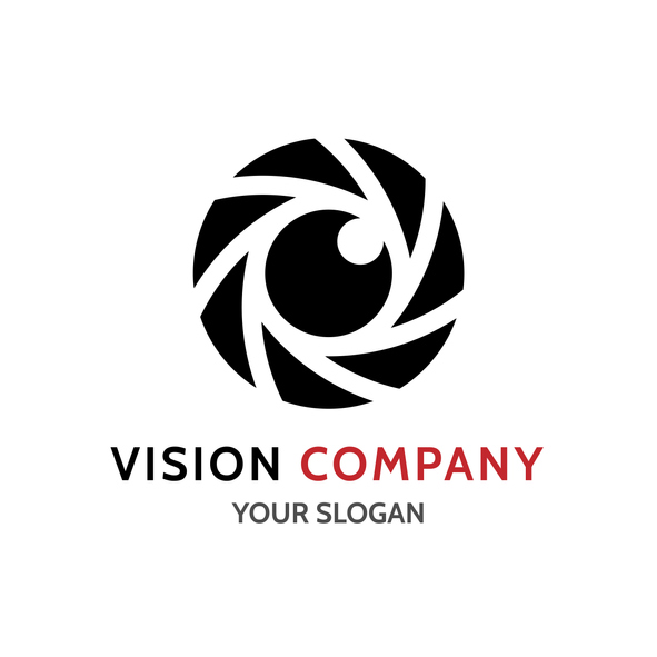
Make it your goal to leave prospective clients eager to learn more about your business. How do you go about doing that? Create an image that tells a story, whether it’s through action or aesthetic value.
An action-driven logo gives the impression something is happening. For example, it could be a camera flashing, an object or animal in motion, or a scenic image.
Think about the story behind your business and how those details can be simplified into a single frame. An aesthetic-driven logo can play up a visual feature, such as cropping details or a color gradient.
Give viewers a focal point they can easily relate to your business and convert to memory.
7. Make an Impact
Put your brand front and center when designing a photography logo. In many cases, clients will encounter your logo long before they meet you in person.
Strive to create a design that makes a positive introduction and motivates people to reach out.
When you are ready to design a logo for your business, get started in minutes with our easy-to-use logo maker.


