Once you have a great idea for a hair salon, you don’t want a bad logo design to pull down your brand. Salons are hubs for self-expression and trend-setting.
At the same time, clients are putting their hard-won trust in your hands every time they sit in the styling chair. As with all modern logos, Salon logos can have creative branding while still projecting a professional image.
If you aren’t sure how to make yours stand out, check out these successful brands for ideas on how to design a salon logo.
The Top 15 Salon Logo Designs
The Beehive Salon
Having a playful name gave the Beehive Salon in Boise, Idaho, plenty of wiggle room to come up with an original design. The simple blue spiral over the letter “I” captures the idea of a bumblee’s flight path.
This sense of graceful motion continues in the hand-drawn wordmark. Small details, such as the fluctuating line weights and whimsical letter shapes, come across as creative and inviting.
Laboratorie
For a salon that’s all about experimenting with color, shape, and style, Laboratorie went in a surprising direction with the brand logo. At first glance, the Baltimore salon’s serif wordmark has a tame and traditional appearance.
Look again, and you’ll see artistic touches — mixed uppercase and lowercase letters, slender ascending stems, and an elegant descending stroke on the letter “R.”
![]()
Carmella Marie
Coming up with a fresh, expressive design can be hard when it’s so common for salons to bear personal names. Carmella Marie natural hair salon in Youngstown, Ohio, aimed for a one-of-a-kind look with a hand-drawn signature.
The flowing script is readable while still embodying the uniqueness and authenticity of the natural hair trend.
Theory Hair Salon
The logo for Theory Hair Salon in Bozeman, Montana, is a great example of an ultra-simple design that makes an instant connection with viewers. The boxed letters immediately remind you of a square from the periodic table. The design choice ties in with the science-inspired name and branding, and it easily works as a social media icon.
Oyin Handmade
A push for healthy, organic hair care is the driving force behind this Baltimore salon and boutique inspired by West African culture. The hand logo is a simplified version of a hamsa — a well-known symbol of protection and strength.
To round out the design, the warm, inviting color palette matches the positive and earthy personality of the brand.
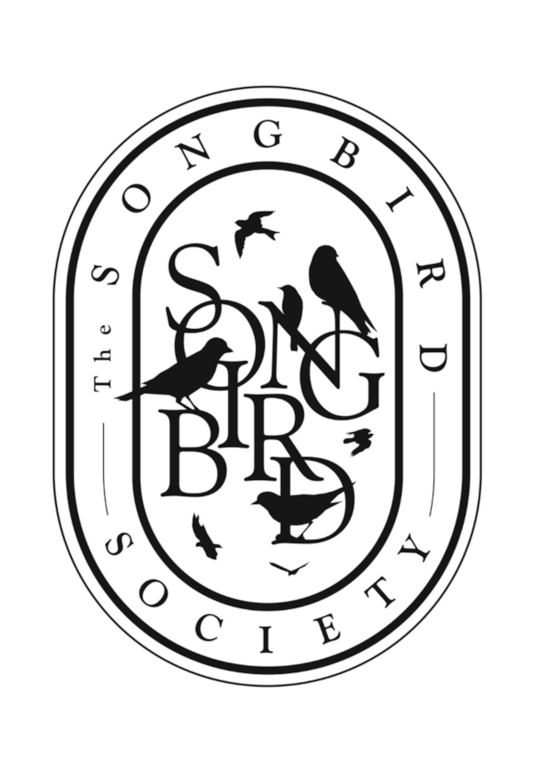
The Songbird Society
The Songbird Society in Dallas, Texas, is described as a “small, diverse, and impassioned group of beauty creatives.” How fitting then for the logo to depict a spontaneous gathering of birds all doing their own activities.
The logo cleverly features an outer shield design with the full name clearly written. While the interior text plays with artful overlapping, it’s legible enough to stand alone in certain applications.
More importantly, a stark, black-and-white color scheme keeps the design from looking muddled.
Snip Salon
An all-caps calligraphy logo can be hard on the eyes in a long brand name. Fortunately, the four-letter logo for Snip Salon keeps it short.
While it isn’t the most sophisticated design, the tattoo-like typeface and hand-drawn scissors fit the edgy style of this Miami Beach establishment.
A tiny pop of red balances the neutral color scheme, and the bisected design conveys the theme of expert haircutting.
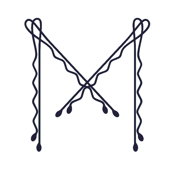
Mirror & Mantel
A basic monogram logo can be a showstopper with the right idea. Mirror & Mantel salon in Philadelphia, Pennsylvania, was smart enough to avoid treading into murky waters with an M&M logo. Instead, the boutique studio transformed a few well-placed bobby pins into a sophisticated letter “M.” No confusion here.
Serge Normant
Serge Normant salon in New York City proves you can make an exciting logo using a personal name. Radiant and unconventional, a gold color scheme is the first sign this salon caters to an upscale crowd.
The geometric icon is clean and refined, while easy to print on various media because of its neat proportions. The icon seems intricate, but it’s entirely crafted from squares and circles.
Nine Zero One
Look to Nine Zero One in West Hollywood, California for ideas on how to get creative with fonts. Your eyes are quickly drawn to two key points of interest where letters unexpectedly fuse together.
Since the words are evenly lined up on all sides, the overall design is clean and easy on the eyes. However, each word has slightly different sizing, which breaks up the uniformity and keeps the design from looking bland.
Even without the hummingbird and flower, the logo grabs attention.
Ado Hair Design
If the name is any indication, Ado Hair Design in Indianapolis, Indiana, is a place where excitement and energy are welcome. A lowercase, hand-drawn scribble perfectly sums up this spirited brand.
The freestyle script works for a short name, and you can guarantee there won’t be another brand with the exact same design.

Bijin Salon and Spa
Bijin Salon in Prairie Village, Kansas, boasts a brilliant wordmark design that demands a serif font. The extended strokes of a serif create visual symmetry, making your eyes effortlessly travel across the central letters.
The dots above the trio of glyphs “iji” nearly function as a minimalist wordmark by themselves. For the final touch, the logo uses a warm gradient to balance the flat shape.
Clementine’s
Although Clementine’s in Denver, Colorado, is less than a decade old, the salon’s branding is all about hospitality and heritage. Soft pastels and earthy neutrals evoke a feeling of downhome comfort, which comes through in the classic script logo.
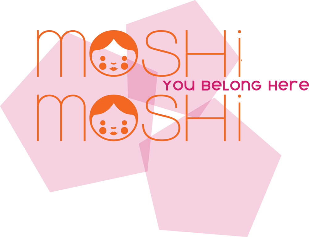
Moshi Moshi
“Moshi moshi” is an informal way to say “hello” in Japanese. So don’t be surprised if you instantly get positive vibes from the smiley face logo of this Chapel Hill, North Carolina, salon.
Moshi Moshi is committed to being inclusive, giving stylists a platform to grow, and being active in the community. The bright, cheerful concept comes through in the orange and pink color scheme, playful sans serif font, and youthful characters.
Eye-catching salon logos don’t have to be complicated to set your business apart from competitors. The best designs tie in with the company’s brand story and make sense the moment you spot them. Try to pinpoint the most compelling traits of your brand, and make those elements the focal point of your logo design.
Create your own unique logo in minutes with our easy-to-use online logo maker.
