Business logos are the foundation of a company’s visual identity and are often the first impression people have of a brand. Good or bad, consumers can make quick judgments about an organization based on their reaction to a logo and whether or not they perceive the brand to align with their own personal values.
So, whether you are just starting out and thinking about logo design ideas for business, or considering a logo redesign, remember that logo design requires thoughtful consideration and even research. Let’s face it, your logo is kind of a big deal! You want to build credibility and name recognition with your audience, and your logo is one of the first identifiers that can help make those important connections.
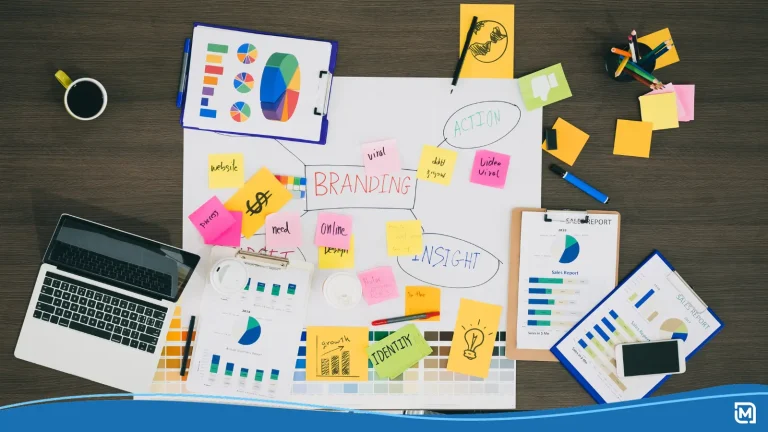
Components of logo design
Several components that make up a logo will need to be addressed when considering logo design ideas for business.
1. Your brand
Your logo reflects your organization’s values and personality. It influences how people perceive your brand and should be designed with your audience’s preferences in mind. If you’ve already developed a brand platform, this will be the foundation of your logo design.
If you are starting from square one, ask yourself these questions to help develop your brand’s personality and determine how you want your audience to perceive your company:
- Is your brand silly or sophisticated?
- Masculine or feminine?
- Peaceful or unreserved?
- Economical or high end?
- Youthful or mature?
- Trendy or classic?
2. Logo style
Maybe you already have a vision for your logo. Is it simply an icon or a stylistic text representation of your company name? One of the very next things to consider in the logo design process is style. For purposes of this article, we’re going to cover five basic logo styles.
![]()
Wordmarks (text)
Text-only logos often use a very stylized and unique font. Many major brands have used wordmarks quite successfully – think Mobil, FedEx, and Coca-Cola. Some designers believe that wordmarks are the best choice for new companies when building name recognition. They can be simpler than logos with other design elements and the company name does not get lost in the design.
![]()
Lettermarks (initials)
Lettermarks are also based on text, but typically only use initials or an abbreviation. This is a great alternative when the company name is long and doesn’t lend itself to a simple and easily understood logo. Well-known examples of lettermarks are CNN, IBM, and P&G (Proctor & Gamble).
![]()
Brandmarks (symbols only)
Because symbols or icons can be more recognizable or memorable than words, many businesses opt to use brandmark logos. This is a choice that many well-known brands opt to go for and in many cases, it is a gradual transition. For example, you may be familiar with the evolution of the twitter logo. The most recent version (bird only) is so recognizable that nothing else is required. It is simple, versatile, and effective!
![]()
Combination marks (both text and symbols)
In cases when the company name doesn’t convey who the business is or what they do, a relevant symbol can immediately communicate that additional information. Symbols are incredibly useful for making an unknown brand name immediately relevant by helping to establish a connection in the consumer’s mind. An ideal choice for new companies who want name recognition, but also need to pair a visual with the name to deliver a stronger sense of who they are and what they do.
![]()
Emblems (text inside symbols)
Emblems can be more complicated. They usually involve text inside a badge or icon. They tend to be more detailed, so if you decide to go down this path, remember to keep it as simple as possible.
3. Font
If you’re not a designer, you may not have given much thought to fonts in the past, and you might be surprised to find out just how many choices there are. Like the other components of business logos, font choice should reflect the personality of your brand.
Here are some of the standard font types:
![]()
Serif: A classic choice. If you want your business to be perceived as traditional, professional or reliable, this can be an excellent option. (Example: Google)
![]()
Sans Serif: Sans Serif fonts are clean, readable, more modern and project stability. (Example: Linkedin)
![]()
Script: Script fonts are artsy, creative and add more of a distinctive touch. (Example: Cadillac)
![]()
Modern: Modern fonts convey strength, style, and progressiveness. (Example: hulu)
![]()
Display: Display fonts are used to get attention and demonstrate personality. They may be large, bold, fun and friendly. (Example: Disney)
Things to keep in mind when selecting a font for your logo design:
- Don’t overdo the number of fonts. No more than two fonts in a logo should be your rule. Otherwise, you run the risk of getting overly complex and simplicity goes out the window.
- Experiment with different weights, spacing, and height.
- Keep readability in mind. Be wary of frills. Fonts that are too flowery or thin with lots of curlicues don’t convert well when sized down. Remember that your logo may have to be the size of a postage stamp at times. Will it still convey the same qualities and be readable?
- Your font should complement the overall logo design and convey the qualities of your brand.
4. Color
If you already have a primary color that identifies your business, wonderful! If not, this is a major decision. Colors have an ability to conjure up certain feelings or emotions and creating an emotional connection with your audience is one of the keys to building a great brand.
Things to keep in mind when selecting a font for your logo design:
- Readability: Think about different channels and backgrounds where your logo will appear. Certain color combinations can affect readability.
- Stay consistent with your overall brand.
- Translation: Business logos often must appear in one color or black and white, so it’s important that your design converts well.
- Meanings of colors: learn a bit about the psychology of color choice.
Your logo design will ultimately have a major impact on your business. It’s important work, and we recommend giving it the time and attention it deserves. Do your research and take all the factors that we’ve covered into account. A strong logo that reinforces your brand personality sets you apart from the competition and builds credibility and trust with your audience!
Need some more business logo design ideas? Browse thousands of designs in our easy-to-use logo maker.