Change for change’s sake isn’t the wisest choice in logo design. In recent years, brands such as Gap and Kraft Foods discovered that messing with an iconic logo can drive away customers and lead to a branding crisis.
And when the replacement design is uninspired or completely out of sync with the brand, everyone is left wondering, ‘What was the point?’ Creating a timeless logo is an incredible accomplishment.
Since the goal of a logo is recognition, you don’t want to throw out a distinctive brand mark on a whim. A logo with staying power is a sign that your design concept and brand story are stronger than any passing trend.
Although they make minor tweaks in size, shape, or font, smart companies aren’t afraid to stand behind a classic logo. If you’re planning to create a logo, these 20 famous logos will help give you an idea of how a brand can withstand the test of time.
Levi’s — 50 years
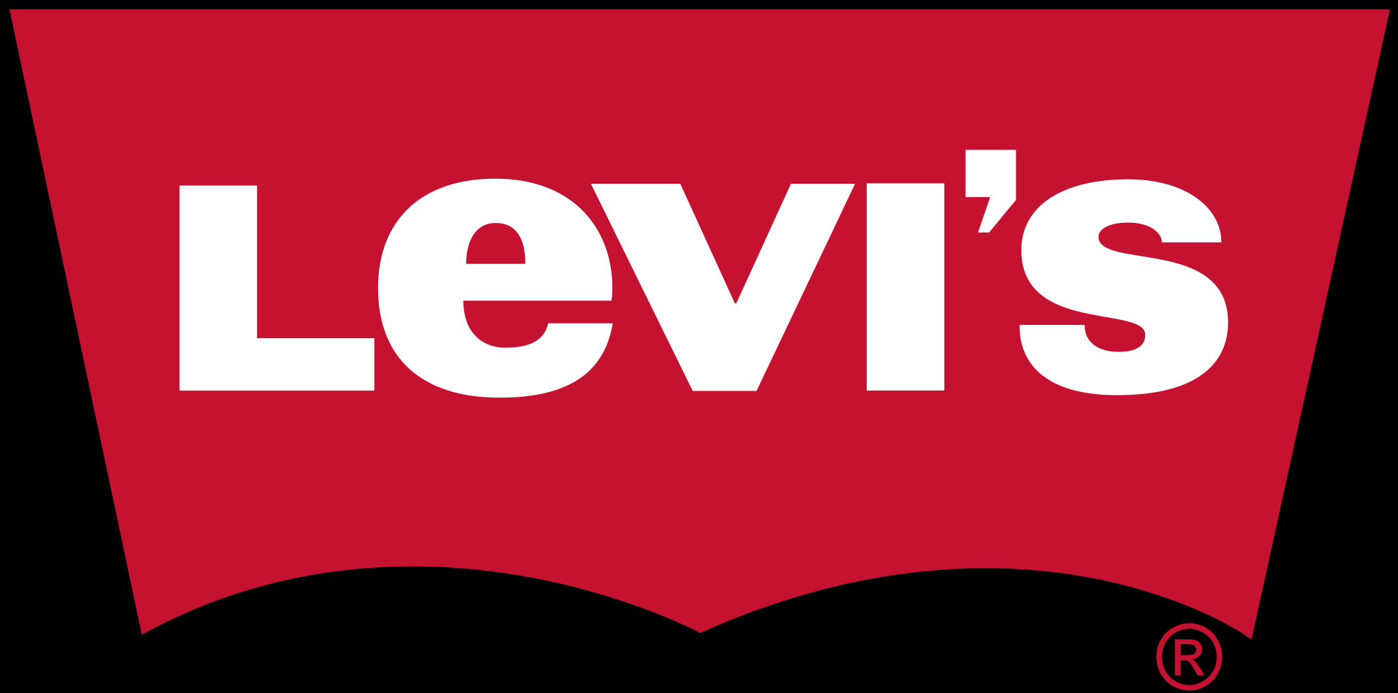
The 50-year-old red banner most people know so well is a mere remnant of the Levi’s two horse logo from 1892. The company once used the image of two horses pulling a pair of jeans to illustrate the strength and durability of the product.
Now, Levi’s name is more than enough to convey a sense of quality.
World Wildlife Fund – 32 years
![]()
For the World Wildlife Fund, it was a safe bet that panda bears would stay adorable for the foreseeable future. Chi-Chi the giant panda has been the WWF mascot since the organization was founded in 1961.
Not only is the panda’s black and white fur boldly graphics and easy to print, but WWF leaders knew this lovable animal could charm a global audience.
Apple — 41 years
![]()
Apple has recolored and retextured its iconic logo over the years, but the famous apple with a missing “byte” has remained the same since 1977. As the brand is known for sleek simplicity, Apple smartly ditched its original logo.
A hyper-detailed grayscale drawing of Sir Isaac Newton under an apple tree doesn’t quite offer the instant recognition factor a logo needs.
Starter — 47 years
![]()
Choosing a flat, black-and-white logo has proven to be one of the best ways to navigate around color and design trends. The Starter star is right at home among minimalist logos.
Despite the company’s ups and downs, the logo has always captured the pride and glamour of pro athleticism.
IBM — 51 years
![]()
You aren’t alone if you can’t imagine the IBM wordmark without its signature stripes. IBM started using a solid wordmark in the 1940s, but in the mid-1960s, the letters were segmented into eight horizontal bars to represent “speed and dynamism.”
Designer Paul Rand clearly had the future in mind when he created a logo that symbolizes continuous change. When it comes to famous logos, this has got to be one of the most recognizable.
Vans — 42 years
![]()
Not every successful logo comes from a high-profile design team. Co-founder Jim Van Doren enlisted his 13-year-old son to create the original Vans “Off the Wall” logo, which has graced the iconic skate sneakers since the 1970s.
The only major change is that the Vans name is now front and center — a common choice for companies with a time-honored reputation.
FedEx — 24 years
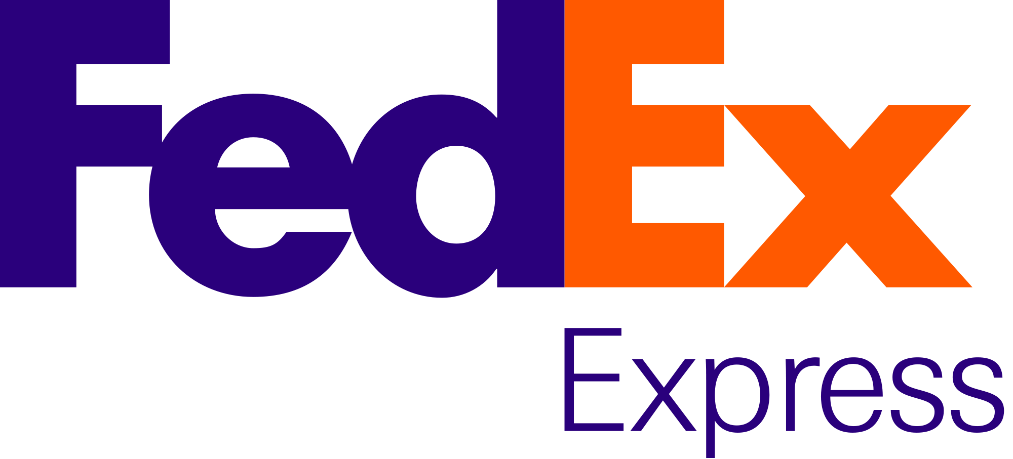
FedEx finds it way onto just about every list of exceptional brand logos, and with good reason. The hidden arrow between the letters “E” and “X” is an impressive example of ingenuity. The design also provides plenty of room for growth. FedEx simply modifies the color scheme to differentiate a range of shipping and packing services.
Ford — 91+ years
![]()
Few brand marks are more enduring than the Ford blue crest. Ford employee Childe Harold Wills is credited with designing a simple hand-drawn script to replace the company’s elaborate crest logo in the early 20th century.
In 1917, Ford debuted its signature oval crest, and a decade later, added the brand’s trademark blue background. Ford has experimented with minor changes in shape and color over the years, ultimately settling on the elongated oval and blue gradient we know today.
Coca-Cola — 131 years
![]()
With its incredibly long shelf life, it’s no wonder the Coca-Cola logo is among the most recognized brand marks in the world. The company’s first bookkeeper Frank Robinson penned the fluid script and elaborate “Cs” for a dramatic look that would grab attention in ads.
The hand-drawn design is inspired by Spencerian script — a popular style of business penmanship in the late 1800s. Not convinced that custom script is a worthwhile investment? More than a century later, the Coca-Cola logo still reigns as a unique, unrivaled design.
Goodyear — 88+ years
![]()
It’s not easy for a tire company to stand out next to glamorous food and lifestyle brands, but Goodyear is proof that it’s possible. Founder Frank Seiberling wanted the brand to embody the spirit and speed of Hermes, the Greek god of trade and travel.
He wisely chose a symbol that went against the grain for the industry. Sieberling championed the winged foot concept when the company started in 1898, and the modernized version has been in use since 1930.
Nike — 47 years
![]()
The Nike swoosh hit the scene in 1971 and has been propelling the brand to success ever since. Similar to Apple, Nike cleverly uses color and textural changes to customize the logo for a variety of campaigns.
The flat, minimalist swoosh is infinitely versatile while embodying the speed and motion of the goddess Nike with its clean, effortless form.
Sony — 61 years
![]()
Look to Sony for insight on how to create a stark, yet sophisticated wordmark that captures the strength of the brand. Sony has used a simple serif typeface since the mid-1950s, conveying a sense of tradition and longevity.
The company has tried different line weights and expanded and condensed the font, but these four simple letters make an impact on their own.
BMW — 102 years
![]()
Anyone who spots the legendary BMW logo immediately thinks of luxury and affluence. According to popular legend, the design represents a rotating propeller and the colors of the Bavarian flag.
Font and color changes aside, this familiar emblem is a testament to the value of heritage in branding. A total reinvention of the blue and white checkered circle with a black border would waste decades of brand power built upon an exemplary reputation.
McDonald’s — 50+ years
![]()
No matter where you live or what language you speak, you have no trouble recognizing the famous golden arches. Since 1961, McDonald’s has used the double-arch icon to mirror the restaurant’s architectural design during the mid-century era.
While the first golden arch included a diagonal slash, McDonald’s soon adopted the modern version we know and love in 1968. The king of fast food has played around with more variations than you count — from the speech bubble design of the late 90s to the smiley face arch of the early 2000s.
Lacoste — 85 years
![]()
Sometimes, it pays to create a logo design that’s completely one-of-a-kind and not associated with your industry at all. French tennis star René “the Crocodile” Lacoste started sporting shirts and blazers embroidered with a signature reptile in the 1920s.
When Lacoste retired from sports and launched his own company, the athlete’s celebrity quickly turned the simple clothing into a status symbol in Europe and beyond.
Keeping a brand fresh and modern is important, but it’s equally vital to creating a recognizable image your customers will never forget. It’s hard to build recognition and consistency if you chase every trend or choose a logo design that doesn’t fit your brand.
Design a logo that offers the flexibility to evolve with your brand, so there’s no need to start from scratch when your business grows.
Ready to design a logo for your business? Get started in minutes!


