
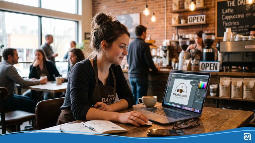
An AI logo prompt is a short written brief that tells an AI logo generator the style, color, tone, and design constraints for your logo. The best AI logo prompts follow a five-part formula: Style + Industry/Niche + Color + Tone + Technical Note. The more specific you get, the better your result. If you’re using LogoMaker, our structured input fields handle this for you automatically: you answer a few focused questions, and we build the brief behind the scenes. If you’re using a general AI tool, this guide shows you how to write that brief yourself, plus 20 ready-to-use templates by industry.
A generic prompt gets you a generic logo. A specific prompt tells the AI exactly what kind of brand it’s designing for, and that difference shows up immediately in the output.
Why Your Prompt Matters
AI logo generators learn from patterns. Which fonts pair well with which industries, what colors suit different brand personalities, and how shapes create different emotional impressions. When you give the AI a specific, well-structured brief, it applies that knowledge precisely. When you give it something vague, it falls back on generic defaults. If you’d like a step-by-step walkthrough, see our guide on how to create a logo with AI.
Think about how a human designer works. They’d ask you questions before picking up a pencil: What’s your industry? What feeling are you going for? Your prompt is your answer to those same questions, written out for the AI instead. A prompt like coffee shop logo and a prompt like minimal wordmark for a third-wave coffee roaster, earthy greens, warm and approachable will produce two completely different logos, even though they’re for the same type of business. A wordmark is a logo made up of the brand name in a styled font, without using an icon.
Want to see what’s happening under the hood? Check out our guide on how AI logo generators work.
How to Write a Prompt for an AI Logo Generator
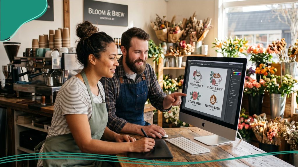
The 5-Part Prompt Formula
Every strong AI logo prompt includes five elements:
[Style] + [Industry/Niche] + [Color] + [Tone] + [Technical Note]
- Style: Minimal, bold, retro, geometric, hand-drawn, illustrative, modern, or classic.
- Industry/niche: Specific beats generic. Specialty coffee roaster works better than food and drink.
- Color: Name a color family or hex code, and always note colors to avoid.
- Tone: Two words that capture your brand personality, like approachable and clean or bold and premium.
- Technical note: Any constraints, like no script fonts, icon-only, no text, or combination mark, which is essentially a logo and logomark combined in one logo.
Good vs. Vague: Two Prompts Side by Side
Vague: Modern logo for my business, blue and white, professional-looking.
Specific: Minimal combination mark for a sustainable coffee roaster. Earthy greens and off-white, no black. Approachable and warm. Clean sans-serif font. No script fonts.
The second prompt hands the AI six concrete design constraints. It produces a result you can immediately tell apart from what a tech startup or a law firm would get.
What to Include in an AI Logo Prompt
Once you have the five-part formula down, here’s how to fill in each piece with real detail.
1. Your Industry or Niche
Specific language triggers more relevant design associations from the AI:
- Coffee shop pulls generic café associations.
- Third-wave specialty coffee roaster serving an urban professional audience pulls a cleaner, more minimal aesthetic.
One sentence naming your category and your position within it is usually enough.
2. Your Brand Tone in Two Words
Two-word combinations force you to prioritize. Try pairing one word from each column below:
| Energy | Modifier |
| Bold | Professional |
| Playful | Approachable |
| Clean | Premium |
| Warm | Trustworthy |
| Fresh | Modern |
| Classic | Authoritative |
You’ll end up with combinations like bold and approachable, clean and premium, or warm and trustworthy.
3. Colors & Colors to Avoid
Telling the AI what you don’t want matters as much as what you do want. Deep greens and earthy neutrals, no red gives clearer direction than earthy tones on its own.
If you have hex codes, use them. If not, color family names like navy, forest green, or warm terracotta work well.
4. Typography Direction
You don’t need to name a specific font. A category direction is enough:
- Serif: Traditional, trustworthy, authoritative.
- Sans-serif: Modern, clean, accessible.
- Script: Personal, expressive, creative.
- Display: Distinctive, bold, brand-forward.
5. Icon or Symbol Guidance
Give the AI a direction rather than a literal description:
- Geometric icon, no literal references to the industry.
- Leaf or plant element, minimal and abstract.
- Combination mark with a bold wordmark.
- Icon only, no text in the logo.
Overly literal descriptions, like a dog holding a coffee cup, tend to produce cluttered results. Directional language, like playful animal icon, abstract, not literal, gives you a cleaner output.
6. What to Leave Out
Fewer elements usually means a stronger logo. If you know you don’t want a mascot, multiple colors, or a tagline in the logo, say so upfront.

20 AI Logo Prompt Templates by Industry
Copy, adapt, and paste these into any AI logo tool.
| Industry | Prompt Template |
| Restaurant/Food | Minimal wordmark for a modern farm-to-table restaurant. Warm earth tones, deep green accent, no red. Honest and inviting. Clean serif font. No icons. |
| Coffee Shop | Combination mark for a specialty coffee roaster. Earthy browns and off-white, no black. Warm and approachable. Rounded sans-serif. Simple coffee-related icon, abstract, not literal. |
| Fitness/Gym | Bold combination mark for a functional fitness gym. Black, white, and one accent color (red or orange). Energetic and no-nonsense. Strong sans-serif. Geometric icon. |
| Tech Startup | Minimal combination mark for a B2B SaaS startup. Navy and light blue, white background. Clean and trustworthy. Geometric sans-serif. Abstract icon, no literal tech clichés. |
| Legal/Law | Classic wordmark for a boutique law firm. Deep navy and gold. Authoritative and professional. Serif font. No icons, wordmark only. |
| Real Estate | Modern combination mark for a boutique real estate agency. Warm charcoal and soft gold. Premium and approachable. Clean serif or transitional font. Minimal architectural or home icon. |
| Beauty/Spa | Elegant wordmark for a luxury day spa. Blush pink and warm white, no black. Calm and refined. Thin serif or script font, legible at small sizes. |
| Retail/Boutique | Minimal combination mark for a women’s clothing boutique. Warm beige and terracotta. Chic and approachable. Clean sans-serif. Abstract fashion-related icon or no icon. |
| Healthcare/Medical | Clean wordmark for a private medical practice. Light blue and white, deep navy accent. Trustworthy and calm. Rounded sans-serif. No red cross or overly clinical symbols. |
| Photography | Minimal lettermark for a portrait photographer. Black, white, and one warm accent. Modern and creative. Geometric sans-serif. Abstract camera or aperture element, not literal. |
| Construction/Trades | Bold combination mark for a residential construction company. Dark navy and bright orange. Dependable and strong. Heavy sans-serif. Geometric icon representing a building or structure. |
| Creative Agency | Distinctive combination mark for a branding and design agency. Black and white with one vivid accent color. Bold and creative. Modern grotesque sans-serif. Abstract geometric icon. |
| Financial Services | Trustworthy combination mark for a financial planning firm. Deep green and warm gold. Professional and calm. Classic serif font. Abstract mark: shield, balance, or growth motif. |
| Education | Approachable combination mark for a private tutoring company. Royal blue and light yellow. Encouraging and credible. Rounded sans-serif. Abstract book, pencil, or star, minimal. |
| Pet Services | Playful combination mark for a dog grooming and boarding service. Warm teal and soft white. Friendly and trustworthy. Rounded sans-serif. Friendly animal icon, illustrative not realistic. |
| Sustainability/Eco | Minimal combination mark for a sustainable products brand. Forest green and natural off-white. Fresh and principled. Clean sans-serif. Abstract leaf or cycle icon, not a literal recycling symbol. |
| Event Planning | Elegant combination mark for a luxury wedding and events company. Dusty rose and gold. Refined and warm. Script or thin serif font, legible. Minimal floral or ribbon icon. |
| Apparel Brand | Bold wordmark for a streetwear brand. Black and white only. Edgy and minimal. Custom or display font. No icons, full wordmark only. |
| Non-profit | Warm combination mark for a community food bank. Deep orange and warm brown. Approachable and human. Rounded sans-serif. Hands, harvest, or community icon, minimal, not literal. |
| Coaching/Consulting | Clean combination mark for an executive coaching practice. Midnight blue and warm gold. Confident and professional. Transitional serif or geometric sans-serif. Abstract growth or direction icon. |
How LogoMaker Handles Prompts for You
If you’re using LogoMaker, you don’t have to write a prompt manually. Our structured input process works like a prompt behind the scenes: you answer focused questions about your business name, industry, and style preferences, and we build your brief from those answers.
Every question we ask is designed to capture exactly what the AI needs to produce relevant results, so you spend less time figuring out how to phrase your brief and more time reviewing options. We generate designs dynamically from your inputs, not from a template library, so each brief produces results unique to your business.
Design for Free. Customize until it’s right. Pay a one-time fee of $40 when you’re ready to download your digital logo files. No subscription required.
Tips for Getting Better Results
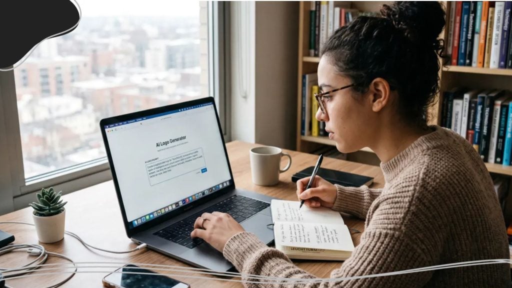
Generate Multiple Rounds
Don’t judge your AI logo output after one generation. Change one variable in your brief and generate again. Two or three rounds give you a much broader set of options to choose from.
Change One Variable at a Time
If you change everything at once, you can’t tell which input caused which change. Isolate one variable, like bold sans-serif versus thin sans-serif, so you understand how each piece of your brief affects the output.
Use the Editor After Generation
The best AI logo is rarely the raw output. Use the editor to adjust font sizing, tighten spacing, swap colors, or replace an icon. A small amount of customization often makes a big difference in the final result.
Don’t Over-Specify
Giving the AI too many constraints can produce cluttered or contradictory results. Focus on the five-part formula, and resist the urge to add more than you need.
Frequently Asked Questions
What are good AI logo prompts and logo design prompts?
A good AI logo prompt is specific, focused, and structured. It includes your style direction, your industry or niche, your color preferences (including colors to avoid), your brand tone in two words, and any typographic or icon constraints. The five-part formula in this guide covers all five elements.
How do I describe a logo to an AI?
Focus on what your brand feels like rather than what you want the logo to look like. Clean and professional, like a premium accounting firm gives the AI better direction than I want a navy blue circle with my name in it. Describe tone, industry, and audience first, then add color and typography second.
Can I use these prompts in Midjourney?
Yes, with some adjustments. Midjourney needs more technical specificity for logo use, so add vector style, flat design, white background, and no gradients to improve the output’s suitability as a logo. Midjourney doesn’t export vector files, so you’ll need to convert the output separately. For a purpose-built comparison, see our guide to the best AI logo generators for 2026.
Can I use these prompts in ChatGPT?
Yes, ChatGPT can generate images through DALL-E when you prompt it to do so. The same five-part prompt structure applies. As with Midjourney, the output will be a raster image rather than a vector file, so you’ll need extra steps before using it professionally.
What makes a bad AI logo prompt?
Vague prompts (modern and professional), overly literal prompts (a golden retriever holding a coffee cup in front of a mountain), and prompts that pile on too many constraints at once all produce weaker results. Specificity in tone, color, and typography beats specificity about literal visual content every time.
Does LogoMaker use prompts?
LogoMaker uses structured input fields that capture the same information as a written prompt: your business name, industry, style preferences, and color direction. We build the brief from your answers and generate logos dynamically, so you never have to write a prompt yourself.