Eco-friendly businesses and nonprofits have big aspirations, and it can be challenging to get their mission across in a logo. A great design has to personify the goals and commitment of the business while making it clear nature is the focus.
Like most industries, eco-friendly businesses have a stable of well-known colors and symbols that get overused in environmental logo designs. Creative designers are skilled at finding new ways to reinvent familiar imagery and come up with exciting logos.
For inspiration, take a look at these 11 outstanding nature logos that never fail to motivate.
The best nature logo ideas to help build your business
The National Audubon Society
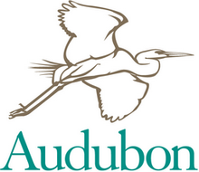
The name “Audubon” is synonymous with bird lovers, so nothing could be more fitting than a feathered mascot. A graceful great egret in flight serves as an instantly recognizable symbol and a reminder that wildlife is one of nature’s invaluable treasures.
Once endangered, the great egret was one of the first species to be championed by bird conservationists in the late 19th and early 20th centuries. The hand-drawn logo design has an organic feel that matches the pure and candid spirit of nature.
One notable feature is the shortened brand name. The Audubon name holds so much clout that it can’t be confused with any other organization, making the full title unnecessary.
Forest Stewardship Council
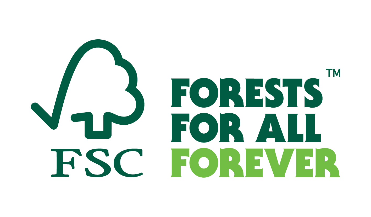
It’s no surprise that earth-friendly brands take pride in displaying the FSC logo on their products. Merging two unrelated symbols can turn into an awkward mishmash, but not in this case. The checkmark seamlessly transforms into a tree with a single fluid line.
As the main color, forest green works well on multiple levels. The earthiness embodies the concept of healthy woodlands, but the color is also deep and authoritative to represent a watchdog organization.
Even without the slogan or wordmark, the FSC logo stands out on product packaging.
World Wildlife Fund
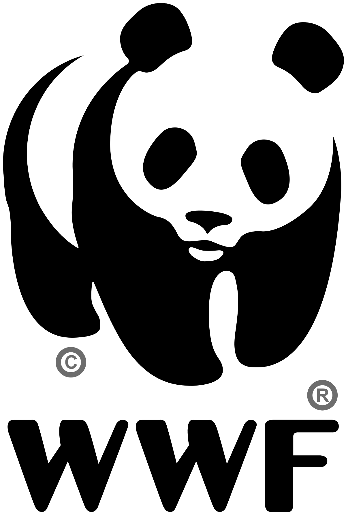
Few nature logos are more endearing or recognizable than Chi-Chi the panda. The burly, black-and-white bear cuts a striking silhouette that sends a compelling message without words.
Globally, pandas have a reputation for being majestic, adorable creatures, making them a safe mascot to rally behind. The WWF founders had practical concerns in mind when they chose this world-renowned design.
Black-and-white logos are the cheapest to print, and you don’t have to worry about major issues with color quality and consistency.
Animal Planet
![]()
Wordmarks can be fun and energetic and still represent a critical topic. Look to Animal Planet — a network all about experiencing wildlife in action — for an example of creative design.
The wordmark goes from simple to dynamic with a few clever variations in color, size, and placement. Notice how the sideways “M” acts as a focal point by defying your expectations.
The monochromatic color scheme uses three values of green to break up the layout and draw your eyes to different sections of the design.
To top it off, the typeface is full of surprises. The height, width, and line weights of the letters vary throughout the design, but there’s always a sense of balance.
The Natural Resources Defense Council
![]()
Not all environment-themed designs have green logos. The NRDC is making a promise to take action and forge a brighter future for wildlife with a blue shield logo. Up until 2015, the logo depicted a bear set against forestland. With this redesign, the organization is expressing a much broader mission to defend all aspects of nature.
Not only is the bear a symbol of a strong protector, but the eight-pointed star references a compass and Polaris, the North Star. The design captures the role of the NRDC as one member of a global community with shared goals of saving the environment.
The Nature Conservancy
![]()
Building upon familiar imagery is one of the best ways to tell an interesting story in your logo design. The Nature Conservancy used this technique to good effect with a leaf-patterned globe symbol. Everyone has seen pictures of the earth so often that the image is deeply fixed in the average person’s mind.
Take away the blue oceans, swirling white clouds, and jagged landmasses, and the basic forms and shapes are still recognizable. Instead of water and terrain, white leaves wrap around a green globe in a protective embrace.
The word “nature” also appears larger than the other words, stressing the brand’s commitment to conservation. Together, the symbol and wordmark convey the organization’s goal of safeguarding the planet and its many creatures.
Oceana
![]()
Simplicity is the standout feature in the aquatic-themed logo of Oceana. The dolphin silhouette embedded in the letter “O” is the first thing you notice about the design. Next, comes the monochromatic color scheme, which showcases the diverse characteristics of blue.
The cool, saturated blue of the dolphin is bright and hopeful, while the wordmark appears in a dark, commanding shade that conveys strength and security. It’s no accident that the organic shapes of a dolphin’s body are mirrored throughout the wordmark.
The subtle tapering at the end of every stroke is reminiscent of fins and curves, resulting in a design that is soothing to the eyes and fluid like water.
National Wildlife Federation
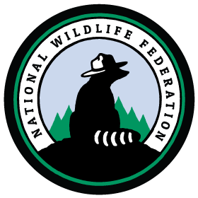
Badge-style logos are a common choice for nature organizations because they communicate the idea of community and partnership. One interesting thing about this design is the choice to have its mascot facing away from viewers.
The 60-year-old character Ranger Rick the raccoon has been front and center since the organization’s logo was redesigned in 2016. With a proud and watchful stance, the woodland creature serves as a “guardian of America’s wildlife and cherished wildlands.”
The black silhouette portrays the power and strength conservationists hold as a community. Yet, a colorful landscape stands out in the background as a reminder that nature’s beauty is the star of this design.
Wildlife Conservation Society
![]()
You’ve struck gold if you can make a stark logo speak volumes. The WCS found a winning combination of minimalist design and expressive color in this vibrant monogram.
The organization is devoted to protecting the world’s wild places, which comes through in this earth-inspired environmental logo. Blue and green both have powerful connections in nature.
Right away, the center of the “W” reminds you of a grassy mountain. From left to right, the logo captures the range of earthly habitats — from the skies to the seas.
The design also makes good use of an analogous color scheme. Values of blue and green naturally occur side by side on the color wheel, creating a smooth transition that’s easy on the eyes.
Goodale State Park
![]()
Can you guess that canoe and kayaking trips are among the most popular activities at Goodale State Park in South Carolina? The simple logo design packs in a few noteworthy details that instantly set Goodale apart from other places in the park system.
A canoe provides the overall shape for the design, framing a scenic picture of trees and a lake. The tree in the center also forms the shape of a paddle, inviting visitors to enjoy adventures on the water.
The dark green outline and blue waves create a tranquil, down-to-earth color scheme that reflects how peaceful it is to get back to nature.
Heal the Bay
![]()
The moral behind the Heal the Bay bonefish logo isn’t subtle by any means. Healthy marine life will disappear if coastal communities don’t work hard to keep oceans and waterways safe and clean.
A bold graphic is well suited for a nonprofit on a mission to build awareness and drive action. The white fish outline stands out against the blue watery backdrop.
Both elements are bright and friendly, so you immediately focus on the contrasting tone of the black skeleton. Overall, the design offers visual impact that does justice to the organization’s brand story.
Making an instant connection with an audience is crucial for any logo, but especially for environmental businesses. Aim to include key elements that tell a story, such as earthy colors, scenic pictures, and heart-warming symbolic imagery.
Whether they represent a sustainable food company or an activist group, environmental logo designs are most effective when they have bold visuals with a clear call to action.
Ready to design a logo for your business? We have two great options! Our DIY logo design option or our Work with a Designer option. See which is right for you.