Education logos have a tendency to fall into a pattern using common symbols, colors, and even fronts. When you think of a school, what comes to mind? Apples. Children. Chalkboard. Desks, pencils, notebooks, etc.
Elementry schools are not the only education institutions to blame. Colleges and Universities also fall prey to this logo design problem. Caps. Gowns. Mascots. Generic Buildings.
The real question is, how do you come up with a unique logo that is memorable? Find inspiration, then put your own spin on it.
To continue with our 2-part ‘Education Logo’ series, here are 10 additional education logos that caught our logo design eye:
The Best Education Logo Designs
Missouri Western State University

The best college logos bring unique elements of each institution to the design. Missouri Western chose a majestic mythical guardian to symbolize education as a precious treasure that should be protected.
Did you notice how the griffin’s pose and outstretched wings mirror the shape of Missouri?
Kids STEM Studio
![]()
When your audience is children, you have more room to be playful and imaginative with education logo ideas. The Kids STEM Studio uses a casual typeface that resembles a child’s handwriting and colorful icons to get young users excited about science and math.
Elementary shapes, colors, and lines make this kid-friendly design authentic and relatable to people of any age.
Code Academy

Add meaning to a basic wordmark by integrating the core values of your brand. Code Academy accomplished this with two simple additions. Framing the word “code” is a reminder that the site’s primary goal is to help people of any background learn to code.
The cursor mark under the letter “C” visually conveys the idea of typing code and the freedom to create elaborate programs from mere key commands.
Salesian Elementary and Junior High, CA
![]()
The Salesian Catholic school logo radiates a sense of warmth, family, and nature the moment you see it. You instantly recognize the familiar “schoolhouse on the hill” concept, and the stunning backdrop of Corralitos, California, is the inspiration for a cheerfully scenic design. This tiny circle of real estate does an excellent job of embodying a small rural community that values agricultural studies.
Indiana Music Education Association
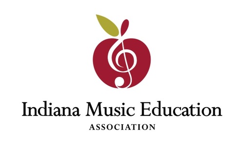
Iconic symbols have their own power and meaning, so combining more than one can send a distinct message. This Indiana organization cut straight to the point by framing a G-clef music note inside an apple.
Creative Action Institute
Cultural myths provide inventive ways to summarize abstract ideas in a clean, uncomplicated logo. As a symbol of freedom in Guatemala, the sacred quetzal bird was an obvious choice to illustrate the power of creativity to reshape the world. CAI views education as the catalyst for cultural, health, and environmental innovation. In this unique design, the multicolored feathers of the quetzal transform the typography, and the “C” and “A” interlock to form one letter.
Oceanwide Science Institute
Mine your industry or professional environment for interesting details to highlight. OSI constructed a simple multicolored dolphin tail to represent marine studies. While the staggered bars have a few minor spacing issues, this vibrant logo is a good example of a memorable design the average business owner could create.
MIT Media Lab
![]()
Try developing your own iconography to distinguish your brand. In a recent redesign, the research lab launched this glyphic logo as part of a larger collection of symbols. The stylized letters look both abstract and primitive, bringing history and technology together in a surprising manner.
Rhodes Trust
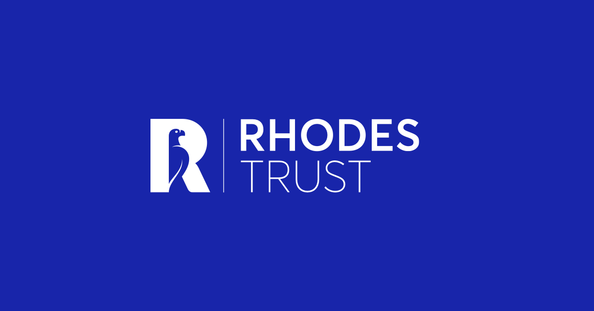
For decades, the Rhodes Trust at Oxford has empowered scholars around the world. An institution of such high esteem needs a logo that personifies heritage and exemplary achievement. This sophisticated design succeeds at both and features a clean layout that can stay legible at small sizes. A Zimbabwe bird from the founder’s coat of arms is the focal point of a refined monogram, and the rich royal blue color evokes knowledge, leadership, and authority.
Pearson
What better way to illustrate the idea of spreading knowledge, curiosity, and innovation than with an interrobang? The hybrid symbol — a question mark merged with an exclamation point — is inside of a thumbprint to embody the educational publisher’s investigative approach to learning. To round off the design, the interrobang doubles as a letter “P” for an effortless, app-ready monogram.
By nature, education is diverse. Learning can take place anywhere and link people together through their shared appreciation for growth and knowledge.
Take advantage of these ideas to come up with dynamic designs that bring out the profound human aspects of learning. Don’t be afraid to show your perspective of the educational experience to connect with other thinkers who have similar values.
Now that you have read both education logo design articles, are you ready to design a logo for your business?