March is National Women’s Month and here at LogoMaker we’re all about supporting both women, small businesses, and the combination of both. National Women’s Month was first recognized back in the early 1980s and has since grown in popularity and respect. During the month of March, female rights advocates, business leaders, and political figures make a point to educate the public about the role women have played throughout our society. One of the biggest roles women have played in today’s society is sharing a large piece of the entrepreneurial pie. Marketing and branding initiatives – including logo design – have helped these women grow and nurture their businesses into what they are today.
But before we introduce you to our list of female small business owners and their logo designs, here are a few statistics about women in the workplace and female business owners and entrepreneurs.
10 Surprising Facts About Female Business Owners
- Female-owned businesses employ over 8.4 million workers.
- 99.9 percent of female-owned businesses are classified as small businesses (employing less than 500 people).
- 36 percent of all businesses (12.3 million) in the US are women-owned, accounting for 12 percent ($1.8 trillion) of all sales and 15 percent (9 million) of overall employment.
- 5.4 million businesses are owned by women of color.
- 1 in 5 businesses with a profit of $1 million or more is female-owned.
- 40 percent (4 out of 10) of businesses have a female owner or CEO.
- Over the past decade, the number of women-owned businesses increased by 58 percent.
- Half of all female-owned businesses fall under the following industries: Health care and social assistance, professional/technical/scientific services, and other services.
- The number one reason female business owners wanted to start their company was that they wanted to pursue their passion.
- 13 percent of women-owned companies have been in business for more than two decades.
The Best Female Small Business Logo Ideas
Our friends over at Small Business Revolution (SBR) have been working with business owners for years. Their goal is to educate these business owners about how to effectively market their brand and scale their business in order to bring revenue through the door. Today we’re going to look at a few of SBR’s most notable female-owned small businesses and their logo design transformations.
Ellen’s Bridal & Dress Boutique
From your average bridal shop to an elevated boutique, Deluxe’s marketing gurus were able to transform Lisa Ellen Downs’ small business into something truly remarkable. Ellen’s end goal was to make her bridal boutique, Ellen’s Bridal & Dress Boutique, a destination for out-of-towners looking for unique dresses for their big day. Deluxe ended up revamping Ellen’s website to include more informative content and better calls to action that lead to online conversions. An email and social media strategy were also established to help Ellen stay in touch with her past customers and gain a loyal following. The biggest change for her small business, however, was her logo design.
A New Boutique Logo Design
The old logo design was outdated and too busy and whimsical for Ellen’s taste. The damask background, overzealous curls, accent dots, and the difficult-to-read cursive font for the business name was a bit too much for the eyes. Ellen did like the black and white logo design color scheme, so the logo designers made sure to stick with this theme.
![]()
The new design is a much more legible and updated look for Ellen’s boutique. The designers quickly ditched the boxy emblem logo design in place of a wordmark logo. The team made sure to select a bolded and large-scale cursive-style font for Ellen’s name with a tasteful and whimsical “E” for a dramatic and luxurious effect. The business slogan, “bridal & dress boutique” is carefully placed under Ellen’s name to help customers understand what service she specializes in. The Sans Serif font does not detract from the rest of the wordmark logo, something the logo designers wanted to make sure wouldn’t be the case. Overall, the new logo design is much more spacious, sophisticated, and easy to transpose onto different marketing mediums.
![]()
Shampooches Dog Grooming
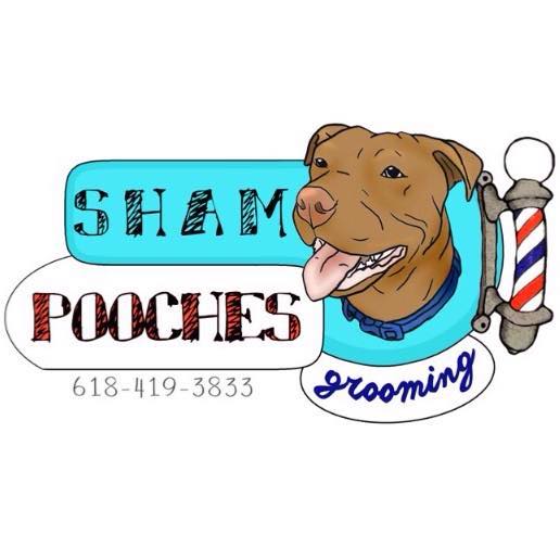
For Alicia Jeffreys, her dog grooming business is her biggest accomplishment. Jeffreys started her own dog grooming business back in 2015 but didn’t have the funds to hire a professional marketing team, let alone a logo designer. She has seen her business grow into a more mature establishment and thought it was time to make sure her marketing materials – including her logo design – were up to speed with her business goals. Deluxe’s marketing team stepped in and created a brand new website for Shampooches Dog Grooming, beefed up her online directory presence, created a social media strategy, and even designed branded promotional items to help spread the word. The first thing that needed to happen, however, was a logo redesign.
A New Dog Grooming Logo
Jeffreys’ original Shampooches logo design was fun and creative, a design aspect that Deluxe’s logo creators wanted to ensure were transpired to the new design. However, there were a few issues with the old design. For starters, the logo featured too many colors. Logos with more than three colors make it expensive and difficult to showcase on promotional products and websites. Second, the logo wasn’t well balanced. The animated dog and barber pole greatly outweighed the space that the hand-drawn font did to the left of the images. Clashing colors and shapes made the logo appear elementary, and Jeffreys was hoping for a design that sparked customer confidence in her business.
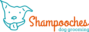
The new logo design for Shampooches Dog Grooming is almost unrecognizable from the original, yet the fun and playful demeanor is still there. The logo designers wanted to keep the animated dog, but they simplified the image into a single-colored line drawing and added the icon to the left of the text. The business name, Shampooches, is a bright and uplifting orange color that immediately draws the attention to any passerby. The unique cursive-style font creates movement across the horizontal logo. Her business slogan, “dog grooming”, is tucked carefully underneath in the same turquoise blue as the dog icon. The two-colored logo design is much more aesthetically pleasing and sophisticated, yet still has that playful air about it that most dog grooming businesses have. Not to mention the negative space created between each element made it easier for the Deluxe team to use the logo on all of Jeffreys’ new promotional products.
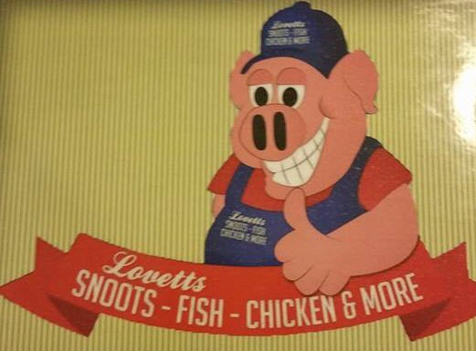
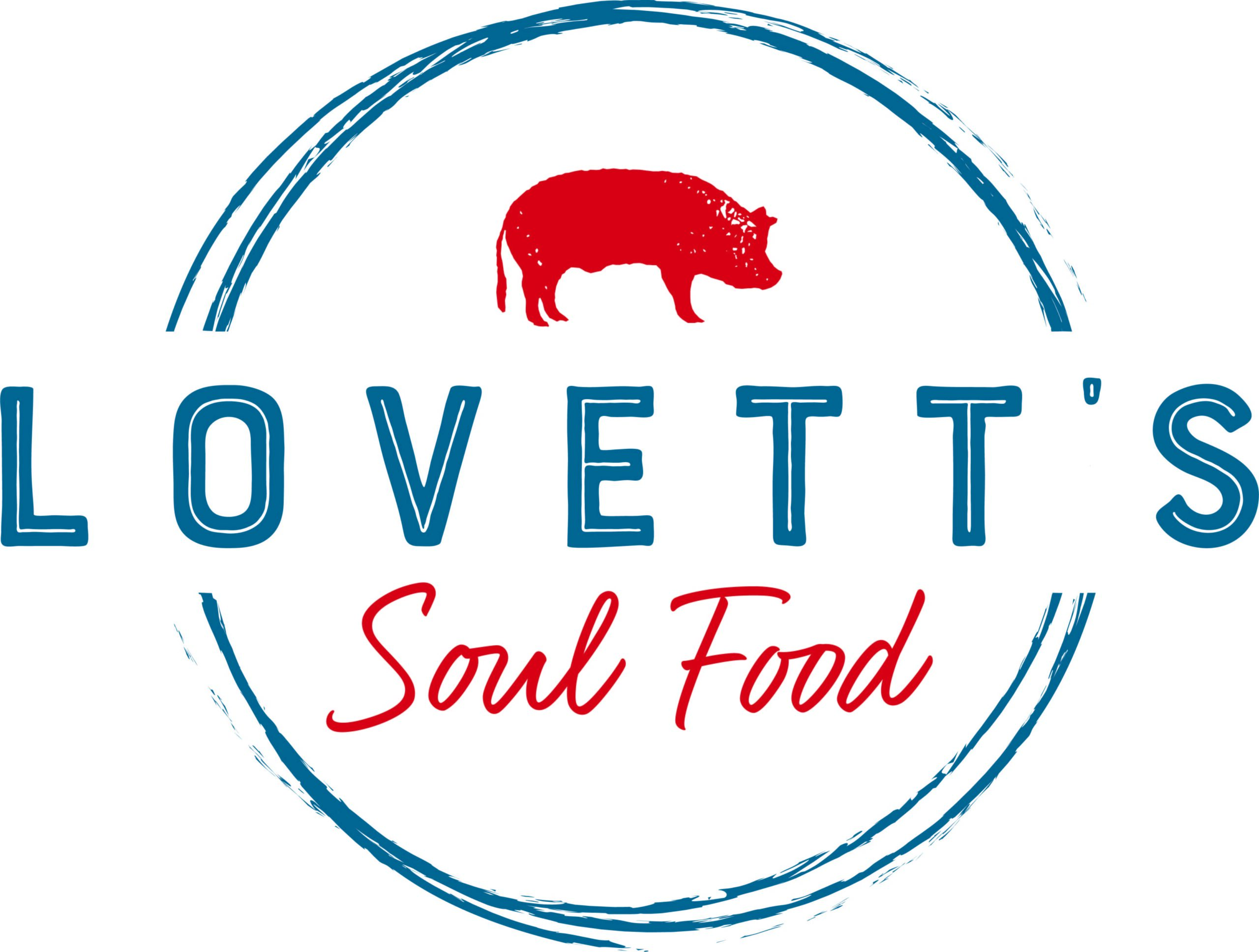
Lovett’s Soul Food
Merry Lovett and her son Brad Chavours have a passion for good old fashioned soul food – and everyone knows they make the best in town at Lovett’s Soul Food. Merry grew up making comfort soul food and selling it out of her father’s garage. Once the demand was high enough, Lovett opened her own restaurant in order to introduce the community to what she had cooking. However, the seasonal inconsistencies and the fluctuations in foot traffic has been a real hindrance for this female small business owner. Deluxe stepped in to help put Lovett’s Soul Food on the map for good and drive more customers to their doorstep. The new branding initiative included a new website (where they didn’t have one before), a social media plan, and custom apparel and packaging. However, none of these marketing improvements would have been possible with their old logo, so that was the first thing to go.
A New Restaurant Logo Design
While the original logo design for Lovett’s Soul Food was like taking a walk back into the 1960s, Deluxe’s team of logo designers knew that it was time to retire the animated pig icon. The old logo was too busy to put on printed materials such as mugs, t-shirts, and bags, and the colors needed updating to attract a younger crowd. The Deluxe team also worked with Lovett to devise a new business name that was similar enough to their old one (Lovett’s Snoots, Fish, Chicken & More) that there wouldn’t be any brand confusion in the future. The business name was lengthy and difficult to remember, so the goal was to shorten it and ensure people understood exactly what type of food they were serving up.
The new logo design is an updated take on a badge logo, making the overall design still have that old-timey look and feel. The business name was changed to Lovett’s Soul Food and features a monochrome red pig icon above the centered business name. The entire logo is surrounded by semicircles to create a badge logo effect. The Deluxe logo designers were careful to choose fonts that were often associated with the type of cuisine Lovett’s was serving. “Lovett’s” is capitalized in a dusty blue font with the word’s “Soul Food” sketched in a hand-drawn cursive font the same shade of red as the pig icon. Overall, the logo design is well-balanced, simple enough to print on promotional products, updated for the current times, and does a better job at describing what kind of food customers can expect at Lovett’s.
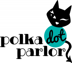
Polka Dot Parlor
One woman’s mission to empower women to explore their sense of fashion ended up turning into her own journey to improve her brand’s image. For Paulette Kirk Kasmer, owner of Polka Dot Parlor, she knew her brand needed a makeover if she was to stay in business and attract the customers she wanted. Paulette has always been a firm believer in encouraging women to dress however they want; she is constantly helping them take a more positive approach to body image through her clothes and the customer service she provides. In order to take Polka Dot Parlor to the next level and help Paulette attract both online and in-store customers, Deluxe stepped in and created new print marketing materials, revamped her old website, and launched an email marketing campaign to drive sales. All of this marketing improvement was centered around a new logo design for the clothing boutique.
A New Clothing Boutique Logo
Paulette’s original logo design for the Polka Dot Parlor is a perfect representation of her upbeat attitude about women’s fashion and need for expression. The badge logo had a few issues, however. The first being that there were too many colors in the design. With a total of five different colors, the logo design looked busy and childish, which was something Paulette wanted to steer clear from. Another issue was the outdated font which could have easily caused the business to be mistaken for an ice cream parlor or gaming arcade. The Deluxe logo design team knew that they had to re-work the design to make sure customers knew the Polka Dot Parlor was a clothing boutique.
![]()
The new logo design ensured that Paulette’s bubbly personality and whimsical boutique still shone through in her logo. The logo designers opted for a creative, bold, and funky font type for the business name. The designers wanted to focus on the font style instead of the colors and therefore opted for a black font. Paulette’s love of cats is also shown in the new logo. The designers updated the animated cat and positioned it to the top right of the logo. The body of the cat, which also houses the word “Dot” is in itself a turquoise-colored polka dot, which helps tie together the business name with the icon. Overall, the new look still has character, yet isn’t as busy as the original design. Both the icon and the font are more in line with what customers associate with a clothing boutique business.
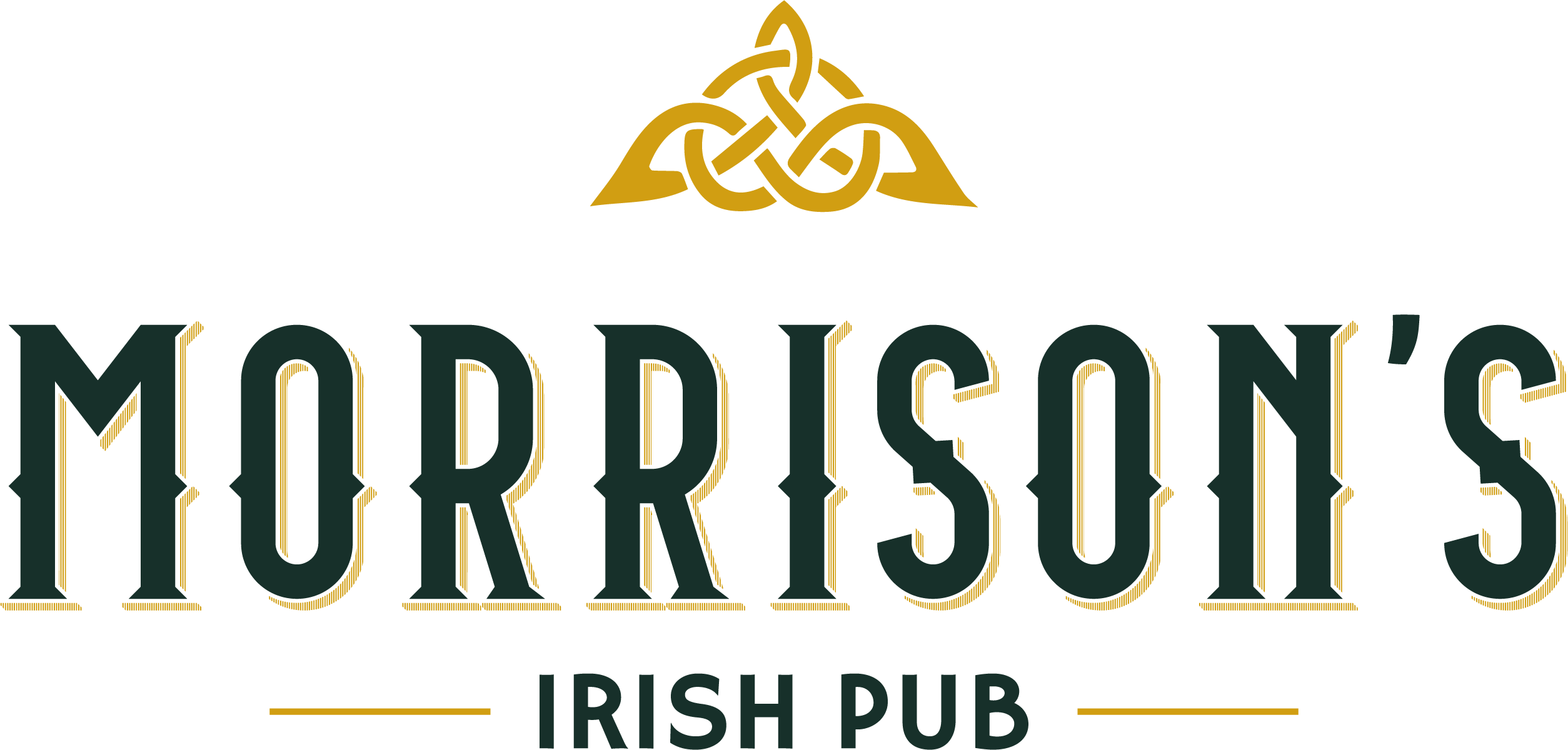
Morrison’s Irish Pub
There’s nothing better for an Irish pub than being located in a cozy historic building. For Lisa and Mary Morrison, opening Morrison’s Irish Pub in a 100-year-old building in the middle of downtown Alton was a dream come true – until they realized running the business was a lot harder than they imagined. The pub features classic Irish dishes from local ingredients in an authentic Irish pub setting. The pub has garnered various nods from the local community, but the Morrison’s were still struggling to bring in a consistent crowd in order to offset heavy business expenses. The Deluxe branding team stepped in and helped Morrison’s Irish Pub revamp their branding efforts. They started with gutting the existing website in favor of a sleek new design, boosting the pub’s social media presence, and rolling out branded packaging and apparel for customers. All of this was done in the wake of redesigning their existing logo.
A new restaurant & pub logo
The original Morrison’s Irish Pub logo was a unique and Irish-themed logo design, but there were a few things missing. While the logo featured the Trinity icon placed above a heart held by two hands, that aspect of the design was lost in the mix. The font used for the business name was Irish-inspired, but the problem was that it was a commonly used font for similar restaurants and pubs. The logo was also black and white, which didn’t help customers when it came to trying to establish themselves as an Irish bar.
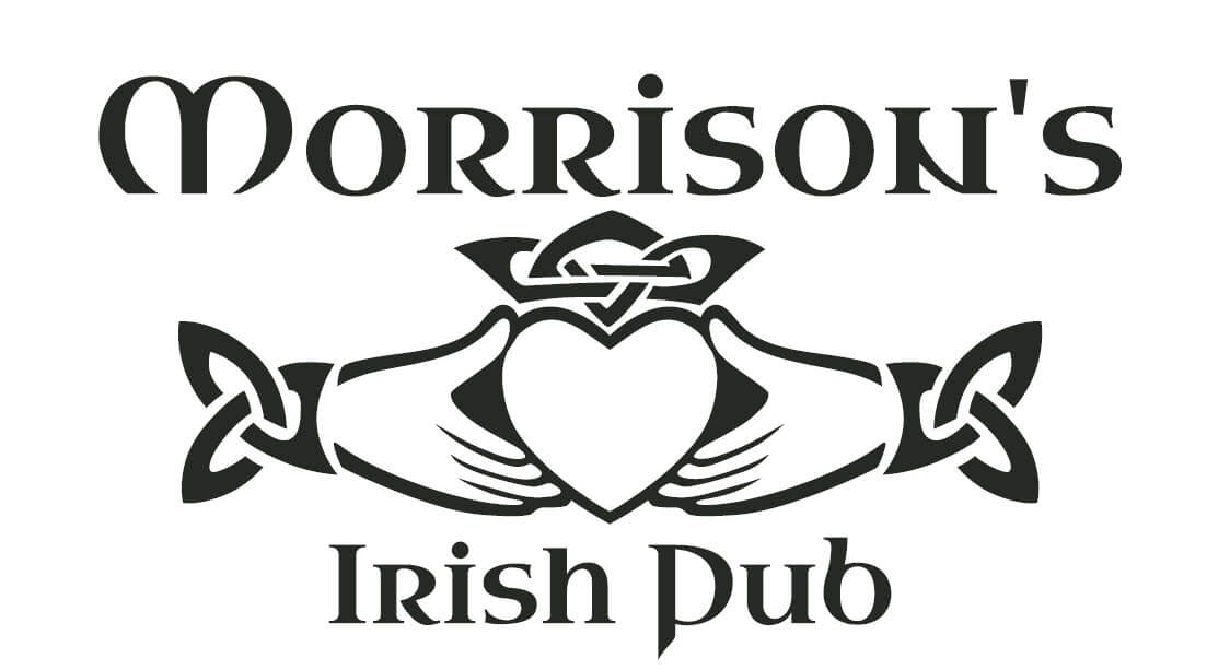
The new logo design for Morrison’s Irish Pub features dark green and gold-colored accents and promotes the famous Trinity icon symbol above the business name. The Morrison’s loved the Trinity symbol mainly because they were three female owners, which made the icon have a special double meaning for the family. When it came to choosing a font style, Deluxe wanted to choose an Irish-inspired style, but one that was elevated and modern. They ended up with a bolded, all capital lettered Serif font with a Sans Serif font for the phrase “Irish Pub” placed below the family name. The goal was to help customers understand that Morrison’s Irish Pub is an authentic, grounded, and modern pub offering up plenty of charm and – of course – an extensive whiskey collection.
Celebrating Female Business Owners Everywhere
Whether you are the female owner of a boutique clothing store, a pub or a any other small business, know that there are resources out there to help you build your brand from the ground up. At LogoMaker, we’re here to provide you with the right tools you can use to elevate your brand. From designing small business logos to building a website, to creating business cards and other promotional products, our goal is to make sure you can market your business quickly, effectively, and affordable.