The history of the Coca-Cola logo is almost burned into our imaginations. We often see it framed behind private detectives in the movies. Amidst the constant rain, looming over our detective hero, we see the Coca-Cola logo in a huge red-and-white neon sign. The red glass tubes may be filled with neon gas, but the Coca-Cola logo is almost worth its weight in gold.
Few logos feel as familiar as Coca‑Cola’s flowing red script. It’s on shelves, screens, and fridges almost everywhere you look. Over the past 130 years, the Coca-Cola logo evolution has accelerated, but it’s never lost its core personality.
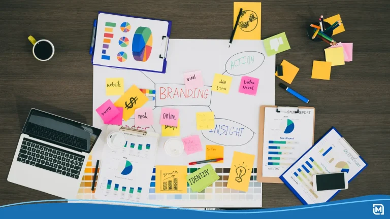
This article walks you through Coca-Cola logo history, era by era. Then we’ll pull out branding lessons you can use with an AI logo maker for your own merch, website, and growing business.
CONTENTS TABLE
- 1886 to 1893: The Birth of a Wordmark
- 1890: The Art Nouveau Experiment That Didn’t Stick
- 1890s to 1940: Refinement, Red, and Developing Reach
- 1941 to 1960s: Standardization & Brand Containers
- 1969: The Dynamic Ribbon and the Modern Identity
- Red, Script, Ribbon: A Quick Visual Timeline
- What the Coca‑Cola Logo Actually Means in Branding Terms
- Branding Lessons From the Coca‑Cola Logo
- How to Apply These Principles With an AI Logo Maker
- Extending Your Logo to Merch and Your Website
- Follow These Quick Steps to Bring Your Brand to Life
Blog highlights
- Investigating Coca-Cola logo history: We talk history and introduce you to the Spencerian script, an ingredient as important to Coca-Cola as sugar.
- Background checking the Coca-Cola logo evolution: Discover how the Coca-Cola logo developed but maintained consistency using standardisation.
- Questioning the Coca-Cola logo meaning: Learn how the curve of a simple ribbon gave the Coca-Cola logo motion, fluidity, and refreshment.
“The story of The Coca-Cola Company is fundamentally a story of marketing.” [1]
Robert Crawford, Linda Brennan & Susie Khamis, Decoding Coca-Cola, 2020.
1886 to 1893: The Birth of a Wordmark
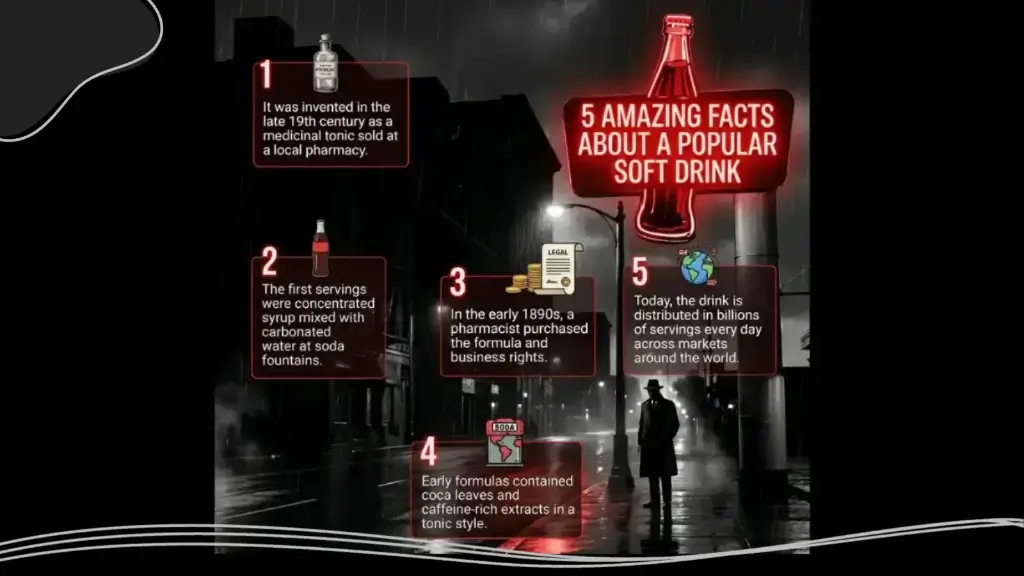
The story starts with something surprisingly plain. In 1886, the Coca‑Cola logo history began with a simple serif wordmark that felt more pharmaceutical than playful. It looked like a label, not a lifestyle signal.
A year later, bookkeeper Frank Mason Robinson made a decisive move. He wrote the name in Spencerian script, a flowing style common in business correspondence at the time. Those rounded letters gave the logo movement and warmth, almost like handwriting across a ledger.
By 1893, the company registered the logo as a trademark: A huge moment in the history of the Coca‑Cola logo. The phrase TRADE MARK was even tucked inside the long tail of the first C, formalising its new role as an asset, not just decoration.
1890: The Art Nouveau Experiment That Didn’t Stick
Coca‑Cola logo evolution did have one early wobble. In 1890, the brand used a decorative logo on a calendar, full of curving flourishes and ornamental swirls. It leaned heavily into the Art Nouveau fashion of the time.
It looked pretty, but it drew attention away from the word itself. The script became harder to read at a glance, especially in small applications. Coca‑Cola quickly retreated, returning to the cleaner Spencerian version by the following year. A moment that shaped the history of the Coca‑Cola logo.
The lesson here is simple but powerful. Experimentation is useful, but your recognisable core should stay visible, even when you dress it up for campaigns and seasonal artwork.
“The red and white of a Coke can or bottle label is so distinctive that you don’t even have to read the wording to pick it out on a shelf.” [2]
BBC News, Bitesize Topical, 2025.
1890s to 1940: Refinement, Red, and Developing Reach
From the 1890s into the early 20th century, Coca‑Cola focused on refinement, rather than reinvention, marking another step in the Coca‑Cola logo evolution. Designers thickened strokes, adjusted spacing, and polished curves so the script reproduced better on signs, crates, and early packaging.
This period also cemented the brand’s red‑and‑white color system. The vivid red background with white script became a visual shortcut for refreshment and energy. The look is now inseparable from the Coca‑Cola logo meaning itself. Red caught attention; white provided contrast and clarity.
As bottling and distribution expanded, that consistent visual system was applied to painted signs, coolers, and delivery trucks. You can recognise the brand from across the street, long before you may read the name in detail.
1941 to 1960s: Standardisation & Brand Containers
By 1941, another chapter in the Coca‑Cola logo history began as the logo underwent structural refinement. Designers removed some decorative elements, balanced the diagonal slant, and subtly tweaked letterforms for better legibility in mass printing. The script you know today comes mostly from this era.
Another quiet shift happened around the same time. The ® and trademark information moved outside the main wordmark, separating legal detail from the visual centerpiece. The logo itself became cleaner and easier to drop into different layouts. This result was a turning point in the Coca‑Cola logo evolution.
Then came the idea of brand containers. Coca‑Cola started using red discs and, later, the famous fishtail (arciform) panel was introduced around 1958. These shapes framed the logo on vending machines, signs, and displays, turning it into part of a broader design system.
Those containers acted like a stage. No matter where the logo appeared, the backing shape kept it consistent, even as formats and surfaces changed.
1969: The Dynamic Ribbon and the Modern Identity
In 1969, Coca‑Cola introduced one of the most enduring parts of its visual language: the dynamic ribbon device. The ribbon was a milestone in the history of the Coca‑Cola logo. The Arden Square design placed the script inside a red rectangle, with a white wave flowing beneath it.
“There will be a new logotype on Coke cans, boxes, signs, trucks, cups, glasses and uniforms—everything but the bottles. But the logo will still spell Coca-Cola in the familiar flowing, baroque script. The new twisting white ribbon under the words is supposed to ‘echo’ the wasp-waisted shape of the bottle.” [3]
Time magazine, Marketing: Coke’s New Image, 1969.
That simple curve suggested motion, fluidity, and refreshment, without touching the core lettering. It also gave designers a powerful device for unifying packaging, signage, and advertising. The ribbon can extend across cans, posters, and billboards, linking everything together visually.
Over time, this detail reflected the Coca‑Cola logo evolution. In the early 2000s, Coca‑Cola pushed a more three‑dimensional, shaded ribbon that caught light and felt glossier on screen and in print. Later, the brand pared things back again, using flatter, cleaner ribbon shapes that better suit mobile screens and minimalist design trends.
Red, Script, Ribbon: A Quick Visual Timeline
To keep the Coca-Cola logo evolution straight in your mind, it helps to treat it as a timeline you may pin on a studio wall.
- 1886: Plain serif wordmark.
- 1887 to 1891: Frank Mason Robinson introduced the Spencerian script.
- 1890: Ornate Art Nouveau experiment on calendar materials.
- 1893: Script registered as a trademark with TRADE MARK inside the C.
- 1891 to 1940s: Red‑and‑white palette gains strength and recognition.
- 1941: Standardized script refinements and clearer letter shapes.
- 1958: Fishtail/Arciform background used as a brand container.
- 1969: Dynamic ribbon appears in the Arden Square design.
- 2003 onwards: 3D ribbon experiments, then a cleaner, flatter modern version.
“Coca-Cola’s enduring look can go simpler without sacrificing design identity; that ribbon is enough to let us know what’s in store.” [4]
WIRED magazine, Coca-Cola’s Beautiful New Logo Is No Logo at All, 2015.
What the Coca‑Cola Logo Actually Means in Branding Terms
The history of the Coca-Cola logo isn’t only about aesthetics. It reflects how a brand sees itself and wants to be seen. The Spencerian script signals friendliness and human touch, like a handwritten note rather than a corporate stamp.
The red color leans into excitement, warmth, and sociability. It’s no coincidence you see red around gatherings, celebrations, and shared meals. Over time, the logo has come to represent moments of pause and refreshment as much as the drink itself.
Even the dynamic ribbon has a quiet meaning. It suggests movement, flow, and the feel of a poured drink without spelling that out. This combination of script, color, and device gives the Coca-Cola logo meaning that many people feel before they consciously process it.
Branding Lessons From the Coca‑Cola Logo
Here’s where this becomes practical for your own business. You may not be trying to reach billions of people, but the principles are the same.
Evolve but Don’t Constantly Reinvent
Coca‑Cola kept its core script and refined details over time, showing how thoughtful change drives the Coca‑Cola logo evolution. You can refresh thickness, spacing, and supporting elements while keeping your core mark recognizable.
“The firms that [Coca-Cola] was working with at the time, like [Lippincott & Margulies], pulled from the Swiss school of thinking, with minimalism and the idea of reduction as the best path forward.” [5]
Jesse Reed, Partner & Designer, Order. 2025.
Make Typography Your Signature
A custom or script‑style wordmark can become your most distinctive asset. Look at the Coca‑Cola logo meaning and how easily people recognise the Coca‑Cola name without any extra symbol.
Commit to a Focused Color System
Coca‑Cola’s red‑and‑white palette works beautifully across bottles, signs, and digital placements, cementing its place in the Coca‑Cola logo history. Pick a palette that can handle merch, websites, and packaging without getting muddled.
Use Supporting Devices, Not Replacements
The ribbon, discs, and fishtail don’t replace the logo: they amplify it, adding depth to the history of the Coca‑Cola logo. They support it and extend the visual story. Your equivalent may be a line motif, frame, or shape that repeats across materials.
Protect and Document Your Logo
From early trademarks to strict usage rules, the brand treats its symbol as a legacy of the Coca‑Cola logo evolution. Even as a small business, you can document spacing, colors, and correct versions in a simple brand sheet.
These ideas sound obvious, but they’re easy to skip when you’re rushing through setup tasks for a new venture.
Start Designing for Free
LogoMaker makes it easy to leverage advanced AI technology while keeping your brand’s identity genuine and human. Its powerful, AI-Driven logo maker is simple and beginner-friendly, helping you design professional-quality logos with no prior design experience.
How to Apply These Principles With an AI Logo Maker
Now let’s bring this into your workflow. You may not have an in‑house design team, but modern AI tools give you surprising leverage if you pair them with a clear strategy.
Here’s a simple process you can follow:
- Define your personality and tone.
- Decide whether your brand feels playful, formal, premium, or approachable. That choice will guide whether you lean towards script, serif, or clean sans‑serif letterforms.
- Choose a distinctive style.
- Script: friendly, human, service‑oriented.
- Geometric: techy, structured, consistent.
- Rounded sans: warm, modern, casual.
- Use an AI logo maker to generate concepts.
- Tools that suggest wordmarks with simple icons can help you quickly explore directions. The goal here isn’t endless scrolling: it’s spotting a promising family of designs.
- Lock in a core color pair or trio.
- Test your colors against dark and light backgrounds, plus one photo mockup. If your logo disappears on a busy background, your palette needs more contrast.
- Create your ribbon equivalent.
- This may be an underline, a frame, an abstract curve, or a pattern you repeat behind or around the logo. It should feel related to your typography, not random.
- Export and organize formats.
- Save a vector version for print, a transparent PNG for web, and horizontal plus stacked layouts. Keep them in one folder as your master kit.
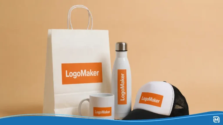
LogoMaker’s AI-Powered personal logo designer makes it easy to explore endless creative ideas and design a logo you love. Once your logo is ready, you can use the built-in marketing tools. You can print your new logo on bags, mugs, stationery, and more.
Extending Your Logo to Merch and Your Website
A logo becomes powerful when it escapes the confines of the design file. The real test, as seen throughout the Coca‑Cola logo history, is how it performs on merchandise, packaging, and your site.
Think about where your logo should live:
- Custom drinkware, like mugs or reusable bottles, for events or clients.
- Apparel such as T‑shirts and hoodies at pop‑ups and conferences.
- Business cards and packaging for physical deliveries or local sales.
- Elements for your website, including your header, favicon, call‑to‑action buttons, and landing pages that continue the story behind your Coca‑Cola logo meaning.
Many modern design platforms let you preview your logo on mockups so you can check scale and contrast before ordering anything.
Clear calls to action help move people from inspiration to action. Near the bottom of your page, you can add prompts like:
- Generate Your Logo for Free.
- Preview Your Logo on Promotional Products.
- Launch a Matching Website for Your Brand or Event.
These CTAs connect the story of a timeless logo to your reader’s next step.
Follow These Quick Steps to Bring Your Brand to Life
- Create your logo for free: Use an AI logo maker to craft a standout wordmark and a complementary design element.
- Preview your logo on real products: Test it on drinkware, apparel, and pens to see how your brand looks in action.
Stand Out Instantly
In the end, understanding the Coca‑Cola logo meaning is like solving an ethereal mystery. It’s about reading the signs, tracing the lines, and knowing when to refine instead of reinvent.
A good logo, like a great detective, doesn’t boast about what it’s going to do. The perfect logo leaves a brief, exciting impression of what’s to come: like red and white neon lights in the fog.
Bibliography
- Crawford, R, Brennan, L, & Khamis, S. 2020. Decoding Coca-Cola: A Biography of a Global Brand. First edition. New York City: Routledge.
- BBC News, Bitesize Topical. How well do you know these famous brand logo origin stories? [Online]. [Accessed 27 February 2026]. Available from: https://www.bbc.co.uk/bitesize/articles/zkmvxg8
- Time magazine. Marketing: Coke’s New Image. [Online]. [Accessed 27 February 2026]. Available from: https://time.com/archive/6633159/marketing-cokes-new-image/
- WIRED magazine. Coca-Cola’s Beautiful New Logo Is No Logo at All. [Online]. [Accessed 27 February 2026]. Available from: https://www.wired.com/2015/07/coca-colas-beautiful-new-logo-no-logo/
- Inc. magazine. A Simple Shape Turned the Coca-Cola Logo Into a Timeless Icon. [Online]. [Accessed 27 February 2026]. Available from: https://www.inc.com/fast-company-2/a-simple-shape-turned-the-coca-cola-logo-into-a-timeless-icon/91239074