We’ve written before about how you can create a great logo design. So if you’re interested in the how-to, click that link. But what exactly makes a logo great? What is it about your favorite logos (or the logos you see most often) that makes them stand out from all the others?
A Great Logo Represents The Company
![]() Or, rather, it represents the idea that the company stands for. It is not necessarily a representation of the products or services of the company. Here’s an example to consider: check out the FedEx logo, which is a pretty standard looking logotype, except that the negative space between the E and the X creates an arrow representing forward movement. Now notice what the logo doesn’t include: packages, letters, deliver trucks and planes—nothing that you would associate with the company’s products or service. Instead they’ve encapsulated an idea that is bigger than all of that with their simple logo design.
Or, rather, it represents the idea that the company stands for. It is not necessarily a representation of the products or services of the company. Here’s an example to consider: check out the FedEx logo, which is a pretty standard looking logotype, except that the negative space between the E and the X creates an arrow representing forward movement. Now notice what the logo doesn’t include: packages, letters, deliver trucks and planes—nothing that you would associate with the company’s products or service. Instead they’ve encapsulated an idea that is bigger than all of that with their simple logo design.
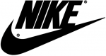
The small business owners we talk to about logos often mention Nike’s logo as the kind of mark they aspire to have. But when these customers see abstract concepts that might represent their businesses (similar to the swoosh), they often respond that they want something that shows their product more literally. What they really want isn’t a logo like Nike’s, it’s a logo as recognized as Nike’s. They’d be better off with a logo design that represents an idea or concept associated with their company, as the Nike’s swoosh represents a wing and speed (not shoes).
Paul Rand, one of the world’s great logo designers, once said: “Surprising to many, the subject matter of a logo is of relatively little importance… Ultimately, the only mandate in the design of logos, it seems, is that they be distinctive, memorable, and clear.” We couldn’t have said it better ourselves.
A Great Logo is Unique and Distinctive
![]() The world is full of small businesses with logos that are almost exactly the same as their competitor’s logos. And to be honest, that’s fine for most small businesses with a local clientele. Or for businesses that want to remain small, lifestyle businesses. But if you want a great logo for your company, or if you are planning on growing beyond your local area, you need to find a more unique combination of icon and typography to create a great logo. Note that unlike virtually every other coffee house, the Starbucks logo doesn’t have a single coffee bean in its logo. Instead, they use a green mermaid.
The world is full of small businesses with logos that are almost exactly the same as their competitor’s logos. And to be honest, that’s fine for most small businesses with a local clientele. Or for businesses that want to remain small, lifestyle businesses. But if you want a great logo for your company, or if you are planning on growing beyond your local area, you need to find a more unique combination of icon and typography to create a great logo. Note that unlike virtually every other coffee house, the Starbucks logo doesn’t have a single coffee bean in its logo. Instead, they use a green mermaid.
A Great Logo Stands the Test of Time
![]() Think now of the logos for Coca-Cola or Tide or McDonald’s. These logos have been around for decades. They haven’t changed dramatically in that time (although they have all been tweaked with slight design changes that keep the logos up-to-date but true to their original designs). These logos have become icons because the companies they represent have jealously guarded against their misuse, and made sure they are used consistently, year after year. This is what makes a great logo so memorable.
Think now of the logos for Coca-Cola or Tide or McDonald’s. These logos have been around for decades. They haven’t changed dramatically in that time (although they have all been tweaked with slight design changes that keep the logos up-to-date but true to their original designs). These logos have become icons because the companies they represent have jealously guarded against their misuse, and made sure they are used consistently, year after year. This is what makes a great logo so memorable.
A Great Logo is Adaptable to Any Application
![]() That is, a great logo works in a variety of situations. It works when it is shown in black and white. It works when it’s shrunk down to fit on a business card just as well as it works when it appears on a billboard. A great logo looks good embroidered on a hat or shirt. It can be easily read when it is reversed out of a background of color (white). And it looks good when printed in full color. (All of which means that your logo probably won’t benefit from a bunch of photoshop effects: shadows, glares, and 3D effects.) Keeping your logo simple helps keep it versatile.
That is, a great logo works in a variety of situations. It works when it is shown in black and white. It works when it’s shrunk down to fit on a business card just as well as it works when it appears on a billboard. A great logo looks good embroidered on a hat or shirt. It can be easily read when it is reversed out of a background of color (white). And it looks good when printed in full color. (All of which means that your logo probably won’t benefit from a bunch of photoshop effects: shadows, glares, and 3D effects.) Keeping your logo simple helps keep it versatile.
A Great Logo is Appropriate for Its Customers
![]() Check out the logo for Toys-R-Us, a company with products that appeal primarily to children. The logo is made up of a fun-looking font and bright colors. The backwards “R” is borrowed from the way a child might mistakenly write the letter when first learning the alphabet. Now imagine the same styling for a logo for an investment firm. It doesn’t work. Because “fun” is not something we want from our investments. We want “safe” or “growth” or something equally serious. Nor would kids be attracted to a toy store with a law-firm style logo. A great logo is appropriate for the company it represents.
Check out the logo for Toys-R-Us, a company with products that appeal primarily to children. The logo is made up of a fun-looking font and bright colors. The backwards “R” is borrowed from the way a child might mistakenly write the letter when first learning the alphabet. Now imagine the same styling for a logo for an investment firm. It doesn’t work. Because “fun” is not something we want from our investments. We want “safe” or “growth” or something equally serious. Nor would kids be attracted to a toy store with a law-firm style logo. A great logo is appropriate for the company it represents.
Perhaps most importantly…
A Bad Company Will Not Have a Great Logo for Long
![]() No matter how good your logo is, if your product or service isn’t also great, the logo will not be great. Think Enron. Their logo was designed by Paul Rand. It’s does everything right from a design standpoint—it’s unique, works at all sizes, works in black and white, and is appropriate for the company. And yet… no one thinks of Enron’s logo as great. Why? Because Enron.
No matter how good your logo is, if your product or service isn’t also great, the logo will not be great. Think Enron. Their logo was designed by Paul Rand. It’s does everything right from a design standpoint—it’s unique, works at all sizes, works in black and white, and is appropriate for the company. And yet… no one thinks of Enron’s logo as great. Why? Because Enron.
Again, from Paul Rand: “A logo derives its meaning and usefulness from the quality of that which it symbolizes. If a company is second rate, the logo will eventually be perceived as second rate. It is foolhardy to believe that a logo will do its job immediately, before an audience has been properly conditioned.”
Think you know enough to try your hand at creating a great new logo? Click here and get started.