This is the seventh article in our series of articles on logo color. To read the previous articles in this series, please see the list below.
No color is more associated with one gender than pink.
You’re probably not surprised to see that several prominent companies using a pink logo are trying to appeal to the female gender. Barbie, Cosmopolitan magazine, Johnson & Johnson, Mary Kay, and Victoria’s Secret are among the female-friendly companies with logos in pink.
If you think, though, that a pink logo is not for your company because you have — or want to have — many male customers, you are mistaken.
It’s true that there are fewer well-known companies with pink logos than prominent companies with logos in many other colors. That includes blue, which is regarded by many people as the male equivalent of pink. However, blue is in fact far more popular among women than pink, according to a poll of 1,974 men and women.
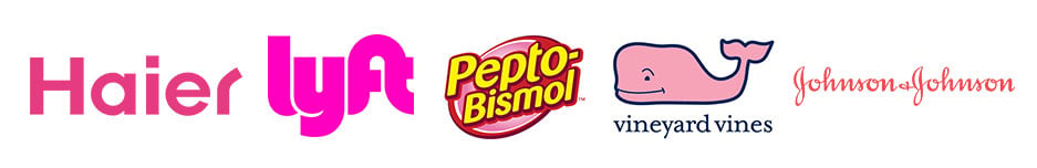
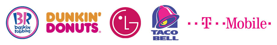
Nevertheless, there is a reason that companies like Baskin-Robbins, Dunkin’ Donuts, LG Corporation, Pepto-Bismol, T-Mobile, Haier, Lyft, Vineyard Vines, and Taco Bell have partially pink or pink logos. The reason is that pink represents far more than feminism.
“While it’s great for putting a feminine touch on logo designs, pink is more powerful than that and can carry many different brand meanings,” reports the article “31 pink logos that flush with possibility.” “While pink is commonly made to look as bright and eye-catching as possible, let’s not overlook its soft and gentle side. By using lightly saturated tones of pink, a business can communicate new meanings beyond bright and feminine.”
Pink can represent fun
Surveys in the United States and Europe report that pink is most associated with the following characteristics according to “Psychology of Color,” a book by Eva Heller.
- Charm
- Childhood
- Femininity
- Politeness
- Romance
- Sensitivity
- Sweetness
- Tenderness
“Pink, a delicate color that means sweet, nice, playful, cute, romantic, charming, feminine, and tenderness, is associated with bubble gum, flowers, babies, little girls, cotton candy, and sweetness,” adds the article “Color Meaning: Meaning of The Color Pink.” “The color pink is the color of universal love of oneself and of others. Pink represents friendship, affection, harmony, inner peace, and approachability.”
Pink’s dual strengths as a feminine color and a friendly color have helped many companies that have a pink logo. The “31 pink logos” article has numerous examples. It lists several “light pink logos with a delicate sensibility” and several “bright pink logos with healthy values” as well as several logos with feminine appeal, several logos for companies that sell sweet treats, and a few other logos with elegant-looking custom typography.
The “31 pink logos” article might be exceptionally beneficial to you because it has a multitude of design ideas, lists companies in several industries, and shows their logos. Most of the companies aren’t well known, but they can give you a better idea of whether your small company can succeed than the large companies on other lists.
“Pink is a fun, vibrant color,” the article says. “This makes it great for portraying cupcakes, popsicles, and candy. If you work in the sweets industry, you shouldn’t have to think twice about using bright pink for your logo.”
You might also know that pink ribbons are an international symbol of breast cancer awareness. That means you should consider a pink logo if your company has anything to do with improving the health of your prospective customers — men and women.
Different shades of pink
The shade of a color that a company uses in its logo can be an important factor in its sales.
This website lists 46 shades of pink. We can’t discuss all of them, but we can say that logos with bright shades of pink convey different messages about a company than logos with lighter shades.
The Entrepreneur magazine article “Your Brand’s True Colors” reports that companies selling less expensive products or “trendy products” for females should consider using “hot pinks” in their logos because they convey energy, excitement, fun, and youthfulness. Lighter pinks are more romantic. And, as we reported in our article on purple logos, purplish pink conveys eroticism, femininity, and seduction. Companies selling romantic products could consider purplish pink logos.
“Bright and warm pinks, such as fuchsia or magenta are vibrant, youthful and encourage a sense of confidence,” adds “Psychology of the Color Pink and What it Means for Your Business.” “Communicating a similar energy as the color red, these pinks are passionate and almost sensual.”
Some shades of pink can calm people down. Baker-Miller pink, the color Pepto-Bismol uses in its logo, calms people down for about 30 minutes, color psychology expert Sally Augustin told Forbes magazine in its article about how businesses can use color psychology. Companies that want customers to relax should consider using calm pink in their logos.
The more you read about pink, the more you realize that companies should consider logos in pink. For example, people today believe that pink is inherently a female color. It is NOT. Pink became a female color because of a “marketing ploy,” Philip Cohen, the sociologist who conducted the poll mentioned earlier, said in an article entitled “Why Is Pink for Girls and Blue for Boys?”
Color historians, if there is such a thing, have pointed out that pink for girls became an accepted part of American culture in the 1930s and 1940s. Here is what a 1918 trade publication said about the subject — “The generally accepted rule is pink for the boys, and blue for the girls. The reason is that pink, being a more decided and stronger color, is more suitable for the boy, while blue, which is more delicate and dainty, is prettier for the girl.”
Pink really was once a boys color. That doesn’t mean your company should have logos in pink if you’re trying to appeal to males and females, but you shouldn’t be afraid to use a pink logo because of stereotypes based on long-ago marketing.
For more ideas, browse the designs in our easy-to-use logo maker.