Color trends start in fashion and design circles and spread to other industries. One moment, we love warm palettes and harvest colors. The next moment, it’s bright neons and cool grays. But preferences change over time as people embrace different facets of our culture. Colors naturally trigger subconscious emotional responses — some good and some bad.
Making smart color choices can position your brand for success. There’s no need to chase every trend, but evolving can help you stay connected to consumers. Brands with a fresh, up-to-date look have a better chance of grabbing attention.
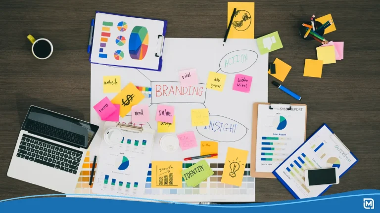
Are you creating a logo, launching a business or rebranding in the new year? Stay ahead of the game with these predictions for top color trends in 2018.
1. Primary colors remixed
Bright hues have inspired new and established brands in recent years. So, it’s no surprise that the Pantone Color Institute expects a return to primary colors. Fun brands such as Google, eBay, and Zoho are making it cool to put bright reds, yellows, and blues side by side. Primary colors go hand in hand with clean, modern design and pop against neutral white backgrounds. Go for high-energy options, such as cherry tomato red, azure blue, and meadowlark yellow.
2. Ombre gradients
The ombre trend will hold strong in 2018 because it adds impact to almost any design. Ombre styles blend gradients of one color or multiple hues. In a solid-color logo, ombre shading is the perfect way to add texture to a flat, simple design. If you have a multicolored design, gradients create smooth, sleek transitions that fit with professional services.
Look to the Instagram and Asana logos for ideas. Versatility is a key benefit of ombre when you’re designing a logo. The gradient pattern can be vertical, horizontal or diagonal. Designers are free to move patterns around to find something visually exciting.
3. Folk multiculturalism
Technology brings people together, sparking a greater appreciation for globalism. As a byproduct, designers are getting inspiration from folk and artisanal traditions around the world.
In the Sherwin Williams 2018 Color Forecast, the “Unity” palette celebrates folk and indigenous patterns. Folk colors typically come from natural dyes made of organic materials. Picture deep reds, burgundies, and browns alongside navy blue, honey yellow, and aged white hues. Shades of indigo and fuchsia offer a splash of color if you want a youthful touch.
4. Low saturation
Prepare for a gradual move from ultra-bright to low-intensity colors. While many brands use boldness to stand out, others prefer less saturation for a timeless look. If you like simple sophistication, stick to moderately cool colors in low-saturation. Choose blue, purple, and pink tints or tones. Tints are colors blended with white for lower saturation. Tones are mixed with gray to lower saturation and soften the intensity of white. Understated tints and tones pair well with navy blue and neutrals, and they never go out of style.
5. Colorful overlapping
Going forward, many color trends are about reinventing solids. Overlapping hues is another way to make sure bright colors aren’t fighting for attention. The technique typically alternates two colors in sections of a logomark or logotype. You can also blend the colors at points of overlap.
The blue and green Waymo logo is a great example of sharp transitions. In contrast, the Mastercard logo overlaps red and yellow-orange circles to form a bright orange gradient. Layering can liven up a simple logo font while maintaining a clean design. Try this style with monochromatic, complementary, or contrasting colors.
6. High-tech hues
Technology is a core influence of coming color trends. Tech-inspired palettes merge youthful contemporary hues with the colors of digital data and machinery. The Sherwin Williams “Connectivity” palette taps into this upbeat movement, representing ideas, innovation, and social freedom.
Think of green computer circuitry, gray CPU casing, and blue Ethernet cables mixing with pastel shades of yellow, purple, and turquoise. For contrast, pair these hues with dark or muted colors, such as hunter green, navy blue, black, and gray.
7. Brilliant duo-tones
Rainbow colors are a popular trend, but they can be overused or hard on the eyes. Duo-tones offer a more mature evolution from intensely saturated rainbow colors. The duo-tone trend blends two colors for a double-exposure or sheen effect.
If you’re creating a website, consider using a duo-tone that combines a bright hue with black for a shaded effect. For a more playful look, choose two brilliant colors, such as purple and magenta or cotton candy pink and blue.
8. Retro spring
Vintage colors of the 60s and 70s are making a comeback in spring palettes. Romantic, carefree pastel shades of peach, rose, lavender, and teal are getting a modern update. You can use these colors to create youthful, beachy palettes perfect for folksy, coastal, or feminine brands. Choose violets and teals with a blue undertone and peach or rose with orange undertones.
9. Black and white
It probably doesn’t have to be said, but black and white is the eternal color scheme. This power duo exudes strength, sophistication, and seduction. B+W logos are low-cost and easy to reproduce on small business materials. If you have an established business, a B+W palette also gives you the flexibility to change up your style from time to time.
A B+W logo is basically a blank canvas. Consider how brands like Nike and Chanel change pattern, colors, and textures for new campaigns. Once you have strong brand recognition with customers, you can use logo remixes to expand your story.
Choosing the right color palette
Colors are just one factor in your branding equation. Creating a brand image is about telling a story and evoking the right emotions in your audience. That’s why color choices should reflect your industry and brand message.
Use the color trends of 2018 to understand the changing tone and expectations of your audience. Customers want to see brands that stand out, but it’s important to start with a palette you can expand upon. Give yourself room to grow by picking hues you can subtly modify in the future. If the time comes to rebrand, color changes will be a natural evolution that makes sense for your business and customers.
Creating a new logo? Use our logo maker to apply these color trends to your design.