Brands big and small are working harder to create eye-catching logo designs. Everyone wants to stand out and be the next trendsetter. But more often, businesses settle for bland designs because it seems like all the best ideas are taken.
Coming up with fresh imagery is a challenge, but there’s an upside. Designers start using more ingenuity to craft unexpected visual twists. We rounded up inspiring logos to recognize what great designers do to make an impact. The best logos of 2017 have a few key traits in common:
- Story: They capture important traits of the brand.
- Nuance: They offer a subtle element of surprise or cleverness.
- Simplicity: They accomplish a lot with very little.
- Color clarity: They have a smart use and balance of color and negative space.
For a well-rounded list, we looked beyond the big brands to find gems you may have missed this year. We also stuck to logos for real organizations that are actively promoting a brand. Check out our picks for some of the best logos of 2017.
![]()
1. AnswerIQ
Mascots are among the most distinctive logos, so they can make brand visuals stick in a customer’s mind. A good mascot should have close ties to the brand name or business operations.
In this case, tech startup AnswerIQ used a parrot to represent AI technology that produces automatic responses to common customer questions. Simply put, chatbots mimic human speech just like a parrot.
Although the logo has a vibrant color scheme, the colors are balanced in placement and temperature. Simple shapes come together in a fun design with the colors restricted to their own zones. Full of whimsy, the parrot fits with the colorful visuals throughout the startup’s website. AnswerIQ can easily use the mascot as a standalone mark in brand images and animations.
![]()
2. Agatha Christie Limited
The updated logo for Agatha Christie Limited is the definition of effortless nuance. Christie is widely known for her witty mystery novels filled with suspense and adventure. That’s why the company liked the idea of having clever elements “hiding in plain sight,” says Chairman and CEO James Prichard.
At first glance, you see a lowercase “A” for Agatha. Take a second look, and you’ll see the curved lower portion is also a lowercase “C” for Christie. The upper portion forms a tilted question mark — fitting for a genre about secrets and riddles. Whodunit? Studio Sutherl& in London designed the logo, which launched on the anniversary of the author’s birthday.
![]()
3. Reykjavik Fashion Festival
The logo of Iceland’s premier fashion festival is a perfect example of a memorable monogram. Fashion is all about rethinking familiar silhouettes and aesthetics to get something new. The topsy-turvy initials shake up your expectations, but never lose readability.
At the same time, the design is grounded by a conventional shape. Square logos are easy to recreate as small app icons and profile photos.
![]()
4. Mozilla
Wordmarks often fall to one end of the spectrum — too dull or too abstract. The Mozilla Corporation got it right with a recent logo redesign featuring familiar web symbols. A colon and double-forward slash replace the letters “ill” in Mozilla.
This familiar URL language is a core part of every web address. Everyone knows it and uses it. What better way to stand out as a leader in internet software development?
True to its open-source roots, Mozilla listened to the internet community before finalizing a design. Johnson Banks agency in London developed the logo, but Mozilla publicly shared early concepts to get crowdsourced feedback.
The end result is a mellow slab serif typeface and a classic black-and-white color scheme. Mozilla has infinite options for recoloring the design, and the visual impact remains just as powerful.
![]()
5. Huski (Hu.ski)
European startup Huski is an online food store that delivers meals to vacationers at ski resorts in the Alps. So it’s no surprise the company chose a playfully majestic husky dog to represent the brand.
Stand and Marvel of Melbourne, Australia, created this polished minimalist mascot to make Huski the friendly face of mountainside delivery.
Monoline drawings are a hot logo design trend right now. They embody simplicity and result in bold, graphic visuals on brand clothing and merchandise.The mascot stands out in the brand’s blue color scheme. Not to mention, the line-drawing logo creates fun opportunities for animation.
![]()
6. Dropbox
Dropbox made a small update to its blue box logo, with positive results. The cloud storage company opted for an abstract box over a literal one. The change comes at a time of widespread redesign, with many big brands scaling down to the simplest details.
Dropbox already has massive brand recognition, so it’s safe for the company to use floating prisms in place of a structured object. The image still conveys the image of a box, but the updated design is even easier to render in print and web applications.
An in-house design team partnered with COLLINS design agency of NY and San Francisco to develop the company’s new identity.
![]()
7. Minio
Our third mascot on the list comes from Minio — a private cloud storage provider. The brand name stands for “minimalism,” making a monoline mascot an ideal choice. Black, white, and gray are the most prominent colors, giving the entire design a sleek, contemporary vibe.
A slim, graceful stork isn’t the most obvious symbol for a tech company, and that’s a good thing. Startups need their audience to connect with a mascot right away to have strong differentiation from competitors.
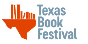
8. Texas Book Festival
No one can overlook the inviting message behind the Texas Book Festival logo. The organization is on a mission to celebrate authors and spread a love for reading in Texas.
Pentagram design studio in Austin created the Texas bookshelf concept as an updated family of logos for the organization’s many programs.
Simple imagery goes a long way in this design. The shape of Texas is instantly recognizable to Americans, and the graphic is easy to recolor for different uses. The execution isn’t the most refined, but the strong concept sells the design.
![]()
9. Zoa
Bioleather brand Zoa is proving elementary shapes really are timeless. The bold pictorial marks probably remind you of playing with blocks as a child or matching words with shapes on school worksheets. Square. Circle. Triangle. Nothing new is presented here, and yet, the finished design is strikingly novel.
Designed by Work Order agency in New York, the logo features shapes that are cropped and spaced in just the right places. The resulting abstract wordmark looks both tribal and futuristic — merging the natural and scientific aspects of growing bioleather.
![]()
10. Juventus
The Italian football club Juventus upset fans this year by redesigning its beloved shield logo. But if we take a step back and look objectively at the new logo, it has a lot to offer. Like most companies, Juventus is focusing on a digital-heavy future in which simpler logos work better.
Juventus aimed to include hints of the team’s iconic imagery in the logo. First and foremost, the logo is a letter “J” for Juventus. The black-and-white design mirrors the stripes of the team jerseys. The logo is also a nod to the past and future.
Juventus wanted to celebrate the scudetto or “little shield,” an Italian symbol of athletic victory. However, the club opted for a half-shield, demonstrating a desire to move forward and blaze a new trail.
Designing logos that have character and staying power is an art. Graphic designers have basically seen and done everything. Yet, new generations of creative artists keep finding incredible ways to reinterpret design trends of the past.
Ready to create your own logo? Browse thousands of designs with our free logo maker.