A logo redesign can be a challenging endeavor for any business, but for those Fortune 500 companies and big-name brands, rebranding is a delicate procedure. There’s a lot at stake when a corporation decides to choose a new business logo: Will the public accept or reject the new look? Will this new logo have a positive impact on our bottom line? Will the company’s message come across strongly to consumers?
Unfortunately, not all logo redesigns hit the mark, and many companies have failed to rebrand successfully, costing them thousands or even millions of dollars in lost revenue and much-needed reputation management. Yet when a business takes the time to research a new design, create a logo that is still in line with core beliefs, and seeks outside opinion throughout the rebranding process, most redesign efforts have a happy ending.
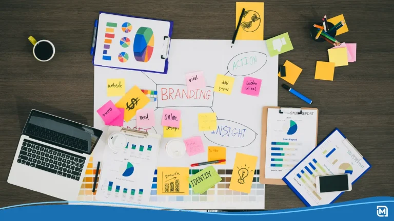
Over the past decade, we have seen a multitude of influential companies opting for a new logo design in an effort to bring their business into the 21st century. Below are the top 10 best logo redesigns from the past decade.
Top Business Logo Redesigns of the Past Decade
- Walmart (2008). Founded in 1962, Walmart introduced a simple business logo in plain blue text. Over the years, the company continued to use their brand name throughout their 5 additional logo revamps which remained largely the same. However, in 2008, the discount store decided for a much more bold approach: adding a company slogan. Their “Save money. Live better.” slogan was precisely what the company needed to stay competitive as the Great Recession rolled through America and the rest of the world.
- Mercedes-Benz (2009). The global automobile company — officially founded in 1926 but with a company history dating back to 1901 — has a long history of rebranding. Their first logo was introduced in 1902 and included the text “Mercedes” within an oval shape. The iconic three-pointed star did not appear until 1909 and has since been included in every rebranding effort. The current iteration (launched in 2009) has dropped the name “Mercedes-Benz” from the logo and instead consists of the star enclosed in a circle.
- MTV (2010). In 2010, Music Television did away with their iconic logo to transition the brand away from exclusively playing music videos. The company dropped the phrase “Music Television” from below the logo and kept the rest, signifying to the public that they will be offering shows in addition to music videos. The goal was to keep the graffiti look in order to cater to the same audience and age range.
- Starbucks (2011). Moving into the second decade of the 21st century, many brands opted for a more minimalist approach to their logo design. One such company that adopted a more minimalism mentality was Starbucks. Founded in 1971, the Seattle-based coffee shop has always displayed their famous mermaid front and center in their company logo. In 2011, they decided to drop the words “Starbucks Coffee” from the circular logo and keep the mermaid. The 45-year-old business also decided that their audience could recognize their brand without the company name written on their promotional materials and products.
- Twitter (2012). The social media giant was the talk of the town when it was revealed that logo designer Linda Gavin was given just a single day to design Twitter’s new logo. Since then, the company has introduced two more versions of their logo. In September 2010, they introduced their iconic bird named after Larry Bird of the Boston Celtics. The current design (in line with the minimalist logo trend) consists of just an updated version of their Twitter Bird icon in their trademark blue. The social media platform dropped their company name entirely from the logo, rightfully assuming that their audience would recognize the bird.
- Doritos (2013). The Frito-Lay-owned company has seen quite a few business logos since it’s beginning in 1964. Spanish for the phrase “turned golden”, Doritos’ logo redesign effort was public knowledge. In fact, the cheesy chip company sent brand ambassadors across the world to speak with individuals regarding their thoughts on a new logo design. In the end, the version (designed by Hornall Anderson) we see today was the most popular amongst their audience. While the company may continue to seek out recommendations for new chip flavors, we don’t see another rebrand in the near future.
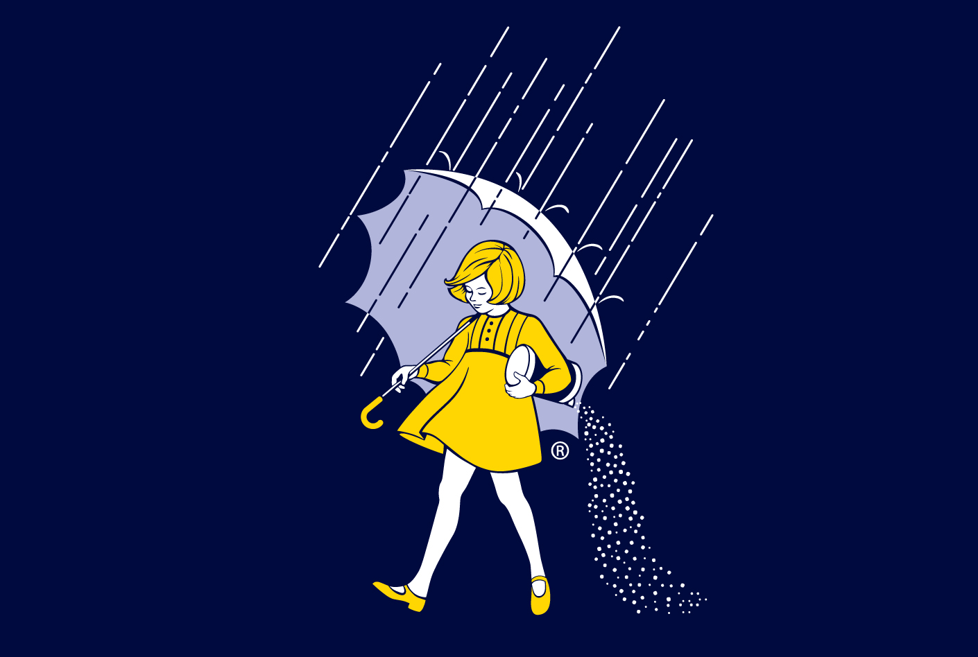
- Morton Salt (2014). Founded in Chicago in 1848 by Joy Morton, Morton Salt and the company’s iconic “Morton Salt Girl” have become a staple name across American households. The logo, which has remained largely the same since it’s the first introduction, consists of the Morton Salt Girl walking in the rain with an opened umbrella. The girl is scattering salt behind her, which coincides with the idea that their cylindrical salt container could withstand a rainstorm without clogging up. The company’s latest logo design was to celebrate 100 years in business. The new logo has clean-cut lines and a more simplified look without taking away any crucial aspect of their famous girl.
- Google (2015). Easily one of the most talked about logo redesigns of the past decade, Google’s revamp of their beloved brand name was surprisingly done in-house. The company recently celebrated their 20th anniversary of providing online search for users, but one thing that has mostly remained the same since their inception has been their logo. The decision to keep the logo largely unchanged was a safe, yet widely accepted, move. After all, the logo needs to fit into different-sized web browsers on both desktop and mobile devices. The company logo was simple enough to roll out across all of its marketing materials and products without having to make costly overhauls.
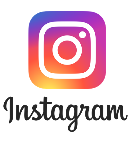
- Instagram (2016). Often known as the logo redesign that broke the Internet, Instagram boldly released it’s new, prismatic company logo on May 11, 2016 much to the dismay of its millions of users. As the dust from the Great Instagram Logo Freakout of 2016 settles, users have finally come to accept the photo-sharing app’s colorful new look. Since it’s acquisition by Facebook in 2012, the platform has included dozens of more features aside from uploading photos and sharing them with friends. The new logo was meant to appeal to an ever-growing (and younger) audience that may not have understood what an original Polaroid camera even looked like.
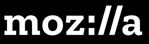
- Mozilla (2017). The open-sourced web browser started the New Year off on the right foot with its introduction of their new company logo. This logo design cleverly took Mozilla’s product and services into consideration with a nod to traditional URL language while still managing to include the brand name within the design. Moz://a has ditched the somewhat bland Helvetica typeset from the early 2000’s in favor of a more edgy and memorable logo design that appeals more to their users.
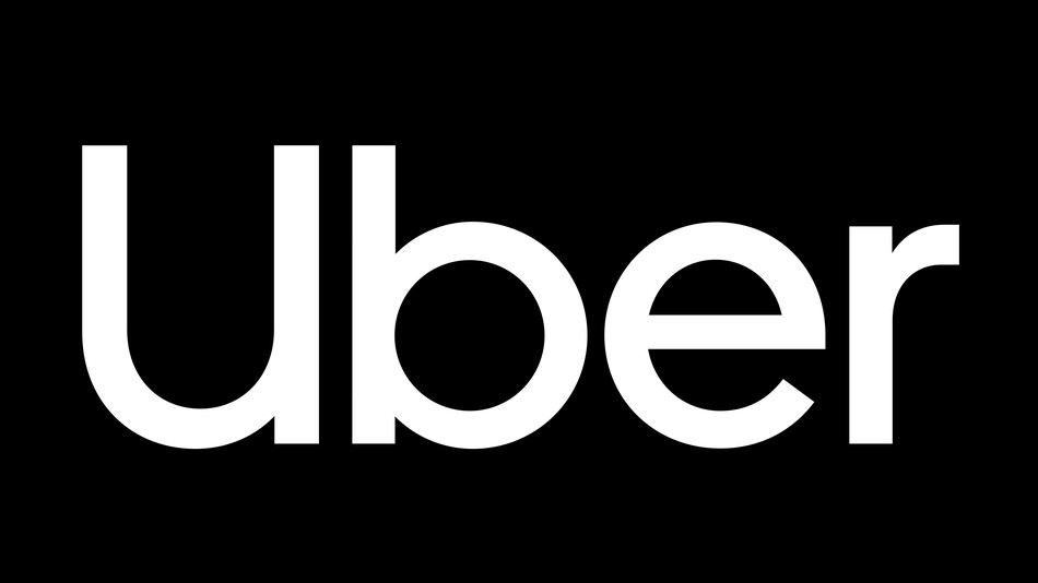
- Uber (2018). Just last month, the ride-sharing company Uber has yet again rebranded. Uber discarded the logo they revealed two years ago — which comprised of a circle with a square in the middle — in favor of a new wordmark that displays the brand’s name in a custom typeface. Mobile users with the app downloaded will notice the app now has a black background with white lettering. This new logo design was simultaneously launched with a new look for its mobile app which the business hopes will be more user-friendly and intuitive.
Over the past decade, it is safe to assume that many big name brands are opting for a more simple, monochromatic company logo. Many businesses have gone away with a brand slogan and often identify themselves with a simple image. No matter what your approach may be when it comes to designing a logo, keep these famous redesigns in mind when it comes time to determine how you want customers to identify with your business.
In need of a new logo or want to re-design an existing logo? Start designing a business logo today and choose from thousands of design templates and hundreds of colors.