When a group of 3,000 individuals was surveyed, 16% of them recognized the Nike logo right away. Apple came in as a close second at 15.6% and McDonald’s at 11%. These brands used the perfect combination of logo color and design to create something memorable.
Whether you’re creating a logo from scratch or attempting to rebrand your business, read on for more insight on choosing the best logo color combination for your company.
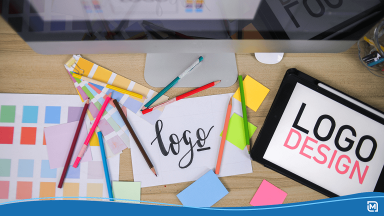
Things to Keep In Mind When Choosing Your Logo Color
While many businesses tend to choose whichever color they feel looks appealing for their logo, it’s important to keep in mind that each color choice will invoke a specific emotion from your audience.
For this reason, it’s best to take the time to choose logo colors that fit your brand culture and message.
Know Your Audience
Hopefully, you’ve spent some time on target audience research before you dove into logo design. If not, you’ll be missing a key piece of designing a memorable and recognizable logo.
Ultimately, choosing your logo colors will be choosing what you want your audience to feel when they see it, which is why it’s important to know their interests, what’s important to them, and what they are looking for from your company.
Know Your Message
Now that you know how you want your audience to feel, it’s time to consider what you want to say. Do you want to let your audience know you’re a trustworthy choice? That you’re passionate about taking care of the planet? That you care about their families health?
While it may seem far fetched, your color choice can be a powerful step in sending such messages.
The Role of Color Psychology
The good news is, you don’t have to teach your audience how to respond to specific colors, they already know how. Due to years of social conditioning, we each respond to colors in a rather similar way, this is known as color psychology.
The more you know about color psychology and the triggers each color causes in your consumer, the easier choosing your logo will be. Read on for insight on what each of the colors may mean to your audience.
Green
The Good: Green is a great color for health-focused companies or environmental groups as the color sends a message of health, nature, and prosperity.
The Bad: Some shades, however, can trigger feelings of boredom or blandness. One negative feeling caused by green is envy, which can still be a powerful marketing tool when used correctly.
Blue
The Good: Think blue is purely a masculine color? You may be surprised to find the color wasn’t always associated with boyish nature. In fact, pink was originally the color for boys and blue for girls. Despite its gender associations, blue sends a message of serenity, security, and logic.
The Bad: Just be sure you’re using the right shade of blue, as some tones can create feelings of aloofness, and unfriendliness. Not a look you want for your brand!
Red
The Good: Red encourages feelings of power, passion, and energy. It can showcase your brand as a strong option that audiences should be excited about.
The Bad: On the other hand, the high energy triggers of red can also have negative effects. Some audiences may recognize red as the color of anger, danger, or even defiance.
Orange
The Good: Orange is a great color choice if you’re looking to invoke feelings of courage and confidence in your audience. It’s also a prime choice for tech companies as the color gives the feeling of innovation.
The Bad: It’s important to know that orange can also give off feelings of immaturity and ignorance, so it may not be the choice you’re looking for if you want to demonstrate expertise.
Yellow
The Good: Want your audience to feel happy, creative, and even a bit optimistic? Yellow is a great way to invoke those “feel good” emotions.
The Bad: Thanks to road signs, yellow can also make the individual feel cautious, fearful, and even a bit anxious. Also, some shades of yellow have been found to create feelings of frustration.
Turquoise
The Good: Turquoise is a great transitional color as it can create feelings of clarity, calm, and healing. If your business focuses on creative arts, utilize the color’s feeling of “self-expression”.
The Bad: Use turquoise wisely, as the color can also make your brand come off as boastful, secretive and even a bit unreliable.
Purple
The Good: Purple is the color of royalty for a reason. The color exudes the feeling of luxury, wealth, wisdom and sophistication.
The Bad: That Queen Elizabeth look may come with a price. Some negative feelings associated with the color are decadence, suppression, and inferiority.
Black
The Good: Don’t overlook this darker color choice. Black can give your brand a feeling of sophistication, security, and power. It’s also a great choice if you want to be seen as an authority in your industry.
The Bad: Black can also send a message of evil, mourning, or oppression. So it may be best to pair it with another color.
Gray
The Good: Before you pick out all your gray hairs try and remember that gray is the color of timelessness, balance, intelligence, and reliability.
The Bad: Keep in mind, some shades of grey may also create a lack of confidence and even feelings of depression.
Knowing What Goes into a Great Logo
Choosing your logo color is just one of the many steps involved in creating the perfect logo. The more research and thought you put into the design of your logo, the greater conversion you’ll see from it.
If you’re still developing your logo we suggest checking out our blog on responsive logos.