Color in 2026 does more than “look nice”; it carries emotional weight and helps brands stand out in crowded digital spaces. Strong, intentional palettes are becoming a primary driver of recognition, especially as logos themselves stay simpler and more flexible.
For brands, this means color choices should support both emotional connection and digital clarity, but also, palettes must look great on screens, print well on merchandise, and feel coherent across all touchpoints.
Looking to the year ahead, these emerging color trends for 2026 reveal a shift from cool grays to warm neutrals, deep jewel tones, and nature-based greens, reflecting a fresh approach to design and decor.
Let’s dive into it and help you review if your brand needs a revamp!
- How to Use Trends Without Breaking Your Brand?
- Top 10 Color Trends & Palettes for 2026
- Turning 2026 Palettes Into Logos with AI
- Applying 2026 Colors to Promo Products & Websites
- Quick Checklist: Is Your Color Palette 2026 Ready?
How to Use Trends Without Breaking Your Brand?
Using the 2026 color palette trends doesn’t mean throwing out everything that already works. The right combination of your existing brand colors with trending hues can keep your brand both recognizable and fresh.
Embrace the chance to love color and see trend updates as an opportunity for creative expression and to connect emotionally with your audience!

Define Core Brand Colors & Personality
Your core colors are the ones customers already associate with you, often the main logo color and 1 or 2 supporting hues. These should connect clearly to your brand personality:
- Calm, trustworthy, sustainable brands often use greens, soft neutrals, or muted blues.
- Bold, energetic, disruptive brands lean into high contrast, saturated color, and dynamic gradients.
- Luxury and boutique brands frequently use rich jewel tones, deep browns, and creamy whites.
Decide What Flexes vs. What Stays Fixed
Not every color in your system needs to change to reflect 2026 trends. Treat your palette like layers. Layering colors can create depth and visual interest in your interior spaces, while also maintaining a calming effect.
- What to maintain fixed:
- Main logo color.
- Signature background color (like a specific green or neutral).
- What can be flexible:
- Accent colors for buttons, icons, and social media backgrounds.
- Seasonal or campaign-specific tones.
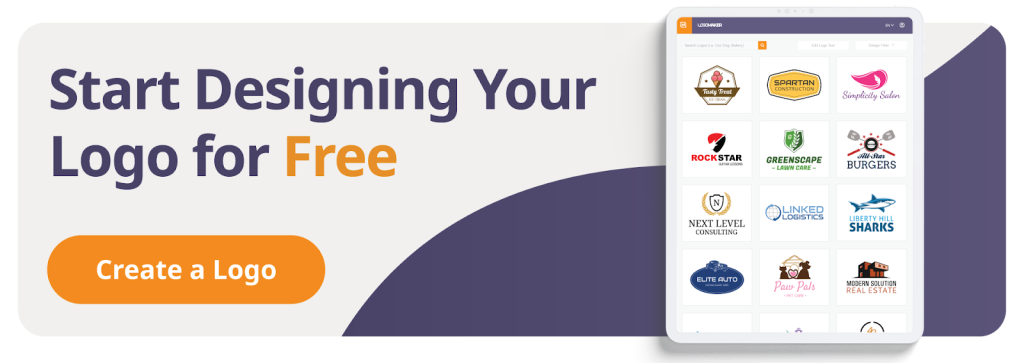
Use AI Tools to Test Palettes Safely
AI logo generators and design tools allow you to remix colors on your existing logo, generate new possibilities, and preview them on mockups.
In a tool like LogoMaker, you can:
- Keep your brand name and symbol the same while swapping in new main and accent colors.
- Experiment with different shades and paint color options to see what fits your brand best.
- Preview how colors work on dark vs light backgrounds, then export matching versions for web and print.
Top 10 Color Trends & Palettes for 2026
Color forecasting platforms and paint brands point strongly toward green and teal families, along with soft, structural whites, as principal influences in 2026. Ecological regeneration is a primary theme alongside a desire for serene mental clarity, exemplified by the selection of Pantone, Pinterest, and Elle.
- Pantone highlights Cloud Dancer, a soft, billowy white, as a versatile structural color that supports bolder accents.
- Forecasters like WGSN and Coloro emphasize Transformative Teal and similar green-blue tones such as Warm Eucalyptus and Smoky Jade, representing renewal, balance, and eco-conscious creativity.
Let’s explore ten of the most relevant color trends for 2026, with vibes, use cases, and even some AI/LogoMaker guidance.
Each trend highlights a different color family, helping you understand how these shades can shape perception and style.
1. Earthy & Grounding Neutrals
These palettes draw heavily from soil, clay, stone, and natural fibers, reflecting the broader move toward sustainability and calm. Warm minimalism and nature-led comfort are dominant themes in home decor for 2026, focusing on personal, nurturing spaces connected to nature.
Vibe & Hues
- Grounded, warm, and reassuring like terracotta, ochre, mushroom, beige, and soft taupe.
- Chocolate brown and earth Tones signal comfort in interiors, making spaces inviting and cozy.
Where to Use It
- Logo: Use a rich brown or terracotta as the primary logo color, with a lighter sand or bone for backgrounds.
- Promo products: Tote bags, notebooks, and drinkware in warm neutrals feel tactile and premium.
- Website: Creamy backgrounds with brown typography and muted green accents create a calm reading experience.
Try This in LogoMaker
- Prompt: “earthy, grounded, minimal logo for an eco-friendly brand in warm browns and soft neutrals.”
- Main vs accent: Use deep chocolate or terracotta for the logo mark and text; keep accents in lighter sand, mushroom, or clay.
- Accessibility: Ensure body text and buttons have high contrast by pairing dark browns with very light off-whites rather than mid-tone beiges.
2. Deep Teals & Smoky Blue‑Greens
Teal and jade tones are forecast as defining colors for 2026, balancing nature, technology, and emotional calm.
Vibe & Hues
- Calm yet futuristic; deep teal, smoky jade, eucalyptus green, and cool blue-greens.
- Feels both digital and organic, ideal for brands that bridge wellness, tech, and innovation.
Where to Use It
- Logo: Choose a deep teal for the main mark and pair it with soft jade or misty blue as background or secondary color.
- Promo products: Water bottles, tech accessories, and apparel in teal/jade communicate freshness and modernity.
- Website: Teal hero sections, teal-to-jade gradients, and teal call-to-action buttons stand out while feeling sophisticated.
Try This in LogoMaker
- Prompt: “modern, clean logo in deep teal and smoky jade, tech-forward but calming.”
- Main vs accent: Use transformative teal–style hues as the main color and lighter jade or eucalyptus as accents.
- Accessibility: On dark teal backgrounds, use near-white text; on light jade backgrounds, use nearly black charcoal for strong contrast.
3. Unbleached Naturals & Soft Whites
Soft, almost-cloud-like whites and unbleached neutrals act as a structural base for many 2026 palettes!
Vibe & Hues
- Clean, serene, and minimalist: off-whites, chalky creams, “Cloud Dancer” soft white, and unbleached linen tones.
- Evokes fresh starts, clarity, and visual breathing room.
Where to Use It
- Logo: Use soft white or cream as a background color and pair with a strong accent (teal, plum, chocolate) for the mark.
- Promo products: Stationery, packaging, and apparel with off-white bases and small color pops feel elevated.
- Website: Light, airy layouts with lots of white space and subtle shadows suit editorial, wellness, and SaaS brands.
Try this in LogoMaker
- Prompt: “minimal logo with soft white background and a single bold accent color, clean and airy.”
- Main vs accent: Treat soft white as the base; pick one core accent (teal, brown, or plum) for logo and main buttons to avoid visual clutter.
- Accessibility: Make sure soft whites are clearly lighter than your text color; avoid mid-gray text that risks low contrast on pale backgrounds.
4. Decadent Chocolates & Rich Browns
Deep browns are stepping into the spotlight, offering a richer, more distinctive alternative to black or flat gray.
Vibe & Hues
- Luxurious, cozy, and grounded; dark cocoa, espresso, caramel, burnt umber, warm khaki.
- Great for brands that want warmth and sophistication without feeling cold or overly corporate.
Where to Use It
- Logo: Swap black for a deep chocolate as your main mark color for a softer yet premium look.
- Promo products: Coffee mugs, packaging, and apparel in rich browns feel artisanal and high-end.
- Website: Brown text on soft cream backgrounds, with caramel accents for buttons, delivers a warm reading experience.
Try This in LogoMaker
- Prompt: “premium, warm logo in dark chocolate brown and soft cream, boutique brand feel.”
- Main vs accent: Use the darkest brown for the logo and headings; use lighter tan/caramel as accents and backgrounds.
- Accessibility: Test brown-on-cream combinations with contrast tools; avoid low-contrast pairings like mid-brown on beige.

5. Warm Citrus & Banana Yellows
Warm yellows and citrus tones are surfacing as optimistic, slightly playful contrasts to cooler teals and neutrals.
Vibe & Hues
- Upbeat, friendly, and energetic: banana yellow, persimmon, soft orange, and warm goldenrod.
- Works well for youth-focused brands, food and beverage, and community-driven services.
Where to Use It
- Logo: Use yellow as an accent rather than a full background to preserve legibility.
- Promo products: Tote bags, stickers, and drinkware with citrus accents attract attention on shelves or at events.
- Website: Use yellow sparingly for call-to-action buttons, icons, or highlight strips rather than full sections.
Try This in LogoMaker
- Prompt: “friendly, optimistic logo with warm banana yellow accents and clean neutral base.”
- Main vs accent: Let charcoal, deep brown, or navy do the heavy lifting; reserve yellow for icons, underlines, or small graphic shapes.
- Accessibility: Avoid light yellow text or small yellow text on white; contrast is easiest when yellow appears on darker backgrounds in larger shapes.
6. Bioluminescent Neons & Thermal Glow Gradients
2026 sees a strong push toward glowing, electric palettes that feel like organic light in a dark interface.
Vibe & Hues
- Electric, deep-tech, and cinematic; cyber neons, thermal gradients, glowing blues/teals, magentas, and toxic greens.
- Often used against dark backgrounds to create a luminous, holographic effect.
Where to Use It
- Logo: Gradients in the symbol or icon (for instance, teal-to-magenta) while keeping the logotype more neutral.
- Promo products: Holographic finishes, UV prints, and dark apparel with neon ink can echo on-screen glow in physical form.
- Website: Dark UI with neon-accented buttons, borders, and scroll indicators feels instantly futuristic.
Try This in LogoMaker
- Prompt: “futuristic glowing logo with bioluminescent neon gradients on a dark background.”
- Main vs accent: Choose one dominant glow color (for example, electric teal) and a secondary neon (like magenta or acid green) to avoid chaos.
- Accessibility: Keep text mostly in high-contrast whites or near-whites; use neons as accents, not for small text or long paragraphs.
7. Soft, Sunwashed Pastels
Sun-faded pastels and “bruised” tones bring a gentle, nostalgic feel without leaning too childish or sugary.
Vibe & Hues
- Nostalgic, gentle, and approachable: sunwashed peach, dusty lilac, faded blue, soft mint.
- Works well for lifestyle, beauty, education, and community brands.
Where to Use It
- Logo: Pastels can be used as backgrounds while keeping text and marks in deeper, more legible tones.
- Promo products: Stationery, apparel, and packaging in soft tones feel friendly and Instagram-ready.
- Website: Gradient hero areas, soft card backgrounds, and gentle highlight blocks keep interfaces light and welcoming.
Try This in LogoMaker
- Prompt: “soft, sunwashed logo with pastel gradients and a friendly, modern style.”
- Main vs accent: Choose one deeper anchor color (like plum or navy) and use pastels as backgrounds or large shapes.
- Accessibility: Confirm text remains dark and clear; pastel text on white is a common readability issue on mobile.
8. Retro‑Futurist Tech Palettes (Teal + Neon Accents)
Retro-futurism blends vintage sci-fi vibes with modern UI design, often featuring teal, cyan, muted purple, and neon accents.
Vibe & Hues
- Playful, techy, and nostalgic: teal, cyan, retro blues, neon magenta, and electric greens mixed with dark bases.
- Works for creative studios, tech startups, and entertainment.
Where to Use It
- Logo: Teal or cyan can be the core; neon accents appear in small details or gradients.
- Promo products: Dark hoodies, hats, and accessories with teal and neon prints feel like merch from a sci-fi show.
- Website: Dark mode UIs with retro grid lines, neon outlines, and teal buttons look instantly distinctive.
Try This in LogoMaker
- Prompt: “retro-futurist tech logo with teal as main color and subtle neon accents, dark background.”
- Main vs accent: Use teal or cyan as primary, with just one neon (like magenta) for small highlights.
- Accessibility: Maintain a clear hierarchy: white or near-white text, teal principal elements, neon only for micro accents or hover states.
9. Moody Jewel Tones (Plums, Smoky Jades)
Jewel tones evolve in 2026 toward slightly muted, “smoky” versions that feel both rich and modern.
Vibe & Hues
- Dramatic, artistic, and premium: plum noir, smoky jade, deep emerald, garnet, sapphire blue, and burgundy (also known as oxblood).
- Ideal for beauty, boutique eCommerce, hospitality, and culture brands.
Where to Use It
- Logo: Choose one rich jewel tone for the mark and pair it with soft white or light gray as the base.
- Promo products: Cosmetic packaging, candles, notebooks, and apparel look luxurious in deep plums and jade greens.
- Website: Use jewel tones as section backgrounds, gradient overlays, or main visuals rather than full-page walls of color.
Try This in LogoMaker
- Prompt: “elegant logo using plum and smoky jade, sophisticated and modern.”
- Main vs accent: Pick one jewel tone as primary (for example, plum) and let the second appear in subtle details or secondary graphics.
- Accessibility: Dark jewel backgrounds require light text; avoid mid-tone text colors that disappear against them.
10. Tight, Adaptive Brand Palettes
Beyond specific hues, one of the biggest “trends” is the move toward tighter, more strategic color systems that flex across contexts.
Vibe & Hues
- Intentional, focused, and adaptable: in most cases, 3–5 core colors, used consistently.
- Spotify’s steady green usage is often cited as proof that a simple color system can carry a brand.
Where to Use It
- Logo: Limit your main logo to one primary color plus black/white; use the rest of your palette in supporting graphics.
- Promo products: Reuse the same few hues across apparel, drinkware, and stationery to build recognition over time.
- Website: Build a clear hierarchy: one main color for CTAs, one for backgrounds, one for accents.
Try This in LogoMaker
- Prompt: “simple, modern logo with a tight 3-color palette optimized for web and print.”
- Main vs accent: Designate one color as your hero (for logo and buttons), one as neutral (background), and one as accent (icons, highlights).
- Accessibility: Test your palette for dark and light modes, making sure your primary action color remains legible in both contexts.
Turning 2026 Palettes Into Logos with AI
Working with an AI logo maker can ease the process of exploring new palettes and locking in a color system that feels 2026-ready. Let’s take a look at each step of this process.
Step 1: Pick a Palette That Fits Your Brand’s Mood
- Choose 1 or 2 of the trends above that match your personality and audience expectations.
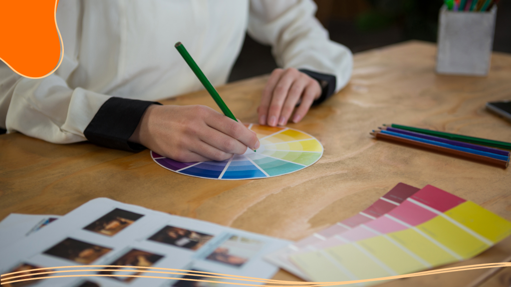
- Gather 3 to 5 specific colors (hex codes if possible) for main, secondary, and accent usage. When selecting your palette, consider incorporating complementary hues. Pairing contrasting colors can create an interesting and unexpected look that makes your brand stand out.
Step 2: Enter Your Brand Name & Style Cues
When you open LogoMaker or a similar AI tool:
- Enter your brand name and slogan.
- Add prompts that align with your chosen trend (for example, “earthy, grounded logo in rich browns and soft neutrals” or “bioluminescent futuristic logo with neon teal accents”).
Step 3: Choose a Strong Base Design
- Browse generated alternatives and focus on structure first: is the logo legible, scalable, and recognizable?
- Favor simple shapes and marks, knowing that color will add much of the character.
Step 4: Apply Your Palette (Main/Secondary/Accent)
Most AI logo tools let you adjust colors on a selected design:
- Main color: your primary brand color (for example, deep teal, chocolate brown, plum).
- Secondary color: a softer complementary tone (soft white, jade, warm neutral).
- Accent color: the “pop” that draws the eye (neon, citrus, or a bright jewel).
Try using painted elements or colored trim in your logo and brand assets to highlight the main colors from your palette. This approach can emphasize your chosen hues and add a modern, decorative touch.
Step 5: Test Legibility & Contrast
- Check how your logo looks at small sizes, in grayscale, and on both dark and light backgrounds.
- Verify your text remains readable: high contrast between logo type and background is non-negotiable, especially for accessibility.
Step 6: Export for Dark/Light, Print, & Web
Download versions optimized for:
- Light background (logo in color on white or Cloud Dancer-style soft white).
- Dark background (logo reversed or using lighter elements on dark teal or charcoal).
- Make sure you have vector or high-resolution formats suitable for both print and digital.
Applying 2026 Colors to Promo Products & Websites
Color trends only really pay off when they show up consistently across your physical and digital presence. Updating your color palettes can bring new life to both digital and physical brand touchpoints, revitalizing your spaces and making your brand feel fresh and current.
On Promotional Products
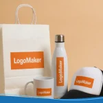
Think about how your 2026 palette will live on real items:
- Apparel: Hoodies, tees, and caps in earthy neutrals or jewel tones, with logos in high-contrast versions of your main color.
- Drinkware: Stainless steel bottles and mugs in deep teal, chocolate, or muted pastels with crisp white logos stand out.
- Stationery: Notebooks, pens, and folders in Cloud Dancer-style whites with brown or teal accents feel modern and clean.
- Packaging: Use your primary color on principal panels and integrate secondary hues in patterns, labels, and tissue paper.
If your promo platform or LogoMaker ecosystem connects to a product catalog, you can often preview your logo on multiple items and filter by colors that match your palette.
On Websites & Digital Experiences
Translating your 2026 palette to your website is where your color system really proves itself.
- Hero sections: Use your main 2026 color (teal, chocolate, or a gradient) in the hero background with clear, high-contrast text and a strong CTA button.
- Buttons and CTAs: Reserve your boldest hue (for example, citrus yellow or bright teal) exclusively for primary actions to train users’ eyes.
- Backgrounds: Think of the top of your web layout as the ‘ceiling’; choosing a color for this upper boundary can set the tone for the entire digital space, much like a painted ceiling in interior design.
- Icons and illustrations: Use accent colors in small graphic elements to tie everything together without overwhelming the page.
Quick Checklist: Is Your Color Palette 2026 Ready?
Use this checklist when reviewing your logo, merch, and website colors:
- Contrast and accessibility:
- Can users easily read text on buttons, cards, and hero areas on mobile?
- Do your main combinations meet common contrast guidelines for body text?
- Print vs screen:
- Have you tested how your colors look on real materials like fabric and paper, not just on a monitor?
- Are gradients and neons reserved for digital, where they shine most?
- Adaptability across channels:
- Does the same core palette work for logo, social posts, promos, and website without constant tweaks?
- Fit with brand values:
- Do your colors still reflect who you are, calm, innovative, playful, luxurious, or did you chase a trend that feels off-brand?
- Palette focus:
- Have you narrowed your system to a handful of reliable colors, rather than a new shade for every campaign?
When you are ready, refresh your logo colors in an AI tool, export updated assets, and then roll them out across merchandise and your website templates for a synchronized 2026 look!
Conclusion
Color trends invite brands to feel both grounded and forward-looking, blending earthy neutrals, deep teals, soft whites, glowing neons, and jewel tones into modern, focused palettes.
When paired with AI-Powered tools like LogoMaker, these palettes become practical levers: you can explore alternatives, refine a tight color system, and roll it out consistently across logos, promotional products, and websites without losing the core of your identity.
Our logo creation tool will make your redesign process easier and affordable, helping you craft a new logo that matches your style while being updated with current trends!

FREQUENTLY ASKED QUESTIONS
Do I need to redesign my logo to follow the color trends of 2026?
Usually, no. Often, updating secondary and accent colors to align with 2026 palettes, such as introducing teal, earthy neutrals, or a jewel tone, keeps your brand current while preserving recognition. However, if the design conflicts with your brand’s identity, there’s no need to update it.
What are the biggest color palette trends 2026 for designers?
Designers are focusing on earthy neutrals, deep teals and jade, bioluminescent gradients, retro-futurist tech palettes, smoky jewel tones, and tight, adaptive systems with just a few well-chosen colors.
How important is accessibility when choosing a 2026 palette?
Accessibility is critical: strong contrast and legible type are becoming part of what defines good, modern color usage, especially as brands rely on color for recognition and navigation in digital interfaces.
Are neon and bioluminescent colors practical for business brands?
Yes, if used strategically. Many brands apply neon or bioluminescent hues as accents, gradients, or special campaign visuals rather than as base colors, balancing excitement with usability.
How can small businesses experiment with color trends without a big budget?
AI logo makers and online mockup tools make it easy to test new palettes, generate logo variants, and preview merch and web designs before committing to print or development costs.
What are the main logo color trends for 2026, specifically?
Logos increasingly rely on simple forms supported by deliberate color choices, including earthy bases, teal and jade accents, controlled gradients, and minimal yet powerful 3–5 color systems. Plum, a cooler-toned cousin of red, is also expected to be impactful in 2026. It can add a playful yet impactful touch to palettes, especially when paired with neutrals.