If you’ve ever stared at a blank screen, trying to pick the perfect font for a logo, you know the struggle is real. Fonts are the voice, attitude, and personality of your brand. The right font can make your brand stand out, stick in people’s minds, and even boost trust. The wrong one? Well, let’s just say Comic Sans has ruined more than a few first impressions.
In this article, we’ll explore the world of font types, break down the four main types of logo fonts, and help you find the right fonts for your next project.
- Why Fonts Matter in Logo Design
- The Four Main Types of Logo Fonts
- How to Choose the Right Font for Your Logo
- Best Fonts for Logos: Our Favorite Fonts & Why They Work

Why Fonts Matter in Logo Design
Let’s start with the basics: Why do fonts matter so much in logos? Your logo is often the first thing people see; it’s your brand’s handshake, smile, and opening line all rolled into one. The font you choose instantly communicates your brand’s personality, values, and style. A bold display font can shout confidence, while a casual script whispers friendliness and warmth.
Fonts are often discussed in conjunction with typography and typeface, but many people are unsure of the differences between the three.
- Typography is the art of text design. However, in addition to the artistic component, typography also comes with established laws and rules that help readers easily scan and understand written text.
- Typeface is a set of characters, including letters, numbers, and symbols, that share a common design. It’s the overall style of a font family, which can include various weights, widths, and styles.
- Font is a particular size, weight, and style of a typeface, defined as the set of fonts that share an overall design.
These three elements work in harmony to ensure that your message comes across as clearly as possible, whether it’s on a business card, billboard, or the tiny corner of a mobile app icon. Choosing the right font and paying close attention to your typography helps your brand stand out in a crowded market, creates emotional connections, and ensures your brand is remembered long after the first glance.
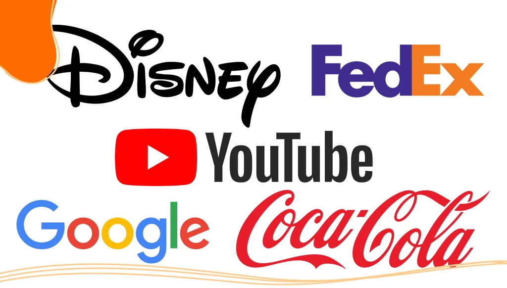
Famous Logo Font Examples
While many companies use proprietary typefaces for their logo designs, the designers often use an existing font as a jumping-off point. Here are some famous logo fonts and the inspirations behind them.
- Google: The current Google logo uses a custom-designed, geometric sans-serif font called Product Sans. Google switched from a serif-based font, Catull BQ, to a geometric sans serif for better digital adaptability and modern appeal.
- Coca-Cola: The iconic logo begins with Frank Mason Robinson, who wanted the logo to have a certain dramatic quality. He began experimenting with the Spencerian script, developing a unique handwritten font. The custom script font became a fixture for all future logo designs.
- Disney: Instantly recognizable, the iconic display font is based on Walt Disney’s signature. While the logo evolved over the years, eventually adding the Disney castle, the signature has remained relatively unchanged.
- YouTube: YouTube’s base font is Alternate Gothic No. 2. The most noticeable difference between the two fonts is that there is a red box enclosing the word “Tube.” This distinction technically means that the YouTube logo is not a wordmark, but it’s close.
- FedEx: The font in the FedEx logo is a combination Futura Bold with a bit of Univers 67 mixed in. It also features a nice, yet subtle, design element with the arrow in the negative space between the ‘e’ and the ‘x’.
Want to create an iconic logo of your own? LogoMaker‘s suite of AI-powered logo design tools makes the process easy. Craft an eye-catching professional logo in just minutes!

The Four Main Types of Logo Fonts
Most logo fonts fall into four main categories: serif, sans serif, script, and display fonts. Each has its own unique style, history, and best-use scenarios. Let’s break them down.
1. Serif Fonts
Serif fonts are the granddaddies of typography. They’re characterized by the little “feet” or lines (called serifs) at the ends of each letter. Think Times New Roman, Garamond, or Baskerville.
- Personality: Traditional, trustworthy, elegant, authoritative
- Best for: Luxury brands, law firms, financial institutions, editorial logos
- Examples: Tiffany & Co., The New York Times, Vogue
Serif fonts evoke a sense of history and sophistication. They’re perfect for brands that want to project reliability and timelessness. Modern serif fonts, such as Playfair Display or Lora, can add a fresh twist without losing their classic vibe.
2. Sans Serif Fonts
Sans serif fonts skip the little feet and go for clean, straight lines. They’re the cool, modern cousins in the font family. Examples include Helvetica, Avenir, and Montserrat.
- Personality: Modern, clean, approachable, minimal
- Best for: Tech companies, startups, lifestyle brands, web and app logos
- Examples: Google, Facebook, Airbnb, Uber
Sans serif fonts are incredibly versatile and look great on screens, making them a favorite for digital-first brands. They’re also highly readable at small sizes, which is crucial for logos that need to work everywhere from printed materials like brochures to tiny app icons.
3. Script Fonts
Script fonts are all about personality and flair. They mimic cursive handwriting or calligraphy, ranging from elegant and formal to casual and playful.
- Personality: Elegant, creative, personal, friendly
- Best for: Beauty brands, food and beverage, fashion, and personal branding
- Examples: Coca-Cola, Barbie, Instagram, Cadillac
Script fonts can add a human touch and a sense of uniqueness to your logo. Just be careful, legibility is key. Use script fonts for short brand names or as an accent, and avoid them for long or complex words.
4. Display Fonts
Display fonts are the showstoppers. They’re bold, decorative, and designed to grab attention. These fonts often feature unique styles, geometric shapes, or custom glyphs.
- Personality: Bold, unique, creative, memorable
- Best for: Entertainment, children’s brands, creative agencies, any brand that wants to stand out
- Examples: LEGO, Toys R Us, Fender
Display fonts are perfect for making a statement, but they should be used with care. Too much flair can hurt readability, so balance it with simpler elements or use it for short, punchy wordmarks.
Typeface Classification: Beyond the Basics
While the four main types cover most logo needs, there’s a whole universe of typeface classifications and font families out there. Here are a few you’ll encounter:
- Grotesque Sans Serifs: Early sans serif fonts like Akzidenz-Grotesk date back to the late 1800s. These fonts come with a slightly quirky, vintage feel.
- Geometric Sans Serifs: Fonts like Futura and Poppins, built from geometric shapes, offering a clean, modern look.
- Humanist Sans Serifs: More organic, with subtle variations in stroke width, think Gill Sans or Calibri.
- Slab Serif: Serifs with thick, blocky “slabs” at the ends, like Rockwell or Courier. They’re bold and a bit retro, great for brands wanting to make a strong impression.
- Handwritten Fonts: Mimic real handwriting for a casual, approachable vibe, ideal for brands that want to convey a personal and unique feel.
How to Choose the Right Font for Your Logo
With so many different font types and styles, how do you pick the right one? Here’s a step-by-step guide to choosing fonts that fit your brand and project:
1. Know Your Brand Personality
Is your brand modern or traditional? Playful or serious? Luxurious or affordable? The font you choose should instantly communicate your brand’s personality.
- Modern and minimal: Go for sans serif fonts like Helvetica, Avenir, or Montserrat.
- Traditional and trustworthy: Try serif fonts like Garamond, Baskerville, or Times New Roman.
- Creative and friendly: Script or handwritten fonts like Pacifico, Satisfy, or Caveat.
- Bold and unique: Display or decorative fonts like Bodoni, Didot, or custom typefaces.
2. Consider Your Audience
Who are you trying to reach? Younger audiences may respond better to bold display fonts or playful scripts, while older or more professional audiences might prefer classic serifs or clean sans serifs.
3. Prioritize Readability & Legibility
No matter how cool a font looks, if people can’t read it, it’s not doing its job. Test your logo at different sizes and on various backgrounds to ensure it’s always clear and legible.
4. Think About Versatility
Your logo will appear everywhere—from web to print, social media to signage. Choose a font family with multiple weights and styles so you can adapt as needed. Google Fonts is a great resource for free fonts with wide language and Unicode character support.
5. Make it Unique, But Don’t Overdo It
A unique font can help your brand stand out, but too much flair can hurt your message. Strike a balance between originality and clarity. Customizing a font or tweaking glyphs can give your logo a unique style without sacrificing readability.
6. Aim for Timelessness
You don’t want to pick a font that will seem dated in just a few years, so look for fonts that seem timeless. Robin Nicholas, the long-standing director of typography at Monotype UK and one of the minds behind the Arial font, had this to say in a 2012 interview with Eye Magazine about how certain fonts become dated while others don’t:
“Typefaces age. Rockwell looks so old-fashioned to me. As soon as I see it, I’m back in the 1930s again. Things like Helvetica transcend an era.”
7. Pair Fonts Thoughtfully
If your logo uses more than one font (for example, a wordmark with a tagline), make sure they complement each other. Pair a bold display font with a simple sans serif, or a classic serif with a modern sans for contrast and hierarchy.
Best Fonts for Logos: Our Favorite Fonts & Why They Work
Ready for some inspiration? Here are some of the best fonts for logos, along with examples and descriptions of their unique styles.
Best Sans Serif Fonts
- Helvetica: The gold standard for clean, modern design. Used by brands like Panasonic, Toyota, and Microsoft.
- Avenir: Geometric, versatile, and warm. Great for tech and lifestyle brands.
- Montserrat: Highly legible and contemporary, inspired by urban signage.
- Futura: Futuristic and geometric, perfect for innovative brands.
- Roboto: Friendly and approachable, with excellent readability on screens.
Best Serif Fonts
- Garamond: Elegant, traditional, and refined—ideal for brands that want to convey history and sophistication.
- Baskerville: Sophisticated and timeless, with a touch of luxury.
- Playfair Display: Modern take on classic serifs, great for progressive brands.
- Times New Roman: The classic newspaper font, reliable and authoritative.
- Abril Fatface: Bold and confident, perfect for brands that want to make a statement.
Best Script & Handwritten Fonts
- Pacifico: Playful, casual script with a retro vibe.
- Satisfy: Elegant yet relaxed, great for beauty and lifestyle brands.
- Brush Script: Classic script, used in retro and vintage logos.
- Allura: Elegant and formal, perfect for luxury or wedding brands.
- Caveat: Whimsical handwritten font, adds a personal touch.
Best Display & Decorative Fonts
- Bodoni: High contrast, dramatic, and stylish—favored by luxury and fashion brands.
- Didot: Elegant and modern, with a timeless feel.
- Avant Garde: Geometric and bold, great for creative industries.
- Neutraface: Modern and architectural, perfect for brands wanting a sleek look.
- Lobster Two: Fun and decorative, ideal for playful brands.
Best Slab Serif Fonts
- Courier New: Classic typewriter style, adds a vintage touch.
- Arvo: Modern slab serif, great for brands wanting to stand out.
Free Fonts & Where to Find Them
You don’t have to break the bank to get great logo fonts. Google Fonts offers hundreds of free fonts, including many that support Unicode characters, Cyrillic, and other scripts. Some favorites include:
- Poppins: Geometric sans serif, versatile and modern.
- Libre Baskerville: Classic serif with a modern twist.
- Quicksand: Rounded sans serif, friendly and approachable.
- Work Sans: Clean and neutral, perfect for professional logos.
Adobe Fonts and other resources also offer a wide selection of free and premium fonts for every style and project.
Tips for Customizing & Using Logo Fonts
- Kerning: Adjust the space between letters for balance and visual appeal. Good kerning can make a wordmark logo look polished and professional.
- Weight and style: Experiment with bold, light, italic, or condensed styles within a font family to create hierarchy and emphasis.
- Glyphs and Unicode characters: Many fonts offer special symbols, alternate characters, and Unicode support—great for adding unique elements or supporting multiple languages.
- Geometric shapes: Incorporate geometric elements or lines into your logo for a modern, structured look.
- Printed materials vs. web: Test your logo on both screens and printed materials to ensure it looks great everywhere.
Conclusion
Choosing the right font for your logo is a strategic move that shapes how the world sees your brand. Whether you go for the timeless elegance of a serif, the modern clarity of a sans serif, the personality-packed script, or the eye-catching display font, your choice should reflect your brand’s unique style and message.
LogoMaker‘s easy-to-use interface allows you to explore different font types, experiment with styles, and customize fully until you’re totally satisfied. Start today and create a logo that will help your brand leave a lasting mark.

FREQUENTLY ASKED QUESTIONS
What are the four main types of fonts for logos?
Serif, sans serif, script, and display fonts are the four main types. Each brings a unique style and personality to your logo.
How do I choose the right font for my logo?
Consider your brand personality, audience, and the message you want to convey. Prioritize readability, versatility, and uniqueness. Test your logo at different sizes and on various backgrounds to ensure clarity.
Can I use free fonts for my logo?
Absolutely! Google Fonts and Adobe Fonts offer many high-quality free fonts suitable for logos. Just check the license to ensure commercial use is allowed.
What’s the difference between a font and a font family?
A font is a specific style and weight (Arial Bold), while a font family includes all styles and weights of a typeface (Arial Regular, Arial Italic, Arial Bold).
Are display fonts good for logos?
Display fonts can make your logo stand out and add personality, but use them carefully. They’re best for short, punchy wordmarks and should always be legible.
Should I use more than one font in my logo?
You can, but keep it simple. Pair fonts that complement each other and maintain visual hierarchy. For example, a bold display font for the main name and a simple sans serif for a tagline.
What are some popular sans serif fonts for logos?
Helvetica, Avenir, Montserrat, Futura, and Roboto are all popular choices for their modern, clean look and versatility.
What font styles work best for luxury brands?
Elegant serif fonts, such as Bodoni, Didot, and Garamond, are often used by luxury brands for their sophisticated and timeless appeal.
How important is kerning in logo design?
Proper kerning ensures your logo looks balanced and professional. Poor kerning can make even the best font look awkward.