When you think of iconic brands like NASA, H&M, or IKEA, what do they all have in common (besides being global giants)? Yup, you (probably) guessed it: their logos are in uppercase.
There’s something undeniably bold about an all-caps logo. It grabs attention, screams confidence, and delivers instant impact. But what is it about uppercase typography that makes such a statement? And when should your brand consider going all-in on capital letters?
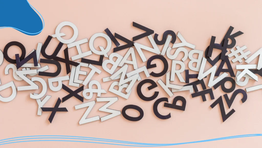
Let’s explore the power of uppercase logos and how bold typography can elevate your brand identity like never before.
- Why Typography Matters More Than You Think
- The Bold Statement of Uppercase Logos
- Sans Serif: The MVP of Uppercase Typography
- Serif Fonts in All Caps? Yes, Please!
- Script & Cursive Logo Fonts: Use Uppercase Sparingly
- The Psychology of Uppercase in Branding
- Font Selection Tips for Uppercase Logos
- When to Choose an Uppercase Logo
- Real-World Examples of Uppercase Typography Done Right
- Uppercase Logos in the Digital Age
- Sustainability, Elegance & the Font Factor
Why Typography Matters More Than You Think
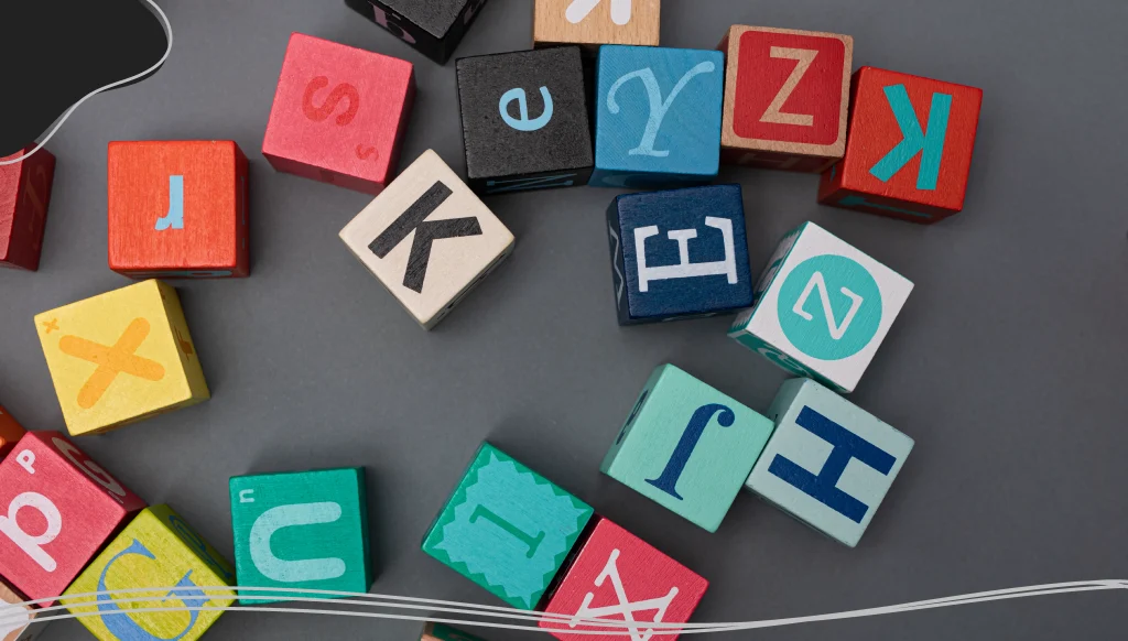
Typography isn’t just about pretty letters; it’s the voice of your brand in visual form. Your choice of logo font—whether it’s serif, sans serif, or a playful script font—says a lot before your brand even says a word.
Think of it like the outfit your company wears to make its first impression.
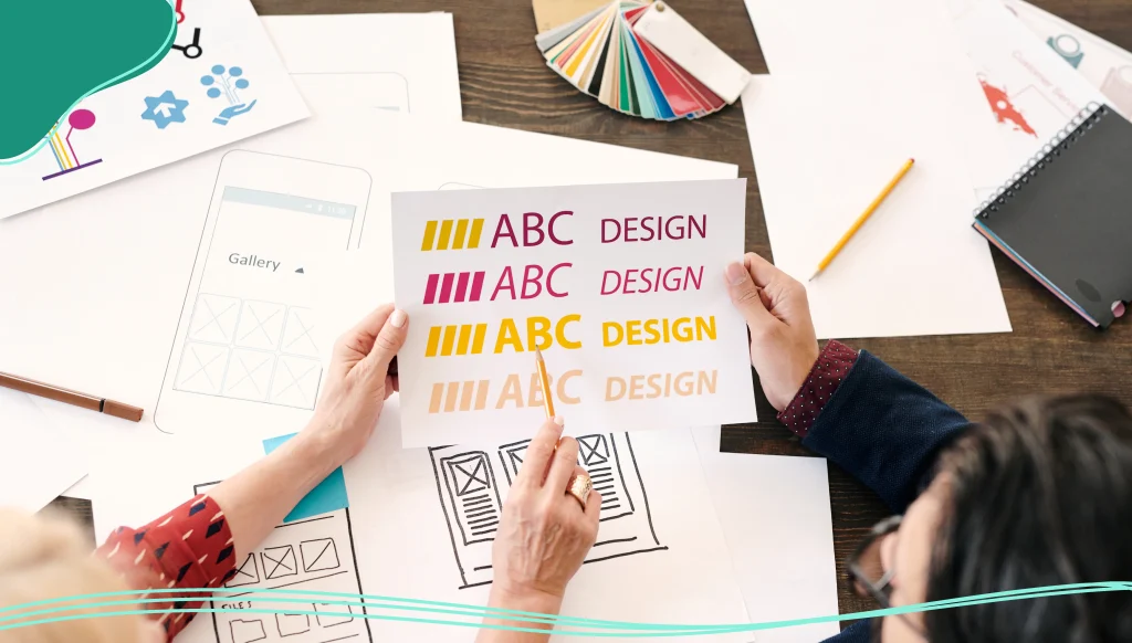
Typography plays a huge role in graphic design and logo design, affecting everything from legibility to brand recognition. That’s why font selection is more than just picking what “looks nice”—it’s about choosing the right fonts that reflect your brand personality, values, and target audience.
The Bold Statement of Uppercase Logos
Uppercase logos do one thing really well: they shout (in a good way). An all-uppercase logo says, “Hey! Look at me!”—and that’s sometimes exactly what a brand needs.
Here’s why uppercase letters pack a punch:
- Clarity and legibility: Uppercase letters tend to have more uniform shapes, making them easier to read, especially in small sizes or on digital screens.
- Strength and authority: They exude power, confidence, and professionalism. It’s why so many luxury brands and corporations favor them. This clean, powerful aesthetic has roots in classic Modernist design, which prioritized function and clarity above all else.
- Versatility: Uppercase logos work well across platforms—whether on a billboard, app icon, or embroidered on a hat.
- Minimal design, maximum impact: When paired with a simple sans serif or geometric typeface, uppercase logos feel clean, modern, and refined.
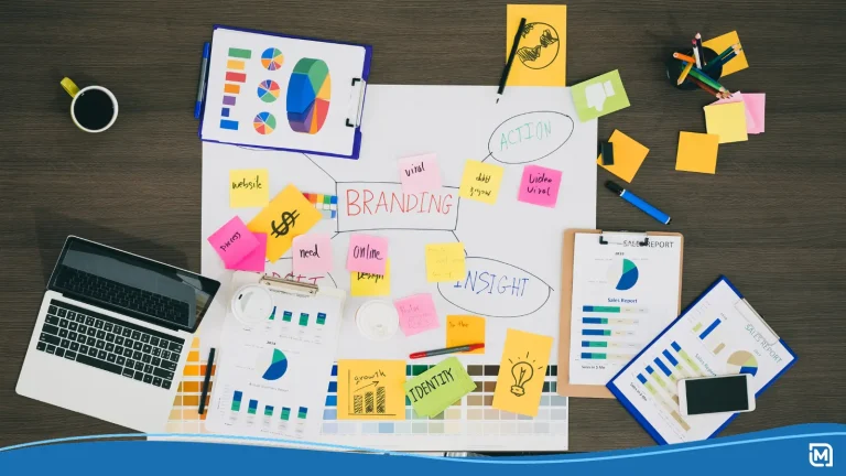
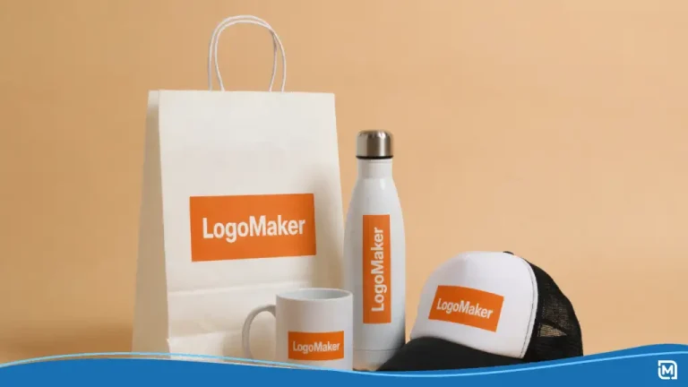
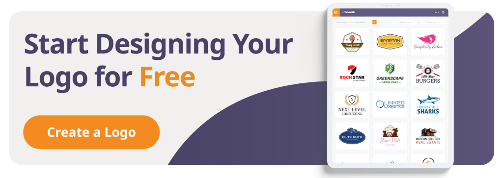
Online logo design tools, like LogoMaker, allow you to have full control over your font selection. Customize your logo font and unleash the full potential of uppercase logos.
Sans Serif: The MVP of Uppercase Typography
When it comes to choosing fonts for uppercase logos, sans serif fonts often steal the show. These fonts are sleek, modern, and free of the decorative tails you find on serif typefaces.
Why do designers love them?
- Clean lines for a modern feel
- Better scalability across sizes
- Works well in digital branding and web design
- Pairs easily with other fonts for taglines or slogans
Think of fonts like Helvetica, Futura, or Gotham. These are modern logo fonts that feel bold without trying too hard. They’re especially effective in uppercase because their simplicity allows the shape of the letterforms to shine. It’s this blend of minimalism and strength that has led many major tech and fashion brands to adopt similar styles, a trend some in the design world call “blanding” for its uniform, digital-first approach.
Serif Fonts in All Caps? Yes, Please!
Although sans serif gets most of the uppercase spotlight, don’t count out the serif logo fonts. Think a classic serif can’t feel powerful in all caps? Think again. A serif typeface in all caps can look striking, combining the authority of uppercase with the elegance of serifs.
For instance, a slab serif in uppercase (like Rockwell) can create a strong, retro-inspired vibe. Meanwhile, thinner serif styles like Didot or Bodoni exude luxury, making them perfect for fashion, editorial, or upscale lifestyle brands.
Just remember: not all serifs play well in uppercase. Look for display fonts that are designed to maintain legibility and personality even when capitalized.
Script & Cursive Logo Fonts: Use Uppercase Sparingly
Here’s the thing: script fonts and cursive logo fonts often rely on the flow of lowercase letters to achieve their charm. So, going full uppercase can kill the vibe.
However, you can still combine logo fonts by using a bold uppercase sans serif for the main name and a stylish script for a tagline or descriptor. This creates contrast while allowing both fonts to shine.
Font pairing tip: Match a statement font in uppercase with a softer script font for a luxurious but approachable feel.
The Psychology of Uppercase in Branding
Every typeface carries emotional weight, but uppercase logos come with their own set of psychological effects. Here’s what you’re communicating when you use all caps:
- Confidence: Your brand isn’t whispering—it’s making an announcement.
- Consistency: All caps mean uniformity. That often translates to reliability.
- Impact: Uppercase is louder, stronger, and bolder. It feels intentional.
- Modernity: Especially with sans serif typefaces, uppercase logos scream “contemporary.”
This is why uppercase logos are popular in sectors like fashion, tech, fitness, and luxury industries that value strong first impressions.
Font Selection Tips for Uppercase Logos
Choosing the perfect font for your uppercase logo isn’t about trends; it’s about alignment with your brand identity. Here are a few quick tips:
- Test for legibility: Zoom out. Shrink it down. If your uppercase logo still reads clearly at tiny sizes, it’s a keeper.
- Master your spacing: A professional logo isn’t only typed, it’s crafted. Pay close attention to the tracking (the overall spacing between all letters) and kerning (the space between specific letter pairs). Well-spaced uppercase letters look intentional and refined.
- Think about vibe: Is your brand aiming for a glamorous vibe, a sustainable vibe, or an upscale look? The right font will reflect that.
- Avoid over-stylization: Ultra-thin fonts or overly decorative serifs can lose impact in uppercase.
- Use font pairs thoughtfully: Don’t let your uppercase font overpower your subtext or slogan. Balance is key.
- Customize where needed: Sometimes tweaking a single letter—or creating a monogram—can elevate your logo from generic to unforgettable.
When to Choose an Uppercase Logo
Uppercase logos are not one-size-fits-all. Here’s when going all caps makes sense:
- Short brand names: A four-letter name in uppercase (think LEGO or VISA) packs a punch.
- Tech companies: Clean, uppercase sans serif logos convey innovation and trust.
- Fashion and lifestyle: All caps deliver elegance and sophistication.
- Fitness brands: Power, strength, and high-energy? Uppercase has you covered.
- Editorial brands: Magazines and blogs benefit from the attention-grabbing nature of uppercase.
That said, if your brand skews warm, personal, or artisanal, lowercase or mixed-case might better express that intimacy.
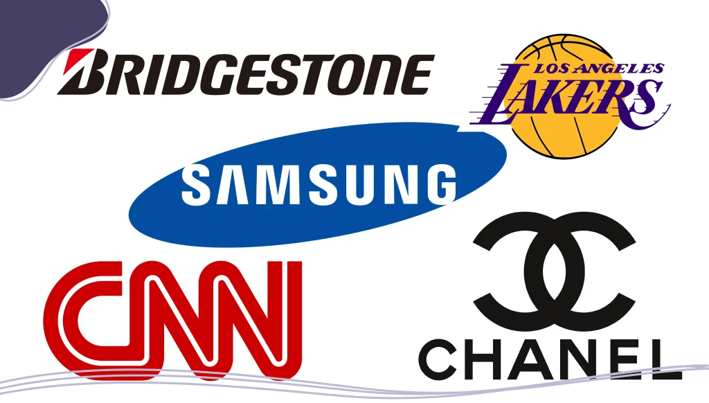
Real-World Examples of Uppercase Typography Done Right
Let’s take a peek at some brands that use uppercase logos effectively:
- NASA: The blocky, space-age look of the logo reflects precision and technological prowess.
- H&M: Bold, energetic, and fashion-forward.
- IKEA: Friendly but powerful. The uppercase blue and yellow combo is instantly recognizable.
- ZARA: High-fashion serif letters in all caps—effortlessly elegant.
Each of these logos uses uppercase to align with what the product represents and the target market they’re aiming for.
Uppercase Logos in the Digital Age
In a world dominated by screens, uppercase logos offer a serious advantage in terms of readability and brand recognition. On apps, websites, social media, and even smartwatch screens, all-caps logos hold their shape and don’t blur into illegibility.
Uppercase typography also pairs beautifully with minimalist web design. When used with contemporary typefaces and bold whitespace, it delivers a clean, confident message.
Even better? It scales beautifully, so whether your logo is on a phone or a billboard, it keeps its impact.
Sustainability, Elegance & the Font Factor
Want your brand to scream eco-chic or timeless glamour? Your uppercase logo can help set the tone. Combine the right typeface with thoughtful design, and you’ll strike the perfect balance.
- For a sustainable vibe: Try geometric sans serif typefaces like Avenir or Circular, especially in earthy tones or green palettes.
- For a glamorous vibe: Elegant serif logo fonts like Didot or Playfair Display in uppercase can convey opulence.
The trick is to choose fonts that reflect the essence of your brand, not just what’s trending.
Conclusion: Go Big, Go Bold, Go Uppercase
At the end of the day, an uppercase logo is more than just capital letters—it’s a declaration. It tells your customers who you are before you say a single word. Whether you’re creating a new typography logo or refreshing an old one, uppercase can give your brand that bold, unforgettable edge.
But don’t forget—power comes with responsibility. Your choice of logo font (be it sans serif, serif, script, or display) must align with your brand personality and speak directly to your target market. The magic happens when design, readability, and purpose come together.
So, if you’re ready to stop whispering and start shouting your brand’s value from the rooftops, an all-caps logo might just be your most powerful asset. Go ahead—make your statement!
Creating eye-catching uppercase logos using LogoMaker’s AI-powered suite of logo design tools that make the process easy even for non-designers. Get started now and create your logo in minutes!

FREQUENTLY ASKED QUESTIONS
Is an uppercase logo better than a lowercase one?
Not necessarily—it depends on your brand’s tone. Uppercase logos are bold, professional, and strong. Lowercase logos can feel friendly, casual, and modern.
Are sans serif fonts better for uppercase logos?
Generally, yes. Sans serif fonts tend to be more readable and modern when used in all caps. But stylish serif or slab serif fonts can also look stunning with the right design.
Can I use a script or cursive font in all caps?
It’s tricky. Script fonts are usually meant to flow, which gets lost in all caps. If you use a cursive logo font, stick to sentence case or use it in combination with a bold sans serif.
What’s the best way to choose the right font for a logo?
Think about your brand’s personality, your target audience, and where the logo will appear. Always test fonts for legibility and scalability. If needed, customize your letters for a more unique look.
Can I mix uppercase with lowercase in a logo?
Absolutely. Some brands mix cases for stylistic contrast. Just ensure that the font pairs you choose don’t compete for attention.
Are uppercase logos considered modern or traditional?
Uppercase logos can be either, depending on the typeface you choose. A sans serif or geometric font in all caps leans modern and minimal, while an elegant serif typeface in uppercase can look timeless and traditional. It’s all about the font style, color palette, and overall logo design.
Do uppercase logos work for every industry?
Not necessarily. Uppercase logos are great for industries where boldness, strength, or professionalism are key, like fashion, fitness, tech, and luxury goods. But for brands that want to appear friendly, creative, or handmade (like bakeries or children’s products), a softer, lowercase approach may resonate more with the target audience.
Can uppercase logos still feel unique?
Absolutely. Even if you’re using all caps, you can customize the letters, tweak curves, combine different fonts, or incorporate an icon or monogram. Don’t be afraid to create a new typography logo that feels distinctly yours.
Is all-caps ever a bad choice for logos?
It can be, especially if you’re using fonts that are too thin, too stylized, or hard to read in uppercase. Legibility is essential. Also, all caps can come off as aggressive if not balanced correctly, especially in industries where warmth and friendliness are key brand values.
What’s the best font for an uppercase logo?
There’s no single “best font,” but some tried-and-true best logo fonts for all-caps include:
- Helvetica: Clean and iconic.
- Futura: Geometric and modern.
- Montserrat: Rounded and friendly.
- Gotham: Bold and professional.
- Playfair Display: Elegant and serif-stylish.
The perfect font depends on your company name, brand identity, and how you want customers to feel.
Can I use a display font for an uppercase logo?
Yes! Display fonts are made to stand out, which can work beautifully in uppercase. Just make sure they’re still readable at small sizes. Pairing a display font with a subtler secondary font for a tagline is a smart move.
How do I make sure my uppercase logo stands out?
To ensure your uppercase logo pops:
- Choose a bold statement font.
- Keep the design simple and uncluttered.
- Pay close attention to letter spacing (tracking and kerning) so it looks polished.
- Make sure the color contrast works well across platforms.
- Test your logo across print, web, and mobile.
- Consider adding a small symbol, icon, or letter design tweak for a signature look.