When you’re strolling through the snack aisle at your local grocery store, what’s the first thing that catches your eye? Is it the bold colors, the quirky fonts, or maybe that friendly cartoon mascot waving at you from a chip bag? Welcome to the deliciously visual world of snack logos, where food brands use smart, strategic design to make us crave their goodies before we’ve even tasted them. Snack logos are actually a subset of food logos, which cover the broader category of branding for all types of food products.
From iconic chip brands to irresistible candy packaging, logos aren’t just a pretty face for products. They’re silent salespeople whispering, “Pick me!” in the most appetizing way possible. Whether you’re looking to create your own food logo or you’re just curious about how snack brands hook us, this article’s for you.
So grab your favorite bag of something crunchy (we won’t judge), and let’s explore how food brands design logos that are impossible to resist.
- Why Snack Logos Matter More Than You Think
- What Makes a Snack Logo So Effective?
- From Sketch to Shelf: How to Create Your Own Food Logo
- Big Snack Brands Who’ve Nailed Their Logos
- Why the Right Logo Is Worth It
- Tips from Professional Designers: Snack Logo Dos & Don’ts
- Love at First Bite: How Customers Connect with Logos
- A Logo You Can Grow With
Why Snack Logos Matter More Than You Think
Here’s the thing: when it comes to food, especially snacks, we eat with our eyes first. Before a single bite is taken, your brain is already forming opinions based on what you see on the packaging. And at the heart of that visual impact is the logo.
Snack logos do more than identify a brand. They communicate personality, flavor, emotion, trust, and can even reflect the quality of service a snack business provides—all in just a few seconds. That’s not by accident. Behind every iconic food logo, there’s usually a team of professional designers, marketers, and even psychologists working together to make sure you feel something when you look at it.
Want to look fun and playful? Think bold colors and rounded fonts. Going for healthy and organic? You’ll probably see greens, handwritten scripts, and earthy tones. It’s all part of the branding magic.
What Makes a Snack Logo So Effective?
You don’t need to be a designer to recognize when a snack logo works. The best ones stick with you—they’re easy to remember, instantly recognizable, and make you want to dive into the bag. But what goes into that kind of success?
Here are a few tasty ingredients:
1. Bold Typography That Pops
From Frito-Lay to Doritos, snack logos often use bold, custom typefaces that are hard to ignore. Strong lettering ensures visibility even from a distance, which is perfect when your logo needs to stand out on crowded shelves.
2. Mouthwatering Color Palettes
Color plays a HUGE role in food marketing. Red and yellow are the go-to combo because they stimulate the appetite and grab attention. That’s why so many snack brands rely on these hues.
3. Playful or Trustworthy Imagery
Some logos feature mascots or illustrations (hello, Pringles guy), while others go for clean and minimalistic looks. What’s important is that the imagery connects with the company’s target audience.
4. Consistency Across the Board
The best snack logos appear not just on packaging, but on websites, social media, and even vending machines. Consistent branding helps people instantly recognize and love their favorite snacks.
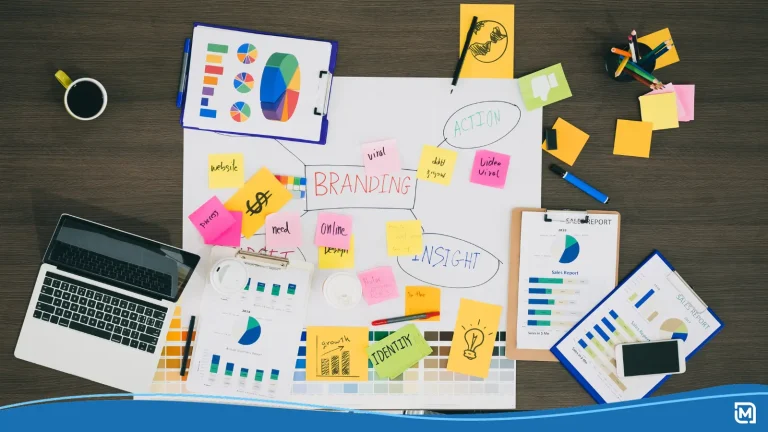
From Sketch to Shelf: How to Create Your Own Food Logo
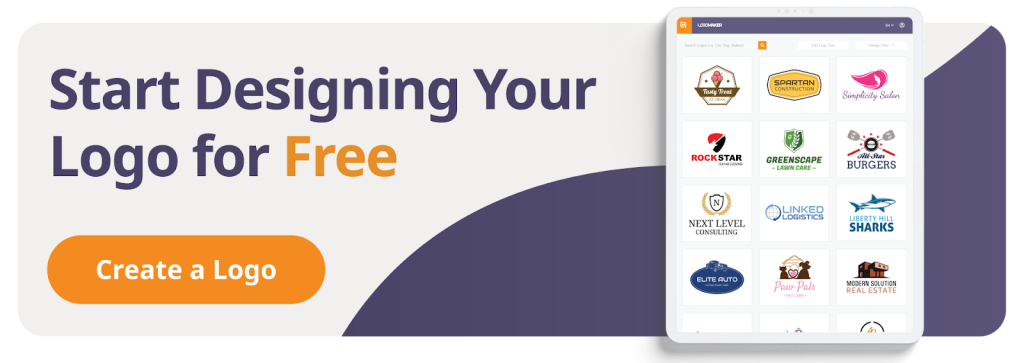
So, maybe you’re a small business owner ready to take your snack brand to the next level. Or maybe you’re dreaming of launching your own granola bar empire. Either way, designing your own food logo is a big step, but it doesn’t have to be scary.
With today’s tech tools, it’s easier than ever to access a food logo maker that lets you get started in minutes. These platforms are great for customizing fonts, colors, and icons until you find the perfect combo for your brand.
Creating Your Own Food Logo
Here’s how to get your snack logo up and running:
- Browse for inspiration: Look at what your competitors are doing. What works? What doesn’t?
- Choose your vibe: Is your snack fun? Fancy? Family-friendly? Let that guide your design choices.
- Customize your logo: Use a food logo maker to tweak fonts, colors, and shapes. Many services let you create and edit for free.
- Remove the background: For a sleek, modern look, consider removing the background so your logo can shine across all platforms.
- Add your personal touch: Whether it’s a quirky icon or your signature, don’t forget to make it yours. Try adding a tagline or a unique design element to further enhance your logo and make it stand out.
Once you’ve customized several options, you can easily finalize your logo by selecting your chosen design that best fits your brand. This makes the decision-making process quick and straightforward.
If you need help creating your food logo, LogoMaker’s AI-powered suite of logo design tools and intuitive interface make the process as simple as possible!
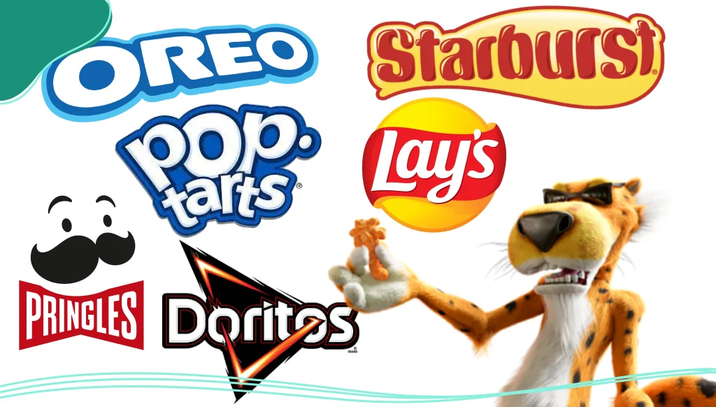
Big Snack Brands Who’ve Nailed Their Logos
Let’s take a look at a few snack logos that have stood the test of time. These brands didn’t just design logos—they created iconic symbols that consumers love and instantly remember.
1. Lay’s
That cheerful yellow circle wrapped in a red ribbon is pure sunshine. It screams happiness, flavor, and approachability. The design feels like a party, making it the perfect visual for a shareable snack.
2. Cheetos
From the chaotic, graffiti-style font to the iconic Chester Cheetah mascot, the Cheetos logo screams bold and mischievous—a perfect reflection of the snack itself. It promises a wild flavor experience, and the design delivers on that promise.
3. Oreo
This food logo is a masterclass in timeless design. The custom, elegant typography inside the iconic blue oval feels both retro and modern. It’s simple, memorable, and has become synonymous with the “twist, lick, dunk” ritual known the world over.
4. Pop-Tarts
Funky lettering, bright colors, and a whimsical feel—Pop-Tarts has always leaned into its fun, kid-at-heart vibe.
These logos aren’t just nice to look at—they work because they align perfectly with the flavor, audience, and brand personality of the product.
Why the Right Logo Is Worth It
Here’s where it all comes together. Your logo is more than a cute design; it’s the face of your snack business. It tells customers what they can expect, and it helps build trust and brand loyalty. A good logo can turn curious buyers into lifelong fans.
In a world where people are bombarded with choices, the brands that win are the ones with strong visual identities. That means if you’re serious about your snacks, it’s time to get serious about your logo too.

Tips from Professional Designers: Snack Logo Dos & Don’ts
Want some insider advice? Here are tips from professional designers who’ve helped launch food brands from scratch.
Do:
- Keep it simple. The best logos are clean and uncluttered.
- Use colors that reflect your snack’s personality.
- Make sure it looks good in black and white too (just in case).
- Think about how it will appear on social media, bags, and websites.
- Test it on people! Feedback is your best friend.
Don’t:
- Copy other logos. Originality matters.
- Overdo the fonts. One or two is enough.
- Use clipart that looks generic or dated.
- Forget about scalability. Your logo needs to work on everything from a giant banner to a smartphone screen.
Love at First Bite: How Customers Connect with Logos
Here’s a little psychology for dessert: studies show that customers form opinions about a brand within 90 seconds of interacting with it. And up to 90% of that judgment is based on visual cues alone. That’s huge.
A great snack logo creates an emotional connection. It might remind someone of after-school treats, road trips, or midnight munchies. When done right, a snack logo doesn’t just sell a product—it sells a feeling.
A Logo You Can Grow With
Your logo isn’t just for now—it’s something your snack company will grow with. Think long-term. Will this design still feel fresh in five years? Can it adapt as your product line expands?
That’s why many successful snack brands revisit their logos every few years—not to completely change them, but to customize, refine, and modernize them to stay current.
Whether you’re just getting started or already making snack waves, your logo deserves regular check-ins to make sure it still aligns with your vision.
Final Crunch: Your Logo Is Your Most Valuable Asset
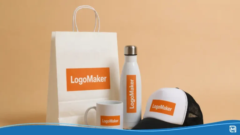
In the crowded, chaotic, and crave-worthy world of snacks, your logo is your superpower. It’s the thing that makes people stop, smile, and toss your product into their cart. And with all the tools available today—from free food logo maker services to professional design platforms—it’s easier than ever to create something you’re proud of.
So take your time. Browse for inspiration, sketch a few ideas, and don’t be afraid to stand out. Your snack deserves to shine—and your logo is how it starts.
Create a captivating food logo in minutes with LogoMaker’s AI-powered logo maker. Customize each element of your logo and start seeing immediate results!

FREQUENTLY ASKED QUESTIONS
What makes a good snack logo?
A good snack logo is simple, memorable, and visually appealing. It should reflect your brand’s personality and be versatile across different platforms like packaging, websites, and social media.
Can I design my own food logo for free?
Yes! There are many free tools and food logo maker platforms online that let you create and customize logos in seconds. Many of these platforms offer inspiration and templates for food logos, making it easy to get started. LogoMaker’s online logo maker offers hundreds of options for you to choose from, allowing you to create a logo for your business or startup in minutes.
Do I need to hire a professional designer?
Not necessarily. If you’re just starting out, DIY tools are great. But if you want a high-level, polished look that’s totally unique, working with a professional or design team can be a great investment.
How can I make sure my logo stands out?
Focus on a unique concept, use bold yet relevant colors, and keep the design simple and clean. Also, test your design on real people to see how they react!
What are some common mistakes to avoid?
Avoid copying other logos, using too many fonts, and making your design too complex. Also, don’t forget to create a version with a transparent background for better versatility.
How do I choose colors for my snack logo?
Think about what emotion you want to convey. Red and yellow are great for excitement and appetite, while green might signal health. Let your snack’s personality guide you.
Can I update my logo later?
Absolutely. Many brands evolve their logos over time. Just make sure any changes still feel familiar to your customers.