Rebranding is not for the faint of heart. You’ve spent years, maybe decades, building up your brand and forming a loyal customer base. Going through a rebrand could mean losing all of that progress. What if your customers don’t connect with your new identity? What if the relaunch falls flat? What if the effort of rebranding doesn’t lead to any new business growth? These are all valid concerns, but sometimes, a rebrand is just what your business needs to get out of a rut and take a step to the next level.
When done right, a successful rebrand can breathe new life into a company, spark insane sales growth, and make a brand feel fresh, relevant, and ready for a new era. While challenging, rebranding is a natural step in the evolution of many businesses. According to Landor, 74% of the S&P 100 companies have rebranded within their first seven years of operation—underscoring how essential rebranding is in achieving long-term impact.
In this article, we’ll explore what rebranding means and how to execute a worthwhile rebrand. We’ll also look into how some of the most famous brands in the world handled their rebrands and what we can learn from them.
- What Is Rebranding?
- Reasons for Rebranding
- The Main Elements of a Successful Rebrand
- Top 10 Successful Rebranding Examples
- When Should You Consider a Rebrand?

What Is Rebranding?
Rebranding is a process of changing a company’s brand identity, including its logo, name, and messaging, to stay relevant and competitive in a changing market. The purpose of rebranding is to create a new brand image that appeals to a new target audience, addresses brand problems, or modernizes the brand’s visual aesthetic.
One of the best descriptions of rebranding comes from the AMC show Mad Men. The show’s main character, Don Draper, is an advertising executive working in the 1960s who frequently produces profound quotes that relate to advertising just as much as they do to real life. In relation to public perception and branding, Draper says:
“If you don’t like what’s being said, change the conversation.”
This is a perfect encapsulation of what rebranding is all about. If you don’t like the way your brand is being perceived, then change things up and take control of your own narrative.
Reasons for Rebranding
Rebranding is a bold move—but it’s often a necessary one. Businesses choose to go through a rebranding process for all kinds of reasons, and it’s rarely just because they want a new logo.
Here are some of the biggest reasons why a company might decide to hit the refresh button:
1. Staying Relevant in a Changing Market
Consumer tastes change. Technological advancements shake up industries. What was cool or cutting-edge five years ago might feel dated today. A brand refresh helps companies stay aligned with younger consumers and modern expectations.
2. Reflecting a Company’s Growth or Shift
As companies expand their service offerings, enter new markets, or pivot their focus, the original brand identity might no longer fit. A rebranding strategy can reflect a company’s shift toward new goals or a broader mission.
3. Reaching a New Demographic
Maybe you’ve mastered one market and now you want to appeal to a new demographic. A fresh brand aesthetic and updated brand messaging can help attract and resonate with new groups of customers.
4. Differentiating from Competitors
In crowded industries, blending in is the fast track to getting overlooked. A new brand identity can help sharpen your positioning and create a brand image that’s unforgettable.
5. Fixing a Damaged Reputation
Sometimes, a brand has to move on from past missteps. A well-planned rebrand can help repair brand sentiment, allowing a company to start fresh and rebuild trust with customers.
6. Outgrowing Your Old Logo or Name
Your original logo and company name might have served you well when you were a scrappy startup—but now? Not so much. A logo change or renaming can give your brand the polish and professionalism it needs for the next stage of growth.
If you feel that you’ve outgrown your current company logo, LogoMaker is here to help! With thousands of fully customizable logo templates and a suite of AI-powered design tools, you can have an amazing new logo design in just minutes!

The Main Elements of a Successful Rebrand
Pulling off a successful rebrand requires a great deal of thought and planning. It’s all about creating a complete, authentic transformation that still feels true to your brand’s roots. The last thing that you want to do during a rebrand is alienate your existing customer base. You need to make deliberate decisions that elevate your brand while maintaining recognizability.
Here are the key elements that make or break a rebrand.
A Clear Brand Strategy
Before anything else, you need a rock-solid brand strategy. Understand your company’s vision, your target audience, your core values, and what makes your brand stand apart from the competition. This strategic foundation will guide every creative decision you make.
A New (but Recognizable) Visual Identity
Whether it’s a new logo, a modernized color palette, or a custom typeface, your new visual identity should feel fresh but still recognizable to existing customers. If people can’t tell it’s still you, you might lose precious brand loyalty.
Consistent Brand Messaging
Every piece of communication, from your Instagram captions to your product packaging, should reflect the same voice and tone. Updated brand messaging ensures you’re telling a consistent, compelling brand story across all touchpoints.
Updated Brand Guidelines
Brand guidelines are your blueprint for consistency. They define how your brand logo, marketing materials, typography, imagery, and messaging should look and sound. Good guidelines make it easy for everyone in your company to stay on brand.
Customer-Centric Approach
Your rebrand should reflect what your customers care about today, not just what your company has changed internally. Pay attention to consumer preferences and use feedback loops to stay connected with your audience’s evolving needs.
Alignment Across All Platforms
A rebranding process isn’t finished until your new brand shows up everywhere: your website, your social media profiles, your business cards, your app icon, and any other marketing materials. A scattered rebrand creates confusion and damages brand recognition.
Launching With a Strong Marketing Campaign
Don’t just quietly swap out your old logo and hope people notice. Plan a loud, proud marketing campaign that explains the “why” behind your rebrand. This builds excitement, trust, and a sense of inclusion among both loyal customers and new customers.
Top 10 Successful Rebranding Examples
Rebranding happens all of the time. Some of the most famous companies in the world have gone through a rebrand or two at some point in time.
Here are the top 10 examples of companies that have done rebranding the right way.
1. Apple
Although Apple is a multi-billion-dollar behemoth today, you might be surprised to learn that in the late 90s, the company was on the verge of bankruptcy. After a string of unsuccessful launches, the once innovative brand had become stale.
In 1997, Apple founder Steve Jobs returned to the company as CEO and initiated a massive rebranding strategy that focused on minimalism, innovation, and creativity. The first thing that Jobs did was change the name from Apple Computers Inc. to just Apple Inc. This removed the limit that the company only specialized in computers. It enabled Apple to develop new and innovative products in other areas, such as the iPad, iPhone, and iPod.
Apple also dropped the rainbow-striped old logo and embraced the simple, iconic monochrome apple, which was much more futuristic and forward-leaning. They revamped their brand messaging, launched bold marketing campaigns focusing on the “Think Different” slogan and aligned their brand identity with cutting-edge technological advancements. It wasn’t just a new logo; it was a whole new brand identity that resonated with younger consumers, tech lovers, and creatives.
Key takeaway: A significant rebranding paired with an emotional brand story can completely shift brand sentiment and bring a company back from the dead.
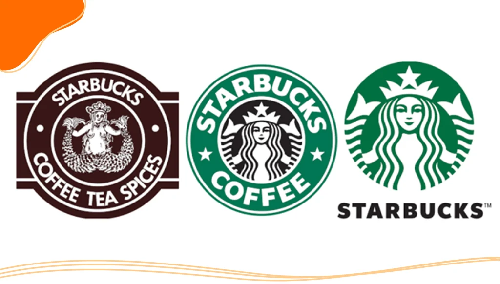
2. Starbucks
You know you’ve got strong brand recognition when you can ditch your name from your logo entirely and still be iconic.
That’s exactly what Starbucks did in 2011 during their major rebranding efforts. The original siren in the old logo was framed by the words “Starbucks Coffee.” In the redesigned version, they dropped the text and made the siren the central focus, creating a new visual style that was clean, global, and adaptable.
Starbucks wasn’t just updating its look; it was signalling a company shift. They wanted to be more than just coffee — think teas, food, and even mobile ordering. The bold move paid off, strengthening their brand equity and making them an even bigger player worldwide. What started as a small chain of coffee shops in Seattle is now a global empire with 40,199 stores worldwide.
Key takeaway: Sometimes, a logo change isn’t about changing who you are — it’s about showing how much bigger you’ve become.
3. Instagram
When Instagram replaced its beloved old logo (the cute retro camera) with a bright, abstract gradient icon, the internet was up in arms. Initially, people disliked the new logo design, arguing that the redesign stripped away the quirky character that made the older logo so cherished in favor of a more generic and sterile icon.
Despite the initial blowback, Instagram’s rebranding ended up being a very smart move. The new design matched the sleek and minimalist style that was taking over the tech world in the mid-2010s. The redesigned logo better suited the mobile-first, photo-sharing app that had evolved far beyond its humble beginnings.
Along with the logo redesign, Instagram updated its brand aesthetic—opting for a stripped-down interface that lets users’ photos take center stage. This rebranding strategy modernized the app’s look while keeping the core values intact.
Key takeaway: Just because there is initial blowback to a brand redesign doesn’t mean that you’ve made the wrong decision. It takes time for customers to acclimate to a new design language.
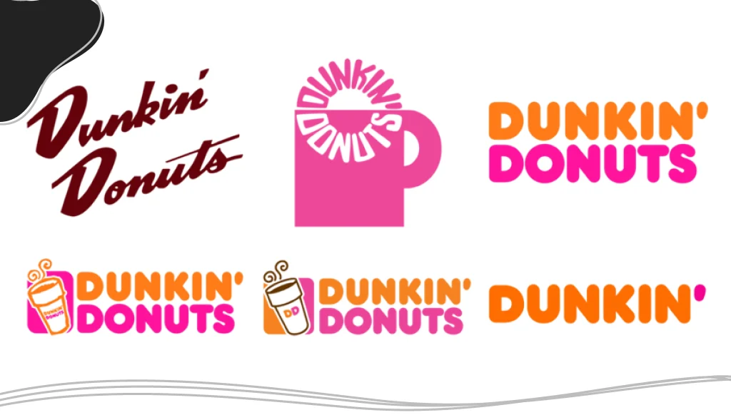
4. Dunkin’
Dunkin’ Donuts officially became just “Dunkin'” in 2018. The company name change was part of a larger brand refresh aimed at highlighting their broader service offerings—coffee, breakfast sandwiches, and an on-the-go brand vibe.
The new logo kept the recognizable pink and orange color palette and custom typeface, ensuring strong brand recognition even after the name change. Their marketing materials also leaned into the fun, fast, mobile-focused experience they wanted to deliver.
The company embraced celebrity partnerships as part of the new marketing strategy. Because of the company’s Massachusetts roots, they teamed up with popular Boston icons Ben Affleck, Matt Damon, and Tom Brady for a series of comedic Super Bowl commercials.
Dunkin’ sales have steadily gone up in the last few years. The company nailed the balance between staying true to its brand’s roots while appealing to a new demographic and younger audience.
Key takeaway: A brand refresh doesn’t mean abandoning your past; it’s about evolving with your customers. Sometimes, a small change can have a big impact.
5. Old Spice
Old Spice’s rebrand is the stuff of marketing strategy legends. Once seen as your grandpa’s go-to scent, Old Spice needed a major overhaul to connect with younger men.
In order to connect with a younger audience, Old Spice created a series of meme-like commercials. “The Man Your Man Could Smell Like” commercials starred Isaiah Mustafa, also known as the Old Spice Man, and featured direct-to-camera rapid-fire monologues promoting the benefits of using Old Spice products. These ads were a massive success and won a Primetime Creative Arts Emmy Award for Outstanding Commercial.
The shareable nature of the new commercials resulted in a massive boost in customer engagement, sales, and brand loyalty—plus a totally revitalized brand image.
Key takeaway: Understanding consumer preferences and having a killer creative team can turn an outdated brand into a cultural phenomenon.
6. Airbnb
Airbnb’s 2014 rebranding was a comprehensive effort that extended to every part of the brand, creating a unified look and feel. The center of the rebrand was the new Airbnb logo, “the Bélo.” This icon had a great story behind it. The image was created using symbols that represent people, places, and love, along with the letter A, which stands for Airbnb.
The new logo was paired with the “Belong Anywhere” marketing campaign that illustrated the wide reach that Airbnb had across the world. This was a strategic rebranding process centered around brand story and community. Airbnb wasn’t just a company about renting places, it was about helping people feel like they belong anywhere in the world.
Key takeaway: A great rebranding strategy should connect deeply with the emotions of your target audience. Telling a story that resonates with your customers is a great way to create long-lasting connections.
7. Burberry
In the early 2000s, Burberry had a serious image problem. The once-prestigious brand had become associated with knockoffs and a less-than-luxurious reputation.
Burberry’s rebranding strategy focused on revitalizing the luxurious brand image. They launched edgier marketing campaigns and tightened up their visual identity with a more streamlined logo design.
Fast-forward a few years, and in 2023, Burberry went through yet another significant rebrand. During the 2010s, the company embraced minimalist design principles that were popular in the fashion world with a simple serif logo and low-key branding. New Creative Officer Daniel Lee decided to return Burberry to its roots, bringing back the iconic horseman crest, a symbol of Burberry’s rich heritage.
Key takeaway: A rebranding process can be about reclaiming your heritage while stepping confidently into a new era.
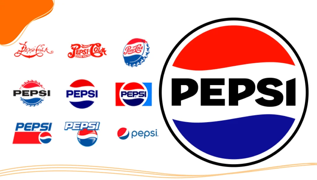
8. Pepsi
Unlike its biggest rival, Coca-Cola, which has not had a significant rebrand since the 1980s, Pepsi has tweaked its brand identity over a dozen times. But the 2008 rebrand was a big one.
Pepsi introduced a softer, more dynamic redesigned logo that suggested movement and energy, aligning with a younger demographic and younger consumers. The new logo incorporated a smile into the traditional Pepsi globe and famously cost over 1 million dollars.
Despite the large price tag, the logo helped reposition Pepsi as a contemporary brand. Along with a bold ad campaign and updated marketing materials, Pepsi’s rebranding efforts focused on redefining its brand messaging to focus on “happiness” and “living in the now,” a vibe that resonated on social media and beyond.
Key takeaway: When you’re in a crowded market, a successful rebrand can create a brand sentiment that sets you apart.
9. GoDaddy
GoDaddy, once known for its cringey, controversy-driven ads, realized it needed to grow up.
The 2020 rebranding efforts swapped the loud, immature image for a modern, approachable, and professional new brand identity. They introduced a new logo, “the GO,” a fresh colour palette, and a brand aesthetic that positioned them as champions of entrepreneurs and small businesses.
The new marketing strategy put core values like empowerment, accessibility, and support front and center, a huge shift from GoDaddy’s previous party-animal branding.
Key takeaway: A well-executed rebrand can reposition a company entirely, helping to broaden a company’s horizons and move forward from branding mistakes of the past.
10. Mailchimp
Mailchimp started as a scrappy email service. But as their service offerings expanded into full-blown marketing, they knew their brand identity needed to catch up.
Cue a playful, vibrant brand refresh in 2018: new fonts, a bright yellow color palette, quirky illustrations, and a charming, slightly tweaked Freddie the Chimp brand logo. They didn’t just redesign their look; they redefined their brand story from a tool for newsletters to a full-on platform for growing businesses.
Mailchimp’s rebrand is a great example of using creative direction to enhance brand recognition while keeping the heart of the original logo and brand charm alive.
Key takeaway: If your company has changed over the years, your brand strategy should too.
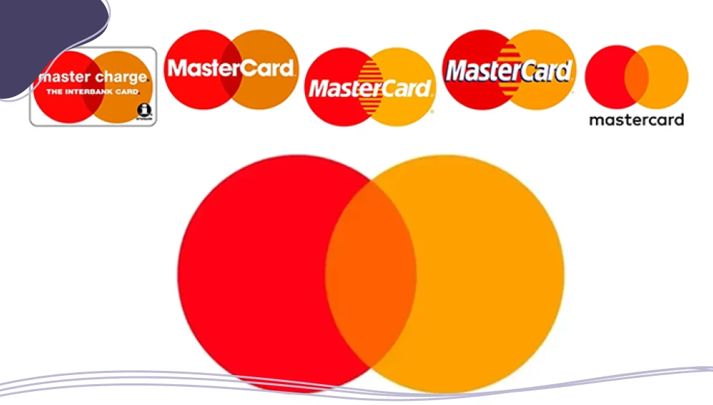
Bonus: Mastercard
Mastercard’s rebranding is a perfect example of less being more. When you’ve got one of the most recognizable logos in the world, rebranding can feel like walking a tightrope. But Mastercard nailed it.
In 2016, Mastercard introduced a new visual identity that simplified its iconic overlapping red and yellow circles, and by 2019, it dropped the word “Mastercard” from the brand logo entirely.
This bold move was a smart response to changing consumer preferences in the tech world, where everything is moving to a mobile-first approach. The sleek, modern logo redesign embraced a minimalist look, making it perfect for tiny smartphone screens and apps.
The rebrand emphasized Mastercard’s confidence in its brand recognition and strong brand equity. And it worked as consumers immediately recognized the symbol, while the company reinforced its image as an innovative, tech-savvy brand ready for the new era.
Key takeaway: Simplicity is always a good approach when it comes to rebranding. If you already have a recognizable brand, trust your established visual identity while making small yet deliberate changes that show your brand’s dedication to moving forward.

When Should You Consider a Rebrand?
Thinking about a brand makeover for your own business? Here are some signs it might be time:
- The brand no longer reflects your company’s vision: Maybe you started selling shoes, but now you’re a full lifestyle brand. Time for a rebrand!
- Struggling to connect with a younger audience: A new visual identity and updated marketing strategy can help you stay relevant.
- Logo or branding looks outdated: If it screams 2005 and not in a cool retro way, it might be time for a logo redesign and new ideas.
- Expanding your service offerings: As you grow, your brand messaging and brand aesthetic should evolve to reflect the bigger picture.
- Facing a PR disaster: Sometimes, a clean slate and a fresh brand image are exactly what’s needed to rebuild brand loyalty and customer engagement.
- Mergers or acquisitions: If two brands are coming together, crafting a new brand with a clear central focus is crucial.
- Your competitors are leveling up: Staying competitive often means evolving alongside (or ahead of) industry trends.
Tip: A successful rebrand isn’t just about a prettier new logo. It’s about realigning your entire brand strategy with who you are now and who you want to become.
Conclusion
At its core, a successful rebrand is about evolving while staying true to your brand’s roots. Whether you’re a tech startup chasing a younger audience or an iconic company stepping into a new era, a thoughtful rebranding strategy can mean the difference between fading out and standing out.
Every brand featured in this article has faced major turning points. Their ability to refresh, realign, and reconnect with customers led to massive success. And the good news? With the right mindset, the right creative team, and a focus on customer engagement, your own business can absolutely do the same.
Rebranding can be challenging, LogoMaker is here to help! Along with a suite of easy-to-use logo design tools, LogoMaker offers business cards, custom apparel, website design, and other marketing services to make sure that your rebranding project is a massive success.

FREQUENTLY ASKED QUESTIONS
What makes a rebrand successful?
A rebrand succeeds when it enhances brand recognition, strengthens brand loyalty, and supports the company’s vision while connecting emotionally with the target audience.
How often should a company rebrand?
Many companies opt for a brand refresh every 7-10 years or when a major market shift happens.
Is changing a logo enough for a rebrand?
Not quite, while a logo design update is important, true rebranding also involves updating your brand messaging, visual identity, and sometimes even your brand story.
Will rebranding upset existing customers?
Clear communication and honoring your brand’s roots can help maintain (or even boost) brand loyalty during the transition.
How can I measure the success of my rebranding efforts?
Track brand sentiment, social media engagement, sales growth, and overall customer engagement to see if your new brand is hitting home.
How do I know if my company needs a rebrand or just a brand refresh?
If your business has evolved slightly, but your core values are the same, a brand refresh might do the trick. But if your mission, audience, or services have changed significantly, a full rebranding process may be necessary.
What mistakes should I avoid when rebranding?
Common mistakes include ignoring loyal customers, changing too much too fast, forgetting to update all marketing materials, or lacking a clear creative direction. Always stay on brand and think about long-term brand equity.
Should I involve customers in my rebranding process?
Yes! Getting feedback from existing customers or even involving them in early design polls can improve customer engagement and create a stronger emotional connection to your new brand.
How important is the color palette in a rebrand?
Very important. Colors influence emotions and brand sentiment more than you think! Choose a color palette that matches your brand’s positioning and resonates with your target audience.