Physical Address
304 North Cardinal St.
Dorchester Center, MA 02124
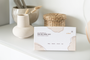
Did you know that 88% of business cards are tossed in the trash within a week? If you want your business cards to buck those odds, you’ll need an advantage. Check out these mistakes to avoid when you design your own set of business cards.
Simple and sleek is beautiful, but if your business card is plain white with an ordinary black font, you’re taking simplicity too far. According to SmallBizTrends, 72% of those who receive business cards will judge your business by the quality of the card. If you want your business cards to make an impression, you’ll need to find a way to make your cards unique and interesting. Sometimes, simply adding a great logo will help.
Have you seen business cards that include fonts of many different colors, styles, and sizes? Unless you’re a painter or a font designer, this approach will probably not work for you. Try to use no more than two different fonts on the card, and limit the colors and sizes of those fonts as well. A clean, well-designed card is more restful for the viewer’s eye than a busy, visually crowded one.
Select colors that work well with your position or the type of business you are running. A black card could be ideal for a high-level CEO, but a poor choice for a baker, since the color is reminiscent of burnt baked goods. A card as brown as dry grass might be unfortunate for a landscaper, whereas a lush green version could achieve a more positive vibe with clients.
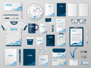
The recipient of your business card needs to know who you are, what you do, and how to get in touch with you. If any of that information is missing from the card, you could be risking the loss of valuable business contacts. Most business cards included the name or logo of the company, as well as the name, title, phone number, email, and address of the person giving the card.
On the other hand, it is possible to have too much information on a business card. If you find yourself adding more and more “essential” items to the card, try putting a website link or a QR code on the card instead. A QR code is an easy, interactive way to lead a client to more information.
Nothing detracts from the purpose of a business card more than a misspelling or a glaring grammatical error. If you’re not an expert at spelling and grammar yourself, ask someone with editing expertise to look over the final copy for the card before you have it printed. Errors tend to negatively affect the recipient’s view of you as a professional. If the errors occur in the address, email address, or contact number on the card, those problems can keep potential customers from being able to contact you.
Are you trying to be unique and different by having a mystery business card? Maybe it simply has a phone number on it, or perhaps it’s printed in invisible ink. Don’t waste your time and money trying to develop a piece that’s more like a clue than a business card. Your potential customers are too busy to solve your riddle; they need a clear, practical card with helpful information presented in an attractive way.
If you don’t have the in-house staff to design your own business card, or if you need one in a hurry, visit LogoMaker.com. We have hundreds of high-quality options that you can browse and customize; and you don’t have to pay a dime until you find the right one! Avoid the common business card mistakes, and soon you’ll be proudly handing out your fantastic, error-free cards.