Brown? As the color of your logo? While some perceive brown to be drab or boring, it can be a surprisingly strong color choice in logo design, conveying quality, strength, reliability, and honesty. But before we get too deep into the woods of logos in brown, let’s cover some basics.
Your business logo is part of your brand’s foundation. It is a critical visual connection that consumers will make in their minds when they think of your products or services. What’s more, researched published in MIT Sloan Management Review found that “effective corporate logos can have a significant positive effect on customer commitment to a brand – and even on company performance.” It seems that if a brand is successful in incorporating their values and benefits into the logo design, they can realize deeper brand-customer connections.
Color should be your final decision.
If you’re thinking about color, most of your upfront logo design work should already be complete. But if you’re just getting started, logo design may be a bit more complex than you realize. Before the design process begins, you’ll need to research your industry, understand your audience, and prioritize your company principles.
Once you’ve decided what exactly you want your logo to communicate, you’ll need to consider style and types of logos. Will you select a wordmark, a combination mark, or an emblem-style logo? Font choice is also a significant decision. Every creative element should reflect the personality of your brand and ultimately work in harmony to reveal who you are, what you do, and how you do it.
A decision on color should be one of the final decisions made in your logo design. A strong logo works well in black and white. Build your initial design without color and when you’re ready for decisions regarding color, consider the complete story you want your logo to tell.
A great logo will speak directly to its intended audience. You may be tempted to select a color that appeals to you personally, but give serious thought to your target audience and the message that this visual association that will be the cornerstone of your brand should deliver.
So what about brown?
We may not be actively aware of it, but colors evoke emotions in us. According to a study called The Interactive Effects of Color, colors are even more compelling when the consumer feels that a color is the right “fit” for the brand.
So, what about brown? Brown communicates strength, ruggedness, masculinity, nature, earth, and seriousness. While practical, it can also suggest a degree of sophistication. Because of its “outdoorsy” feel, brown is often associated with organic, wholesome, or all-natural products.
When selecting a logo color keep in mind the audience and the emotions you hope to elicit. Brown can evoke feelings of reliability, support, stability, structure, and trustworthiness. Brown can also connote comfort and contentment. Think associations with coffee, chocolate, or dark beers.

United Parcel Service
One of the most well-known brown logos belongs to UPS. It’s simple, distinctive, and conveys strength. The United Parcel Service has truly leveraged the sense of duty and reliability that brown delivers (pun completely intended). The UPS brand consistently uses the color brown in their uniforms, boxes, on their website, and trucks. It’s also fitting that sustainability is one of the key values of this global logistics leader.
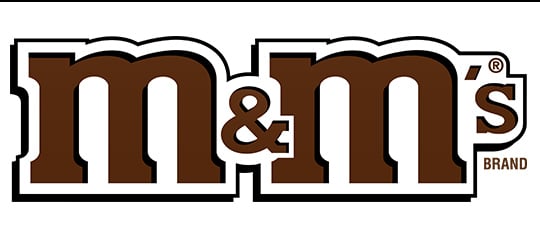
M&Ms
Logos in brown are the primary color choice for several chocolate companies. The M&Ms brand that originated in the U.S. in 1940 has consistently used brown logos through the years. Though the M&M candies themselves are colorful and many new flavor variations have been introduced, they remain a simple, comforting treat that can bring about sentimental feelings of favorite childhood candies.
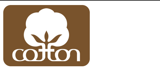
Cotton
Cotton Incorporated uses a predominantly brown logo to express comfort, dependability, simplicity, and wholesomeness.

Louis Vuitton
Brown suggests endurance and can also relate to the acquisition of material wealth, security, and sophistication. Luxury brand Louis Vuitton was founded in 1854 as a purveyor of leather trunks and ultimately other leather goods and fashions. The color brown also speaks to the fine craftsmanship and timeless elegance of the brand’s products.
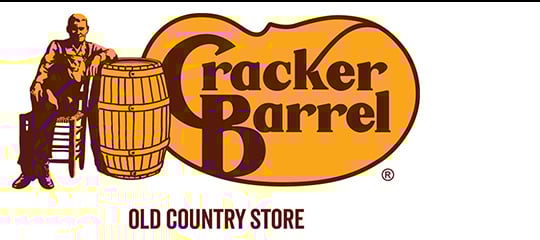
Cracker Barrel
Cracker Barrel restaurants have been around for over 45 years and their gold and brown logo demonstrates a sense of reassurance that in their dining rooms you’ll be served a quality, home-style meal with warm, friendly service.
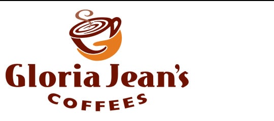
Gloria Jean’s Gourmet Coffee
Gloria Jean’s use of brown in their logo suggests a charming, approachable, and wholesome environment where you might want to stop and enjoy a deliciously warm and nutty cup of java.
While we may not be consciously aware of it, as consumers, many of our opinions and decisions are influenced by logos. Color has a major impact on the associations we make with brands.
The color brown is quietly confident and stabilizing. If your brand personality has a strong sense of duty and responsibility or is practical and down-to-earth, and your target audience values stability, quality, and wholesomeness, brown could be an optimal color choice. Understand your audience and what they value and you’ll be on the right path to selecting your brand color.
Need some more logo color ideas? Play around with different colors with our free logo maker.