Wordmark logos often earn a reputation for being too dull. The problem happens when you choose an all-too-common logo font without adding a unique touch to distinguish your brand. The end result is a stale, generic design that looks just like 50 other business logos.
If you want to build a memorable brand, be willing to take risks and come up with something truly one-of-a-kind. Not sure where to begin? Many companies ditch standard typefaces and draw up custom typography to capture the qualities of their brand.
Hand-drawn logos offer a chance to inject personality into your wordmark and win over new customers. You don’t have to be an experienced artist to brainstorm great ideas. Simply grab a pen and paper to sketch interesting letterforms that make a statement.
If you need help finding logo inspiration, take a look at clever techniques the pros use to design an unforgettable wordmark.
The Most Creative Hand-Drawn Logo Designs
Signature Styles
![]()
Does your handwriting make you cringe? You aren’t alone. Yet, from a design perspective, using a signature as a logo is an easy way to make your mark.
No one has your name or writes exactly like you, so you’re less likely to encounter a brand with the same logo.
Is your signature bold and eccentric? That’s even better. Subtle flourishes can come to define your logo and make it memorable.
The tall stems on the letters “N” and “M” create instant recognition in the Nicole Miller fashion logo. The lowercase letters and the ascending shape formed by the three “Ls” also creates visual balance across the whole design.
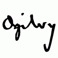
On the other hand, marketing firm Ogilvy and Mather uses a simpler scrawl. The authentic writing looks like the work of a real person, which is exactly the impact you want it to have.
Keep in mind, a signature logo doesn’t have to perfectly mimic your natural cursive. Use your writing style as a starting point, and look for ways to make the final design more striking.
Abstract Styles
![]()
Brands that aren’t afraid to go against the grain can make an impact with an abstract hand-drawn logo. Here’s where your personal brand of chicken scratch might just come in handy.
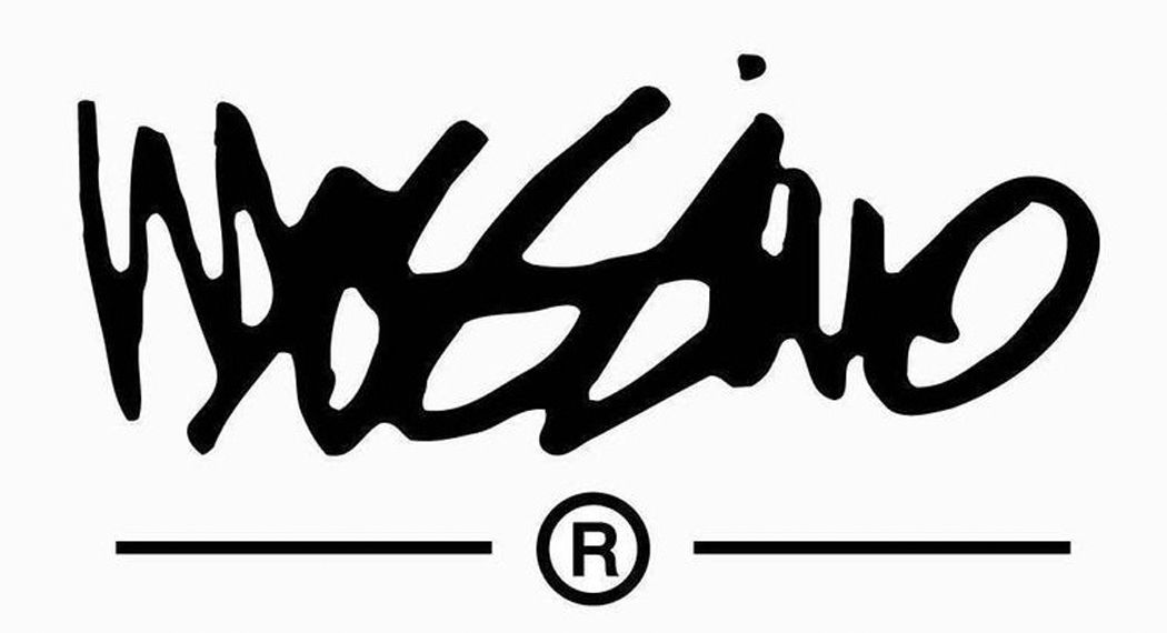
Abstract styles transform the shape and readability of familiar letterforms, as in the Mossimo fashion logo. The design is a jumble of graphic letters in irregular shapes and sizes, similar to a scribble. Artistic value is more important than legibility, as long as the wordmark is recognizable overall.
However, an abstract logo design doesn’t have to be extreme. In the United Talent Agency logo, the letters are joined together in an unexpected way and finished with a brushstroke texture. The unembellished monogram is fitting for a company that hunts for raw talent to cultivate.
Casual Styles
![]()
![]()
Celebrating imperfection is one way to show the authenticity behind your brand. While many hand-drawn logos are sharp and refined, some of the best designs stand out because of their unpolished appearance. Casual writing is carefree and relatable, making it ideal for representing fun, youthful, or humorous brands.
Picture the raw, wispy edges on the Virgin Group wordmark inspired by spray painting. Right away, founder Richard Branson loved the edgy logo when a young designer drew it on a napkin.
The first version featured shaky lines of varying thicknesses, much like the spreading and splotching that occurs with ink. Both designs showcase the naturalistic flaws of everyday writing, which makes the mark distinct and recognizable.
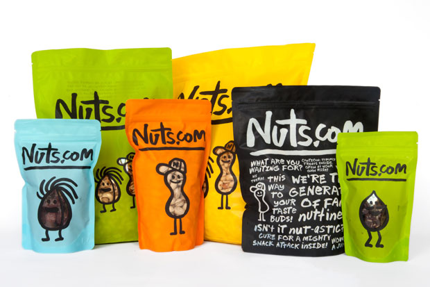
Design studio Pentagram took a similar approach to the updated logo for Nuts.com. Designer Michael Bierut created an entire hand-drawn alphabet to embody the laid-back style of the brand. The logo may look crude at first glance, but the fun, zany style grabs attention on product packaging.
Script Styles
![]()
![]()
![]()
Script typography is a popular choice in custom logo design because the unique alphabet becomes synonymous with the brand. Can you imagine a box of Corn Flakes or Fruit Loops without the famous Kellogg’s wordmark?
In the company’s early days, William Kellogg placed his real signature on every box to mark it as a genuine product. His friendly signature became the basis for the red stylized script that has been used for more than a century.
Unlike a signature logo, a script typeface contains an entire collection of glyphs, or letters, with shared design elements. With today’s advanced design tools, you can easily create a hand-drawn design and digitize it for use as a logo.
Script styles are modeled after classic cursive, but you can personalize individual letters to create a custom alphabet. Play around with connected scripts, which are joined by continuous lines, and unconnected scripts with freestanding letters.
Whimsical Styles
![]()
A whimsical brand needs a playful logo that exudes character. With whimsical wordmarks, you can let your imagination run wild as much or as little as you like. Try pairing upper- and lowercase letters or letters of different sizes. You can also experiment with the shape and orientation of some letters to create natural focal points.
What’s the first thing you notice about the bright orange wordmark for the Finnish TV network Jim? The logo has a subtle sense of symmetry because the letter “J” is leaning away from the rest of the word. With that small change in orientation, the “J” mirrors the tail on the letter “M” and the tittle mark over the “I.”
Graphic Styles
![]()
![]()
![]()
Don’t be afraid to make a logo that’s graphic and unconventional. Graphic styles tend to use bold lettering with a dynamic element of motion and texture.
There’s a reason why Coca-Cola has successfully used the same hand-drawn style for 130 years. The scrolling stems and overlapping loops are so energetic and festive that they make you want to smile.
The company’s bookkeeper Frank M. Robinson developed a custom version of Spencerian script for this famous wordmark. A century later, it’s still one of the most recognized logos in the world.
To make your own graphic logo, think of ways to incorporate your brand characteristics into the letter forms. SlyFox Brewing Company made a smart redesign by crafting letters stylized as fox tails.
Another technique is to use textures that resemble drawings from common art and writing tools, such as paintbrushes or pen sketches. The finished product should jump off the page and grab attention without relying on three-dimensional elements.
Start Sketching Logo Ideas
Experimentation is the most effective way to come up with an exciting hand-drawn logo. Sketch different variations side by side, so you can figure out which elements do or don’t work.
Try not to obsess over creating something perfect. The more you draw, the easier it will be to spot design details that pair well together. When you’re finished, you’ll have a one-of-a-kind wordmark that is 100 percent made for your brand.
Looking for a wordmark logo? Make a logo with our easy-to-use logo design tools!


