Your business name and logo are among the most recognized elements of your brand. No doubt, you want them to be memorable and show others what makes your business special.
Start with a standout business name, and it’s much easier to brainstorm a creative logo design that distinguishes you from other brands. Not sure how to begin? Check out how these thriving brands used creative business names to generate an equally imaginative logo design.
Creative Business Names Give Rise to Unique Logo Designs
Rhino Foods
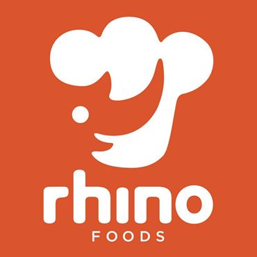
Rhino Foods is well known for its innovative company culture and as the creator of the heavenly cookie dough found in ice cream products. A rhino might not be the first animal that comes to mind when you think of fun, friendly, or food. And that unlikely inspiration is one reason why the branding grabs attention.
With thoughtful design, the company logo does a great job of turning this imposing mammal into a warm, inviting symbol of the brand. The logo makes use of minimalism to fit two familiar shapes — a rhino and a chef’s hat — into a seamless design.
An orange color scheme automatically pumps energy into the design. The whole image feels sunny and enthusiastic. The square sans serif font adds another element of youthfulness to round out the design’s pleasant tone.
Soundcloud
As a business name, Soundcloud succeeds by uniting ideas that normally don’t relate to one another. Really, how often do music and clouds come up in the same conversation?
Yet, cloud-based services are a booming industry in today’s web-driven world, which creates a unique context for many startups searching for interesting business names.
The Soundcloud logo presents a perfect union of the images people associate with these common words. One side of the logo is a cartoony version of a cloud, while the other side resembles sound waves.
Again, an orange logo color scheme results in an energetic design and sparks happiness and quick decision-making for customers. Brands have more creative leeway to use a bold, in-your-face color when the logo is ultra-simplistic.
Imperfect Produce
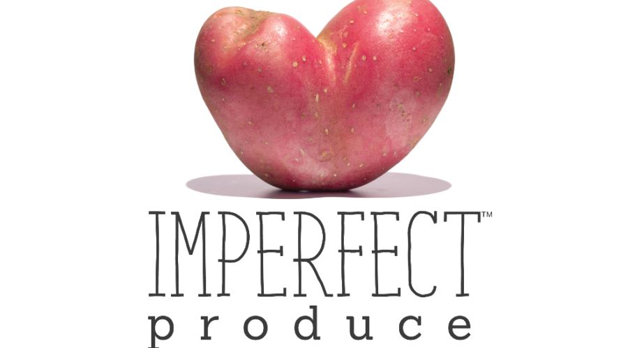
Imperfect Produce is on a mission to get consumers and stores to stop discarding quality food simply because it doesn’t look perfect. What mascot could be better than the humble potato, known for its lumpy, twisted, and pockmarked forms?
Photorealistic logos aren’t a good idea for most small businesses, as they’re harder to work with. However, this approach makes sense for a brand that wants to celebrate the odd irregularities of real food.
The logo features a potato in the shape of a heart, and “imperfect” is in a hand-drawn font for added authenticity.
ExSeed Health
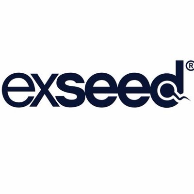
Male fertility isn’t the easiest topic to broach, so imagine trying to develop a brand that’s both clever and tactful. ExSeed accomplished both with a tongue-in-cheek logo that doesn’t downplay the sensitivity of the issue.
With its ingenious spelling, the name “ExSeed” is already a great play on words. The definition of “exceed” is to surpass an expected amount or show superior performance. For a company that makes technology for managing sperm quality, this concept offers an optimistic outlook on fertility.
The logo is effective in building on this idea. At first glance, you get a clean, sans-serif wordmark that fits the simple, modern design aesthetic of most tech companies.
Then, you notice the end of the word contains a sperm cell (or seed) with its signature tail extending outside the letter “D.” Nothing is more distinct and recognizable, which makes this creative logo design easy to remember.
First Draft Book Bar
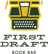
Maybe, this logo is a winner because classic authors have an infamous reputation for being enthusiastic drinkers. Or perhaps, it’s the all-too-common image of the starving writer who haunts local cafes and taverns trying to craft that elusive bestseller.
Whatever the inspiration, First Draft succeeds at bringing diverse elements together without the design looking forced or chaotic. When you’re ready to get a business logo, look for opportunities to exploit words that have multiple meanings. The word “draft” relates to both writing and beer, providing a way to tell an engaging story with visuals.
Look quickly, and you might miss the glass of beer framed inside the typewriter. Not only is the design subtle, but the dark green and gold color scheme puts most of the focus on the outline. To top it off, the logo is paired with a serif font, which is synonymous with literary tradition.
Labobatory
A science theme jumps out at you the moment you enter Labobatory, a boba tea cafe where patrons love to try inventive ingredient combos. With flavored tapioca pearls at the bottom of every cup, boba already comes across like a science fiction novelty.
And in true scientific fashion, the founders used experimentation to think up a new word. The business name is a clever fusion of “boba” and “laboratory.”
Armed with a unique name, the logo practically creates itself. The design features a blue Erlenmeyer flask, which instantly reminds you of a science lab. In the wordmark, “Boba” is emphasized in a separate color to add contrast and reinforce the core business concept.
Sunday Dinner
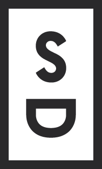
Look no further than Sunday Dinner brand consultancy for a truly off-beat business name. The company follows a distinct business model, hosting casual dinners to build relationships and spark creativity between clients, marketers, and creatives.
The Sunday Dinner logo is based on the popular minimalist trend of using a simple, framed monogram. In fact, it’s included on this list for one effortless design choice.
By changing the orientation of the letter “D,” the monogram now looks like a bowl with steam rising above it. It’s common in clipart and illustrations to create stylistic steam resembling an “S” shape. The logo delivers upon these visual expectations, making the design both straightforward and fanciful.
Pizza Brain
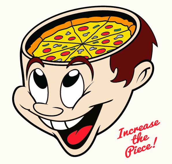
Pizza Brain is an eatery and museum dedicated to one of America’s most beloved foods. Just about everyone knows the feeling of having pizza cravings on the brain, and therefore, can appreciate the humor behind the name.
The cheerful yet kooky expression on the mascot logo flawlessly captures the experience of visiting Pizza Brain. Everything from the pizza-themed decor to vintage albums to novelty toys graces the walls in celebration of this savory Italian staple.
The company and its extensive list of specialty pizzas are inherently unique. The logo designer was able to draw from a playful, one-of-a-kind concept, which makes the creative process more productive.
Make your own logo just as exceptional as these winning designs by drawing ideas from your business name. Pay attention to familiar words and shapes you can use in surprising ways to make your design unforgettable. The more thought you put into crafting a distinctive brand, the easier it will be to build a loyal following for your business.


