Ready to launch your company? Do you have the right logo to go with it?
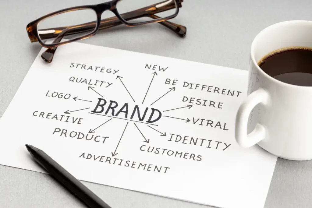
The importance of a logo is undeniable because this one image creates brand awareness, marketing opportunities, and communicates your company’s message to the world. With so much responsibility leaning on your logo, you have to get it right.
Before starting the logo design process, it’s very important to gather as much information as possible about your brand, audience, and goals.
How do you know you designed the right logo? You can start by knowing which right questions to ask.
Bridging the Gap: Communication in Logo Projects
Clear and consistent communication is the cornerstone of any successful logo design project. From the initial discovery session to final delivery, maintaining open lines of communication with your client is paramount.
Don’t hesitate to ask clarifying questions, even if they seem minor.
Document all feedback, decisions, and revisions to create a comprehensive record that can be referenced throughout the project and for any future updates.
28 Questions To Ask a Logo Designer in the Logo Design Process
We’ve gathered our top questions to ask when designing a logo, some of which we would definitely ask ourselves (if we were you).
The following questions are there to ensure a successful logo project. We split these questions into multiple categories so you can find yours faster.
I. Foundation Questions: Understanding the Brand
What are the company’s mission statement, vision, and values?
Understand the core purpose of the company, its mission statement, long-term aspirations, and the principles that guide its operations. This helps ensure the logo reflects the company’s fundamental beliefs and future direction.
What is the brand’s personality and market positioning?
Describe the brand’s character traits and how it is positioned in the market compared to competitors. Encourage the client to explain how they want their brand to be perceived—if friendly, professional, innovative, or traditional—which influences the logo’s style and tone.
What is the company’s unique value proposition?
Identify what sets the company apart from its competitors—its unique selling points or advantages. Ask what the client wants their logo to accomplish in communicating this distinctiveness visually to attract the right customers.
What is the broader industry context and the company’s business goals?
Consider the broader industry environment and the company’s specific objectives, such as growth targets or market expansion plans. This verifies the logo aligns with the business’s strategic goals and resonates within its industry. Uncovering the client’s vision during this discovery session is imperative to guide the design process.
What is the brand’s story and heritage?
Explore the company’s history, founding story, and cultural background. Understanding the company’s past and how it has evolved can inform the logo design. Incorporating elements of this heritage can add depth and authenticity to the logo, creating a stronger emotional connection with the audience.
II. Market Research Questions
Who are the company’s primary and secondary competitors?
Identify the main competitors in your industry, both direct and indirect, to understand the competitive landscape. Analyze the competition to see how they present themselves and use this insight to create a logo that stands out and positions your brand uniquely.
Who is the target demographic?
Analyze the characteristics of your ideal customers, including age, gender, location, income level, and lifestyle, to confirm the logo appeals specifically to them.
What are the customer personas and behaviors?
Develop detailed profiles of typical customers, including their preferences, motivations, and purchasing habits, to tailor the logo design to resonate with their expectations.
What is the brand’s market positioning strategy?
Determine how your brand is positioned in the market relative to competitors—whether as a premium, budget-friendly, innovative, or traditional option—to guide the logo’s tone and style accordingly. Research what other companies in your sector are doing and understand different markets to make sure your positioning is effective.
Where are the best opportunities for differentiation?
Explore areas where your brand can differentiate itself from competitors through unique design elements or messaging that can be reflected in the logo to attract and retain customers. Consider new markets as part of your differentiation strategy to identify additional growth opportunities.
III. Design Direction Questions
Which colors best represent the brand’s personality and values?
Explore the colors that best represent your brand’s personality and values. Consider how different colors evoke emotions and perceptions, and decide which hues will resonate most effectively with your target audience.
Any existing brand elements should also be discussed, such as current brand colors, to maintain consistency or identify new palettes that align with your client’s vision. When selecting colors, choose a specific range that aligns with the brand’s identity and market positioning.
Which typography or font styles reflect the brand’s tone?
Determine the typefaces that reflect your brand’s tone, whether it’s modern, traditional, playful, or corporate. Discuss preferences for serif, sans-serif, script, or custom fonts, and consider readability across various platforms and sizes.
Specify how typography will complement other design elements to create a cohesive logo.
What type of logo best suits the brand’s identity?
Identify the logo style that best suits the brand’s identity and marketing goals. This could include wordmarks (text-based logos), pictorial marks (icon or symbol-based), abstract marks, combination marks, or emblems.
When planning a redesign, consider the current logo and how its design, feel, and relevance may influence the new branding.
Examine the advantages and suitability of each type in relation to the client’s industry and audience, and consider the use of symbols to visually represent key brand themes or attributes.
What visual inspiration or mood boards guide the design direction?
Gather and review examples of logos, images, color schemes, and design styles that inspire the client or align with their brand values. Use mood boards to visualize the desired aesthetic and help guide the creative process.
Include a link to visual references or collections for easy access and collaboration. When developing new branding, consider how inspiration sources may influence the logo and guarantee alignment with the updated brand direction. Reviewing existing brand elements can also help maintain consistency.
What are the brand’s defining attributes (modern/classic, playful/serious, etc.)?
Define principal descriptive attributes that capture the essence of the brand’s personality. Identify three attributes the logo should convey, such as honesty, strength, or humor, to guide the design process.
Choose whether the logo should convey a modern or classic feel, be playful or serious, bold or subtle, luxurious or cost-effective. These attributes will steer the overall design direction and help achieve a logo that authentically represents the brand.

IV. Technical & Practical Questions
Where and how will the logo be used?
Before starting the design, identify every context where the logo will appear—from digital spaces like websites, apps, and social media profiles to print materials such as business cards, brochures, and packaging.
Don’t forget merchandise like apparel, signage, or promotional items.
Consider how the logo will be created for each of these contexts, ensuring it is suitable for both web and print. Knowing where the logo will live ensures it’s versatile enough to perform across all mediums without losing its integrity or impact.
The point of this process is to make sure the logo serves its intended purpose in every application.
How adaptable should the logo be across different platforms and formats?
A strong logo must maintain visual consistency across diverse applications. Discuss whether the design needs multiple variations—for example, a horizontal layout for website headers, a stacked version for social media, or a simplified icon for app use.
Considering adaptability early confirms the logo works harmoniously wherever it’s displayed. The point here is to guarantee the logo remains effective and recognizable, no matter the context in which it is created and used.
Will the logo remain legible and impactful at all sizes?
Size and scalability are essential. Ask whether the logo must be readable and recognizable at both large scales (like billboards or trade show banners) and small ones (like favicons or mobile app icons).
Testing the design at multiple sizes ensures clarity, balance, and legibility, primary qualities for brand recognition.
Which file formats are required for various uses?
Every medium demands specific file types. Discuss the need for vector formats (SVG, EPS, or PDF) to allow infinite scalability without losing quality and raster formats (PNG or JPEG) for online use.
If the logo will be printed on specialized materials, make certain you have high-resolution or color-profile-specific files ready. Addressing these details up front prevents production headaches later.
What are the project’s budget and timeline constraints?
Establishing financial and scheduling boundaries helps keep expectations realistic and the project efficient. Discuss the scope of work, number of revisions, and delivery milestones before starting. Having a clear plan in place is crucial for managing resources and ensuring the project stays on track. This clarity allows for proper resource allocation, prevents delays, and avoids last-minute compromises that could affect design quality.
Who are the key stakeholders and decision-makers?
Clarify who will be involved in feedback, approvals, and final decisions. Having too many voices can slow down the process, while too few can lead to missed perspectives. Define a clear communication chain—who reviews drafts, who provides feedback, and who gives final sign-off—to confirm smoother collaboration and fewer surprises. Be sure to include the graphic designer as a key contributor, as their expertise is essential for creating a logo that aligns with your brand’s goals.
How will project management and documentation be handled?
If you are managing multiple logo design projects, keep thorough documentation of feedback, revisions, and approvals for each. This helps maintain organization and ensures that every project is completed efficiently and meets its objectives.
V. Client Communication Best Practices
How can you conduct a thorough discovery session with the client?
A discovery session sets the foundation for the entire logo design project. Use this time to explore the client’s vision, mission, audience, design preferences, services, and long-term goals.
Ask open-ended questions to uncover not just what they want, but why they want it.
Collect thorough answers from the client to ensure you fully understand their business and brand identity. A strong discovery phase minimizes miscommunication and leads to a logo that genuinely reflects the brand.
How should client expectations be managed throughout the project?
Transparency is key. Clearly outline each stage of the design process, from concept creation to revisions and final delivery. Communicate realistic timelines and explain what each phase includes.
Encourage the client to provide a clear answer to each question or feedback request. Keeping clients informed ensures alignment, reduces frustration, and builds trust—especially during revisions or feedback rounds.
What red flags should you watch for during the logo design process?
Be alert for early warning signs that could cause issues later—vague goals, contradictory feedback, or unrealistic demands. These red flags can derail timelines or compromise design quality. Address each challenge immediately with clear communication and documented expectations to keep the project on track.
How will project documentation and feedback be recorded and shared?
Maintain detailed notes, version tracking, and written feedback throughout the project. Use shared tools (like Google Docs, project management software, or design review platforms) to capture all decisions and revisions. This documentation not only keeps everyone aligned but also serves as a valuable reference for future updates or rebranding efforts.
What is the role of the client in the logo design process?
The business owner plays a crucial role in establishing brand identity and making key decisions. Their involvement in answering strategic questions and providing detailed answers ensures the final logo aligns with the company’s values, goals, and market positioning.
VI. Should I Hire a Professional Logo Designer?
The final and most important question is whether or not you should hire a logo designer. What does a logo designer do? Designers guide the entire process, working closely with clients by asking all of the above questions and collaborating to create a logo that perfectly embodies your business.
Yes, it might seem expensive to hire a designer. However, the investment pays off because you won’t have to keep redesigning every few years. You could end up with a logo design that sticks with your company for decades.
Design the Best Logo Today
These are the crucial questions to ask when designing a logo. By answering each one, you can cross out the design factors that are detrimental to your brand.
Whether you are starting from scratch or updating an existing logo, you can come up with the right image, font type, and color that works to broaden your brand’s identity and reach. A great logo is versatile, recognizable, and impactful across all mediums and sizes.
Don’t stop there!
Visit us today, and we can guarantee to help design a logo that is cutting-edge and brings your brand to life. We also provide other guides to help you come up with the ideal design, brainstorm ideas, and develop the core idea behind your logo. A well-designed logo can help your brand stand out in your industry.
Don’t hesitate to rely on us to strengthen your brand with a memorable logo.

