
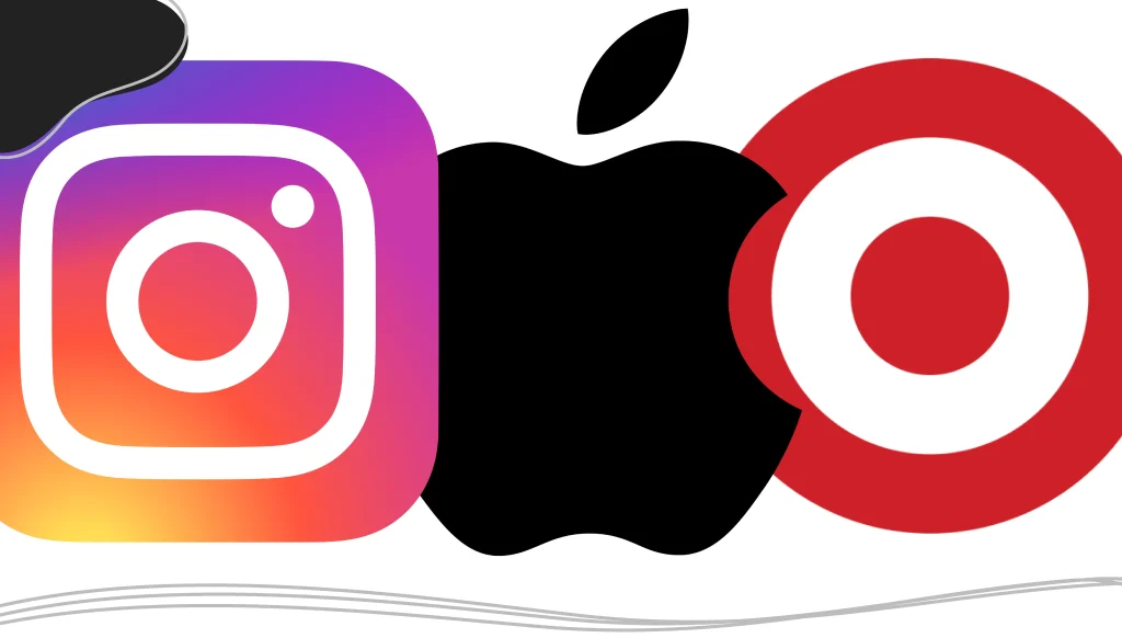
A pictorial mark logo (also called a brand mark logo or symbol logo) is a logo made only of an icon that depicts a real, recognizable object, like Apple’s apple, Target’s bullseye, or Shell’s seashell. Unlike an abstract mark, the image is literal. Unlike a combination mark, it has no text. Most brands earn a standalone pictorial mark by pairing the icon with their name first.
| Pictorial marks at a glance | |
|---|---|
| Also called | Brand mark, logo symbol, icon logo |
| What it is | A single literal image, with no words |
| Best for | Brands with a visual name or offer, international audiences, app icons, favicons and products |
| Watch out for | Low recognition at launch, category clichés, trademark conflicts |
| Famous examples | Apple, Target, Shell, WWF, Instagram |
You can recognize the world’s best pictorial marks before you read a single word, because there’s no word to read. Here’s how pictorial marks differ from other logo types, 10 examples that show what makes them work, and how to design one for your own business, even if your brand is new.
Pictorial Mark vs. Other Logo Types
Every logo falls into one of a handful of types. The quickest way to spot a pictorial mark: if you can name the object in the logo, and there’s no text, it’s pictorial. If the shape doesn’t depict anything real, it’s an abstract mark.
| Logo type | What it is | Examples | How it differs from a pictorial mark |
|---|---|---|---|
| Pictorial mark | A literal, recognizable image with no text | Apple, Target | — |
| Abstract mark | A non-literal shape or form | Nike, Mastercard | Suggests an idea instead of showing an object |
| Wordmark [LINK: wordmark post] | The company name in distinctive type | FedEx, Coca-Cola | All text, no image |
| Lettermark (monogram) | Initials in distinctive type | IBM, HP | Letters, not a picture |
| Combination mark | An icon paired with the name | Burger King, Adidas | Adds the name next to (or under) the icon |
| Emblem | Text set inside a badge or crest | Harley-Davidson, NFL | Text and image locked together in one shape |
| Mascot | An illustrated character | KFC’s Colonel Sanders | A character, not an object |
For a deeper look at each category, see our guide to the different types of logos. If you’re deciding on the look and feel rather than the structure, our logo styles guide covers that side.
10 Pictorial Mark Logo Examples
These brands show the range of what a pictorial mark can do, from playing on a company’s name to signaling what a product does.
1. Apple
Designed by Rob Janoff in 1977, the apple with a bite taken out is the textbook pictorial mark. The bite keeps the silhouette from being mistaken for another round fruit, such as a cherry.
Why it works: An unmistakable silhouette that reads at any size, from a laptop lid to a pixel-sized icon.
2. Target
Target has used a bullseye since its first store opened in 1962. The logo is a direct visual pun on the company name.
Why it works: Name and image reinforce each other, so customers remember both.
3. Shell
Shell’s scallop shell has represented the company for more than a century and has been redrawn to be simpler several times.
Why it works: It shows how a pictorial mark can evolve without losing recognition.
4. WWF
The World Wildlife Fund’s panda dates back to the organization’s founding in 1961. Its black-and-white design was practical as well as symbolic, since it printed cheaply in one color.
Why it works: Emotional appeal plus a design that works in black and white.
5. Instagram
Instagram’s logo started as a detailed vintage camera. Its 2016 redesign reduced the camera to a simple outline on a colorful gradient.
Why it works: The icon tells you exactly what the app does: take and share photos.
6. Dropbox
Dropbox’s open box links the image to both the brand name and the product’s core job of storing files.
Why it works: A literal connection to the name, built from clean geometric shapes.
7. Lacoste
The crocodile comes from founder René Lacoste’s nickname as a tennis player. On Lacoste’s clothing, it appears without the name.
Why it works: A pictorial mark can carry a story, not just a literal meaning.
8. Puma
Puma’s leaping cat illustrates the brand name and suggests speed and agility, which suits a sportswear company.
Why it works: One image signals both the name and the brand’s personality.
9. Penguin Books
The publisher’s penguin has appeared on book spines since the 1930s.
Why it works: It proves pictorial marks work in very small spaces, like a book spine.
10. Snapchat
Snapchat’s ghost nods to the app’s disappearing messages, set against a bright yellow background that stands out on any phone screen.
Why it works: It turns a product feature into a friendly, memorable symbol.
What Makes a Pictorial Mark Work
The examples above have five things in common:
- Simple: One idea, a few shapes, no fine detail. If it can’t be drawn from memory, it’s probably too complicated.
- Relevant: The image connects to your name, your product or your story, as with Target’s bullseye or Lacoste’s crocodile.
- Scalable: It stays recognizable at 16 pixels as a browser favicon and at 16 feet on a billboard.
- Distinctive: It doesn’t look like your competitors’ logos or like the first icon you’d find in a stock library.
- Timeless: It avoids trendy effects that will date it in a few years.
Should Your Business Use a Pictorial Mark?
The common advice is that pictorial marks are only for big, established brands. The real story is more useful. Apple and Target didn’t start with a logo nobody recognized. They paired a strong symbol with their name until customers made the connection. Starbucks only dropped the words from its logo in 2011, after decades of using them.
So for a new business, the question isn’t “pictorial mark or not?” It’s “what symbol will we grow into?” We recommend an icon-first approach:
- Design a symbol that can stand on its own: Treat the icon as the long-term asset, not decoration next to your name.
- Launch with a combination mark: Pair the icon with your business name so people learn to connect the two.
- Use the icon alone where space is tight: Favicons, social media profile pictures, app icons, packaging and merchandise are all places the icon can stand alone from day one.
- Drop the name once recognition builds: When customers recognize the symbol alone, you have a true pictorial mark.
A pictorial mark is a strong fit if your name suggests an image (Target, Puma), you sell across languages or borders, or your logo will mostly appear in small square spaces like apps and social media.
Think twice if your name is abstract and nothing about your business suggests a clear image, or if your industry is full of the same clichés (house rooflines for real estate, teeth for dentists, coffee cups for cafés). In those cases, a wordmark or a more distinctive combination mark may serve you better.. This approach helps build the association between your symbol and brand name. As your recognition grows, you can gradually transition to using just the pictorial element.

How to Create a Pictorial Mark in LogoMaker
Enter your business name (company name) and industry: LogoMaker uses these to suggest relevant symbols.
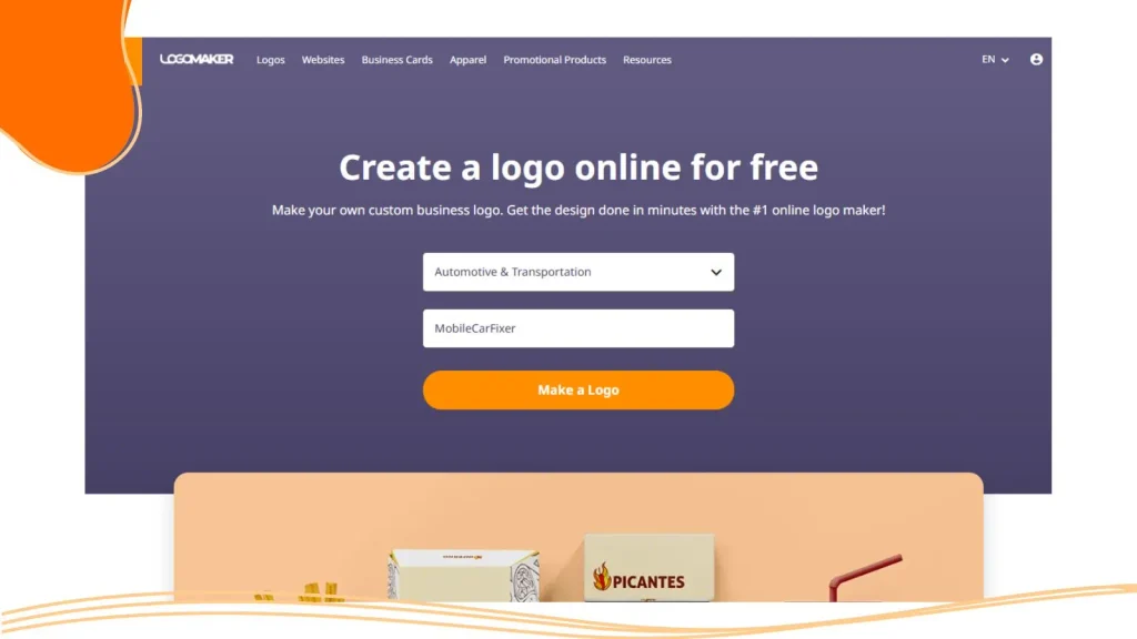
Answer questions that describe your business, such as business angle, colors, and special touches, so that the logo fits your needs 100%.
Choose a symbol with meaning: Before you scroll, write down three to five objects tied to your name, your product, or your story. Then look for symbols that match one of them, and skip the most obvious icons in your category.

Simplify and set your colors: Remove anything that doesn’t help recognition. Check how the symbol looks in a single color first, then add your brand colors.

Create your two versions: Save an icon-only version for favicons and social avatars, plus a combination version with your business name for everything else.
Test it small, then download: Shrink it to favicon size to confirm it still reads. Then download vector files (SVG or PDF) for print and scaling, plus PNG files with transparent backgrounds for the web.
Other routes: A professional designer or agency can create a fully custom mark with research, multiple concepts, and brand guidelines, at a higher cost and over a longer timeline. If you have design skills, vector tools like Adobe Illustrator, Affinity Designer, or Inkscape (free) let you build your own. Always work in vector so the mark scales cleanly.. BrandCrowd, though they may not offer the same depth of options specifically for pictorial mark creation.

A Short History of Pictorial Marks
Picture symbols are older than writing, and merchants used simple marks on goods long before modern branding. The pictorial marks we know today grew up with mass marketing in the 20th century: Shell’s shell in the early 1900s, Target’s bullseye in 1962 and Apple’s apple in 1977.
Digital screens pushed these logos toward simplicity. Marks that had to work as tiny icons on low-resolution screens, and later as app icons and favicons, lost gradients, shadows and fine lines. The wave of flat design in the 2010s finished the job, and brands such as Instagram redrew their symbols as clean outlines. The lesson for today: design for the smallest place your logo will appear.tor-based artwork that can scale without losing quality.

Common Mistakes to Avoid
- Too much detail: Fine lines and small text disappear at small sizes. If the icon doesn’t survive at favicon size, simplify it.
- Category clichés: A generic lightbulb, globe, or house makes you look like everyone else. Look for a more specific angle tied to your name or story.
- Using clip art or emoji: These are licensed for use, not owned by you, so they rarely make a protectable or distinctive logo.
- Leaning on color: Your mark should work in one color and reversed (white on dark) before you add brand colors. Our guide to the best colors for a business logo can help with the next step.
- Dropping your name too soon: Use the icon alone in small spaces, but keep your name visible until customers recognize the symbol.
- Skipping a trademark search: Check that a similar mark isn’t already registered in your industry, and learn how to use the trademark symbols correctly.
Frequently Asked Questions
What is a pictorial logo?
A pictorial logo is a logo made only of an image of a real, recognizable object, with no text. Apple’s apple and Target’s bullseye are two well-known examples.
What is the difference between a pictorial mark and an abstract mark?
A pictorial mark shows a real, recognizable object, such as Apple’s apple. An abstract mark uses a shape that doesn’t depict anything literal, such as Nike’s swoosh, to suggest an idea or feeling.
What is the difference between a pictorial mark and a combination mark?
A pictorial mark is the icon alone. A combination mark pairs an icon with the company name, like Burger King’s logo. Many brands use both: the combination mark as the main logo and the icon alone in small spaces.
Is a pictorial logo good for a new business?
Yes, as long as you introduce it alongside your name. Launch with a combination mark, use the icon alone for favicons and social profiles, and drop the name only after customers recognize the symbol.
What are some examples of pictorial mark logos?
Well-known examples include Apple, Target, Shell, the WWF panda, Instagram, Dropbox, Lacoste, Puma, Penguin Books and Snapchat.
Can I trademark a pictorial logo?
Yes. You can use the ™ symbol to claim a mark right away, but use ® only after the mark is officially registered. Registration rules vary by country, so check with your local trademark office or a trademark attorney.
Can I use clip art or an emoji as my logo?
It’s not recommended. Clip art and emoji aren’t unique to your business, you often don’t own them, and they’re difficult or impossible to register as a trademark.
What file formats do I need for a pictorial logo?
Get vector files (SVG, AI or PDF) for print and resizing, PNG files with transparent backgrounds for websites and social media, and JPG files for everyday use.

Let Your Symbol Do the Talking
A pictorial mark is a long-term asset. Done well, it becomes the fastest way people recognize your business. Start with a simple, relevant symbol, pair it with your name while you build recognition, and let the icon take over as your brand grows.
Design your pictorial mark today. Create your icon and a matching version with your business name in LogoMaker, and download every file format you need for web and print.