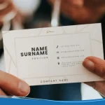

Business cards in 2027 are quieter, heavier, and smarter than they were a few years ago. The loud gimmicks have faded. What’s left are cards that feel good in the hand, say one thing clearly, and connect to everything else you do online.
The nine business card design trends for 2027 are tactile minimalism, retro type, dark palettes, earthy sustainable stocks, vertical layouts, oversized type, purposeful QR codes, metallic accents, and brand pattern backs. Below, each trend gets a quick verdict: who it suits, what it adds to your print cost, and how to try it in the LogoMaker business card maker.
CONTENTS TABLE
- Are Business Cards Still Relevant in 2027?
- The 2027 Business Card Design Trends: Nine Looks to Consider
- Trends to Use Carefully
- 2027 Trends at a Glance
- How to Use a 2027 Trend on Your Own Card

Are Business Cards Still Relevant in 2027?
Yes, if you meet customers face to face. A card gives someone your name and contact details after a trade show, client meeting, or conversation at your shop.
What has changed is the job. A 2027 card doesn’t need to hold everything. It needs to make you memorable and give people one easy way to find the rest, often a QR code that leads to your website, booking page, or portfolio. A QR code is a scannable square barcode. For an online destination, it lets someone open a link without typing the address.

The 2027 Business Card Design Trends: Nine Looks to Consider
Business card design trends from 2025 to 2027 have shifted from loud to considered. Compared with the 2025 business card design trends, heavy stocks and texture have replaced flashy finishes, QR codes have moved from novelty to standard, and sustainable paper has gone mainstream.
Each trend below includes who it suits, what it adds to your print cost, and how to try it in LogoMaker.
1. Tactile Minimalism
Fewer words, more white space, and a heavier card stock that tells people you’re serious before they read a word. It’s the modern business card design trend with the widest appeal, because it works in almost any industry. Think logo and name on the front, essentials on the back, and a thick 16 to 32pt stock.
- Suits: consultants, law, finance, architects, premium services.
- Print cost: medium; the stock does the work, so skip extra finishes.
- Try it: in LogoMaker, start from a minimal business card template and cut every line that isn’t a name, role, phone, email, or website.
2. Retro & Nostalgic Type
Rounded lettering and warm off-white backgrounds borrow from vintage packaging and shop signage. Serif fonts have small strokes at the ends of letters; sans-serif fonts don’t. A chunky serif can give your business name character without making the whole card hard to read.
Keep decorative lettering for your name or headline, and use a simpler font for contact details. Our business card fonts guide can help you compare styles.
- Suits: cafés, barbers, breweries, vintage, and lifestyle shops.
- Print cost: low; it’s a type choice, not a finish.
- Try it: in LogoMaker, pair one retro display font for your name with a plain sans-serif for contact details. Our guide to business card fonts has pairings that work.
3. Dark, Moody Palettes
Deep navy, forest green, charcoal, and black create a different look from a white card. Use light lettering with enough contrast to keep names and contact details readable. Don’t assume a dark background will hide scuffs or fingerprints; the result depends on the stock and finish.
- Suits: creative studios, photographers, tattoo artists, luxury, and nightlife brands.
- Print cost: medium; full-coverage ink costs more than a white card.
- Try it: pick a dark background in the LogoMaker editor, keep contact text at 8pt or larger, and use a bold weight so it doesn’t fill in when printed.
4. Earthy Naturalism & Sustainable Stocks
Soft greens, sky blues, botanical details, and recycled or cotton stocks. The look signals care, and the paper backs it up. It suits brands whose customers care where materials come from, and textured stock adds the tactile feel that runs through most 2027 trends.
Ask the printer about recycled content and the exact finish. Our recycled card guide introduces material choices, but confirm the specifications of the product you’re ordering before making a claim on your card.
- Suits: wellness, landscaping, eco brands, florists, makers.
- Print cost: medium to high for specialty stocks.
- Try it: pair an earthy palette in the LogoMaker editor with a recycled stock and an uncoated finish. See our article: Are business cards recyclable? before you order.
5. Vertical Layouts
Most cards are horizontal, so turning yours on its side is an easy way to look different without spending more. Vertical cards also give tall logos, portraits, and stacked names more room to breathe. Changing orientation doesn’t require changing the card’s dimensions.
- Suits: designers, real estate agents, personal brands, and anyone with a tall logo.
- Print cost: no extra cost; same size, same stock.
- Try it: pick a vertical template in LogoMaker and stack name, title, and contact details down the center.
6. Bold, Oversized Type
One big word, a name, a business name, a single verb, filling most of one side. It’s confident and memorable when the rest of the card stays simple. It pairs naturally with tactile minimalism, since one bold word needs plenty of space around it.
This approach works with a simple card, but don’t make every element bold. Readers still need to see which information matters first.
- Suits: creatives, agencies, personal trainers, startups.
- Print cost: low.
- Try it: in LogoMaker, set your name or business name in a heavy display font on the front only, and keep the back a clean contact layout.
7. QR Codes With a Purpose
A QR code is useful when it leads to a clear next action. In 2025, the trend was simply adding one; in 2027, the trend is using it well. For example, one code with a clear label: Book a call, See my work. Plus, a link that’s worth the scan.
Leave an empty border around the code. For a standard QR code, that border needs to be at least four small code squares wide on every side. Test a printed version at its intended size on more than one phone before ordering
- Suits: almost everyone, especially service businesses and creatives.
- Print cost: no extra cost.
- Try it: see our QR code business card ideas article for what to link to and how big to print it, then add the code to your design in the LogoMaker business card maker.
8. Metallic & Spot-Gloss Accents
Instead of covering a card in foil, 2027 cards use a touch of it: a foil logo, a spot-gloss name, or a raised gloss pattern you notice when you tilt the card. Muted golds and gunmetal are replacing bright shiny foil. Ask for a printed proof, since metallic effects look different on paper than on screen.
- Suits: jewelers, salons, event planners, premium retail.
- Print cost: high; foil and raised finishes add setup costs.
- Try it: keep the LogoMaker design simple and apply the finish to one element only, often the logo, so the accent stands out.
9. Brand Pattern Backs
The back of the card becomes a repeating pattern built from your logo mark or brand colors. It makes your card recognizable even face-down, and it’s one of the cheapest ways to make a card feel designed because it only needs your existing logo and colors.
- Suits: retail, food brands, franchises, anyone with a strong logo mark.
- Print cost: low to medium.
- Try it: in LogoMaker, place your logo icon at low opacity in a repeating grid on the back side.

Trends to Use Carefully
Some business card trends get attention but come with trade-offs in cost, readability, or practicality. Use these only when they clearly fit your brand:
- NFC-only cards: Near-Field Communication (NFC) enables tap-based sharing with compatible devices. Don’t make tapping the only way to reach you; include visible contact details or another access route.
- Clear plastic and metal cards: memorable but expensive, and often hard to read.
- Die-cut novelty shapes: fun for one campaign, but they don’t fit a wallet or cardholder.

2027 Trends at a Glance
Here are the nine 2027 business card trends side by side, with the industries each one suits best and its relative print cost.
| Trend | Best for | Print cost |
|---|---|---|
| Tactile minimalism | Professional services | Medium |
| Retro type | Hospitality, retail | Low |
| Dark palettes | Creative, luxury | Medium |
| Earthy and sustainable | Wellness, eco brands | Medium to high |
| Vertical layout | Personal brands, real estate | No extra cost |
| Oversized type | Creatives, startups | Low |
| Purposeful QR code | Almost everyone | No extra cost |
| Metallic accents | Premium retail, events | High |
| Pattern backs | Brands with a logo mark | Low to medium |

How to Use a 2027 Trend on Your Own Card
You can try any of these business card design trends in a few minutes. Here’s how to apply one to your own card in LogoMaker.
- Open the LogoMaker business card maker and pick a template close to the trend you like.
- Add your logo, or make one in minutes if you don’t have one yet.
- Swap fonts and colors to match the trend, keeping contact text at 8pt or larger.
- Choose your stock and finish, then order a small run first to check the result in hand.

Frequently Asked Questions
What’s the biggest business card design trend in 2027?
The biggest business card design trend in 2027 is tactile minimalism paired with a purposeful QR code. These cards feel premium, read in a second, and connect to your online presence.
Are vertical business cards a good idea?
Yes. Vertical business cards cost the same as horizontal cards and stand out in a stack, as long as your logo and text fit a tall layout.
Should I put a QR code on my business card?
In most cases, yes. A QR code is now a standard in modern business card design. Link it to one useful page, label it, and print it at least an inch (2.5 cm) square.
Do I need to follow trends to have a good business card?
No. Pick one trend that fits your brand and get the basics right: readable text, the right information, and the standard 3.5 x 2 inch size.