Coca-Cola has one of the most recognizable logos of all time. No matter where you are in the world, when you see that iconic red wordmark, you know what it means instantly. Now consider this: would the Coca-Cola logo be as effective if it were blue?
Red logos have always had a certain power over audiences. When you think about the color red, what comes to mind? Passion? Power? Excitement? Maybe even hunger? That’s the magic of red, it’s a color that grabs your attention instantly and stirs up strong emotions.
And when it comes to logo design, a red logo can make all the difference between being overlooked and standing out.
If you’re considering creating your own red logo, you’re on the right track. In this article, we’ll dive into the world of red logos, explore why they’re so effective, look at real-world examples, and give you tips on designing the perfect red logo that people will remember.
- Why Red Logos Work
- The Psychology Behind the Color Red
- Famous Red Logo Examples That Inspire
- The Logo Design Process for a Red Logo
- Why a Red Logo Makes a Bold Statement
Why Red Logos Work
The color red is powerful. It’s not just another hue on the color wheel; it’s one of the most emotional colors in branding. Many cultures around the world place a special emphasis on the color red.
For example, in China, red is auspicious, associated with life-generating energy (the sun, blood, and fire), and is the color of celebrations and prosperity.
It’s also associated with the element of fire and is prominently used during festivals like the Chinese New Year and at weddings to ward off evil.
Here are some of the most common emotions that red is linked to.
- Passion and love: Think Valentine’s Day hearts, roses, and romance.
- Energy and excitement: Perfect for sports teams, media companies, and brands that thrive on speed and action.
- Appetite and craving: There’s a reason so many fast food chains use red logos. It sparks hunger and stimulates taste buds.
- Urgency and importance: Sales, alerts, and breaking news often come with red because it’s attention-grabbing.
No matter your industry, if your brand is about passion, excitement, or energy, a red logo might just be the perfect color to represent your business.
The Psychology Behind the Color Red
If you take a look at the most popular fast food restaurants in the world, like McDonald’s, Burger King, KFC, and Chick-fil-A, you’ll notice that they all use red in their logos. This isn’t a coincidence, it’s science.
According to various studies, colours like red, yellow, and orange have been shown to stimulate appetite, while colours like blue and green can suppress it.
The color red is scientifically proven to raise heart rates and increase adrenaline, creating a sense of urgency or excitement, which makes us more likely to eat quickly or eat more.
The psychological effects that the color red has on our bodies can be used strategically. Here’s how different industries use the power of red to their advantage.
- Food brands: As we mentioned, red makes you hungry. It stimulates appetite and adds energy. That’s why companies like Coca-Cola, Red Bull, and Pizza Hut lean on red.
- Media and news: Red conveys urgency and importance, making it perfect for the CNN logo or YouTube’s play button.
- Fashion and lifestyle: Red signals passion, boldness, and confidence, making it a favorite for brands that want to stand out.
- Technology and startups: Red can signal disruption, innovation, and daring ideas. Look no further than the Oracle logo.
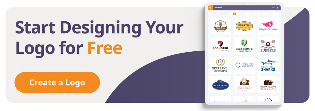
Ready to harness the power of red? Design your own red logo using LogoMaker’s innovative, AI-powered platform that allows you to craft an eye-catching logo in just minutes!

Famous Red Logo Examples That Inspire
Red is everywhere in branding, but not every red logo is created equal. Some companies use it for urgency, others for appetite, and some simply for bold visibility.
Let’s dive deeper into some of the world’s most iconic red logos and see why they work so well.
CNN Logo
The CNN logo is a textbook example of red being used for urgency and authority. As a news network, CNN has to project immediacy; breaking news, alerts, and live updates are its bread and butter. The solid, continuous red lettering reinforces the network’s credibility and seriousness while also grabbing instant attention.
Why it works:
- Bright red conveys urgency, importance, and trust in real-time information.
- The sleek, connected letter design shows continuity, symbolic of 24/7 global news coverage.
- Its simplicity ensures it works across all mediums: TV, web, and mobile.
Coca-Cola
Coca-Cola’s bright red logo has been linked with happiness, joy, and refreshment for over a century. The flowing script paired with bright red is playful, inviting, and universally recognized.
In a genius bit of branding, Coca-Cola linked its iconic red symbol to another iconic red symbol: Santa Claus. Through various clever advertisements, Coke became the unofficial drink of Christmas, further cementing its connection to joy and happiness.
Why it works:
- Bright red stimulates appetite and thirst, making it an ideal color for a beverage brand.
- The curvy script font conveys a sense of friendliness and nostalgia.
- Its timeless design has made it one of the most beautiful logos in history.
YouTube
YouTube’s red play button is one of the strongest examples of modern minimalism in logo design. You don’t even need the wordmark anymore; the red icon alone says it all.
Why it works:
- The red logo with the white triangle suggests motion, activity, and entertainment.
- Bright red is highly visible on both light and dark backgrounds, which is a bonus for digital platforms.
- Its simplicity makes it a universal symbol of video, transcending language barriers.
Netflix
Netflix uses a darker shade of red with black, creating a moody, cinematic aesthetic. This color scheme mirrors the entertainment industry’s drama and excitement while also hinting at prestige and seriousness.
The red in the Netflix logo is also a nod to the company’s history as a DVD rental service. Through Netflix, you could order a DVD of your choice, and it would arrive in a bright red envelope. The bright red color helped differentiate the parcel from your regular mail, creating a sense of excitement.
It might surprise you to learn that Netflix continued mailing out DVDs all the way up to 2023.
Why it works:
- Darker red conveys sophistication and drama, fitting for movies and series.
- Pairing red with black creates contrast, amplifying the boldness of the “N” symbol.
- The glowing gradient red adds depth, mimicking the theater experience.
Lego
The Lego logo shows how red can be fun and childlike without losing professionalism. Pairing red with yellow and white results in a color combination that feels energetic and playful.
Why it works:
- Red provides a bold backdrop that makes the logo stand out on packaging.
- The rounded, chunky font paired with white and yellow feels approachable and fun.
- It appeals to kids while also triggering nostalgia for adults.
Marvel
The Marvel logo screams action. With its bold white text in a blocky font against a vibrant red rectangle, it communicates strength, intensity, and excitement. Every time you see that logo before a movie, you know something thrilling is about to begin.
Older generations certainly know the Marvel logo best from the covers of their favorite comic books. However, in recent years, the logo has been adapted into the Marvel Studios logo, which appears before each Marvel Cinematic Universe movie or TV show.
Why it works:
- Bright red matches the adrenaline-fueled world of superheroes.
- Blocky white text enhances visibility and strength.
- Its simplicity allows it to stand as a cultural icon, not just a company logo.
Levi’s
The Levi’s batwing logo is proof that sometimes less is more. The minimalist red shape with white typography doesn’t just represent a fashion brand; it represents confidence and authenticity.
Levi’s wanted their jeans to stand out among the rest, and they used the color red to accomplish this lofty goal.
In 1936, Levi’s added a small red tag to the back right pocket of their jeans as a means of identifying authentic garments. It stood out vividly from the dark blue denim and instantly became synonymous with the Levi’s brand.
Why it works:
- The bright red batwing design is distinctive, stylish, and bold.
- Red conveys confidence and individuality, aligning with the brand’s denim heritage.
- It appeals across generations, staying timeless while still modern.
Red Bull
Red Bull’s logo combines different shades of red with yellow and blue to create an energetic, eye-catching symbol.
The two red bulls clashing convey raw power, strength, and adrenaline, perfectly fitting the brand’s “gives you wings” identity.
Why it works:
- Red symbolizes energy, speed, and physical strength.
- The clash of bulls creates a dynamic image full of movement.
- Pairing red with yellow and blue enhances excitement and visibility.
Wendy’s
Wendy’s logo proves how red logos can trigger appetite. The warm red color paired with a friendly character makes the brand approachable, family-oriented, and inviting.
Why it works:
- Red stimulates hunger, making it ideal for food brands.
- The character’s smile, paired with the red color, creates trust and warmth.
- Its design balances tradition with modern updates, keeping it relevant.
Target
The Target bullseye is one of the most minimal yet effective logos in history. It’s just a red circle with a dot, but it’s unforgettable. Red, in this case, conveys confidence, clarity, and boldness, while also making the brand instantly recognizable in any context.
Why it works:
- Minimalist design with red makes it highly memorable.
- The bullseye symbol suggests accuracy and focus.
- The simplicity of the logo makes it perfect for almost any medium.
The Logo Design Process for a Red Logo
So, how do you go from idea to finished logo? The logo design process doesn’t have to be overwhelming.
Here’s a simple breakdown:
Step 1: Define Your Brand Identity
Before picking colours, shapes, or fonts, think about what your brand stands for. Do you want to convey passion? Energy? Fun? Power? Make sure that a red logo is the right choice for your specific business goals.
Step 2: Choose Your Shade of Red
Not all reds are equal.
- Bright red: Bold, fun, and youthful.
- Blush pink: Softer and more approachable.
- Dark red / maroon: Elegant and sophisticated.
A bright red might be a good choice for a gym or fitness brand that wants to give off a sense of energy and strength, whereas a fashion brand might want to go with something more subtle.
Step 3: Pick Fonts & Icons
Your typography matters. A playful handwritten font paired with a bright red creates a fun vibe, while a sleek sans-serif font with dark red feels more professional.
Don’t forget about icons and symbols; shapes help enhance meaning.
Step 4: Test Color Combinations
Red pairs beautifully with many complementary colors:
- Red + White = Clean and timeless.
- Red + Black = Bold and dramatic.
- Red + Yellow = Energetic and fun (common in food brands).
- Red + Blue = Balanced and trustworthy.
- Red + Green = Holiday vibes or natural balance.
- Red + Brown = Rustic and earthy.
Step 5: Use a Logo Maker
Tools today make it easy to design a new logo that feels professional. Even free online red logo makers can help you customize and experiment with color schemes, fonts, and shapes.
LogoMaker is a great choice for logo design, even if you have no prior design experience. The easy-to-use interface and AI assistant Logi make it simple to create an amazing new logo from scratch.
Step 6: Save Logo Files Correctly
Always export your logo files in multiple formats: PNG for transparent backgrounds, SVG for scalability, and JPEG for general use. This ensures your own logo looks sharp on any website, social media account, or print material.
Playing with Different Shades of Red
Not every red logo needs to be fire-engine red. Experimenting with different shades gives you flexibility and personality.
- Bright red: Eye-catching and exciting.
- Blush pink: Modern and playful, perfect for lifestyle brands.
- Deep burgundy: Luxurious and elegant, great for premium businesses.
- Rusty brown-red: Earthy and warm, ideal for organic or eco-friendly companies.
Finding the right choice depends on your industry, audience, and what emotions you want to convey.
Fonts, Icons & Design Elements
Your red logo isn’t just about the color. The right fonts, icons, and design elements will enhance your design and make your brand identity stronger.
- Fonts: Serif fonts feel traditional and elegant, while sans-serif fonts feel modern and bold. Handwritten or script fonts paired with red can add warmth and personality.
- Icons and shapes: Circles convey unity, squares signal stability, and triangles feel dynamic. Combine these shapes with red, and you instantly enhance meaning.
- Graphics and symbols: Think about the image your audience should remember. A flame, a heart, or even abstract modern graphics can all work beautifully in red.
Why a Red Logo Makes a Bold Statement
At the end of the day, red logos stand out. They grab attention, stir emotion, and make people remember your brand. Whether you’re designing a logo for a business, a new startup, or a personal project, choosing red is a way to:
- Stand apart from competitors.
- Convey passion and excitement.
- Create a lasting impression.
- Make your brand identity feel strong and confident.
When done right, a perfect red logo becomes a symbol of energy, passion, and power.
Conclusion
Choosing red for your logo is more than just a color decision; it’s a branding strategy. Red communicates passion, energy, power, and excitement, making it one of the strongest branding colors out there.
Whether you want to create a fun, modern design with blush pink or a bold, powerful look with bright red, the key is to align your design with your brand identity.
When you pair the color red with the right fonts, icons, and design elements, you don’t just create a beautiful logo, you create a brand that people will remember.
Create a red logo that people will remember with LogoMaker. The AI-powered logo maker allows you to craft a stunning new logo in just minutes. Customize every element of your new logo design until you’re totally satisfied. Get started today!

FREQUENTLY ASKED QUESTIONS
Why do so many companies use red logos?
Companies use red logos because red is attention-grabbing, emotional, and powerful. It sparks hunger, passion, and excitement, making it versatile across industries like food, media, and fashion.
If you want to incorporate some of these feelings into your own brand, you can use a free red logo maker like LogoMaker to craft an amazing symbol for your business.
What colors go well with red in logo design?
Red pairs well with white, black, yellow, blue, green, and even brown. Try a variety of different pairings to see which works best for your red logo. These color combinations can completely change the mood of your brand.
How do I choose the perfect red for my logo?
Consider your industry and brand personality. Bright red is energetic, blush pink is modern and soft, and deep burgundy feels elegant. Use a red logo maker tool to test out different shades.
Can I make a red logo for free?
Yes! Many free logo makers online, like LogoMaker, let you experiment with fonts, icons, and colors to create a professional-looking design without cost. If you want to try some paid options, Adobe Illustrator and Photoshop also provide good graphic design options.
What makes a red logo successful?
A successful red logo uses the right shades, fonts, and design elements to align with brand values. It should be memorable, emotional, and easy to recognize.
Should I always use red if I want my logo to stand out?
Not necessarily. Red is powerful, but it’s not always the right choice. If your brand is calm and minimalist, softer logo colors might fit better. But if you want passion, excitement, and energy, a red logo is perfect.
What file formats should I save my logo in?
Always save your logo files in PNG, SVG, and JPEG formats. This ensures flexibility across websites, social media, and print materials.


