Once again, March Madness is back and whipping fans into a competition frenzy.
New Final Four merchandise is appearing on store shelves. Basketball fans are intensely debating bracket picks in office pools. Businesses everywhere are looking for ways to latch onto this marketing juggernaut.
It’s safe to say the National Collegiate Athletic Association’s 68-team tournament commands serious brand recognition. In 2017, the three-week event pulled in an average daily audience of 9.8 million people. Fans are even expected to bet $10.4 billion on bracket predictions this year.
The NCAA has successfully built a thriving sub-culture and lingo around its mega-brand. Not only can we look forward to thrilling stories as rivals meet, Cinderellas rise, and favored teams drop the ball.
Every year also brings a new NCAA Final Four logo. And each logo introduces the latest chapter in an 80-year tale of exciting triumphs and defeats. Let’s take a look at how the Final Four logo has evolved alongside the larger brand.
Early evolution of the NCAA Final Four logo
“Final Four” is one of several trademarked phrases that define the iconic identity of March Madness. Writer Ed Chay coined the phrase in 1975 in the “Official Collegiate Basketball Guide.” Yet, this famed tagline doesn’t appear in logos until 1986 and 1987 in the women’s and men’s divisions, respectively. Why?
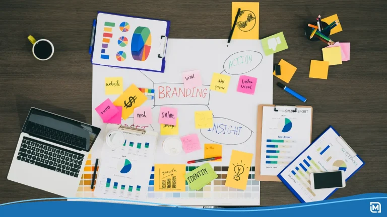
Branding is a learning experience, and it takes time to know which concepts will take root in consumer hearts and minds. NCAA marketers realized the tournament was more than a series of games. It was a sociocultural event with the power to reach one of the largest and most diverse audiences.
![]()
The first championship logo was released in 1979 — 40 years after the tournament began. The framed wordmark is simple and utilitarian — just a way to convey information. In fact, the NCAA name is the most prominent feature.
A classic blue and red color scheme speaks to the unifying effect of national sports. A few short years later, the NCAA started to incorporated more artistry and symbolism. You can divide the championship logos of the 1980s and 90s into two distinct phases.
Emblematic
![]()
The logos are made up of basic shapes and iconic references to the host cities. Saturated, two-tone color schemes grab attention. You can instantly picture the 1981 and 1983 Men’s Final Four logos printed on a range of merchandise.
The 1981 Liberty Bell logo has a minimalist approach that would be easy to produce with the simpler design tools of the past.
Illustrative
![]()
The first Women’s Final Four logo in 1982 introduced a softer illustrative style. The aesthetic soon carried over to the men’s division. At a glance, you can observe hand-drawn images, scenic details, and paler colors.
Illustration was the obvious choice for an expressive logo before digital art transformed the industry. The 1987 Men’s logo recycles the New Orleans trumpet design of 1982 while adding complex linework. Instead of just announcing the tournament, these logos capture the pride of the regions involved.
Making the “March Madness” brand official
The NCAA’s legal battle with the Illinois High School Association likely influenced future shifts in logo design. Since 1939, the IHSA had used “March Madness” as a moniker for the Illinois state high school basketball tournament.
IHSA administrator Henry V. Porter wrote an article titled “March Madness” and later penned the poem “Basketball Ides of March.” The NCAA adopted the phrase in the early 1980s after announcer Brent Musburger used it during a CBS broadcast.
An inevitable conflict arose in 1996 when the NCAA attempted to license a product with the “March Madness” name. The IHSA waited until 1989 to apply for an official trademark.
Meanwhile, the NCAA had publicly used the phrase in promos and merchandise for years. The NCAA won on the basis that the organization held a common-law trademark. But in the end, the IHSA and NCAA jointly formed the March Madness Athletic Association to avoid future litigation.
In the years following, the NCAA has trademarked every major phrase featured in campaigns. Final Four Friday. Selection Sunday. Elite Eight. Sweet Sixteen. Think about the well-known slogans “And then there were four” and “68 teams. One dream.”
Branding has become a top priority in telling the story of the road to success. The Final Four represents the pinnacle of commitment and teamwork. It’s only fitting that this short, memorable tagline would take center stage in the tournament brand story.
Final Four logo trends of the 1990s
The “Final Four” label emerged as a central feature of tournament logos in the 1990s. However, logo designs for the men’s and women’s divisions branched off in far different directions.
1990s Women’s Final Four Logos
![]()
Perhaps, the NCAA wanted to differentiate women’s basketball with light-hearted feminine visuals. Around 1993, the women’s tournament debuted an abstract festive style that continued into the early 2000s.
Nearly every design had a vivid palette of warm and cool colors based around the familiar orange hue of a basketball. Thematic images and scenes are reinvented in abstract shapes with deliberately crude lines and shaky forms.
1990s Men’s Final Four Logos
![]()
On the men’s side, logos were as varied as the host cities. Many designs put a spotlight on state and regional landmarks. The 1989 Space Needle, 1990 Rocky Mountains, and 1996 Statue of Liberty designs are perfect examples. They borrowed the scenic look of earlier designs, but returned to vibrant colors and sharper details.
![]()
Other logos focused on stylized wordmarks. The 1991, 1993, and 1994 designs play around with different typefaces and visual elements of shields, banners, and badges.
Bringing “Final Four” to the forefront
![]()
A consistent look began to take hold in the 2000s. Suddenly, the “Final Four” wordmark was the bold, standout feature of every logo. Initially, the typeface still varied from year to year, and the men’s and women’s logo designs showed more overlap.
![]()
But in the mid-2000s, the NCAA moved toward a unified typeface and shape. Take a look at the St. Louis Arch of 2005 and the San Antonio cowboy hat of 2008. Instead of varying the background, the designs revealed clever new ways to frame the phrase “Final Four.” Distinct color schemes provide ties to host regions, but the core focus is the face-off between skilled athletes.
![]()
The 2019 Final Four logo is a near duplicate of 2018. In recent years, the NCAA seems to value brand recognition over visual differentiation. And that’s likely a smart move. Creating an iconic annual logo design for a sporting event is a challenge, and the extra effort might not matter in this case.
March Madness is a branding spectacle 80 years in the making. The mere words “Final Four” have the power to spark excitement and anticipation in fans around the nation. People show up to be part of the narrative, and they won’t forget crowning moments on the court.
The wordmark is the most crucial element of the Final Four logo. Fans will stay connected to this interactive brand as long as the tournament keeps delivering thrilling outcomes.