

It started with a clunky drop shadow and a Yahoo!-inspired exclamation mark. This was Google’s first logo, serving as the initial visual identity created during its beta phase. It’s hard to imagine now, but the world’s most recognizable logo didn’t begin as a masterpiece of modern design. Instead, its journey from a quirky ‘90s placeholder to the clean, colorful icon we see today tells the story of the internet itself.
But like everything else in tech, the Google logo didn’t just happen; it underwent a notable change over time. It’s been through numerous iterations, each reflecting shifts in technology, design trends, and even company philosophy. From its quirky exclamation mark beginnings to its sleek sans serif font version today, the logo’s evolution is a fascinating story of how a company can stay fresh while staying familiar.
Let’s rewind time and dive into the history and evolution of Google’s iconic G logo, unpacking the fonts, colors, doodles, and perhaps clumsy design decisions that shaped it.
- 1. The 1998 Placeholder with an Exclamation Point
- 2. Ruth Kedar Touch in 1999 & a Rule-Breaking Palette
- 3. The 2000s: The Rise of the Doodle
- 4. 2010 Is The Last Polish Before the Great Leap
- 5. The 2015 Redesign, The Change to Product Sans
- Beyond the Wordmark: A Unified Design System
- Anatomy of an Icon: Why the Google Logo Works
- The Future of the Google Logo
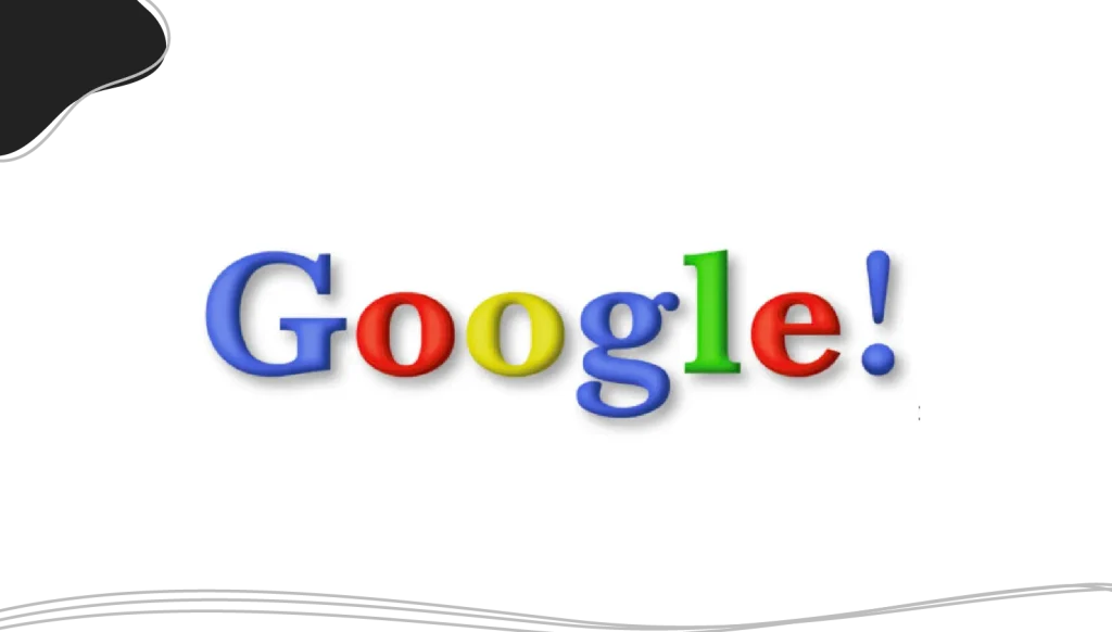
1. The 1998 Placeholder with an Exclamation Point
Before there was the clean, modern Google logo we know today, the first company logo was an afterthought. Think: shadowy letters, a weird color combo, and yes, an exclamation point. Sound familiar? That’s because the early version was very reminiscent of another ‘90s internet darling: Yahoo!
It was 1998, and co-founder Sergey Brin, armed with a free graphics program (GIMP), created what was essentially a placeholder. This software is still widely available and remains very popular within the Linux and open-source communities. He used the Baskerville Bold typeface, added a heavy drop shadow, and, in a move that screamed “dot-com bubble,” tacked on an exclamation point.
The word “Google” itself was styled as a colorful wordmark, with each letter in a different color, emphasizing the playful and approachable identity the brand wanted to convey from the start. The design of the word in the logo played a crucial role in establishing Google’s early branding and visual identity.
But it served its purpose, marking the initial development of the Google brand. When Google was officially launched in 1998 by Larry Page and Sergey Brin, the search engine had a logo that, at the very least, looked like it belonged to a tech startup.
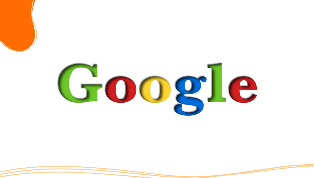
2. Ruth Kedar Touch in 1999 & a Rule-Breaking Palette
In 1999, things changed, along with the Google logo. Enter Ruth Kedar, a graphic designer tasked with bringing Google’s visual identity into focus. She experimented with several concepts, most of which never saw the light of day. But one version stuck.
Kedar’s version introduced a more polished look, dropped the exclamation mark, and established what would become the foundation for Google’s color palette: red, yellow, green, and blue. Kedar experimented with different hues of these colors to create a distinctive and playful identity for Google.
What made this version special was that it didn’t try too hard. Unlike flashy logos of the dot-com boom, the Google logo felt accessible. It was fun, colorful, and didn’t take itself too seriously, just like the company itself.
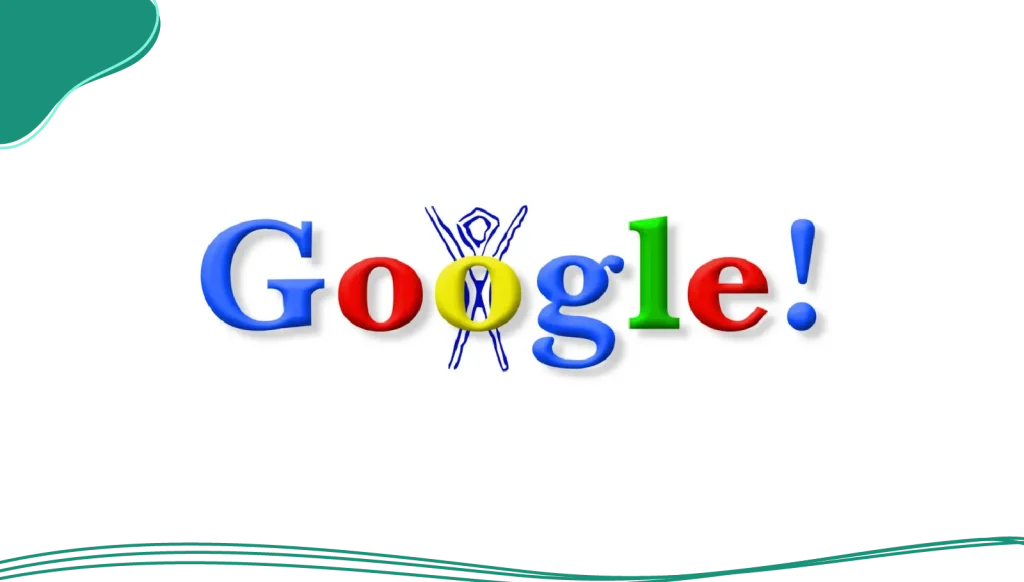
3. The 2000s: The Rise of the Doodle
As Google’s popularity exploded, its logo found a new way to connect with users: the Google Doodle. What began as a simple out-of-office message became a branding masterstroke.
For the first time, a major corporate logo became a dynamic canvas. Google introduced these temporary, creative changes to its logo on the home page to celebrate holidays, events, and notable figures. Often containing external links for discovery, each Doodle was a moment of delight. This innovation showed the brand’s playful side and made the logo an interactive part of the user experience.
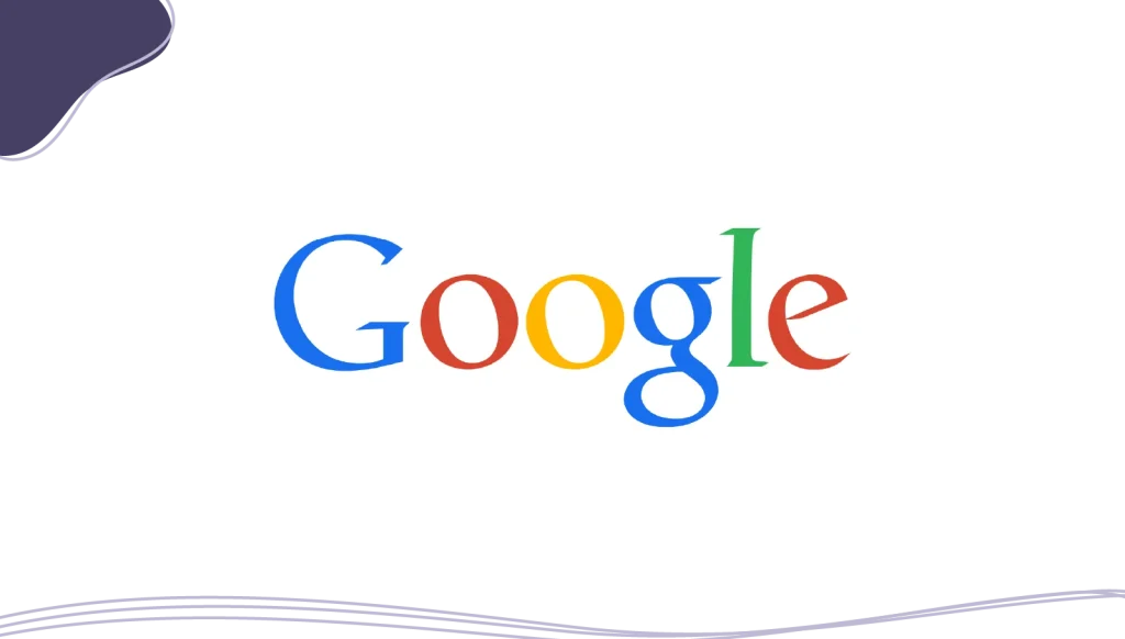
4. 2010 Is The Last Polish Before the Great Leap
A decade later, the web was a different place. In 2010, Google made a notable change to the logo that, while subtle, differentiated it from the previous version. The last remnants of 3D-style design were shaved off as the drop shadow was removed entirely. The colors became brighter, and the lettering was tightened. At the same time, the colors remained consistent with Google’s established palette, even as the design evolved.
The logo design felt fresher, sleeker, and more modern, but it was still unmistakably Google. But this polish also revealed a problem. Google was a sprawling ecosystem of Maps, mobile apps, and new services like Google Play, Pixel phones, and countless other services were taking off.
The elegant, detailed serif logo that looked great on a desktop monitor didn’t scale well to tiny smartphone screens. It was the best it could be, but it was clear that a simple tweak wouldn’t be enough for the future.
5. The 2015 Redesign, The Change to Product Sans
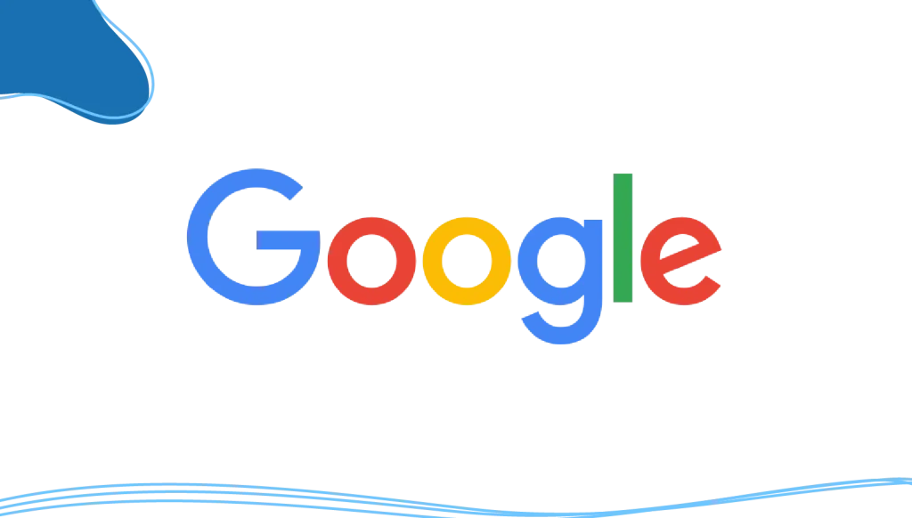
This was the big one. In 2015, Google switched to a new logo that was a complete reinvention, built for a multi-device world.
The redesign was bold. The serif typeface was retired in favor of a clean, modern sans serif font called Product Sans. This new typeface was developed in-house by Google for ultimate clarity and scalability. The changes were fundamental:
- A new font: The custom-built Product Sans is a geometric sans serif that is friendly, approachable, and easy to read on any screen.
- Modernized colors: The iconic colors remained, but with softer, more contemporary, and different hues to create a friendlier feel.
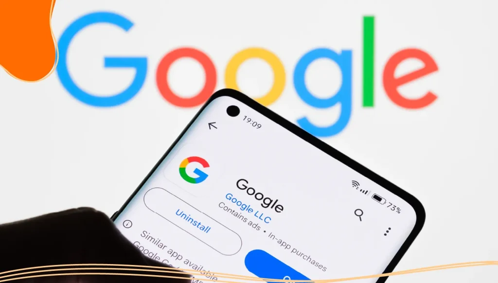
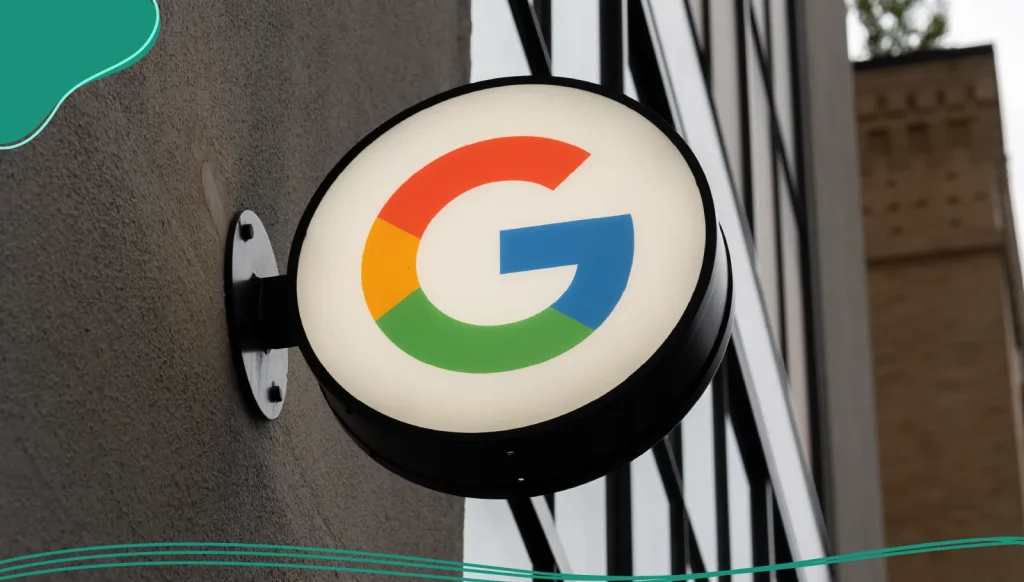
- A new icon: The new favicon was born, a simple but powerful four-color capital letter “G.” This icon serves as a compact symbol for the brand across all its services.
Compared to the previous logo and previous versions, the new design introduced a custom sans-serif typeface, updated color tones, and a flatter, more contemporary style.
The Birth of the Micro‑Icon
- New favicon: Alongside the wordmark came a simple four‑color capital letter “G” favicon, officially launched as a powerful mini‑icon for Google Maps, Chrome, Google Play, Pixel phones, and beyond. This little icon acts like an exclamation mark of branding, bold, unmistakable, and functional, even at the tiniest pixel size.
- Colorless version: A monochrome, colorless version ensures the favicon works in contexts where color can’t go, from print collateral to low‑bandwidth environments.
This new logo didn’t just represent Google-the-search-engine. It symbolized Google-the-ecosystem. It was functional, beautiful, and scalable across everything from smartwatches to billboards.
Beyond the Wordmark: A Unified Design System
After the 2015 redesign, Google had created more than just a new logo. It created a complete design system built to unify its massive digital ecosystem. For a company with sprawling services like Google Maps, Gmail, Google Play, and Pixel phones, creating a cohesive brand experience was crucial.
This unity is achieved through a shared design DNA. While each product, like YouTube or Google Workspace, has its own unique icon or badge, they are all bound by two core elements:
- The clean, readable Product Sans font.
- The iconic four-color scheme.
This ensures that no matter which Google service you’re using, it feels distinctly “Google.”
But the system isn’t just about rigid consistency; it’s also about personality. This is where the playful elements that define the brand come in. The beloved Google Doodle, which we saw rise in the 2000s, continues to be the ultimate expression of this, transforming the home page into a daily canvas for art and culture.
At the other end of the scale is the Google favicon. That tiny, four-color “G” in your browser tab is a powerful micro-symbol for the entire brand. It’s a compact, instantly recognizable ambassador that proves the strength and flexibility of the modern logo design. Together, these elements create a system that is both remarkably consistent and endlessly dynamic.
Anatomy of an Icon: Why the Google Logo Works
So, why has the Google logo remained so powerful and iconic through all its changes? Its success isn’t an accident; it’s built on a foundation of clear design principles, especially since Google updated its branding approach.
- Engineered simplicity: The flat, geometric design is clean and approachable. This is powered by the custom-built Product Sans font, which was engineered for maximum readability on any screen. The logo feels friendly and intuitive, never futuristic or intimidating.
- Strategic color: The use of blue, red, yellow, and green is one of the brand’s most recognizable assets. The deliberate choice to break the pattern of primary colors with a secondary color (green) was a signal of the company’s nonconformist spirit.
- Unmatched versatility: The combination of a simple sans serif font and a distinct color scheme makes the logo design infinitely scalable. It works as a tiny favicon on a browser tab, a full word on the search page, and an animated graphic on a smart display.
- Intentional playfulness: From the “rebellious” green letter to the endless creativity of the Google Doodle, a sense of fun is baked into the brand’s DNA. This injects a dose of humanity and surprise into a massive tech company, making it feel more accessible.
The Future of the Google Logo
If the history of the Google logo has taught us anything, it’s that the design is never truly finished. We can expect its future to be one of evolution, not revolution. Google has always preferred to tweak, adapt, and refine its visual identity rather than overhaul it completely.
Future updates will likely respond to new technologies. Imagine subtle adjustments to the color palette for new displays, or dynamic, motion-based logos that come to life in AR and VR interfaces. We may even see more frequent use of the colorless version for specific events. As technology advances, the logo will adapt.
The Google logo has evolved alongside the very world it helps us explore. It is a testament to the power of simple, two-dimensional, thoughtful design, instantly recognizable, endlessly adaptable, and always ready to show us something new.
Conclusion
From a grad student’s quirky experiment to a global symbol of innovation, the Google logo’s evolution is a story that is far from over. From its humble beginnings with shadows and exclamation points to its flat, sans serif modernity, the logo has evolved alongside the company and the world.
Yet, in that simplicity lies its power. It is instantly recognizable, endlessly adaptable, and infused with a playfulness that keeps it human. From a complex search query to a whimsical Doodle, that colorful wordmark is a reminder that the most powerful ideas are often the simplest ones.
Inspired by Google’s logo evolution? Take advantage of LogoMaker’s intuitive AI-powered platform to create an amazing business logo in just minutes!
FREQUENTLY ASKED QUESTIONS
Why did Google change its logo?
Google changed its logo in 2015 to better reflect its modern identity as a technology conglomerate rather than just a search engine. The update made the logo more adaptable to mobile and digital interfaces, using a sans-serif font and a flat design. Companies usually change their logos every 10 years; however, there’s no specific timeline for when they must do so.
What font does the Google logo use now?
The current Google logo uses Product Sans, a proprietary typeface developed by Google that’s geometric, minimal, and optimized for digital screens.
When was the first Google logo created?
The first Google logo was created in 1998 by Sergey Brin using a free graphics program. It used Baskerville Bold and even had an exclamation mark, similar to Yahoo!’s logo at the time.
What are Google Doodles?
Google Doodles are temporary modifications of the Google logo that appear on the home page to celebrate holidays, milestones, and notable historical figures. They’re often interactive and link to external educational content.
What colors are used in the Google logo?
The Google logo color scheme includes blue, red, yellow, and green. These primary and secondary colors are arranged to subtly break patterns, with green acting as the odd one out to symbolize Google’s unconventional approach.
What is the Google favicon?
The Google favicon is the small icon seen in browser tabs. The current version, introduced in 2015, is a multi-colored capital “G” that uses all four of Google’s signature colors.
Is the Google logo the same across all services?
Not exactly. While services like Google Maps, Google Play, and Pixel phones have their own icons, they all share the same Product Sans typography and color scheme, ensuring consistent branding.