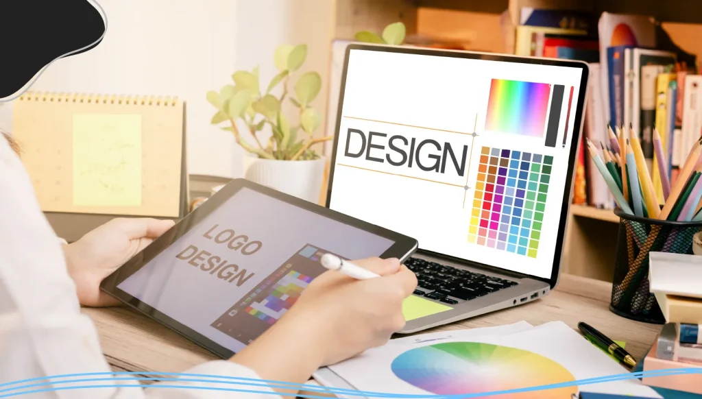
Ever found yourself lost in a sea of graphic design terms, nodding along as designers toss around phrases like “visual hierarchy,” “brand identity,” or “Pantone Matching System”? You’re not alone! If you aren’t able to effectively communicate with your graphic designer, it can make projects infinitely more complicated.
That’s why it’s important to familiarize yourself with the common graphic design jargon and terminology.
In this article, we’ll break down the most important graphic design and branding terms so that you and your graphic designer are on the same page. Let’s get started!
Why Graphic Design Terms Matter
Before we get into the nitty-gritty, let’s answer the big question: Why should you care about graphic design terms in the first place?
As we mentioned before, the main reason you should familiarize yourself with graphic design terminology is to help you communicate your ideas clearly with designers and marketers. If the graphic designers you work with are using terms you don’t understand, you two are literally speaking a different language.
Having an understanding of graphic design jargon also helps you save time. A study by LinkedIn and Duolingo found that 57% of working professionals claim that misunderstanding industry jargon wastes time during their day. Having a shorthand with the graphic designers on your team will lead to quicker decision-making and less confusion.
Essential Graphic Design Terms
Let’s break down some of the most common graphic design terminology you’ll encounter, from the basics to the more advanced.
Typography & Lettering Terms
Typography: The artistic arrangement of type in a readable and visually appealing way.
Typeface: The design of letters, numbers, and other symbols, to be used in printing or for electronic display.
Font: A font is a particular size, weight, and style of a typeface.
Font family: A group of related fonts (like Arial or Times New Roman).
Bold: A heavy weight of any given typeface, often used for emphasis.
Italics: Forward-slanting characters.
Kerning: The adjustment of space between two characters in your type.
Leading: Leading refers to the space between lines of type.
X-Height: The average height of lowercase letters. X-height gets its name as the value is usually determined by the height of the letter “x” in a font family.
Ascenders and Descenders: This is the part of a lowercase letter that extends above and below the x-height. For example, the letter “h” has an ascender section, and the letter “j” has a descender section.
Serif Typeface: These typefaces feature small decorative strokes (called serifs) found at the end of horizontal and vertical lines. Serif fonts tend to have a more traditional and classic feel.
Sans Serif Typefaces: As the name suggests, sans serif fonts/typefaces don’t feature any serifs.
Script Typeface: A typeface that mimics cursive handwriting. While elegant, script fonts might not transfer well to smaller mediums.
Body copy: The main text in your design, usually set in a simple, readable font.
Orphan text: A single word (or very short line of two or three words) that sits on its own on a new line or new page/column.
Alignment: The lining up of elements to achieve balance, order, and a more logical layout. There are 4 common types of alignment: center, left, right, and justified.
Lorem Ipsum: Also known as placeholder text, this is a generic text used when the real text is not available. It is widely believed that the history of Lorem Ipsum originates with Cicero in the 1st Century BC.
Color & Color Theory Terms
Color palette: The set of colors chosen for your brand or a particular design. A good palette includes primary, secondary, and accent colors for flexibility and harmony.
Color model: The method for creating color, like RGB (for screens) or CMYK (for print).
CMYK: CMYK or ‘Cyan, Magenta, Yellow, Key’, is a color model that is used for print purposes.
RGB: RGB or ‘Red, Green, Blue’ is a color model that is used for on-screen purposes.
Color wheel: A visual tool showing the relationships between colors, used to create harmonious color palettes.
Analogous colors: A color scheme built out of three colors that are next to each other on the color wheel.
Complementary colors: A color scheme built out of two colors that sit opposite each other on the color wheel.
Cool colors: Colors like blue, green, and purple that evoke calm and professionalism.
Warm colors: Colors like red, yellow, and orange that tend to feel cozier, friendlier, and more cheerful.
Gradient: A gradual change from one color to another, often used for backgrounds or to add depth.
Monochrome: A color scheme built out of only one color, including lighter and darker tones of that color.
Pantone Matching System (PMS): A standardized color system that ensures your brand colors look the same in print, on screen, and everywhere else. Each Pantone color has a unique code, so “Kodak Yellow” is always exactly Kodak Yellow.
Opacity: The degree of transparency an element has. The lower the opacity, the more transparent an element is.
Resolution: The amount of detail an image has. The higher your resolution, the sharper and clearer your images appear.
Contrast: The degree of difference between two juxtaposed (side by side) elements.
Saturation: The degree of intensity and vividness of a color.

Layout & Space Terms
Aspect ratio: The proportional relationship between width and height of an image or design (for example, 16:9 for widescreen).
White space (negative space): The empty areas in a design that give elements room to breathe. White space is important to make your designs cleaner and more readable.
Horizontal space: The width between elements or within a layout.
Grid: A framework made up of evenly divided, intersecting columns and rows.
Scale: The change of size of an object while keeping its shape and proportions intact.
Margins: The space around the edge of a page.
Design Terms
Icon/icons: Simple graphic symbols that represent actions, objects, or ideas.
Graphic elements: Decorative or functional visuals like lines, shapes, and patterns.
Distinctive elements: Any unique visual feature that sets your brand apart—like a custom illustration or signature color.
Proximity: Grouping related elements together to create order and clarity.
Stock photo: A professionally shot photograph available online for licensing. There are numerous free stock photo websites available online that offer royalty-free images.
Bleed: A printing term that refers to the edge of the sheet that will be trimmed off.
Golden ratio: Also referred to as the golden rectangle, the golden ratio is when you take two objects, divide the larger by the smaller and get the result of 1.6180 (or near it). It is one of the fundamental principles of effective design.
Digital Design Terms
Pixel: The smallest basic unit of a digital image. More pixels = sharper images.
Responsive design: A layout that adapts to different screen sizes for a seamless experience on any device.
Transparent background: An image with no background, so it can be placed over any color or photo without a white box around it.
Raster: A raster (which can also be called a bitmap image) is an image made up of a certain number of pixels.
Vector: A graphic image that is made with mathematical equations. This means that vectors can be resized or scaled to any size without losing quality or getting blurry.
AI file: A vector image format used for original Adobe Illustrator design files.
EPS file: A vector image format often used for high-resolution printing.
JPEG: An example of a graphic image file type that contains bitmaps. It is created for compressing full-color or grey-scale digital images of real-world scenes.
PDF file: A raster image format best used for print files and web-based documents.
PNG file: A raster image format with millions of colors available.
PSD file: A raster image format best for layered Adobe Photoshop design files.
Responsive design: Ensures your website or app looks great on any device, from phones to desktops.
Other Must-Know Terms
Mood board: A collage of images, colors, and fonts that sets the visual direction for a project.
Mockup: A realistic preview of how your design will look in the real world (like your logo on a T-shirt or storefront).
Wireframe: A basic outline of a web page or app, focusing on structure over style.
Information architecture: The way content is organized and presented, especially on websites and apps.
Rule of Thirds: This is a theory that stems from photography, which claims that if you divide your image with two vertical and two horizontal lines, the areas where your lines intersect will become focal points of your design.
Branding Terminology
When working with graphic designers, one of the most crucial aspects to focus on is maintaining an even brand identity. Whether you’re working on elevating an existing brand or building a new brand from scratch, certain brand attributes must remain consistent throughout all materials (websites, business cards, billboards, brochures, etc.) so that customers feel a connection to your brand.
To help facilitate good communication between you and your graphic designer, here are some essential branding terms that you should know.
Brand Identity Terms
Brand identity: The unique combination of elements that shape how people perceive your particular brand. It’s everything from your company name and logo to your brand voice and messaging. A strong brand identity fosters familiarity, builds trust, and helps you stand out in a crowded and competitive landscape.
Brand voice: The tone and style of your communications, whether you’re playful, authoritative, quirky, or formal.
Brand values: The beliefs and principles that guide your business decisions and behavior.
Visual identity: The look and feel, colors, logo, typography, imagery, that make your brand instantly recognizable.
Brand promise: The commitment you make to customers; what they can always expect from you.
Story: The narrative that explains who you are, why you exist, and what makes you different.
Brand Guideline Terms
Guidelines: Also called a brand manual or brand style guide, these are the official rules for how your brand assets should be used. They’re essential for maintaining a consistent visual appearance and brand voice across all channels, from web design to printed marketing materials.
Brand assets: The distinctive brand elements that make your brand recognizable and unique. They’re the tools you use to build your brand’s visual identity and communicate with your audience.
Brand book (or brand bible): The ultimate guide, covering everything from brand mission and values to detailed visual and verbal guidelines. It’s both a reference and a source of inspiration for your team.
Brand voice: How your brand “speaks” to your audience. It’s shaped by your values, personality, and the way you want to be perceived. Your brand voice should be consistent across all channels, from social media to customer service emails.
Visual Identity Terms
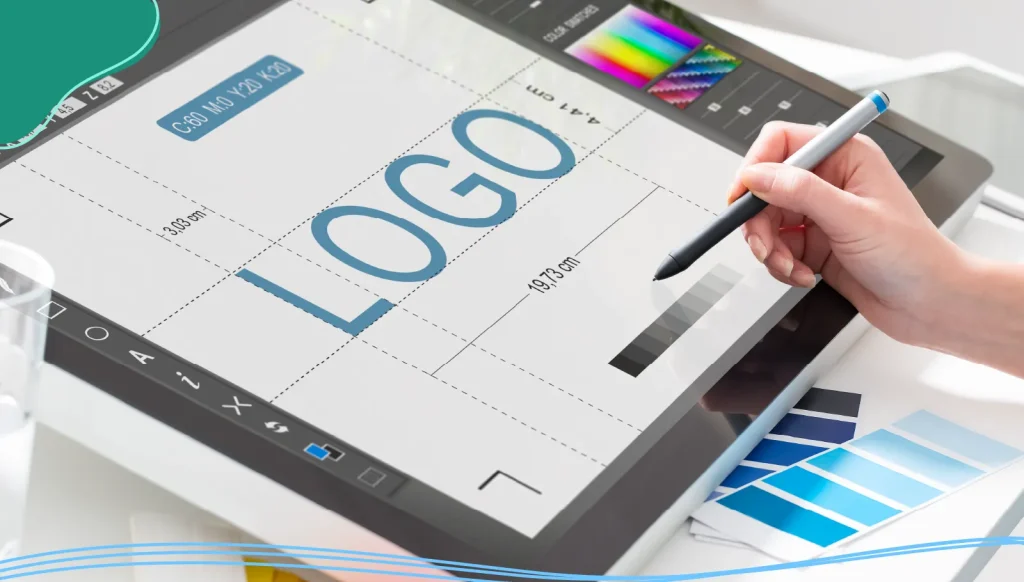
Logo: The graphic symbol or wordmark that’s the centerpiece of your brand. Think Nike’s swoosh or Apple’s apple.
Logomark: A logo of a company that does not contain the brand name itself, usually a shape or character used to represent the company visually.
Logotype: Also known as a wordmark, a logotype is a brand name styled as a logo, designed in a visually unique way for a company.
Imagery: The style of photos, illustrations, and icons that reflect your brand’s personality.
Graphic elements: Patterns, icons, shapes, and other design elements that add flair and recognition to your materials.
Layout and composition: How you arrange all these elements on a page or screen to create a visually appealing and easy-to-navigate experience.
Brand colors: The specific colors you use to represent your brand. They should be chosen for their emotional impact and consistency across all platforms.
Digital elements: Any kind of digital asset, including documents, photos, and videos.
Brand Architecture Terms
Brand architecture: How you structure and organize your company’s brands, products, and services. It’s like a family tree for your brand, helping you manage everything from the master brand to sub-brands and endorsed brands.
Master brand: The main brand that represents the company as a whole.
Sub brands: Sub brands are brands under the master brand with their own identity but still connected to the parent. Sub-brands may share some brand assets with the master brand, but are often a completely separate entity.
Endorsed brands: Independent brands that get a credibility boost from being associated with the master brand.
Brand hierarchy: The structure that defines how all these brands relate to each other.
Product brands: Standalone brands for individual products or services.
Brand Messaging Terms
Brand messaging: The language and ideas you use to communicate your brand promise, values, and positioning to your target audience.
Mission statement: Why your brand exists, your purpose and goals.
Brand Positioning statement: A concise description of how you want your brand to be perceived in the competitive landscape.
Brand values: The core beliefs that guide your actions.
Vision statement: What you aspire to achieve in the future.
Brand attributes: The characteristics that define your brand’s personality.
Brand story: The narrative that brings your brand to life and connects with customers on a human level.
Marketing materials: Brand identity and visual elements come together in your marketing materials. This includes everything from business cards and brochures to websites and social media posts.
Brand equity: The value your brand adds to your products or services. Strong brand equity comes from consistent branding, positive customer experiences, and clear differentiation from competitors.
Brand audit: A thorough review of your brand’s strengths, weaknesses, and opportunities. It examines your brand positioning in the market and how you compare to competitors. The goal is to make sure your brand values are being met and are connecting with the target audience, while identifying areas for improvement.
Customer journey: The complete experience a customer has with your brand, from first impression to loyal customer.
Customer personas: Fictional profiles representing your ideal customers, used to guide design and messaging decisions.
Conclusion
Understanding graphic design and branding terms isn’t just for professional designers; it’s for anyone who wants to build a strong, memorable brand. By mastering these concepts, you’ll communicate more clearly, make smarter decisions, and create an identity that stands out in any competitive landscape.
While remembering all of these terms can seem daunting, being familiar with industry jargon provides you with a powerful toolkit to build a brand that’s not only visually appealing but also meaningful, consistent, and unforgettable.
LogoMaker is your one-stop shop for all things design and branding. Take advantage of our range of branding tools, including our AI-powered logo maker, DIY website builder, business card maker, and promotional product services. Take your brand to the next level using LogoMaker!

FREQUENTLY ASKED QUESTIONS
What’s the difference between brand identity and visual identity?
Brand identity encompasses everything that shapes how people perceive your brand, including visual elements, voice, values, and messaging. Visual identity focuses specifically on the visual aspects: logo, color palette, typography, and imagery.
Why are brand guidelines important?
Brand guidelines ensure everyone uses your brand assets consistently, protecting your brand’s integrity and making your communications more effective.
How many fonts should I use in my brand materials?
Stick to two or three fonts for clarity and consistency; usually one for headlines, one for body copy, and possibly one accent font.
What is negative space?
Negative space (or white space) is the empty area around design elements. It helps your design look clean, balanced, and easy to read.
How do I choose brand colors?
Consider your brand’s personality, values, and the emotions you want to evoke. Use the color wheel and color theory to create a harmonious palette, and use systems like Pantone for consistency.
What’s a brand audit?
A brand audit reviews your brand’s strengths, weaknesses, and opportunities, helping you ensure alignment with your mission, values, and target audience.
What is brand equity?
Brand equity is the value your brand adds to your products or services, measured by recognition, loyalty, and customer preference.