The color of your logo is one of the most crucial design aspects when it comes to branding your business. Unfortunately, many companies fall short of their branding goals in part because they have chosen the wrong color or colors for their logo.
It can be easy to get carried away with the logo design process; there are so many colors to choose from, shapes to incorporate, and different fonts to test. Too much of a good thing can end up doing more harm than good when it comes time to marketing your brand. These days many companies are opting for a more simple brand approach with the use of a black and white logo.
Black and white logos were once the most popular logo style when printed products were still the primary advertising medium. The monochrome color was used to save ink and thus cut down on expenses for the company. Newspapers and televisions were also black and white, so this made choosing a black and white logo design quite easy. Today, printing costs have reduced, televisions broadcast in color, and the marketing industry has shifted to social media, websites, and email. As a result, color logos have become the go-to choice for companies across the world. Yet why do we continue to see black and white logos popping up here and there? Below are a few explanations as to why this trend isn’t going away any time soon.
Benefits of a black and white logo
- Authority. Nothing says “respect my authority” quite like a well designed black and white logo. Athletic apparel corporations such as Nike, Adidas, and Puma each have logos with prominent, bold black typeface lettering accompanied with a simple yet equally commanding icon. The Nike swoosh and the black jumping panther that Puma has trademarked both exude a sense of authority.
- Class. Gucci, Chanel, Coach, Prada… The list of fashion designers with black logos is seemingly endless. This list is exhaustive because nothing says sophistication quite like a black and white logo. With no colors to worry about, these designer brands focus more on font style and icons, such as Coach’s famous horse-drawn coach displayed above their printed brand name.
- Simplicity. As mentioned earlier, the best part about a black and white logo is that there’s no need to spend money on color promotional products, mailers, and other printed material. This logo design conveys to customers that your company can compete with other industry-related brands without the help of all the bells and whistles (in this case, catchy reds, yellows, and greens).
- Elegance. Ralph Lauren, Lancome and Estee Lauder may come to mind when you think of an elegant brand and product. If you’re looking to provide top-notch service or the more reliable product to your customers, then a black and white logo that is designed with elegance and grace in mind will let your customers know you are the best of the best.
- Timeless. SONY, Disney, and Apple’s black and white logos all feature simple, clean lines for an overall sleek and modern logo design. The best part about these logos is that because they are simple and modern, they are also timeless. Legible fonts and perfectly-sized icons make these brands easy to recognize no matter who the audience is.
- Minimalistic. While some companies with black and white logos may feature complex lines and fonts, others have opted for a more minimalist approach. For example, Converse, Gillette, and Louis Vuitton each have a very minimalistic font that is easy to print on their world-renowned products. When designing a black and white logo, it’s always important to keep the design on the more conservative side because anything more complex may not look ideal on promotional products.
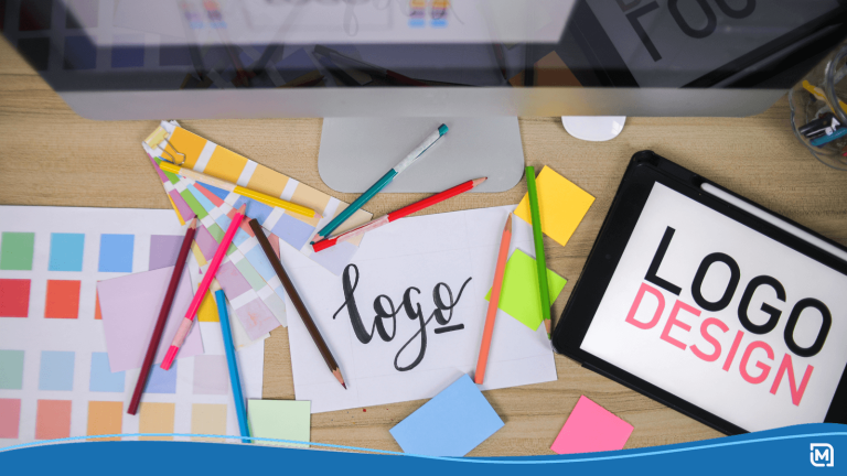
Designing a black and white business logo
When color isn’t an issue for your business logo, the icon and font is the most important aspect of the design process. Below are a few key steps you will need to take to successfully design a black and white logo.
- Choose a style. There are seven logo design styles you can choose from:
- Lettermarks (IMB). A lettermark logo is perfect if your company name has multiple words in it and can be easily abbreviated.
- Wordmarks (Google). Also known as logotypes, this style consists of your brand name written out using a custom font and colors.
- Pictorial marks (Target). These logos just include an image or icon and no lettering.
- Abstract logos (British Petroleum). Often geometric in shape, abstract logos are custom designed for brands and may also include the company name.
- Mascots (KFC). These are personified animals or cartooned people that the brand wants its customers to associate their product or service with.
- Combination mark logos (Doritos). This logo style uses both wordmarks and icons to create a custom logo.

- Emblem logos (Starbucks). Badge or emblem logos are confined to a shape, such as a circle or diamond. Within these shapes are images and/or the company name.
- Choose an icon. If you have opted for a logo design that includes an icon or image, then it’s time to decide on which one best describes your company. When you design a logo using an online logo maker, you will have hundreds of icons from dozens of different industry types to choose from. Select an icon that you think best captures your company’s story. If you don’t like any of the pre-made icons, then you can always work with a designer to create your very own business logo from scratch.
- Choose a font. Picking a font can end up being very time consuming, and it’s easy to start to feel overwhelmed. We recommend doing your research first on the most popular font styles. Below are the 5 main font styles that businesses use when designing a logo:
- Traditional serif. Originating from ancient Rome, the traditional serif font style is timeless due to its all-encompassing design. Businesses in the fashion, academic, and culture industries have gravitated towards traditional serifs.
- Geometic sans-serif. Unlike their serif counterparts, sans-serif fonts have a more clean-cut appearance to them. The lettering features clean lines and a bolder typeface. Startup companies and other tech giants often choose geometric sans-serif fonts to appeal to a younger audience.
- Slab-serif. Chunky, blocky, and bold, the slab serif fonts are ideal for catching the attention of customers. Many businesses who opt for lettermark or wordmark logos will use this type of font style.
- Characterful script. Funky, whimsical, and unique, these scripts are ideal for small business owners who are customer facing. Cursive lines and rounded edges make for a warmer, more approachable brand.
- Stencil font. A great choice if you love the look of the traditional serif font but want to add your unique touch to your logo. Stencil fonts are perfect for media or production companies, as well as small business storefronts.
Finishing touches for your logo design
After you have chosen the type of logo you want, the icon you want to use, and the font for your business name or slogan, it is time to put all these components together to create a unified black and white logo. When designing a logo online, play around with whether or not your logo looks good on a black background or a white background. If you choose a black background, then your icon and text will need to be white to display correctly. If you choose a white background, then make sure your icon and text are black. Don’t forget to try and envision your black and white logo placed on a variety of different backgrounds and on various promotional products. Ask yourself whether or not your logo will look good on your website, social media, a pen, or on insert mailers.
Black and white logos are a sleek and sophisticated logo design that can work for your business no matter what industry you’re in. Using our online logo maker software, you can great and edit your black and white minimalist logo however you see fit!