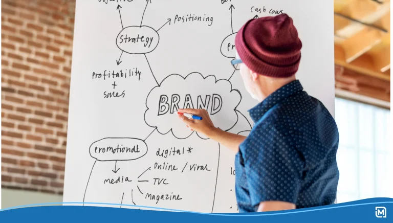

As a small business owner, investing in branded merchandise allows your business to expand outside of the digital world into every area of your customers’ lives. Your business is represented in custom t-shirts, mugs, stickers, packaging, and everything in between. That kind of integration is powerful.
But it also means every little design decision matters a lot more than you might think. We know that a consistent brand identity is the difference between thriving and floundering, and we’ve seen it play out across thousands of small businesses.
Without clear brand guidelines for small business, things can get messy fast. One slightly off color here, a stretched logo there, a different font on your packaging, and suddenly your brand starts to feel less polished, less professional, and harder to recognize. Not because your product isn’t good, but because your visual identity isn’t aligned. Suddenly, your brand doesn’t feel like a cohesive identity anymore; it feels like a bunch of disconnected pieces scattered across a mood board.
The good news? You don’t need a massive corporate brand manual to fix this. You just need simple, practical brand identity guidelines that actually work for real-world printing and merch.
In this article, we’ll walk through how to build a clean, usable, and effective brand guide that keeps everything looking sharp, consistent, and unmistakably you.
- What Are Brand Guidelines?
- Why Your Small Business Needs Brand Guidelines
- Creating Your Own Brand Guidelines

What Are Brand Guidelines?
Before we get into logos, colors, and typography, let’s quickly define what brand guidelines actually are, because this is where a lot of small businesses get tripped up.
At their core, brand guidelines (also called a brand style guide, brand manual, or brand identity guidelines) are a simple set of rules that explain how your brand should look, feel, and communicate. They cover your logo usage, brand colors, typography, tone, and all the visual and design elements that make up your brand’s visual identity.
Think of your brand guide as the instruction manual for your business’s look and feel. It ensures that no matter who is creating something, whether it’s you, a designer, or a print shop, everything stays aligned and consistent.
How Brand Guidelines Connect to Branded Merchandise
When your brand lives on physical products, your guidelines go from “nice to have” to absolutely essential. Unlike digital designs, merchandise introduces real-world variables:
- Fabric textures can change how colors appear.
- Printing methods can affect detail and sharpness.
- Different materials (paper, plastic, metal) react differently to ink.
- Size and placement limitations can distort your logo.
Without clear, specific guidelines, every new product becomes a guessing game. And that’s when mistakes happen, and your brand identity starts to feel inconsistent.
Good brand guidelines for a small business remove that guesswork. They tell you:
- Which version of your logo to use on a hoodie vs a pen.
- What color palette works best on dark vs light backgrounds.
- Which file formats to send to printers.
- How much space your logo needs to stay readable.
- What’s allowed, and what’s never allowed.
In other words, they turn your creative process into a repeatable system.

Why Your Small Business Needs Brand Guidelines
Running a successful small business, or any organization really, comes down to one thing: consistency. It doesn’t matter if you’re talking about services, product delivery, customer relations, or marketing; consistency is one of the key indicators that your business is on the right track. The proof is in the numbers, as recent research shows that consistent branding can increase revenue by up to 20%.
Let’s take a look at how inconsistencies in branding and graphic design can hurt your company and how having the proper guidelines in place can save it.
The Real Cost of Inconsistent Colors & Logo Usage
When you’re running a small business, it’s easy to focus on speed: get the design done, send it to print, move on. But the inconsistencies add up, and not in a good way.
If your logo appears slightly different across products, or your brand colors shift from one item to another, customers notice, even if they can’t explain why. That subtle inconsistency chips away at brand recognition. Instead of building a strong, memorable brand identity, you’re creating confusion.
This rule doesn’t just apply to small businesses; massive corporations make similar mistakes all the time. For example, in 2009, Tropicana replaced its iconic logo and packaging (featuring an orange with a straw) with a modern, minimalist design. The result was disastrous: customers didn’t recognize the product on the shelf, leading to a major dip in sales that cost the company over $20 million dollars.

Why “Just Using the Logo File” Is Not Enough Once You Start Printing
A lot of small businesses think, “I have my logo file, I’m good.” Not quite.
Printing introduces variables you don’t deal with on screen, fabric textures, ink absorption, material colors, and production limitations. Without specific guidelines, your brand’s visual identity can quickly drift.
A logo that looks crisp in a PNG might print poorly on a hoodie. A color that pops digitally might look flat on a mug. Without rules for proper use, your brand elements lose their impact. That’s why you need a simple brand style guide, not to overcomplicate things, but to protect your brand identity as it shows up in the real world.
Protecting Your Brand As You Grow
Another major reason your small business needs brand guidelines is to safeguard your brand consistency as your team and business expand. Even if you’re a solo entrepreneur now, you might eventually work with designers, freelancers, printers, or marketing partners. Without clear brand guidelines, each collaborator interprets your branding elements differently.
Having defined specific guidelines ensures everyone, from a new graphic designer to a merch vendor, follows the same rules for logo usage, colors, typography, and overall visual identity. This keeps your brand recognizable, professional, and cohesive, no matter how many people are creating content or products for your company.
At the heart of every strong brand is an amazing logo that captures your audience’s attention. LogoMaker‘s AI-Powered platform makes it easy to create eye-catching, dynamic logos in just minutes.

Creating Your Own Brand Guidelines
Now that you understand why brand guidelines are important for keeping your merch and marketing consistent, it’s time to roll up your sleeves and create your own. Building a clear, practical brand guide doesn’t have to be complicated or overwhelming. In the next steps, we’ll break down the process into simple, actionable stages.

Step 1: Define Your Core Logo Versions
Before you start applying your brand to merch, it’s crucial to get your logo right. Step one is all about defining the core versions of your logo so you know exactly which one to use, and when. From your full primary logo to a simplified icon, having these variations clearly outlined is the foundation of a consistent brand identity that works across business cards, T-shirts, mugs, and more.
Primary, Secondary & Icon-Only Logos
Every business should have at least three logo variations:
- Primary logo: Your main, full version.
- Secondary logo: A simplified layout (stacked or horizontal).
- Icon-only logo: A small, recognizable symbol.
These variations give you flexibility without sacrificing consistency. Instead of forcing one design into every space, you choose the right version for the job. This is a core part of strong brand identity guidelines; you’re not just creating a logo, you’re building a system.
When to Use Each Logo on Cards, Shirts & Promo Products
Think of your logo like a toolset.
- Use the primary logo on business cards, websites, and packaging where space allows.
- Use the secondary logo on signage, invoices, and social graphics.
- Use the icon-only version on small merch like hats, pens, or stickers.
This keeps your layout clean and your design elements readable. It also makes your brand feel intentional instead of improvised.
What File Formats Do You Actually Need (PNG, SVG, PDF, etc)
This is where many small businesses get stuck. Here’s which file formats you actually need:
- SVG: Best for scaling and professional printing.
- PDF: Ideal for printers and large-format designs.
- PNG: Great for web and quick use (transparent background).
- EPS: Often required by print shops.
Tools like Adobe Illustrator are commonly used to create these files, but once they’re exported properly, you don’t need to be a designer to use them. Having the right formats ensures your logo looks sharp, whether it’s on a tiny sticker or a massive sign.
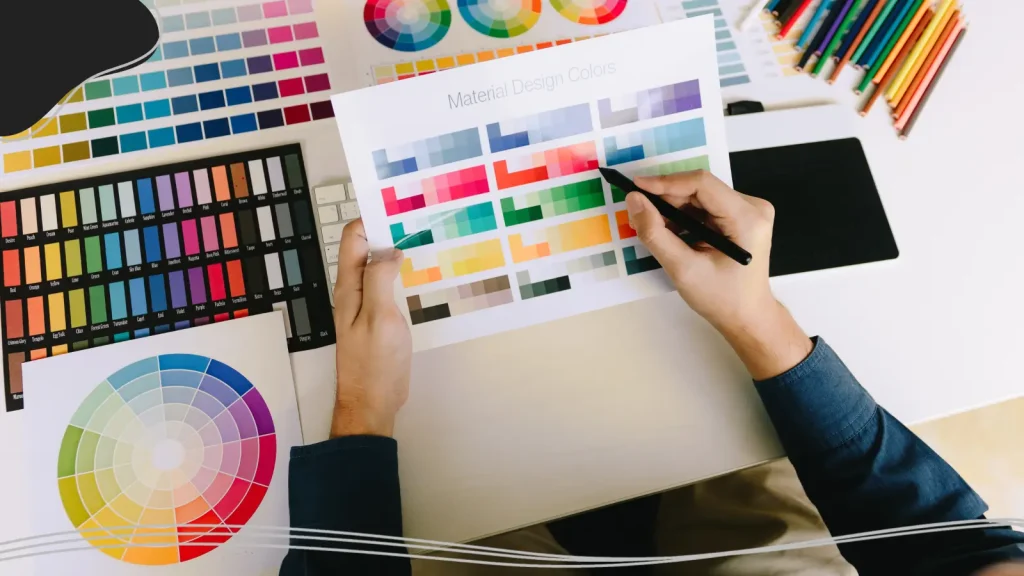
Step 2: Lock In Your Colors for Print & Digital
Your brand colors do a lot of heavy lifting; they communicate your brand’s personality, create recognition, and make your merch instantly recognizable. Locking in a clear, consistent color palette that works both on screens and in print ensures your brand’s visual identity stays vibrant everywhere it appears.
Brand Color Palette
Your color palette is one of the most powerful parts of your brand’s visual identity. A simple structure works best:
- Primary colors: Your main brand colors.
- Secondary colors: Supporting tones.
- Accent colors: Used sparingly for highlights.
These brand colors should feel cohesive and reflect your brand’s voice and values. Whether your tone is bold, calm, playful, or professional, your color scheme should communicate that instantly.
RGB vs. CMYK vs. HEX: Which Codes Go Where
This is where a lot of inconsistency happens. You might have seen these color codes being thrown around by graphic design specialists, but you weren’t sure exactly what they mean or when to use them. Here is a simple breakdown:
- HEX code: Short for “hexadecimal code,” this is a six-digit combination of numbers and letters (like #FF5733) that represents a color on digital screens. HEX codes are primarily used for websites, social media, and any on-screen design because monitors interpret colors using this format.
- RGB: Stands for Red, Green, Blue. RGB defines colors based on how much red, green, and blue light is combined. Screens, digital graphics, and apps use RGB to display color. For example, RGB(255, 87, 51) corresponds to the same color as #FF5733 in HEX.
- CMYK: Stands for Cyan, Magenta, Yellow, and Key (Black). This is the color model used in printing. Instead of light, CMYK works with ink, and it’s what ensures your colors stay accurate on paper, fabric, or other physical products. For example, a bright orange in RGB may need specific CMYK values to look the same on a t-shirt or mug.
If you only define HEX codes, your printed merch will vary. A proper brand guide includes all three formats for every color. This ensures your hoodie matches your website, your packaging matches your social media, and everything feels consistent.
Safe Color Combinations on Fabric, Paper & Drinkware
Not all colors behave the same on different materials.
- Dark fabrics can mute colors.
- Glossy surfaces (like mugs) can enhance contrast.
- Paper can absorb ink differently.
Your brand guidelines template should include “safe combinations”, tested pairings that always look eye-catching and readable. This is especially important for accessibility. High contrast ensures your message is clear to all users, not just some.
Step 3: Choose & Document Your Brand Fonts
Fonts are a commonly overlooked element of branding. Your fonts do more than just spell out words; they set the tone for your brand’s personality and make your messaging instantly recognizable. Think of Google’s iconic font, Product Sans, which has become synonymous with the tech giant. The success of that font is directly tied to a pointed, consistent branding push following the company’s 2015 rebrand.
Headline vs. Body Fonts & Fallback Choices
Typography plays a huge role in brand recognition. When developing your own typography system, you’ll want:
- A headline font (bold, distinctive).
- A body font (clean, readable).
- A fallback system (in case your font isn’t available).
This creates a consistent tone across everything you present.
Where Fonts Show Up In Real Life
Fonts aren’t just for your website. They appear on:
- Business cards
- Invoices
- Packaging
- Social media posts
- Email templates
Without defined typography guidelines, these touchpoints become inconsistent.
How to Keep Typography Consistent Across Tools
Different tools (Canva, Illustrator, Word, etc.) may not all support the same fonts. That’s why your style guide should include alternatives. Consistency isn’t about perfection; it’s about making sure your brand still feels cohesive no matter where it appears.

Step 4: Set Logo Usage Rules That Prevent Mistakes
A logo is the cornerstone of your brand identity, but even the best-designed logo can lose its impact if it’s used incorrectly. This step is all about setting clear logo usage rules, defining the right sizes, spacing, backgrounds, and dos and don’ts.
Minimum Size & Clear Space Around the Logo
Your logo needs room to breathe. Clutter can make your logo feel lost and dampen its impact. When creating your brand style guide, clearly define:
- Minimum size (so the logo stays readable).
- Clear space (empty space around the logo).
This protects your visual identity and keeps your design from feeling overwhelmed.
Backgrounds To Avoid
Some backgrounds just don’t work:
- Busy patterns.
- Low contrast colors.
- Clashing textures.
Your brand guidelines should clearly show what to avoid. Visual examples help a lot here.
What’s Allowed & Never Allowed
This is one of the most important sections of your brand manual.
Allowed:
- Approved color versions.
- Proper scaling.
- Defined placements.
Not allowed:
- Stretching.
- Recoloring randomly.
- Adding shadows or effects.
These rules protect your brand identity and ensure consistency across all assets.
Proper Logo Usage
As your business grows, your logo will be used in more and more places, and not always only by you or your employees. It’s very important to include a section of the brand style guide that covers where it’s appropriate to use your logo and where it isn’t.
A great example of this comes from Apple. While it’s never been confirmed, Apple allegedly has a “no villain clause” in its brand style guide. When Apple products are featured in movies and TV shows, they can never be used by the villains. This creates a subconscious connection between Apple products and the “good guys,” making the products seem more virtuous. This just shows how much effort companies put into controlling the narratives around their brands.

Step 5: Translate Your Guidelines to Merch & Print
Creating brand guidelines is only half the battle; next comes bringing them to life on real products.
Applying Your Logo to Business Cards, Letterheads & Signage
Start with the basics. Your brand elements should feel clean and intentional across all printed materials.
A well-designed business card is often the first physical touchpoint your customers have with your company. Make it count with a beautiful design and consistent layout.
Applying Your Logo to T-shirts, Hoodies & Hats
This is where things get fun and tricky. Different materials require different approaches. Your creative process should include testing placements, sizes, and colors before mass production.
Testing, tweaking, and documenting what works also makes it easier to scale in the future. Once you know which placements and color combinations look best, you can hand off your brand guidelines to printers and suppliers with confidence, avoiding costly mistakes or inconsistent results.
Applying Your Logo to Mugs, Pens, Stickers & Packaging
Smaller items like mugs, pens, stickers, and packaging follow similar rules to apparel, but the scale and materials bring their own challenges.
For mugs and drinkware, color and contrast are critical. Glossy surfaces can make colors appear brighter than intended, while matte finishes may dull them. Always test your brand colors and logo placement on sample products before ordering in bulk.
Pens and small items require a simplified approach. Detailed logos or small text can become illegible, so your icon-only logo version is often the best choice here. Packaging is where your brand guidelines really pay off. Your boxes, bags, or wrappers aren’t just functional; they’re part of the unboxing experience. Consistent logo usage, fonts, and design elements make your packaging feel cohesive, professional, and part of a whole.

Step 6: Document Everything in a 5-Page Brand Guide
We can’t stress this enough: good documentation saves you a world of trouble down the line. You can craft a cool logo with amazing typography and colors, and even have well-thought-out usage rules, but if your documentation is difficult to decipher, it was all for nothing.
The One-Page Overview: Logo, Colors, Fonts at a Glance
Your first page should act as a quick reference:
- Logo variations
- Color palette (with HEX, RGB, CMYK)
- Fonts
This makes your brand guide easy to use, even for non-designers. Putting all of the key information up front is vital; if people have to search too hard for an answer to their branding question, they might decide to forego the guide altogether.
Pages To Include & What to Write on Each
A simple brand guidelines template could include:
- Overview
- Logo usage
- Colors
- Typography
- Applications (merch examples)
You can turn this breakdown into your own free brand style guide template to elevate your brand. Just remember to keep it short, clear, and practical.
How to Share Your Brand Guide with Printers & Freelancers
Your document should be easy to share, PDF is best. Whether you’re working with designers, printers, or partners, your brand style guide ensures everyone follows the same guidelines.
Step 7: Iterate & Refine: Keep Your Guidelines Fresh
Your brand isn’t static; it evolves over time as your business grows, your audience changes, and new products or marketing channels are introduced. That’s why your brand guidelines should be treated as a living, breathing document rather than something you create once and forget.
Conduct Periodic Check-Ins
Start by scheduling periodic check-ins; quarterly or semi-annually is often enough for most small businesses. During these reviews, ask yourself:
- Are your brand colors still working across new merch and print materials?
- Do your logo variations still make sense for all your current products?
- Is your typography consistent across digital and physical platforms?
- Are there new design elements or style trends that need to be incorporated?
Gather Feedback
Gather feedback from everyone who uses the guide, designers, printers, marketing team members, and even partners. They can point out areas where the instructions may be unclear or where new tools or assets might improve workflow. This collaborative approach keeps your brand identity guidelines practical, user-friendly, and relevant.
Make Changes When Necessary
Iteration allows you to refine your brand evolution thoughtfully. Maybe you’ve introduced a new product line that requires a slightly different logo layout, or your color palette has expanded to include seasonal variations. Updating your guide ensures every touchpoint, from T-shirts and hats to packaging and digital ads, continues to reflect a consistent brand identity and strengthens brand recognition.
Conclusion
Here’s the bottom line: your brand guidelines don’t need to be complicated to be effective. In fact, the simpler they are, the more likely your team and your partners will actually use them. Focus on clarity, consistency, and making your brand’s visual identity easy to follow in real-world situations.
As your business grows, your brand evolution will naturally follow. Your brand guide should be a living document, something you update as your styles, tools, and needs change. Brand consistency is something you should always focus on, no matter how big your company gets, so build a solid foundation today with a strong brand style guide.
Need a great logo to go with your new brand style guide? We’ve got you covered. Use LogoMaker‘s intuitive logo design platform to craft the perfect symbol to represent your brand. Once you perfect your logo, you can use it immediately on t-shirts, mugs, and other promotional products. Get started today!

FREQUENTLY ASKED QUESTIONS
What are brand guidelines, and why do they matter for a small business?
Brand guidelines are a set of rules that define how your brand should look and feel across all platforms and products. For a small business, they ensure your logo, colors, typography, and messaging stay consistent, which helps build trust and recognition with customers.
How detailed should my brand guidelines be?
They don’t need to be overly complex. A simple 5-page brand guide covering logo usage, colors, fonts, and examples is enough to maintain consistency while staying easy to use.
What is the difference between a brand guide and a brand manual?
They are often used interchangeably. A brand manual can sometimes be more detailed, while a brand guide or style guide is typically shorter and more practical for everyday use.
Can I create brand guidelines without a designer?
Yes. While designers can help refine your visual identity, you can absolutely create your own guidelines using templates and tools. The key is documenting clear rules and sticking to them.
How often should I update my brand guidelines?
Update them whenever your brand evolves, new products, new colors, or a refined logo. Treat your brand guide as a living document.
Do I need different guidelines for print and digital?
Not separate guides, but your guidelines should include specifications for both. This includes RGB/HEX for digital and CMYK for print to ensure accuracy across formats.