

Putting a logo on a hat is the ultimate flex for any brand. Unlike a T-shirt design that might get covered up by a jacket or a tote bag swinging down by someone’s knees, a hat sits right on top of a person’s head. It’s front and center, making it the most visible piece of merchandise you can create. Hats are walking billboards that people actually want to wear.
But here’s the catch: hat logo design is a completely different beast than designing for web, print, or even flat apparel. You aren’t just slapping a JPEG onto a digital canvas; you are translating your brand identity into physical thread, wrapping it around a curved surface, and hoping it doesn’t turn into a messy, unreadable blob.
In this article, we’ll dive into the rules, the placements, and the secrets to nailing your hat logo design. This complete guide covers everything you need to know, whether you’re launching a streetwear brand, outfitting your corporate team, or designing merch for a local sports league.
- Why Hat Logos Are Different from Other Merch
- Hat Types & How They Affect Your Logo Design
- Logo Placement Options for Hats
- Designing a Logo That Works for Hat Embroidery
- Hat Logo Ideas by Brand Style
- Preparing Your Logo File for Hat Production

Why Hat Logos Are Different from Other Merch
If you’ve ever tried to print a highly detailed, gradient-filled logo onto a piece of headwear and wondered why the result looked terrible, you’ve discovered the hard way that hats play by their own rules.
Curved Surface Challenges: How Embroidery Differs From Flat Printing
When you design a logo on a computer screen, you are working on a perfectly flat, two-dimensional plane. But a hat is essentially a dome. When your logo is applied to a cap, the sides of the design will naturally curve away from the viewer’s eye.
This means that wide, horizontally stretching logos can get distorted or disappear entirely on the edges. Furthermore, printing ink on a flat T-shirt allows for pixel-perfect translation. Embroidery, on the other hand, involves pulling physical strands of thread through thick fabric. A hat embroidery logo has texture, depth, and physical limitations that flat printing simply doesn’t have.
Small Canvas Size: Detail Limits & Minimum Stitch Counts
Hats offer a very restricted piece of real estate. You only have a few square inches to make a lasting impression. Because of this small canvas, embroidery machines have a physical limit to how small they can stitch.
- The thread limit: If your text is smaller than 0.25 inches (about a quarter of an inch) tall, the needle literally cannot create the shapes clearly. The letters will bunch up and look like a Morse code disaster.
- The detail trap: Intricate crests, tiny overlapping lines, and complex sub-text will turn into thread soup. Every stitch adds thickness, and too many stitches in a small area will bunch up the fabric.
High Visibility: Hats Are Worn at Eye Level, Face-Adjacent
Because hats are worn on the head, they sit directly in the natural line of sight. When someone speaks to a person wearing your merch, their eyes will inevitably flick upward to the logo on the cap.
This high visibility is a double-edged sword. On one hand, you get maximum brand exposure. On the other, any flaws in your logo design for hats, like awkward spacing, unreadable fonts, or a crooked placement, will be immediately obvious. You don’t just want it to look good; you want it to look flawless.

Hat Types & How They Affect Your Logo Design
Not all hats are created equal. The physical construction of the hat dictates how your design will behave during the production process. Here is how different hat styles will impact your creative decisions.
Structured Snapbacks & Fitted Caps: Front Panel Space & Rigidity
The history of the structured snapback cap can be traced back to the late 1850s when the Brooklyn Excelsiors wore an early round-crowned cap with a short brim. Over the next 100 years, the cap’s design would be refined, ultimately culminating in the modern-day snapback cap.
Structured hats feature a stiff fabric backing behind the front panels called buckram. This rigidity is a designer’s best friend.
- The pros: The stiff front means the hat holds its shape perfectly, making it the ideal canvas for thick, heavy embroidery like 3D puff designs.
- The snapback logo: A snapback logo can handle dense stitch counts and tall, bold typography without the hat collapsing or puckering around the edges.

Trucker Hats: Mesh Back, Foam Front Constraints
Though originally a functional accessory for workers, the trucker hat made a significant crossover into mainstream American fashion in the early 2000s. Influenced by retro aesthetics and the rise of streetwear, celebrities and musicians, such as Ashton Kutcher and Pharrell Williams, began sporting trucker hats as part of their casual attire.
Trucker hats have a distinct retro vibe, usually featuring a foam front panel and breathable mesh on the back.
- Foam limitations: While foam takes flat embroidery reasonably well, it can easily pucker if the stitch count is too dense.
- Print vs. thread: Because the foam is spongy, highly detailed threadwork can sometimes sink into the material. Alternatively, trucker hats are one of the few styles that take beautifully to screen printing or heat transfers, meaning your trucker hat logo can retain bright colors and finer details if you opt out of embroidery.
Dad Hats & Unstructured Hats: Soft Front, Different Embroidery Behavior
Dad hats have exploded in popularity in recent years due to their relaxed, vintage fit. However, they lack the stiff buckram backing of a snapback.
- The danger of puckering: If you put a heavy, dense logo on an unstructured dad hat, the fabric will gather, wrinkle, and pucker around the design.
- The solution: Keep dad hat designs light, airy, and minimal. Line-art logos, simple text, and small icons work beautifully here.
Beanies: No Bill, Wider Surface But Knit Texture
Beanies flip the constraints entirely. There’s no curved bill to worry about, and depending on the fold, you can actually get a wider flat-ish surface to work with. But knit fabric brings its own challenge: The texture is uneven, ribbed, or looped, which affects how cleanly thread sits on top of it.
- The stretch factor: When a beanie is worn, the fabric stretches to fit the head. If your logo is embroidered directly onto the knit, it can stretch and distort.
- The fix: Many brands opt to use woven patches, leather tags, or thick satin stitches for beanies to ensure the cap logo design remains readable regardless of how far the fabric stretches.
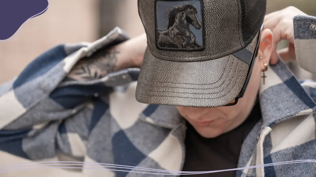
Logo Placement Options for Hats
Where you put your logo is just as important as the design itself. A clever logo placement on hat styles can elevate your merch from standard promotional giveaway to high-end retail fashion.
Front-Center (Most Common)
This is the undisputed king of hat placements. It’s bold, traditional, and impossible to miss.
- Standard size: The safe zone for a front-center logo is generally around 2.25 inches tall by 4 inches wide.
- Pro tip: Don’t feel pressured to fill the entire space. A small, 1-inch minimalist icon placed dead center can look incredibly modern and sophisticated.
Side Logo
Placing a logo on the side panels adds an element of asymmetry that feels very contemporary.
- The supporting act: Side placements are perfect for secondary branding. If your main mascot is on the front, put your brand’s initials or establishment year on the side.
- The solo star: For a minimalist streetwear look, leaving the front blank and putting a small, crisp logo over the left ear creates a sleek, understated vibe.
Back Logo or Tagline
The back of the hat (specifically the arch right above the snap, strap, or velcro closure) is a highly underrated placement.
- Best uses: This space is naturally curved and shallow, making it perfect for short text, a website URL, or a catchy brand tagline.
- The exit impression: A back logo ensures your brand gets noticed even when the wearer is walking away from the crowd.
Under The Brim
Want to add a premium touch that delights the wearer? Use the under-brim.
- Hidden details: While you can’t easily embroider under the brim, you can use custom printed fabric or screen printing.
- The vibe: This space is fantastic for vibrant patterns, secondary logos, or hidden messages that only the wearer knows about. It adds massive perceived value to the hat.
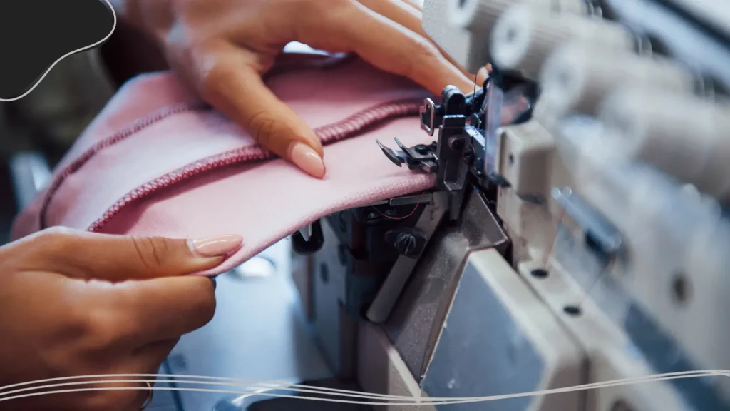
Designing a Logo That Works for Hat Embroidery
Translating a digital graphic into an embroidered reality requires a specific design mindset. Before you send your files off to the manufacturer, run them through this checklist.
Simplify: Drop Thin Lines, Fine Gradients & Tiny Text
Embroidery uses separate thread colors, so fine gradients may not reproduce clearly. They cannot naturally blend a light blue thread into a dark blue thread the way a digital screen blends pixels.
- Ditch the fades: Convert gradients into solid blocks of color.
- Kill the clutter: Remove drop shadows, intricate distressing, and ultra-thin accent lines. If a detail doesn’t translate to a solid, chunky block of color, it won’t survive the embroidery process.
Bold Outlines Hold Better in Thread Than in Print
In flat design, thick outlines can sometimes look cartoonish. In hat embroidery, thick outlines are your best friend.
- Defining shapes: A bold, contrasting outline (often called a satin stitch in embroidery terms) helps separate your logo from the fabric of the hat, making it pop.
- Containing the chaos: Outlines help secure the inner fill stitches, making the overall design look cleaner and more professional.
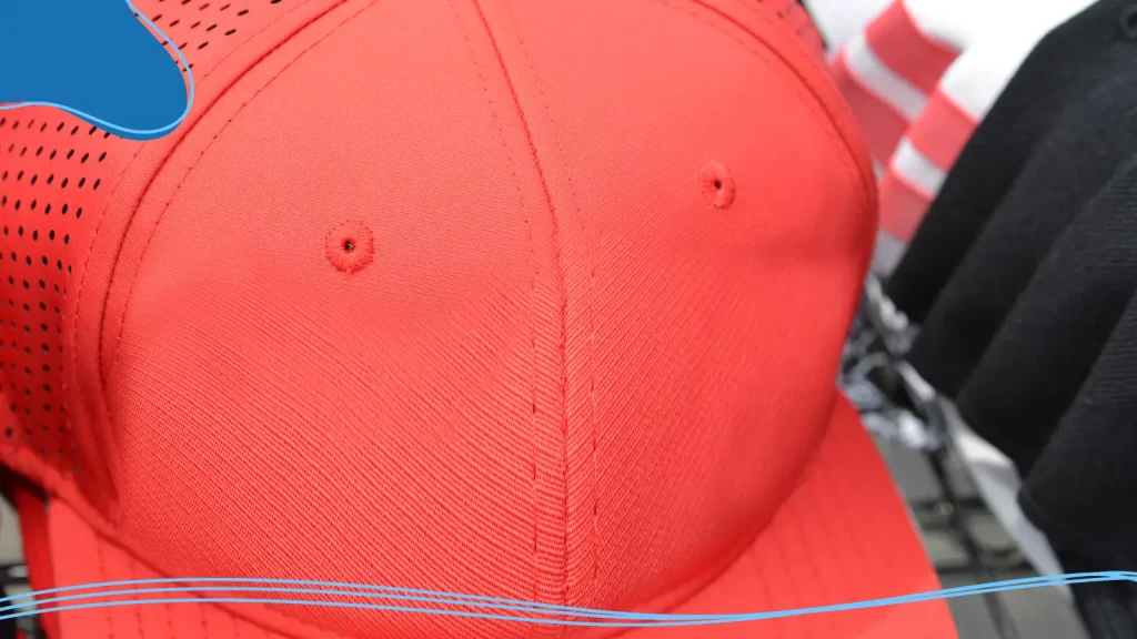
Maximum Stitch Area: Standard Front Panel Dimensions
Respect the boundaries of the machine. The typical maximum embroidery area on a standard cap is roughly 2.25” H x 4” W.
- If your logo is a perfect circle, it can only be 2.25 inches in diameter before it hits the bill or the top crown of the hat.
- If you have a horizontal typographic logo, you can stretch it to 4 inches wide, but you’ll need to make sure the height scales down accordingly.
Contrast: Dark Logo on Light Hat vs. Light Logo on Dark Hat
Because thread has a slight sheen to it, it catches the light differently than flat ink. You need high contrast to ensure readability.
- Dark hats: Use white, bright yellow, neon, or pastel threads. Avoid navy thread on a black hat; it will look like a mistake.
- Light hats: Stick to dark, deeply saturated threads like black, forest green, or burgundy.
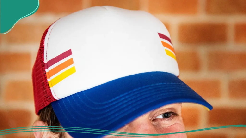
Hat Logo Ideas by Brand Style
Stuck on inspiration? The best hat logos take cues from the industry they live in. Here is how different brand styles approach headwear.
Streetwear: Oversized Front Graphics, Tonal Embroidery
Streetwear is all about pushing boundaries and making a statement.
- The look: Think aggressive fonts, abstract icons, and rule-breaking placements.
- Tonal magic: A massive trend in streetwear is tonal embroidery, stitching a black logo onto a black hat. The logo is only visible via the 3D texture of the thread, creating a stealthy, premium look.
Outdoor & Workwear: Patch Logos, Woven Labels
Outdoor brands (like Patagonia or Columbia) and workwear brands (like Carhartt) lean heavily into rugged, durable aesthetics.
- The look: Instead of direct embroidery, these brands often use custom leather patches, woven fabric labels, or embroidered merit-badge style patches sewn onto the front panel.
- The vibe: Patches evoke a sense of heritage, craftsmanship, and the great outdoors. They also allow for greater detail than direct embroidery.
Sports Teams: Mascot Marks, Number Fonts
Sports caps are the grandfather of modern hat design. They need to be visible from the cheap seats.
- The look: Center-aligned, heavy 3D puff embroidery featuring bold mascots or interlocking city letters (think the classic NY Yankees logo).
- The execution: Sports logos rely on thick satin stitches, vibrant team colors, and aggressive, forward-leaning typography.
Corporate & Promo: Clean Wordmarks, Minimal Color
If you are designing hats for your startup team or a trade show, clarity is your top priority.
- The look: Clean, horizontal wordmarks. Ditch the bulky mascot and focus on reading your company name clearly.
- Color control: Keep it to one or two colors max. A crisp white logo on a high-quality navy dad hat looks professional, expensive, and stylish enough that employees will actually wear it on the weekends.
Preparing Your Logo File for Hat Production
You’ve perfected your hat logo design. Now it’s time to hand it over to the manufacturer. If you send them the wrong file type, you are setting yourself up for failure.
Vector Format Requirements (AI, EPS, SVG)
Embroidery machines do not read JPEGs or PNGs. The software that converts your design into stitches (a process called digitizing) requires clean, scalable mathematical lines.
- Always provide your logo in a vector format.
- File extensions like .AI (Adobe Illustrator), .EPS, or .SVG are the industry standard.
- Make sure to outline all your fonts so the manufacturer doesn’t need to have your specific typography installed on their computers!
Thread Color Selection (Pantone Matching Tips)
Monitors display color in RGB (light). Thread is dyed with physical pigments. What looks like neon lime green on your MacBook might look like dull forest green in physical thread.
- The Pantone system: To ensure accuracy, match your digital brand colors to the Pantone Matching System (PMS) Solid Coated book.
- Thread books: Most professional embroiderers use Madeira or Isacord threads, which have direct conversion charts for Pantone colors, ensuring your brand identity remains intact.
What to Ask Your Embroidery Supplier before approving
Before you hit approve and order 500 hats, always ask your supplier these three questions:
- Can I see a digital sew-out or a physical sample? Never approve a run based solely on a flat digital mockup. Ask to see a photo of a test run on a scrap piece of fabric.
- Will this require a 3D puff underlay? If you want your text to pop off the hat, clarify that you want 3D puff embroidery, which requires placing a special foam under the thread.
- Do any of these details look too small to stitch cleanly? Trust the experts. If your embroiderer warns you that a line of text is going to close up, listen to them and remove it.
Conclusion
Designing a hat that people actually want to wear requires treating the cap as a unique, three-dimensional canvas. By understanding the limitations of embroidery, choosing the right hat structure for your brand style, and simplifying your design to its boldest, most recognizable form, you can create a piece of headwear that turns heads and strengthens your brand.
Remember, the best hat logo design isn’t the one with the most complicated artwork; it’s the one that executes a simple idea flawlessly. Strip away the clutter, pump up the contrast, test your placements, and get ready to see your brand walking down the street.
A strong hat logo design is simple, readable, and suited to the hat you choose. Keep fine details to a minimum, use clear contrast, and confirm the available design area with your supplier before production.
Ready to create your design? Make a hat-ready logo with LogoMaker Free and download your artwork in a vector format for production.
Frequently Asked Questions
Can I put a highly detailed photograph on a hat?
Not via traditional embroidery. If your logo includes photographic elements, gradients, or ultra-fine details, you should opt for a printed patch, a woven label, or heat-transfer printing on a foam trucker hat.
What is the difference between flat embroidery and 3D puff embroidery?
Flat embroidery sews the thread directly flush against the fabric of the hat. 3D puff embroidery involves placing a small piece of foam on the hat and stitching tightly over it, causing the logo to literally raise off the surface of the cap. 3D puff is best for large, blocky elements and thick text.
How small can text be on an embroidered hat logo?
As a general rule, embroidered text should be no smaller than 0.25 inches (6.35mm) tall. Anything smaller than this runs a high risk of the thread clumping together and rendering the text entirely unreadable.
Why does my logo look distorted on the edges of the hat?
This usually happens because the design is too wide for the front panels. Because a hat curves around the head, logos that exceed 4 to 4.5 inches in width will wrap around the curve, distorting the perspective of the outer edges. Keeping the design centered and within the standard 2.25” x 4” safe zone prevents this.
Can I use any font for my cap logo design?
Technically yes, but practically no. Thick, sans-serif fonts and bold scripts work beautifully. Ultra-thin serif fonts, heavily distressed grunge fonts, or delicate cursive scripts often get lost in the texture of the fabric and fail to translate well into stitches. Simple and bold is always better.