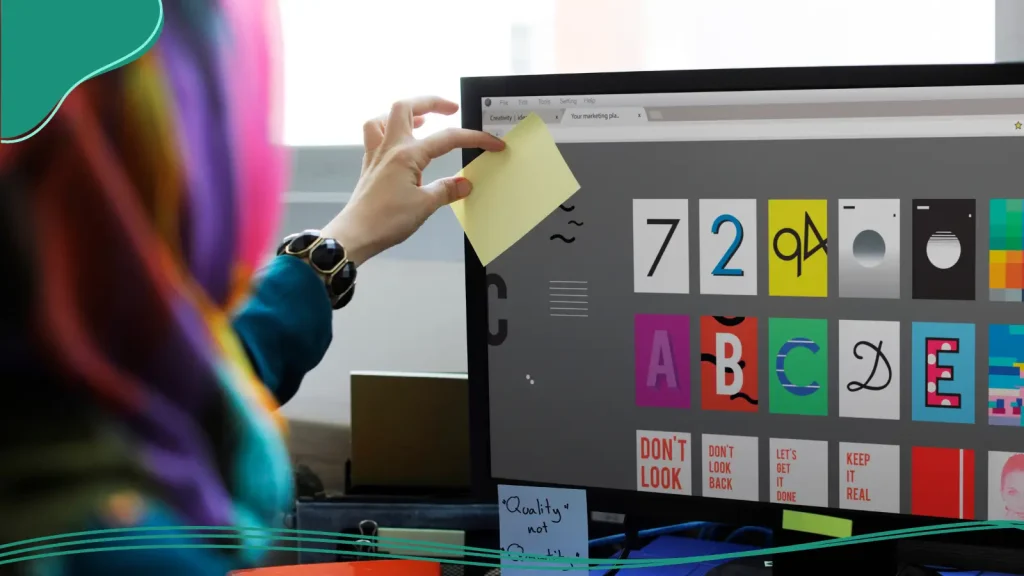
Have you ever opened a document or visited a website and immediately thought, “Something feels off”? That uneasy feeling often has less to do with what’s written and more to do with how it’s written, specifically, the font.
Typography plays a huge role in how we perceive brands, messages, and overall aesthetic. But just like there are fonts that elevate your work, there are others that can absolutely destroy it. These are the worst fonts—the ones that make designers cringe, cause instant eye strain, or scream 1997 Microsoft Word.
So what actually makes a font “bad”? Is it poor readability? Overuse? Outdated style? Maybe all of the above. Ultimately, the worst fonts are those that hinder your goals. If your audience is distracted by a poorly chosen font, which diverts focus from the product you’re trying to highlight, that is a big problem.
In this article, we’ll explore what separates a good font from a terrible one. We’ll go through the 20 worst fonts every designer should avoid, and suggest modern alternatives to keep your projects polished and professional.
- What Makes a Font “Bad”?
- The 20 Worst Fonts to Avoid
- Better Font Alternatives
- Font Selection Guidelines

What Makes a Font “Bad”?
Not every ugly font starts that way. Some of the worst fonts were innovative for their time but aged poorly. Others were simply designed for the wrong purpose and somehow found their way into wedding invitations or restaurant menus.
The transformation of the iconic Google logo is a perfect example of how a font can age poorly. Google’s initial logo design featured the Baskerville Bold typeface, accompanied by a heavy drop shadow and an exclamation point. This combination was outdated just a few years after its introduction. After a few iterations, the serif typeface was replaced with a clean, modern sans-serif font called Product Sans, which is much more fitting for the now multi-billion-dollar tech giant.
Becoming outdated is just one of the factors that land a typeface on the list of worst fonts. Let’s take a look at some other elements that make a font truly bad in modern design.
1. Legibility Issues
A beautiful font is worthless if it’s hard to read. Overly decorative typefaces or those with poor spacing can cause serious eye strain, especially in body text or smaller sizes. Fonts like Mistral or Curlz MT may look fun, but their readability plummets when used for paragraphs or UI text.
2. Overuse & Clichés
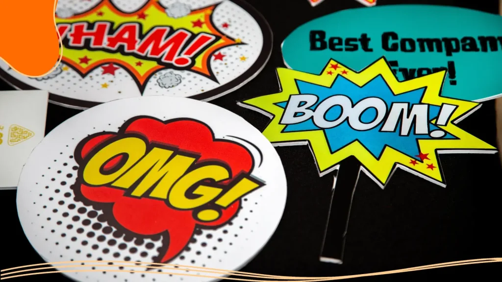
A once-stylish font can quickly become overused due to its sheer popularity. When every second flyer, logo, or meme uses the same typeface, it loses its charm. Fonts like Comic Sans and Papyrus have become victims of their own ubiquity—and now carry a stigma that’s hard to shake. In the case of Papyrus, when you become the default font for one of the highest-grossing films of all time, Avatar, it might mean you’ve reached the point of oversaturation.
3. Inappropriate Context Usage
Even a well-made font can be disastrous in the wrong setting. For example, Brush Script might look elegant on a cafe chalkboard, but drop it into a legal document and it becomes laughable.
Context is key in typography, and using the wrong font can instantly make your design look amateurish.
4. Poor Design Fundamentals
A bad font often lacks visual balance, consistent stroke weights, or coherent letterforms. These inconsistencies create an unprofessional appearance that distracts from the message. Fonts that mimic handwriting often fall into this trap; they feel artificial and forced.
5. Accessibility Concerns
Designers must also consider users with visual impairments. Fonts with poor contrast, irregular spacing, or complex serifs can make reading difficult for many audiences. A clean sans-serif font like Franklin Gothic or Open Sans generally provides far better accessibility and readability.
The 20 Worst Fonts to Avoid
There are a few typefaces that have become legends for all the wrong reasons. Here are 15 of the worst fonts in the design world, why they’re bad, and what you can use instead.
1. Comic Sans
Designed by Vincent Connare in 1994 for Microsoft Bob, Comic Sans was originally meant for speech bubbles and children’s interfaces. Because the font was originally intended for speech bubbles in a cartoon dog, Connare intentionally designed Comic Sans with what he described as a kind of “wonkiness.”
Its playful appearance made sense back then, but it quickly escaped its intended context and found its way into everything from restaurant menus to office memos.
The problem? Comic Sans is informal to the point of absurdity. Its uneven strokes and childlike vibe clash with almost any serious design. While it might feel “friendly,” it also screams “unprofessional.”
Alternatives: Try Poppins, Nunito, or Quicksand. These fonts maintain a friendly feel while offering clean lines and modern readability.
2. Papyrus
Created by Chris Costello in the 1980s, Papyrus was inspired by handwritten letterforms meant to evoke ancient Egypt. Unfortunately, it became the go-to font for yoga studios, coffee shops, and movie posters trying (and failing) to appear “mystical.”
Its inconsistent strokes and weathered texture make it look amateurish, and as we mentioned earlier, the Avatar movie poster cemented its reputation as an overused font.
Alternatives: Consider Cinzel or Cormorant for a classy, ancient-inspired aesthetic without the tired look.

3. Arial
Arial is everywhere. Designed by Robin Nicholas and Patricia Saunders, it was originally designed as a typeface for IBM’s laser printers, then adapted and licensed to Microsoft, which included it with its operating system as a substitute for Helvetica to avoid licensing fees. While Arial has become much more popular than Helvetica in recent decades, it lacks the balance and sophistication of its famous cousin.
Designers criticize Arial for its default font reputation and lack of personality. It’s the equivalent of using instant coffee instead of a barista blend: it gets the job done, but it’s not inspiring.
Alternatives: Stick with Helvetica, or try Inter, Lato, or Source Sans Pro for a cleaner, more versatile font.
4. Times New Roman
Times New Roman was once the gold standard of print and Word documents, but its overuse has drained it of any charm. It’s formal to the point of dullness and doesn’t translate well to modern web design.
It also lacks warmth, not ideal for branding or marketing materials that require an emotional connection.
Alternatives: Merriweather or Georgia offer a traditional serif look with better on-screen readability.
5. Brush Script
Many graphic designers marvel at the handwritten style of the Disney or Virgin logos. Brush Script was meant to create a similar effect and give a “personal touch,” but its stylized letterforms make it look like your aunt’s greeting card from 1998. The letters blend awkwardly, creating a messy overall aesthetic that’s hard to read in smaller sizes.
Alternatives: Go for Pacifico or Satisfy if you want a script-like font that’s stylish yet legible.
6. Impact
Certain fonts take on a life of their own that is very different than what their graphic designers intended. The Impact font was designed by Geoffrey Lee in 1965 for the Stephenson Blake foundry. Both its uppercase and lowercase letters feature a heavy condensed feel.
Initially intended for headlines, the font was later bundled with Microsoft software, becoming one of the original Core fonts for the web. Impact lives up to its name; it’s bold, loud, and overbearing. Because Impact was easily accessible on almost every Windows computer, it was immortalized as the meme font.
If you try to use Impact for anything other than memes, you’ll likely not be taken seriously. However, Impact’s meme font reputation is not the only reason it’s ended up on the worst fonts list. Its compressed, thick strokes make it increasingly hard to read in large blocks of text.
Alternatives: For bold titles, try Bebas Neue or Oswald. They make an impact without shouting.
7. Courier New
Courier New was designed for writing code and monospaced text, not for logos or restaurant menus. Using it in creative projects gives off a dated, “old computer file” vibe. With that being said, there is one very specific instance where Courier New is still the go-to font: script writing.
Courier New is used for scripts because it’s a monospaced font, meaning every character takes up the same amount of horizontal space, which provides a reliable way to estimate screen time. But if you’re not a Hollywood screenwriter, Courier New is probably the wrong font for you.
Alternatives: For a similar monospaced aesthetic in design, try IBM Plex Mono or Fira Code.
8. Bleeding Cowboys
This 2000s grunge font became popular in band posters and tattoo designs, and overstayed its welcome. Its jagged, decorative design is hard to read and looks cliché. If your Daughtry cover band needs a new poster, then feel free to whip this font out; otherwise, let’s leave Bleeding Cowboys back in 2006, where it belongs.
Alternatives: For a Western feel, consider Playfair Display or Adobe Caslon for a more refined, vintage-inspired style.
9. Jokerman
The only thing funny about Jokerman is how often it’s used in the wrong place. Its quirky dots, curls, and random extensions make it unreadable and chaotic. It looks like it belongs on a ’90s carnival sign, not in professional graphic design.
Alternatives: For playful designs, use Baloo or Fredoka One. They’re fun without sacrificing legibility.
10. Trajan Pro
If you’ve seen a movie poster from the 2000s, you’ve seen Trajan Pro. From Gladiator to A Beautiful Mind, it became Hollywood’s overused favorite. Now, it just feels tired and pretentious. Although not nearly the worst font on this list by itself, its overuse makes it feel like a tired and unoriginal choice.
Alternatives: Try Cinzel for an elegant, Roman-inspired alternative that feels fresh and balanced.
11. Curlz MT
Curlz MT looks like it belongs on a birthday invitation for a six-year-old, not a branding project. Its loopy, uneven letters lack structure, making it a nightmare for readability. In very certain situations, Curlz MT can shine, but it is the wrong font for any project that wants a professional vibe.
Alternatives: For a touch of whimsy, try Comic Neue or Amatic SC; they’re playful fonts done right.
12. Bradley Hand
Bradley Hand was meant to simulate real handwriting, but it fails miserably. Every “handwritten” letter looks identical, robbing it of authenticity. Instead of a “personal touch,” it feels like a computer trying too hard.
Alternatives: Use authentic handwritten fonts like Indie Flower or Amatic SC that retain warmth without uniformity.
13. Mistral
Mistral’s jagged strokes and inconsistent flow make it difficult to read, especially at smaller sizes. Once popular in print materials, it now looks outdated and chaotic. Used in very small doses, Mistral can have a nice effect, but more often than not, it will distract from a graphic design project rather than add.
Alternatives: Consider Great Vibes or Allura for elegant scripts that don’t compromise readability.
14. Algerian
Algerian looks like something straight from an old pub sign or Microsoft Word clip art. Its heavy serifs and high-contrast strokes make it nearly impossible to read in paragraphs. It’s the epitome of outdated design.
Alternatives: Use Playfair Display or Abril Fatface for a bold serif style that still feels elegant and readable.
15. Kristen ITC
Another font that is for the juvenile crowd. Kristen ITC is well-suited for classroom signs for pre-schoolers; it is fun, but the wrong font for the business world. You would not want your logo to read like it was made for, or written by, a toddler. The curved style of the words also makes it difficult to space the letters in an effective manner.
Alternatives: Try Poppins or Comfortaa; these fonts maintain the friendliness while maturing the design.
16. Vivaldi
A nice font at first glance, Vivaldi is one that gets worse the longer you look at it. Script typefaces are always troublesome when it comes to ease of reading, but Vivaldi is an especially tricky fellow, given that it is only a half script, meaning the letters are not made up of a single flow of ink.
The spacing of the letters is not ideal, and messing with this only seems to make it worse. Whatever you do, don’t write in all caps, because that just creates an illegible mess.
Whether you are creating wedding invitations or just want your business card to look fancy, stop scrolling before you reach the latter part of the alphabet, because Vivaldi is not for you.
Alternatives: Playball and Alex Brush are formal, refined scripts that keep the elegance but simplify the flourishes.
17. Viner Hand
Viner Hand is one of the fonts that has lost any and all impact it once had. It looks nice and is based on a real handwriting style, but beyond that, its oversaturation in youth-focused areas has made it a font to be avoided.
While not the worst font on the list, there are better choices out there. Take your time and pick one that is going to help your logo and marketing material stand out rather than blend in.
Alternatives: For a more polished handwritten font, consider Shadow Into Light or Patrick Hand.
18. Magneto
Magneto is another script-style font with a retro, almost toy-like personality that rarely aligns with professional branding. Its heavy curves, flashy strokes, and strong “vintage diner” energy make it more suitable for novelty signage than business cards.
When scaled down, Magneto becomes even harder to read, especially in a dense card layout with names, titles, and contact details. If your goal is sophistication or trustworthiness, Magneto works against you.
Alternatives: If you want to keep the 1950s signage feel but with a more balanced approach, try Lobster or Milkshake.
19. Harlow Solid Italic
Harlow tries to be retro and stylish, but it becomes too decorative for comfort. The exaggerated curls and heavy italic slant make the text feel unbalanced and hard to read. At small sizes, the thick–thin contrast gets muddy, and the vintage flair can come across as gimmicky instead of professional.
Alternatives: Quicksand and Raleway keep the vintage charm without the readability issues.
20. Accelerator
This fast-looking, streaky sci-fi font screams “futuristic,” but that’s exactly the problem: it pigeonholes your brand and sacrifices clarity.
The jagged, slanted letterforms look distorted in small print and are nearly impossible to read at a glance. Accelerator is fine for gaming posters or movie titles, but on a business card, it feels overly niche, overly stylized, and wildly impractical.
Alternatives: Eurostile and Oritron give you a sleek, modern tech feel, without ruining clarity.
Better Font Alternatives
We’ve just spent a lot of time going over the worst fonts; let’s now turn our attention to some of the best fonts that designers love.
Professional Sans-Serifs
If you want a font that looks modern, polished, and universally recognized for its versatility, a sans-serif is your best friend. These fonts use crisp, clean lines with no extra “tails,” making them ideal for logos, business cards, websites, and any branding that needs a contemporary touch.
Try these designer-approved picks:
- Montserrat: Geometric, bold, and perfect for headings or logos. Its modern personality makes any brand feel instantly premium.
- Raleway: Elegant and sophisticated, with a sleek, thin version that’s great for minimalist layouts.
- Roboto: A widely used Google font that balances friendliness with professionalism, making it ideal for web and mobile interfaces.
Readable Serif Fonts
Serif fonts add a touch of tradition and authority, but not all serifs feel like they belong in a dusty textbook. Modern serifs bring warmth and sophistication to branding while keeping text easy to read.
Strong alternatives include:
- Georgia: A timeless serif with excellent legibility on screens.
- Lora: Balanced, beautiful, and perfect for brands wanting a classic yet modern feel.
- Playfair Display: High contrast and elegant, ideal for luxury brands, high-end boutiques, or editorial-style layouts.
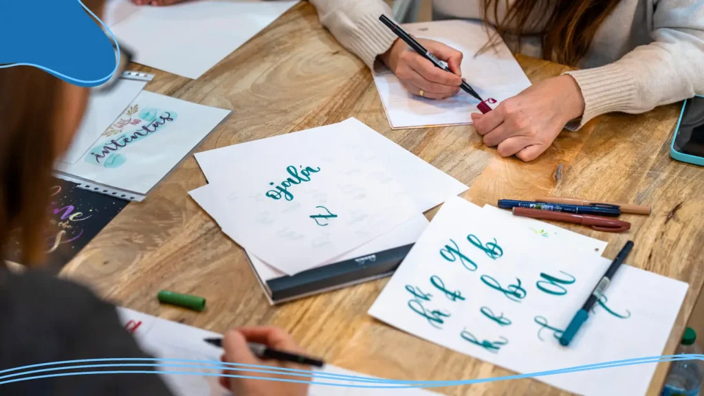
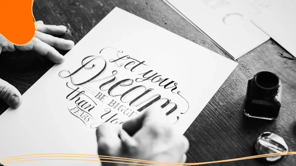
Script Fonts Done Right
Our worst fonts list was littered with script fonts that look beautiful but are the wrong font choice for many design projects. Scripts can be stylish and expressive, but the key is choosing ones that don’t look like a wedding invitation from 1998. Modern script fonts offer personality and flair while staying readable, especially in short bursts.
Designer-friendly choices:
- Great Vibes: Elegant and flowing without overwhelming the design.
- Pacifico: Playful and retro-inspired, great for casual or lifestyle brands.
- Sacramento: Minimalist and monoline, perfect for signature-style logos.
Font Selection Guidelines
Before you pick the next typeface for your project, keep these golden rules in mind.
- Match the context: A right font for a legal document isn’t the same as for a cupcake shop logo. Think about your brand’s identity and message before choosing.
- Prioritize readability: Avoid fonts that cause eye pain or blur together in smaller sizes. Test your choices on both screens and prints. Simple letterforms perform better on smaller screens than decorative fonts.
- Align with branding: Fonts communicate emotion. A sans serif conveys modern professionalism, while a script font adds warmth and friendliness. Choose one that enhances your visual identity.
- Test and refine: Always preview fonts in their intended use, on your website, logo, or printed materials. Sometimes a font that looks great in theory falls flat in practice.
Avoiding Overused Fonts Will Help Your Brand Make an Impression
If there’s one key takeaway from our worst fonts list, it’s that a great font can turn into one of the worst fonts in the world due to overuse. From logos to marketing, the font you choose will say a lot about your brand. If you pick a font that’s been used a million times before, that will make your brand seem unoriginal and stale.
Font choice should always be a key consideration when thinking about your brand. Not only do you need to choose one that fits your business and the sector you are in, but you also need to make sure you avoid all of the common options.
Put some serious thought into your fonts and build a brand that is stylish and stands out from the crowd for all of the right reasons.
Conclusion
Typography is a powerful tool in design. It influences how people feel, what they remember, and whether they trust your message. The worst fonts became infamous not just because they look bad, but because they’re misused and overexposed.
Choosing the right font means balancing style, readability, and personality. With thousands of beautiful options available, there’s no excuse to settle for the wrong font.
Pick the right font for your logo project with the help of LogoMaker‘s innovative AI-Powered platform. Our AI assistant helps you design an amazing logo with the perfect font for your brand. The best part? The process is so simple, you’ll have a professional logo ready in just minutes!

FREQUENTLY ASKED QUESTIONS
What is considered the worst font ever?
Comic Sans usually tops the list. While it was designed for friendliness, its informal appearance makes it inappropriate for most professional contexts.
Why do designers hate Comic Sans so much?
It’s mainly because of misuse. Comic Sans was never meant for serious design projects, but it’s been used everywhere, from medical documents to business presentations.
Are there any situations where bad fonts work?
Sometimes. A retro logo or ironic design might intentionally use a “bad” font for humor or nostalgia. But generally, avoid them in branding or web design.
What’s the difference between typeface and font?
A typeface refers to the overall design (like Helvetica), while a font is a specific weight or style of that typeface (like Helvetica Bold or Helvetica Italic).
How can I tell if a font is overused?
If you’ve seen it on memes, default software templates, or fast-food menus, it’s likely overused. Always search for modern alternatives before using them in your design.
What’s a good all-purpose font for designers?
Fonts like Lato, Roboto, or Open Sans are great starting points. They’re versatile, highly readable, and look professional in almost any setting.