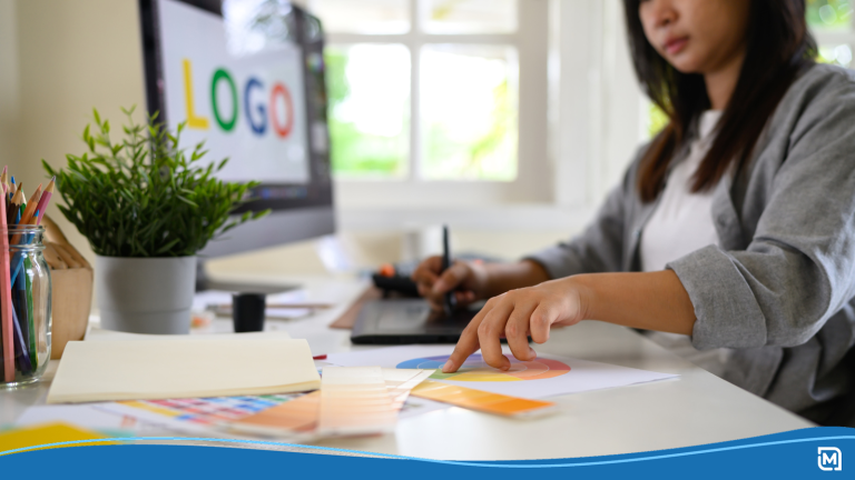
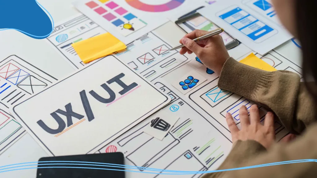
In the world of visual communication, graphic design is central to making sure your content is presented with purpose, clarity, and intention. As with any profession, graphic design has its own vocabulary.
If you’ve ever heard a designer say, “Let’s tighten the kerning, adjust the white space, and balance the visual weight,” you might’ve nodded along while secretly wondering what any of that actually meant. That’s where this guide comes in.
Understanding fundamental graphic design terms isn’t only helpful for seasoned designers; it’s also incredibly valuable for beginners, clients, marketers, business owners, and anyone collaborating with a design team. When you know the language, you communicate better. You give clearer feedback. You avoid misunderstandings. And you start to see (and appreciate) the work behind every digital image, brand identity, and print design project more deeply.
In this article, we’ll build an easy-to-understand graphic design glossary, breaking down typography, color theory, layout, file formats, branding, digital design, print production, and even some advanced concepts.
You’ll learn why serif typefaces tend to feel traditional, how color schemes create contrast and mood, how vector images differ from raster images, and why negative space can completely transform a design’s visual appeal.
- Typography & Text
- Color Theory & Properties
- Layout & Composition
- File Formats & Technical Terms
- Branding & Logo Design
- Digital & Web Design
- AI & Emerging Graphic Design Terms
- Print Design & Production
- Advanced Design Concepts
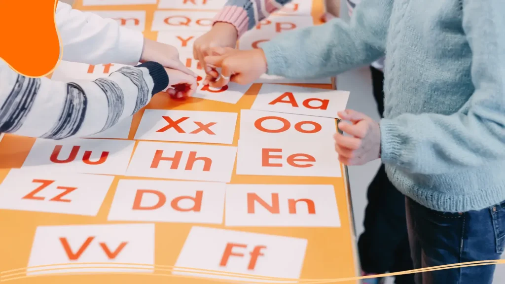
Typography & Text
The Sumerian civilization first developed writing around 3400 B.C. Since then, the written form has undergone significant evolution but has always maintained a clear goal: to communicate your message as clearly as possible.
Typography is one of the most important design elements because it deals with how written language is made legible, readable, and visually interesting. Whether you’re designing body copy for a brochure, a headline for a website, or a logo with proportional and balanced typography, these terms will help you understand how text works in design.
Font vs. Typeface
A typeface is the family (like Arial), while a font is a specific style or weight within that family (like Arial Bold or Arial Italic). Think of typefaces as parents and fonts as their children.
Serif vs. Sans-Serif
Serif typefaces have small decorative strokes (serifs) at the ends of letters, which evolved from ancient Roman stone inscriptions. Sans-serif typefaces remove these strokes for a cleaner, more modern look. Serif typefaces tend to feel traditional or bookish, while sans serif typefaces often appear sleek and minimal.
Kerning
Kerning refers to adjusting the space between two individual letters. Good kerning prevents awkward spacing like “W A” appearing too wide or “AV” overlapping.
Tracking
While kerning adjusts spacing between specific letter pairs, tracking adjusts the spacing across an entire word or sentence. Graphic designers use tracking to create tight, bold headlines or airy, spacious text.
Leading (Line Spacing)
Leading is the vertical space between lines of text. More leading gives a design room to breathe; less leading creates dense, compact paragraphs.
Hierarchy
Typographic hierarchy helps readers navigate content. Larger, bolder text signals importance, while smaller text represents supporting information. Hierarchy upgrades visual consistency and guides the eye.
Legibility vs. Readability
- Legibility measures how easily individual letters can be distinguished.
- Readability measures how comfortably large bodies of text can be consumed.
Choosing the right typeface, size, spacing, and alignment all influence these two factors.
Baseline
The invisible line that text sits on. Understanding baselines helps designers align text with precision.
X-Height
The height of lowercase letters, specifically the letter “x”. A tall x-height improves readability at small sizes.
Ascenders & Descenders
Ascenders are upward strokes on letters like h or k. Descenders extend below the baseline, like g or y.
Widows & Orphans
- Widow: a short line at the end of a paragraph stranded at the top of a column.
- Orphan: a single word stranded at the bottom of a paragraph.
Both disrupt visual harmony.
Rag / Ragged Alignment
When text isn’t justified, the uneven side of the column is the “rag”. A clean, natural rag enriches visual appearance.
Uppercase vs. Lowercase Letters
Capital letters feel strong and authoritative. Lowercase letters often feel friendlier and softer.
Monospaced Typeface
Each character occupies the same horizontal space, often used for coding or stylistic layouts.
Script Typeface
Designed to mimic handwriting with flowing, connected letters, great for invitations or expressive branding.
Display Type
Large, decorative type used for headlines, not meant for body copy.
Why Typography Matters
Typography plays a far bigger role in graphic design than most people realize. It is a core design element that influences how information is perceived, understood, and remembered. The type you use sets the tone of a design before a single word is read. Clean, modern typefaces can feel professional and trustworthy, while expressive or decorative lettering can feel playful, bold, or emotional. In other words, typography speaks before the message itself does.
Clarity is one of typography’s most important jobs. No matter how visually appealing a design may be, it fails if the written language isn’t legible. Proper line spacing, letter spacing, and font choice ensure that body copy remains comfortable to read, even in longer sections. Thoughtful typography helps guide the reader naturally through content, reinforcing visual hierarchy and making it clear what to read first, second, and third.
Beyond communication, typography contributes depth and variety. Variations in weight, size, alignment, and spacing create contrast and movement, preventing layouts from feeling flat or monotonous. When combined with strong layout principles and white space, typography becomes a powerful design tool rather than just a supporting element.
Color Theory & Properties
Researchers estimate that most humans can see around one million different colors. Color is one of the most powerful tools in a graphic designer’s arsenal. While monochrome designs have their place, nothing can spark joy or illicit emotions like an engaging design with bold, beautiful colors.
Because color can be so powerful, it’s important to know how to harness it effectively. Color theory shapes everything from brand identity to web design to print production. Learning how colors interact helps designers build visually appealing palettes and create contrast that guides the viewer’s attention.
Color Models
- RGB (Red, Green, and Blue): Used for digital displays, combining light to create various colors. Adding all colors produces white.
- CMYK (Cyan, Magenta, Yellow, and Black): Used in printing, where inks subtract light. Combining all colors ideally produces dark brown/black.
- Pantone Matching System (PMS): A universal color model that ensures exact color matching across print materials. Perfect for brand consistency.
Hue
Hue refers to the actual color (like red, blue, or green).
Saturation
How intense or dull a color appears. High saturation feels bold; low saturation feels muted.
Brightness (Value)
How light or dark a color is. Brightness affects mood and clarity.
Warm vs. Cool Colors
Warm colors (red, orange, yellow) feel energetic. Cool colors (blue, green, purple) feel calm.
Primary, Secondary, and Tertiary Colors
- Primary colors: Red, blue, and yellow.
- Secondary colors: Green, purple, and orange.
- Tertiary colors: Mixes of primary and secondary colors.
Monochromatic Colors
Different shades, tints, and tones of the same hue.
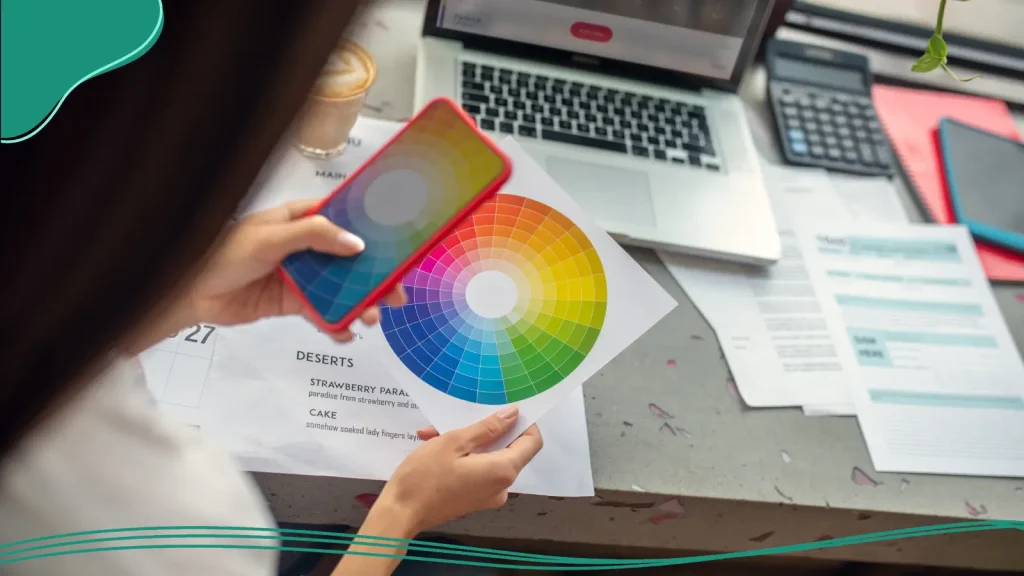
Color Wheel
The color wheel is a visual tool that organizes colors into a circular format to show their relationships to one another. It’s one of the most fundamental tools in color theory.
Analogous Colors
Colors next to each other on the color wheel, creating harmony.
Complementary Colors
Colors opposite each other on the color wheel, creating strong contrast.
Triadic Colors
Three evenly spaced colors on the wheel.
Contrast
Differences in color used to create emphasis and visual interest.
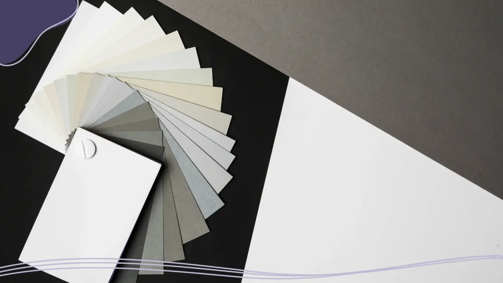
Color Palette / Color Scheme
A selected group of colors used consistently across a design project.
Hex Code
A six-character digital code representing a color in web design (e.g., #FFFFFF for white).
Why Color Theory Matters
Color theory is the foundation behind every visually appealing design, whether it’s a digital image, a brand identity, or a piece of print design. While color might seem like a purely aesthetic choice, it plays a critical role in communication, perception, and emotional response. Studying color theory allows designers to move beyond guesswork and make intentional, strategic decisions.
Thoughtful color choices help organize information and establish visual hierarchy. Contrast between background color and text improves readability, while accent colors draw attention to key elements like buttons, headlines, or calls to action. Without a solid understanding of color relationships, designs can feel cluttered, confusing, or visually overwhelming.
Color theory also influences emotion and mood. Different colors naturally evoke different feelings, cool colors often feel calm and trustworthy, while warm tones can feel energetic or urgent. Designers use this knowledge to shape how audiences perceive a particular design, brand, or message.
Layout & Composition
Layout and composition are at the heart of every compelling design. They determine how visual elements are arranged on a page or screen, guiding the viewer’s eye, creating order, and enhancing overall visual appeal. Even simple designs, like a social media post or a business card, rely on strong layout principles to feel intentional rather than chaotic. A well-thought-out composition ensures that text, images, and other design elements work together harmoniously, establishing clarity, balance, and rhythm.
Alignment
Refers to how elements line up along invisible lines. Good alignment creates order and avoids a chaotic look.
Balance
Balance distributes visual weight across a design. There are two main types:
- Symmetrical: Mirrored elements, formal and stable.
- Asymmetrical: Different elements balanced through contrast, size, or placement.
Proximity
Grouping related elements together to show connection or meaning.
White Space (Negative Space)
The empty areas between elements. White space isn’t wasted; it strengthens readability, creates contrast, and gives designs room to breathe.
Grid Systems
Grids provide structure. Whether you’re designing landing pages or posters, grids use horizontal and vertical lines to organize content.
Columns & Gutters
Columns divide content; gutters are the spaces between columns.
Margins
The outer spacing surrounding your design.
Rule of Thirds
A layout guideline dividing a page into a 3×3 grid. Placing key elements along intersections increases visual interest.

Golden Ratio
A classic proportion (approx. 1:1.618) used to create visually pleasing compositions.
Visual Hierarchy
The arrangement of elements according to importance. Size, color, contrast, and positioning help guide the viewer.
Focal Point
The main area the viewer’s eye is drawn to.
Flow
Movement created by lines, shapes, or arrangements that guide the viewer’s gaze.
Repetition
Repeating patterns, colors, or elements to establish consistency.
Movement
The illusion of motion through placement and direction.
Unity
The sense that all design elements belong together.
Pattern
Repeated decorative elements are used to enhance texture or interest.
Texture
The visual representation of a surface (smooth, rough, soft), even in digital images.
Why Layout & Composition Matters
Good composition is about more than just placing elements randomly. It involves mastering concepts like visual weight, alignment, and proximity to create a structure that makes sense to the viewer. A design with poor composition can confuse or overwhelm the audience, no matter how beautiful the colors or typography might be. Conversely, a thoughtful layout draws attention to key elements, emphasizes the most important information, and builds a sense of flow that feels natural and intuitive.
Composition also plays a critical role in establishing visual hierarchy. By arranging elements strategically, varying size, color, placement, and spacing, designers guide the viewer through the design in a deliberate sequence. This ensures that the most important messages stand out, secondary information is easy to find, and the overall design feels cohesive and polished.

File Formats & Technical Terms
File formats and technical specifications may not be the most glamorous part of graphic design, but they are imperative to creating professional, reliable work. Understanding digital file formats helps designers choose the right tools and export options to maintain image quality, ensure scalability, and guarantee compatibility across different platforms, devices, and production methods. Even the best-looking design can fail if it’s saved in the wrong format or prepared incorrectly.
Vector vs. Raster Images
- Vector images use mathematical equations to create shapes. They scale infinitely without losing quality, making them ideal for logos.
- Raster images (bitmap images) are made of pixels. Enlarging them can cause blurriness and pixelation.
Resolution
The amount of detail in an image.
DPI (Dots Per Inch)
Used in print design. Higher DPI means higher image quality.
PPI (Pixels Per Inch)
Used for digital displays. More pixels produce sharper visuals.
Common File Types
- PNG: Supports transparency; great for logos on the web.
- JPG/JPEG: Good for photos; small file sizes.
- SVG (Scalable Vector Graphics): Vector format ideal for web icons.
- EPS: A print-ready vector format.
- PDF (Portable Document Format): Excellent for sharing final layouts.
Aspect Ratio
Aspect ratio is the proportional relationship between width and height.
Artboard
The canvas area within Adobe Illustrator or similar tools.
RGB vs. CMYK
RGB for screens; CMYK for print.
Compression
Reduces file size but can decrease image quality.
Bleed
Extra area beyond the trim line to ensure ink runs to the edge.
Why File Formats & Technical Terms Matter
Every design project has a final destination, whether it’s a website, a social media post, or a large-format sign, and each destination has its own technical requirements. Designers must know when to use vector images versus raster images, how resolution impacts image quality, and why certain file types are better suited for print or digital use. Making the wrong choice can lead to blurry visuals, oversized files, incorrect colors, or artwork that simply won’t work where it’s needed.
Mastering file formats and technical terminology also improves collaboration. When designers can confidently share the correct file types with developers, printers, and clients, projects move faster and with fewer revisions.

Branding & Logo Design
A strong brand identity includes a complete visual system that communicates a company’s values, personality, and promise at a glance. Every color choice, typeface, icon, and layout decision works together to shape how a brand is perceived; often before a customer ever interacts with the product or service itself.
At the center of this system is the logo, but it’s only one piece of a much larger puzzle. A well-designed logo must function across a wide range of applications, from digital displays and social media avatars to print materials and packaging. At the same time, it must remain recognizable, scalable, and visually consistent no matter where it appears.
Logo Types
- Wordmark: Text-only logo (Google).
- Lettermark: Initial-based logo (IBM).
- Brandmark: Symbol-only logo (Apple).
- Combination Mark: Symbol + text (Adidas).
- Emblem: Text inside a shape (Starbucks).
- Abstract Mark: Unique shapes representing a brand.
Brand Identity
Includes logo, color palette, typography, imagery, voice, and design elements that create visual consistency.
Brand Guidelines / Style Guide
A document that outlines how to use brand visuals correctly.
Tagline
A short phrase expressing a brand’s essence.
Brand Mark
The icon or symbol part of a logo.
Typography System
The chosen hierarchy of fonts used across the brand.
Color System
The primary and secondary colors used for brand expression.
Iconography
A style of symbols used to represent features or ideas.
Why Branding & Logos Matter
Brand identity establishes emotional connections. Through consistent use of color schemes, typography, imagery, and design elements, brands can feel trustworthy, playful, premium, or innovative. These visual cues influence how audiences feel and what they expect, helping a brand stand out in crowded markets and remain memorable over time.
Equally important is consistency. When brand visuals are applied consistently across platforms, they build familiarity and credibility. This consistency is often documented in brand guidelines or style guides, ensuring that everyone uses the brand correctly. Ultimately, effective branding and logo design create a unified visual language that supports recognition, builds trust, and reinforces a company’s identity at every touchpoint.
Need help developing a logo for your brand? LogoMaker‘s innovative AI-Powered platform makes the logo design process simple. Craft an eye-catching logo in just minutes, no prior experience necessary.
Digital & Web Design
Digital and web design focus on creating visual experiences specifically for screens. Screen time statistics show Americans are spending an average of 5 hours and 16 minutes on their phones each day. If you want to connect with your audience, you have to meet them where they are.
UI (User Interface)
UI refers to the visual side of a digital product: buttons, menus, icons, forms, typography, spacing, and color choices.
UX (User Experience)
Focuses on how users feel when interacting with a digital product. Good UX design anticipates user needs, removes friction, and makes navigation effortless.
Responsive design
Ensures layouts adapt smoothly to different screen sizes, from large desktop monitors to tablets and smartphones. Responsive design uses flexible grids, scalable images, and adaptable typography so content remains readable and functional no matter the device.
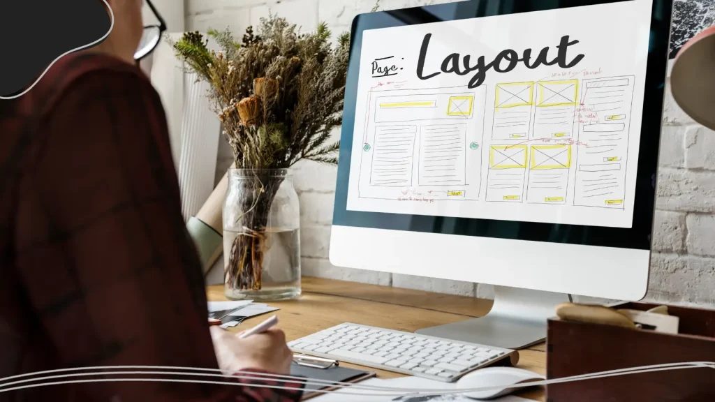
Wireframe
Before visuals are finalized, designers often start with a wireframe. A wireframe is a low-fidelity layout that maps where elements like headers, images, navigation, and body copy will appear.
Prototype
This builds on the wireframe by adding interaction. Prototypes simulate clicks, scrolling, and transitions, allowing designers to test functionality and user flow before development begins.
Hero Image
The large visual element at the top of a webpage, often paired with a headline and a call-to-action. It sets the tone, communicates value quickly, and grabs attention.
Alt text
Written text that describes images for screen readers and situations where images don’t load. It improves accessibility and helps ensure digital experiences are inclusive.
Favicon
The small icon displayed in browser tabs. Though tiny, it reinforces brand identity and helps users quickly identify open pages.
Why Digital & Web Design Matters
Digital and web design shape how people experience, interact with, and trust brands in an increasingly online world. For many users, a website or app is the first point of contact with a company. If that digital experience feels confusing, outdated, or frustrating, users are unlikely to stay long enough to engage.
One of the biggest reasons digital and web design is so important is usability. Thoughtful design ensures that information is easy to find, navigation feels intuitive, and interactions happen smoothly. When design removes friction, users are more likely to stay, explore, and convert.

AI & Emerging Graphic Design Terms
Artificial intelligence has quickly become part of the modern graphic design workflow. From generating visuals to speeding up repetitive tasks, AI tools are changing how designers think, create, and collaborate. Understanding AI-related graphic design terms helps you stay relevant, communicate clearly with your design team, and make informed decisions about when (and when not) to use automation.
Generative Design
Generative design uses algorithms and AI systems to automatically produce design variations based on rules, constraints, or prompts. Instead of manually creating every option, designers guide the system and curate the best results.
Prompt
A prompt is the text input used to guide an AI tool. Clear prompts lead to better, more usable visual outputs.
Text-to-Image
Text-to-image tools generate a graphic image or digital image based entirely on written descriptions. Designers often use these tools for concept art, mood boards, and early visual exploration.
Style Transfer
Style transfer applies the visual appearance of one image, such as color schemes, textures, or artistic style, to another image.
AI Upscaling
AI upscaling improves image quality by intelligently adding detail to raster images. Unlike traditional resizing, AI upscaling reduces blurriness and helps images scale without obvious loss, though it doesn’t fully replace vector graphics.
Content-Aware Fill
Popularized by tools like Adobe Photoshop, content-aware fill uses AI to remove or replace parts of an image by analyzing surrounding pixels. It’s widely used for photo retouching and background cleanup.
Smart Object
A smart object preserves original image data, allowing non-destructive editing. While not purely AI-driven, many smart object features now incorporate AI-assisted adjustments.
Neural Filters
Neural filters apply machine-learning-based effects, such as facial expression changes, color grading, or depth simulation, directly to images.
Human-in-the-Loop
This term describes workflows where designers actively guide, edit, and refine AI-generated content. AI assists, but humans maintain creative control.
Why AI Graphic Design Matters
AI-related graphic design terms reflect a shift in how designers work, not what design fundamentally is. While tools evolve, core principles like visual harmony, hierarchy, and visual appeal remain incredibly important. Understanding AI terminology simply helps designers use these tools wisely, efficiently, and creatively, without losing the human touch that great design depends on.
Print Design & Production
Print design and production bring digital concepts into the physical world, and that transition comes with its own specialized language. While many design principles remain the same, print design introduces unique terminology related to materials, measurements, inks, and finishing techniques. Understanding these terms helps make sure what you see on screen translates accurately and professionally onto paper.
Bleed
Printed artwork extending beyond the trim line.
Trim Size
Final size after cutting.
Margins
Safe area inside trim where important elements must stay.
CMYK Printing
The process using cyan, magenta, yellow, and black inks.
Offset Printing
High-quality printing technique using metal plates.
Digital Printing
Quick printing method for small batches.
Foil Stamping
A technique using metallic foil to create dimensional indentations or shiny accents.
Spot UV
A glossy coating applied to selective areas.
Paper Weight
Thickness of paper (measured in GSM).
Finishes
Gloss, matte, or soft-touch coatings.
Why Print Design & Production Matters
Unlike digital design, print work is permanent; once it’s printed, there’s no undo button. This makes technical precision especially important. Designers must consider factors like bleed, trim, margins, and color modes long before a project reaches the printer. A small oversight, such as incorrect resolution or missing bleed, can result in misaligned cuts, unwanted white edges, or color shifts that affect the final result.
Print design also involves close collaboration with printers and production teams. Knowing the correct terminology allows designers to communicate clearly about paper types, finishes, and printing methods, ensuring expectations are aligned on both sides.

Advanced Design Concepts
The final section of our graphic design glossary will cover some advanced design concepts that take graphic design beyond surface-level aesthetics and into the realm of strategy, psychology, and theory.
Understanding these terms can give your designs greater depth and visual interest while developing a particular style that is able to communicate effectively with an audience.
Gestalt Principles
Psychological concepts explaining how people perceive patterns and groups.
Visual Weight
How heavy or important an element appears based on size, color, or contrast.
Visual Harmony
The pleasing arrangement of elements.
Invisible Line
An implied line created through alignment or flow.
Detailed Visuals
Complex graphics requiring high resolution.
Conclusion
Graphic design is a craft built on creativity, problem-solving, and a shared language. Understanding essential graphic design terms empowers you to see design through a sharper lens, whether you’re creating your first logo, collaborating with a seasoned graphic designer, or reviewing a design project with your team. The vocabulary you’ve learned gives you the tools to think and communicate like a designer.
Design is always evolving, and so is the language that describes it. Keep experimenting, keep learning, and keep adding new terms to your graphic design vocabulary. The more fluent you become, the stronger and more effective your work will be.
Put these graphics design terms and concepts to work and design your own unique logo using LogoMaker‘s intuitive AI-Powered platform. Get started today!
FREQUENTLY ASKED QUESTIONS
Why should beginners learn graphic design terms?
Because knowing the terminology helps you communicate clearly, understand tutorials, collaborate with other creatives, and produce better work.
What’s the difference between raster images and vector graphics?
Raster images use pixels and can lose quality when scaled. Vector graphics use mathematical equations and stay sharp at any size.
Why is the color wheel important?
It helps designers create color schemes, complementary colors, analogous colors, and palettes that enhance visual appeal.
What is negative space in design?
Negative space (or white space) is the empty area around elements. It helps readability and gives designs room to breathe. This is especially important when using a grid pattern design style, so elements don’t clash.
Which file type is best for logos?
SVG or EPS are best because they’re vector formats that stay crisp at any size.
Why is typography so important in graphic design?
Typography affects readability, mood, tone, and visual hierarchy. It influences how users interpret written content.
What is DPI, and why does it matter?
DPI (dots per inch) measures print resolution. Higher DPI means better print quality.
How does color impact brand identity?
Color affects perception, emotions, and recognition. Consistent color use builds a strong brand presence.
What’s the difference between UX and UI?
UI is how a design looks; UX is how the user feels interacting with it.
What makes a design visually appealing?
Balance, color harmony, contrast, hierarchy, and thoughtful composition all contribute to visual appeal.